Inspiration
We are interested in Time Series and creating interactive dashboard for data visulization and forecasting.
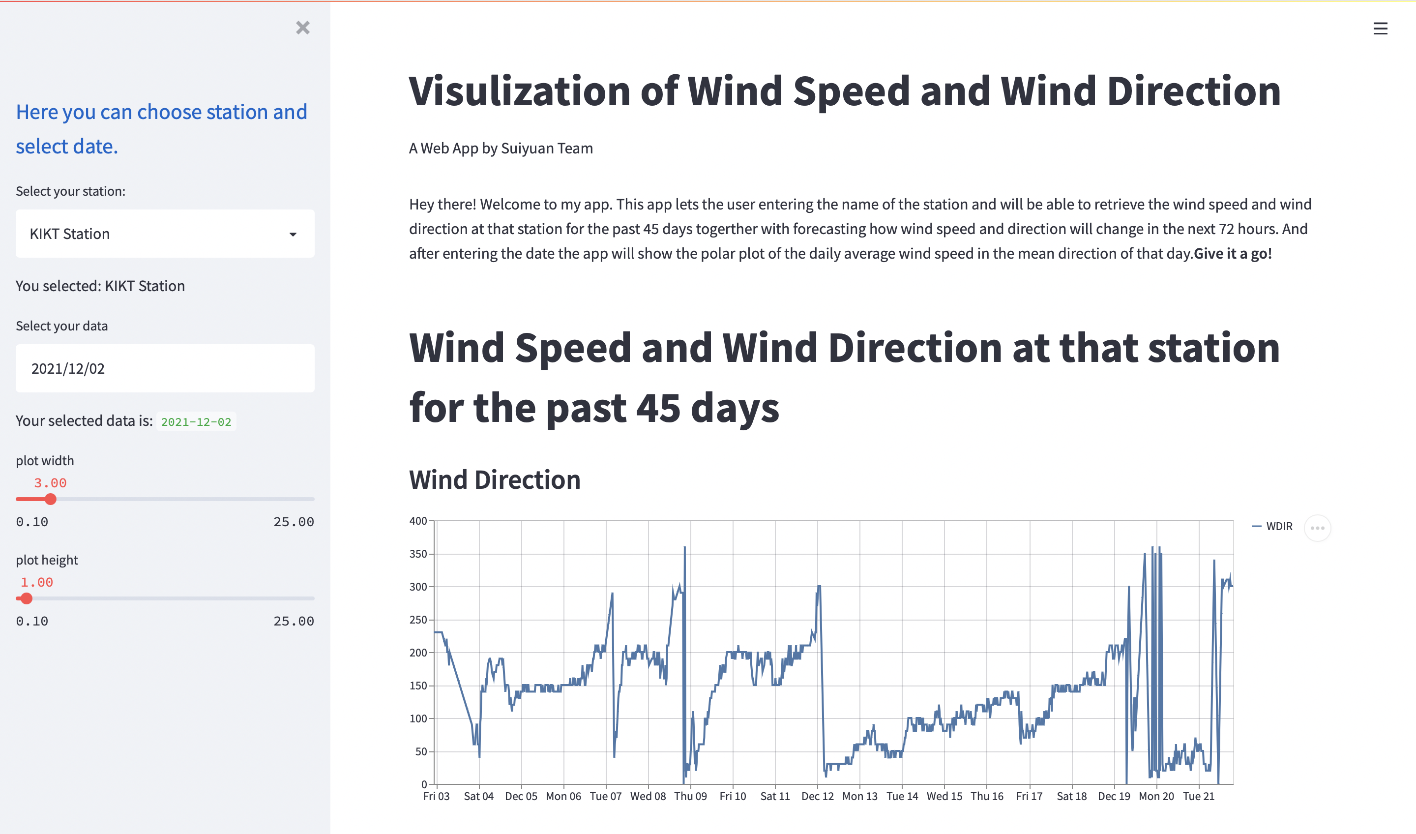
What it does
Visualize the wind speed and wind direction in a time series plot. Forecast how wind speed and direction will change in the next 72 hours.
How we built it
Use python first for data cleaning and feature finding. After obtained the processed data set, we tried several ways of modelling and choose the best one for dashboarding. Streamlit is used create data visulizationa and interaction.
Challenges we ran into
Dirty data, difficult to transform data format, hard to aggregate data. Also new to streamlit and had trouble for creating the dashboard.
Accomplishments that we're proud of
Build a interactive dashboard using streamlit.
Built With
- python
- streamlit


Log in or sign up for Devpost to join the conversation.