-
-
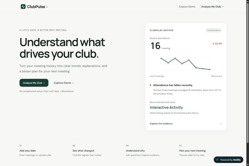
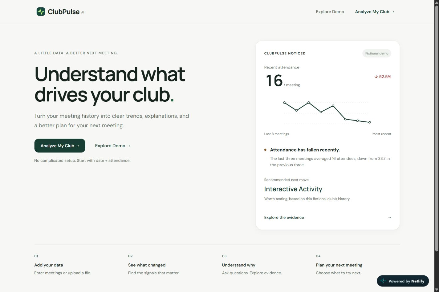
ClubPulse homepage with a sample attendance trend and recommended next meeting format.
-
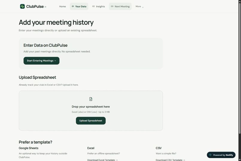
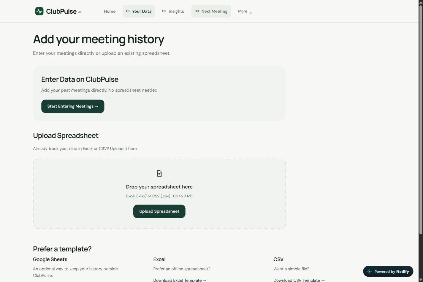
Options for entering meetings manually, uploading a spreadsheet, or downloading a template.
-
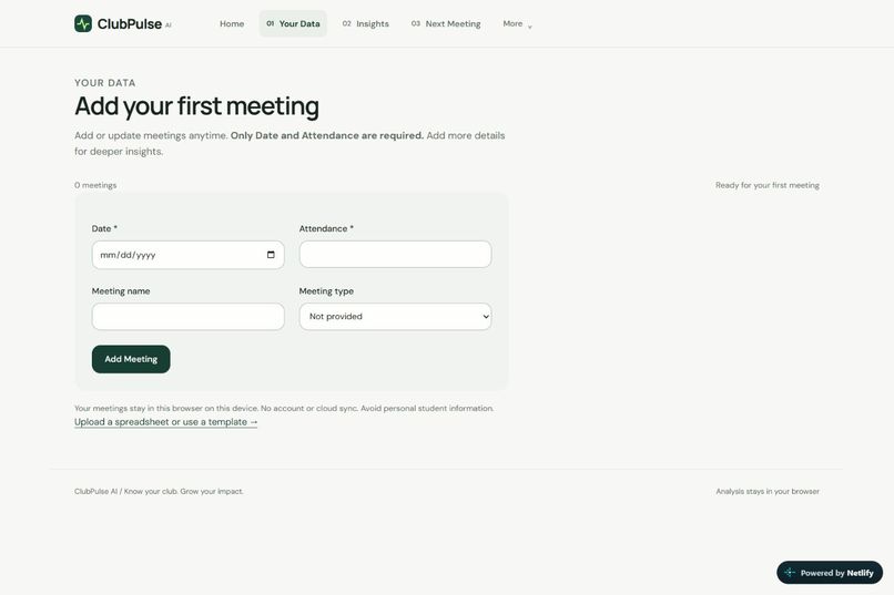
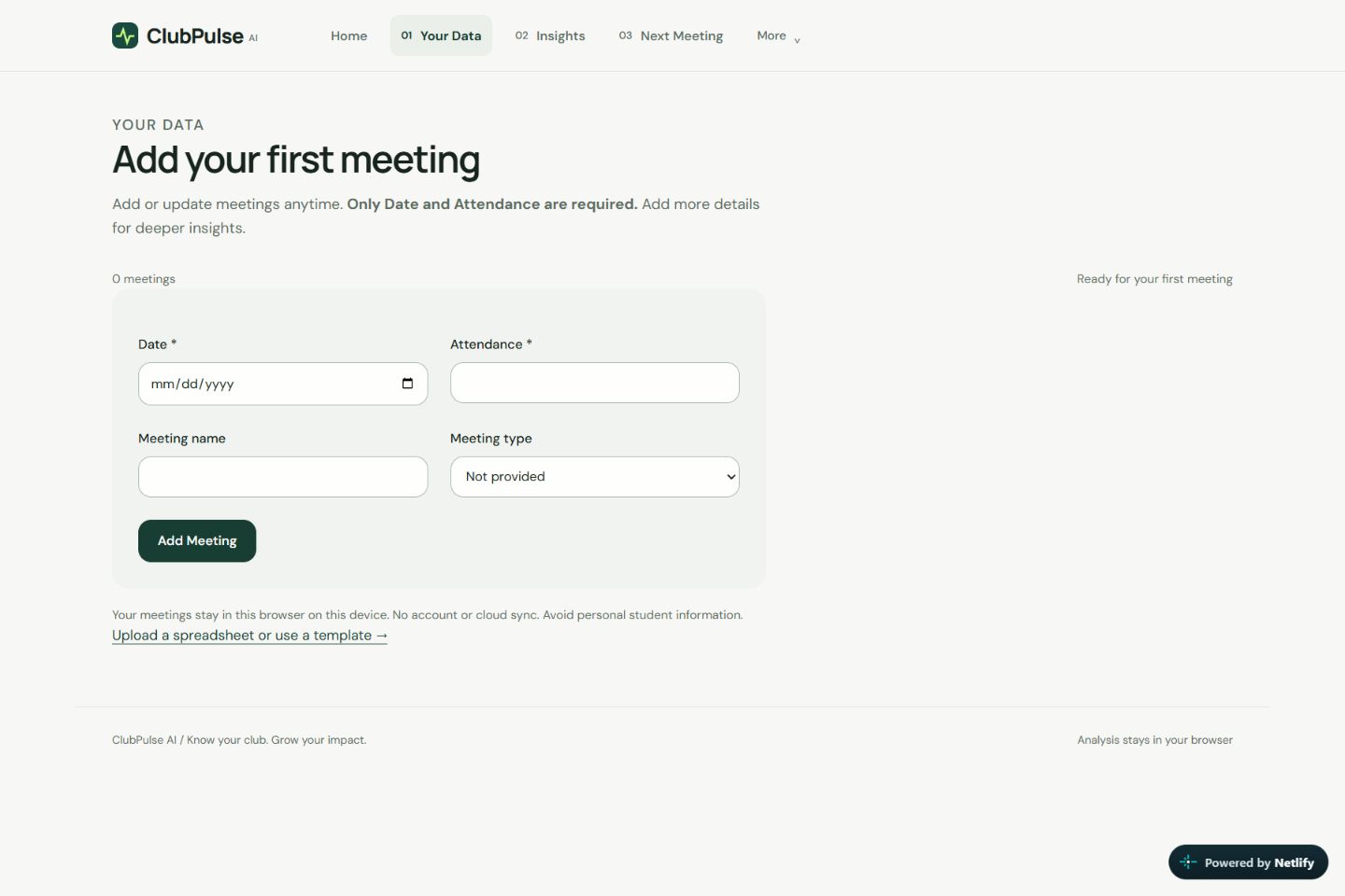
Empty meeting-entry form with required Date and Attendance fields and optional meeting details.
-
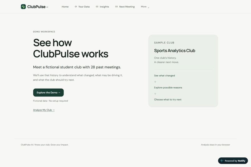
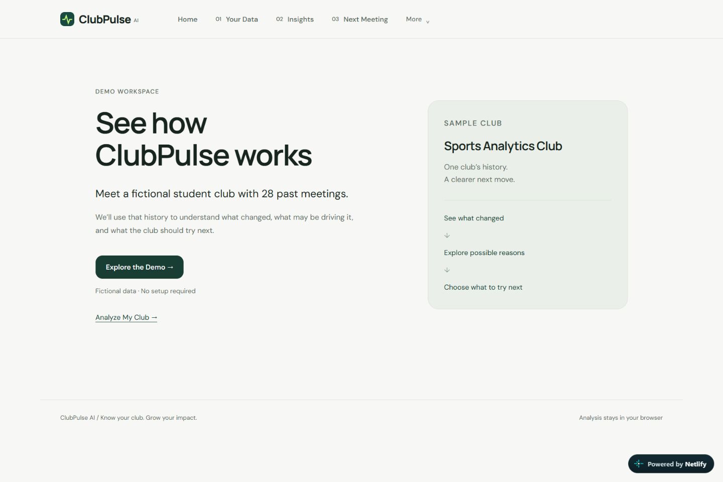
Demo introduction featuring a fictional Sports Analytics Club with 28 past meetings.
-
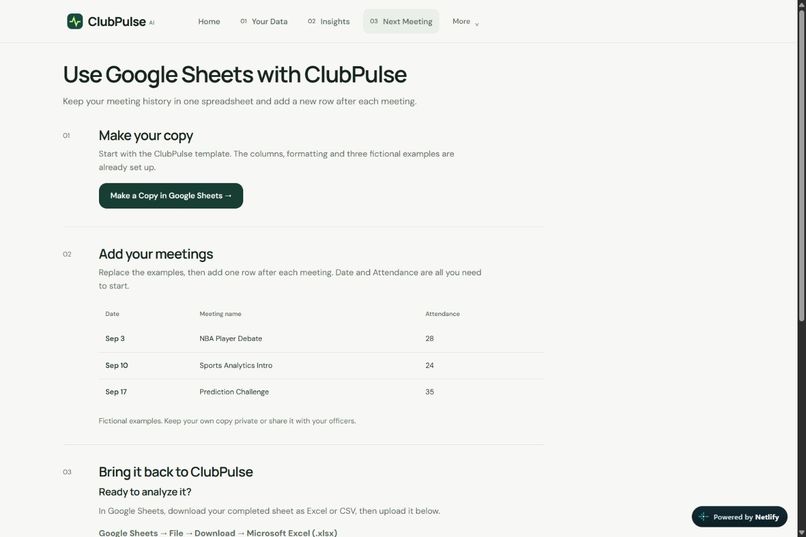
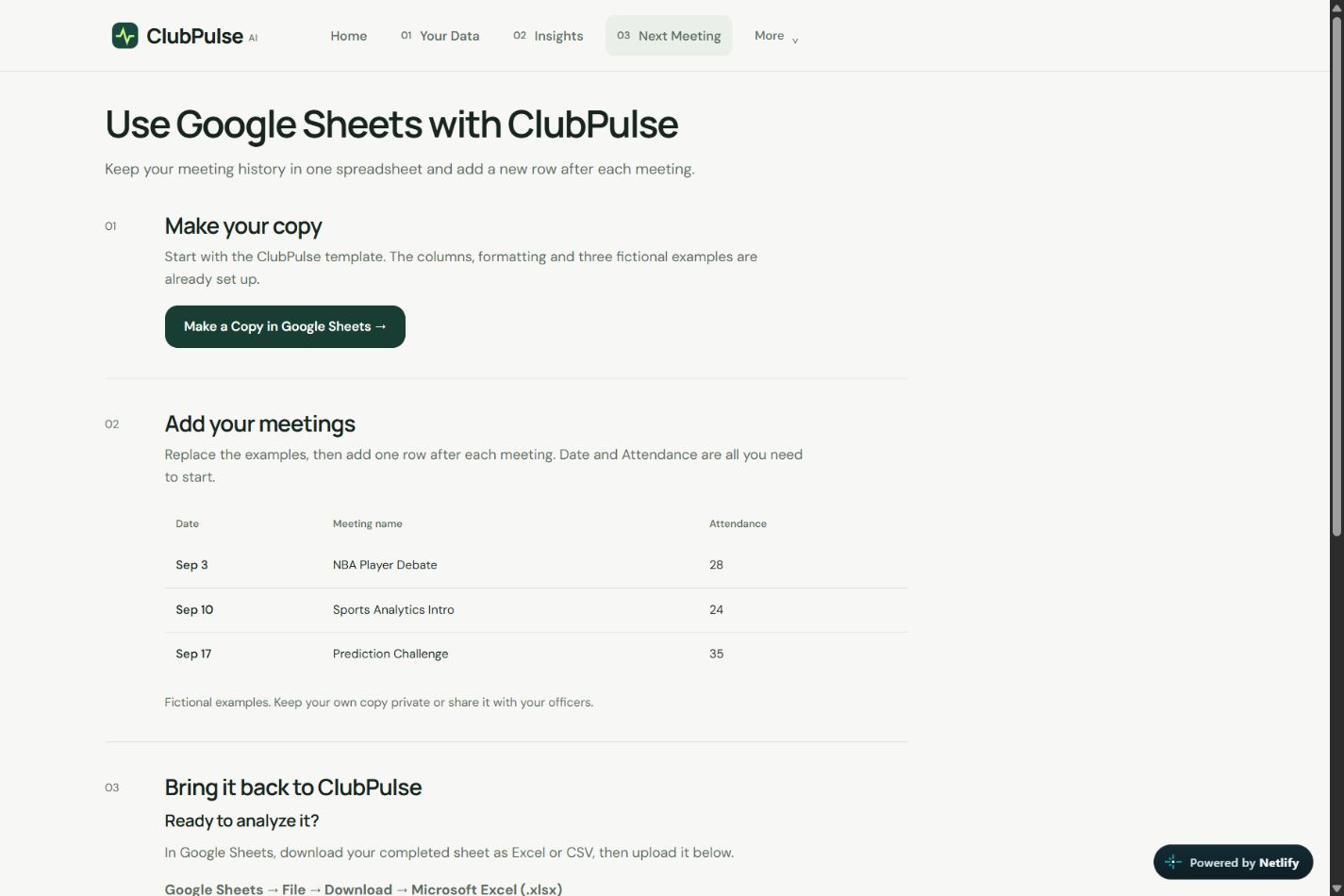
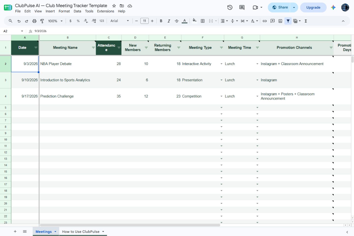
Instructions for copying the Google Sheets template and recording your club’s meetings.
-
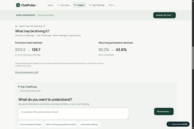
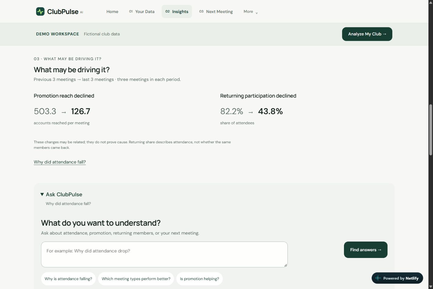
Comparison of promotion reach and returning participation, followed by the Ask ClubPulse question box.
-
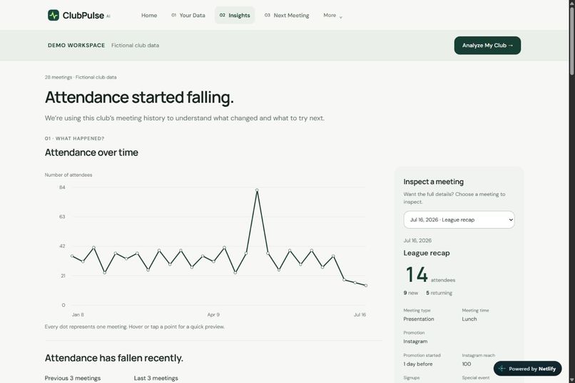
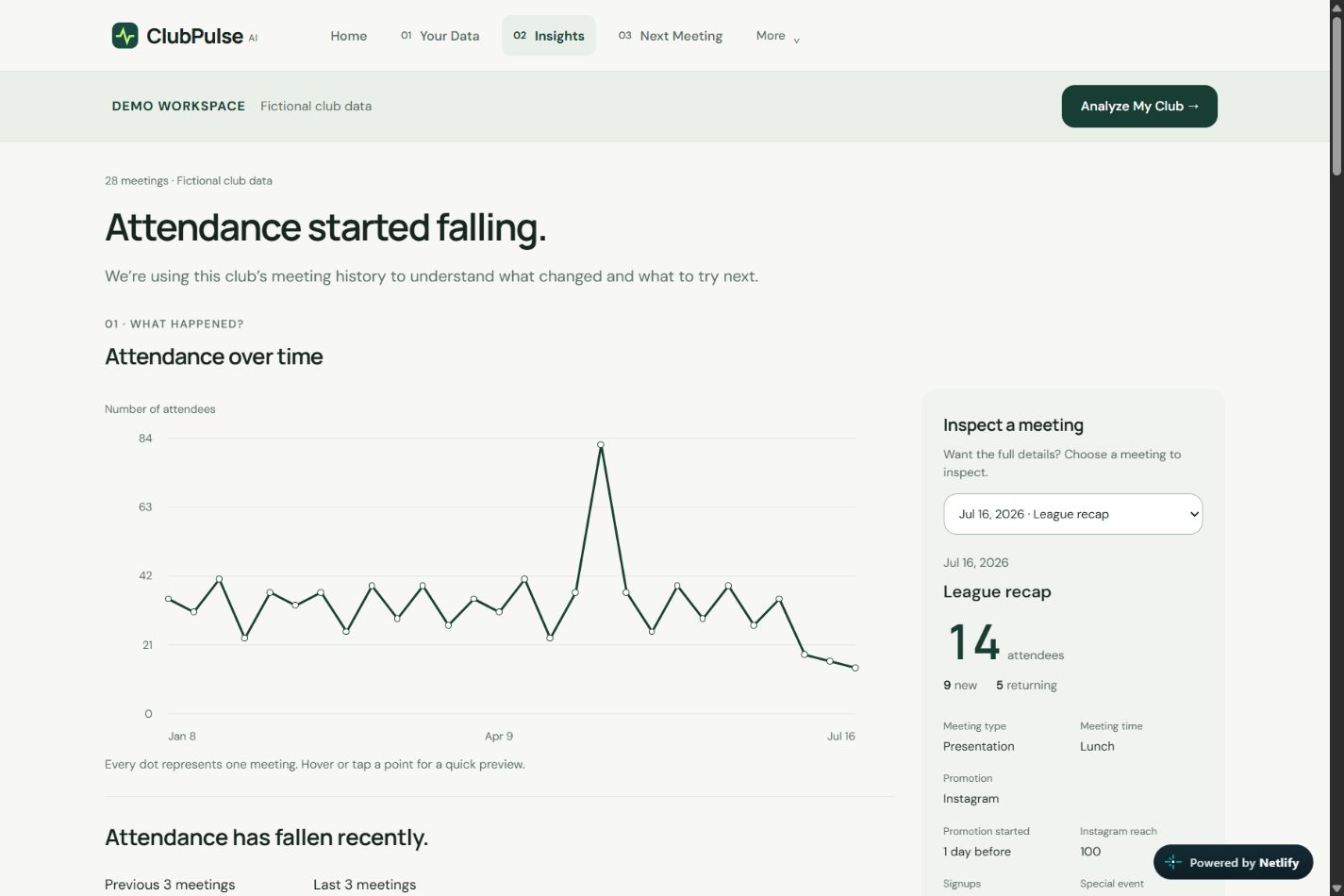
Attendance chart showing a recent decline, alongside details for the selected meeting.
-
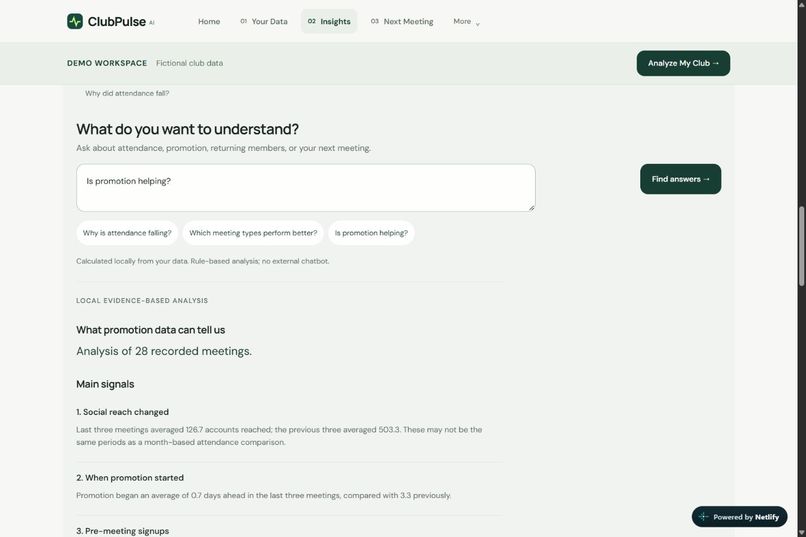
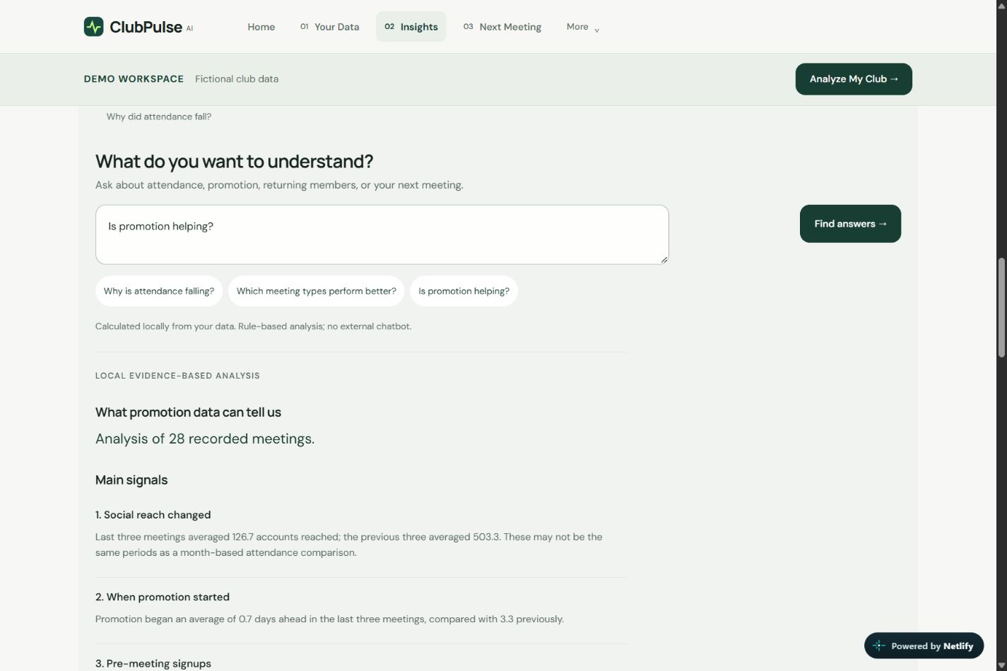
Results for “Is promotion helping?” showing changes in social reach and promotion timing.
-
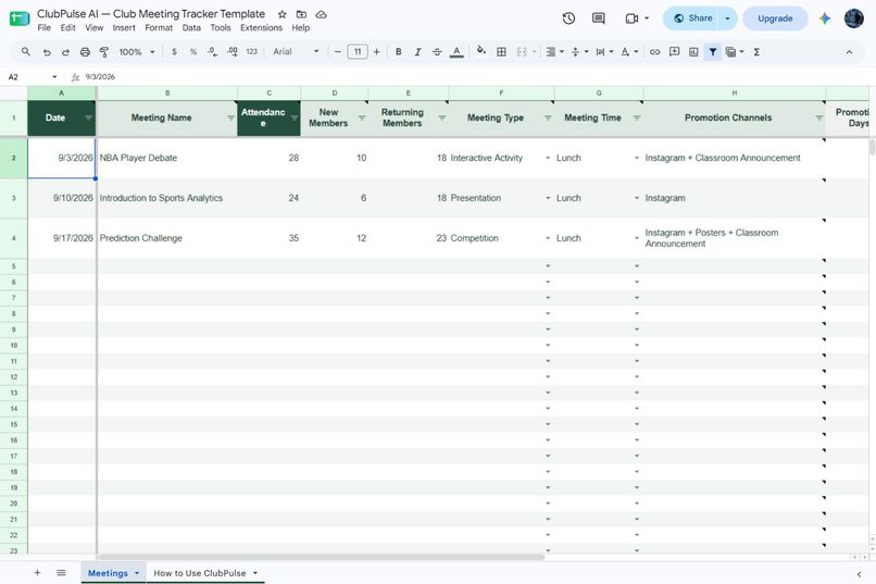
ClubPulse’s Google Sheets template showing sample meetings, attendance, member counts, and promotion channels.
-
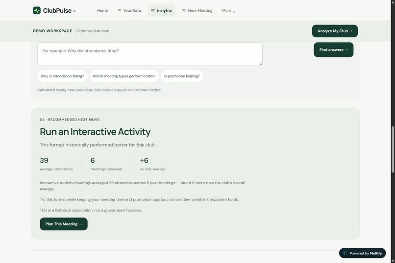
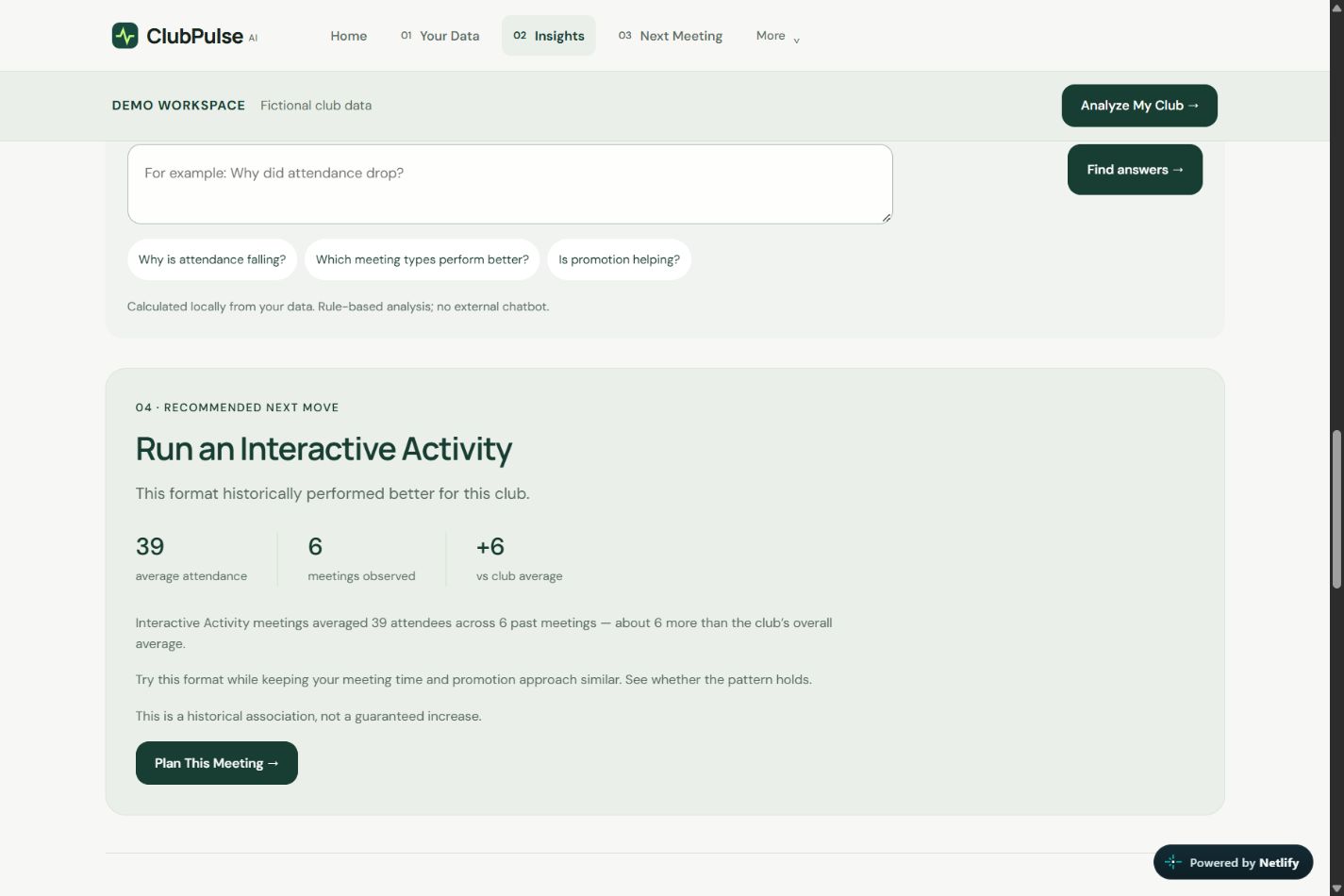
Recommendation to try an Interactive Activity, supported by historical attendance figures.
-
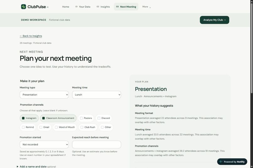
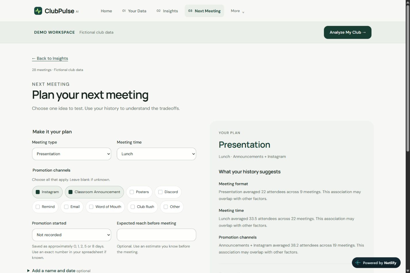
Meeting-planning form alongside historical comparisons and an estimated turnout range.
Inspiration
Student club leaders often collect attendance, promotion, and engagement data, but they usually do not have an easy way to understand what that data actually means. This affects club presidents and board members who are trying to increase turnout, keep members coming back, and plan better meetings, but are often making decisions based on guesswork instead of their own club history. ClubPulse was built to turn that existing data into clear trends, explanations, and practical next steps.
What it does
ClubPulse AI analyzes a club’s meeting history and turns it into clear trends, explanations, and recommendations. Users can enter meetings directly, upload Excel/CSV files, inspect attendance over time, and get a data-backed recommendation for what to try at their next meeting.
How we built it
I built ClubPulse as a responsive web app with one shared data structure for manually entered meetings and spreadsheet imports. The analytics calculate trends and patterns first, while the AI layer helps explain those results in simpler language instead of inventing numbers. I also used ChatGPT and OpenAI Codex to help brainstorm features, refine the user experience, debug issues, and assist with implementation, while I reviewed the code and made the final product and design decisions.
Challenges we ran into
One of the biggest challenges was making the analytics easy to understand. Early versions would say things like “attendance decreased 52%,” but testing showed that users needed graphs, actual attendance numbers, comparison periods, and the underlying meeting data for that insight to make sense.
Accomplishments that we're proud of
I shared the beta version of ClubPulse with five student club presidents and had them try the platform with their clubs. Seeing real club leaders use it to better understand attendance and engagement showed me that ClubPulse could solve a real problem beyond just being a project.
What we learned
I learned that useful analytics is not just about calculating the right number—it is about presenting the evidence clearly and making the next action obvious. I also learned a lot about data visualization, spreadsheet imports, responsive design, deployment, and building AI features around reliable calculations.
What's next for ClubPulse AI
Next, I want to start introducing ClubPulse to more clubs at my local high school and improve it based on feedback from actual student leaders. From there, I hope to expand to other schools and make ClubPulse something clubs can regularly use to track engagement and make better decisions for their next meeting.
Built With
- ai
- css
- csv
- excel
- github
- google-apps-script
- google-sheets
- html
- javascript
- netlify
- openai

Log in or sign up for Devpost to join the conversation.