-
-
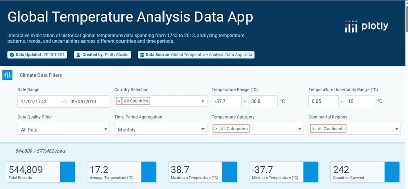
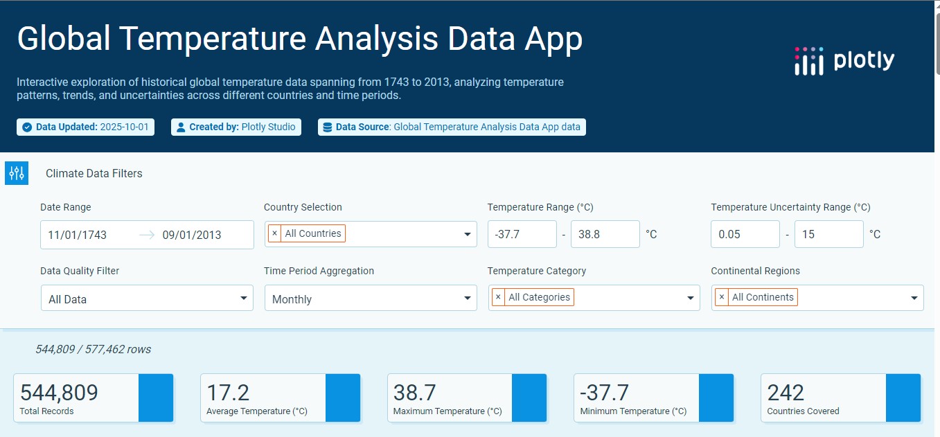
Front page of project
Inspiration
We were inspired by the gap between complex climate data and public understanding. While scientists have extensive temperature records, most people never get to see the actual patterns of global warming. We wanted to transform raw numbers into visual stories that anyone could understand and connect with emotionally.
What it does
Global Temperature Analysis Data App named ClimatePulse Explorer turns 270 years of global temperature data into an interactive visual journey. Users can explore temperature trends across countries and continents, see how seasons are changing, compare regional warming rates, and understand climate patterns through intuitive, beautiful visualizations. It makes abstract climate concepts tangible and personally relevant.
How we built it
Frontend: Plotly Dash for interactive components and visualizations Data Processing: Python Pandas for cleaning and analyzing the dataset Visualizations: Multiple chart types including choropleth maps, line charts, and heatmaps Features: Decade filters, country comparisons, seasonal analysis, and temperature anomaly calculations Design: Custom color schemes from blue to red to intuitively represent temperature changes
Challenges we ran into
Data Quality: Dealing with missing values and inconsistent records across different time periods Performance: Managing large datasets efficiently within platform limitations Visual Clarity: Balancing scientific accuracy with accessibility for non-expert users Resource Constraints: Working with trial version limitations required creative problem-solving and optimization
Accomplishments that we're proud of
Creating an intuitive interface that makes climate data accessible to everyone Developing a cohesive visual language that tells the climate story effectively Building a responsive application that works across different devices Transforming complex scientific data into engaging, understandable visual narratives
What we learned
Climate data tells a compelling story when presented visually Color choices significantly impact how people interpret temperature data Interactive elements help users form personal connections with global trends Simple, clean designs often communicate complex information most effectively Resource constraints can spark creativity and innovative solutions
What's next for ClimatePulse Explorer
Adding real-time climate data integration Incorporating predictive modeling for future temperature scenarios Expanding to include extreme weather event tracking Adding educational content to explain climate science concepts Developing mobile app version for broader accessibility Including more environmental indicators beyond temperature


Log in or sign up for Devpost to join the conversation.