Inspiration
Climate change is often discussed in terms of rising global temperatures, but behind every fraction of a degree are billions of people whose lives are directly affected. We were inspired by the need to connect climate signals — such as warming trends and carbon emissions — with the demographic pressures of population growth. By making this link visible, we hope to highlight not just the science, but the human urgency of climate action.
What it does
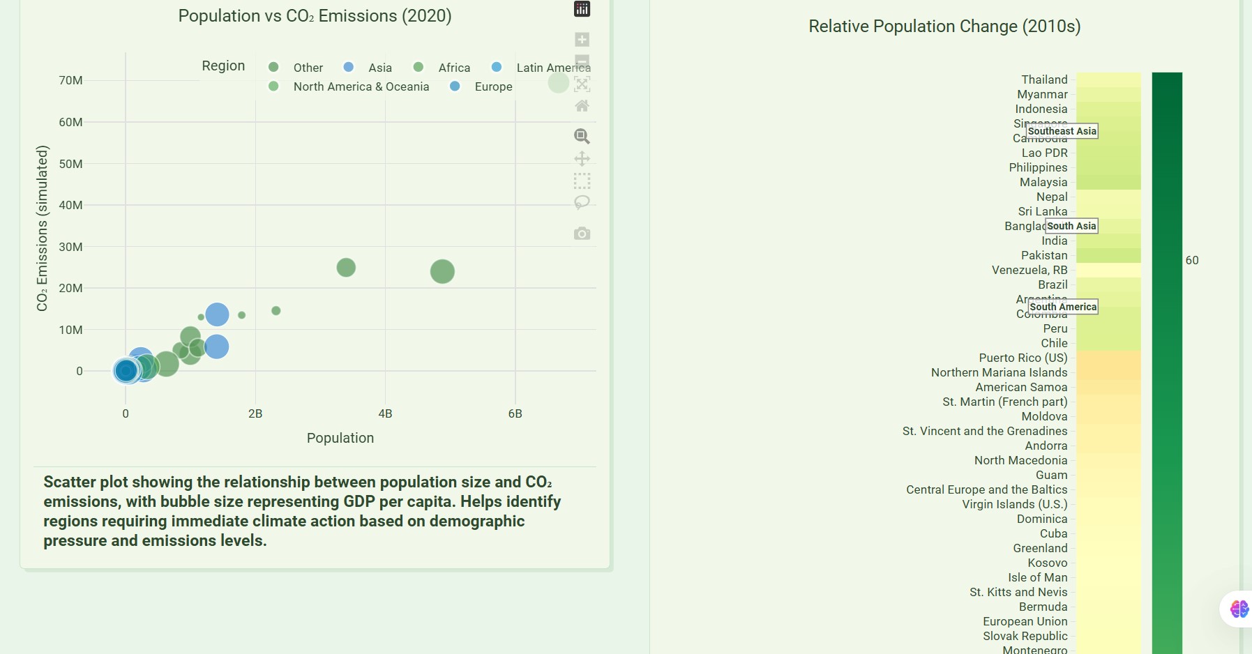
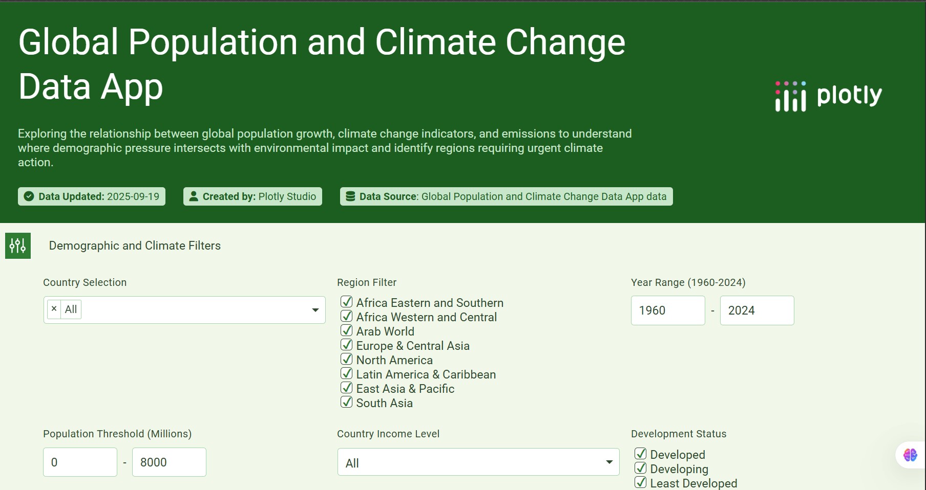
ClimateLens is an interactive data app built in Plotly Studio that brings together global population growth, temperature anomalies, and CO₂ emissions. Users can:
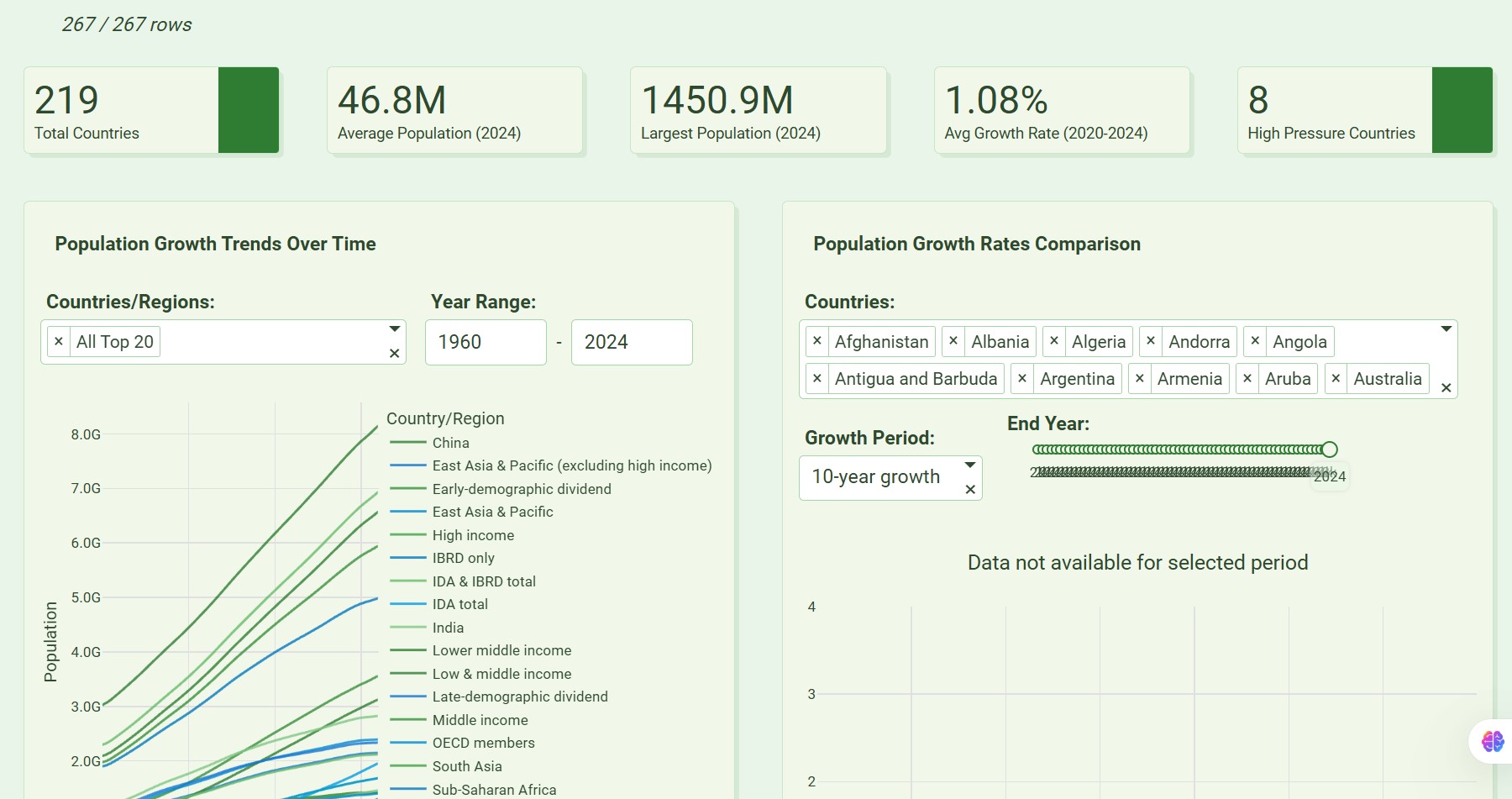
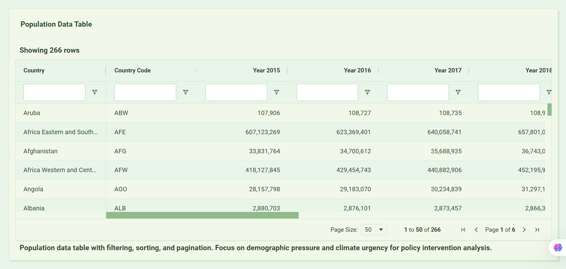
Explore historical and projected population trends by country or region.
Visualize global warming over the past century.
Compare emissions and demographic pressure side by side.
Identify hotspots where rapid growth overlaps with climate vulnerability.
How we built it
We started with datasets from the World Bank (population), NASA GISTEMP (temperature anomalies), and Our World in Data (CO₂ emissions). After cleaning and preparing the data, we uploaded it into Plotly Studio. Using Studio’s drag-and-drop interface and customization features, we built a dashboard with line charts, maps, scatter plots, and heatmaps — all linked with global filters for country, region, and year. Finally, we deployed the app to Plotly Cloud, making it accessible to anyone with a link.
Challenges we ran into
Cleaning World Bank and NASA data so Plotly Studio could parse it correctly.
Keeping datasets under the 75 MB limit while retaining global coverage.
Designing charts that are not only accurate but also intuitive for non-technical users.
Aligning population years with emissions and temperature years (not all datasets cover the same time periods).
Accomplishments that we're proud of
Building a multi-dataset climate app fully inside Plotly Studio.
Making a clean, interactive dashboard that works globally — from Pakistan to the US to Africa and beyond.
Showing judges and users how demographic growth intersects with climate change in ways that spark action.
What we learned
How to transform large, messy datasets into clean CSVs ready for visualization.
The power of Plotly Studio for quickly prototyping interactive data apps.
That storytelling is as important as the data — clarity and accessibility matter when communicating climate urgency.
What's next for ClimateLens?
Expanding to include real-time air quality data from OpenAQ.
Adding predictive models to explore “what if” climate and population scenarios.
Collaborating with NGOs and policymakers to use ClimateLens as a decision-support tool.
Scaling beyond visualization to include policy recommendations and adaptation strategies.
Built With
- excel
- plotly-cloud
- plotly-studio
- world-bank-data


Log in or sign up for Devpost to join the conversation.