-
-
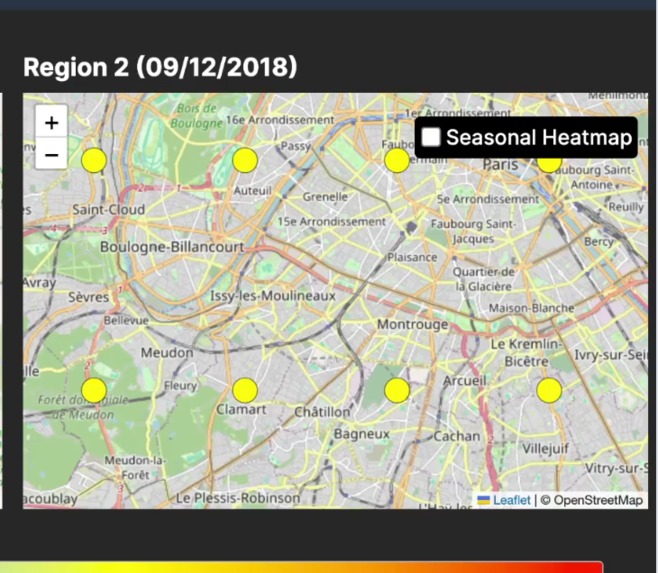
HeatMap
-
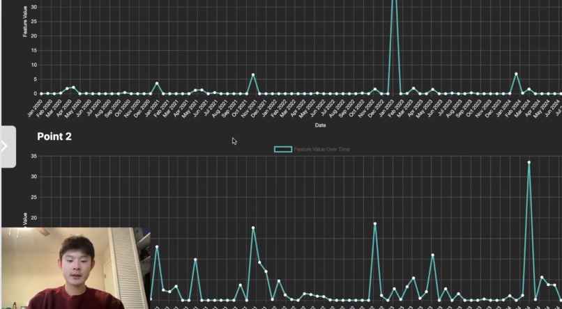
LineChart


Inspiration
This past summer, I participated in a research program on preserving recreational mountain biking forests. I was tasked with finding locations experiencing high levels of precipitation, which exacerbate soil erosion impacts. However, even after thorough browsing on the Internet, I found it challenging to access precipitation data for the forests we were considering. I realized that although climate data is essential in a wide variety of fields, it is difficult to obtain in easily comprehensible forms. An app capable of creating climate data visualizations based on any region of the world would make climate data more understandable, streamline access to the data, and save time for countless people working to combat environmental issues.
What it does
ClimateLens helps address environmental issues, such as climate change, by making climate data accessible, understandable, and approachable to everyone. Our target audience involves researchers, policy-makers, students, environmental organizations, or anyone working with climate data. ClimateLens offers users quick and easy access to clear visualizations of climate data that they can use to make specific conclusions about their study regions.
ClimateLens fetches climate data from an API and creates visualizations based on user preferences for selected climate features, periods, and regions. The app offers two main options: exploring regions and historical trends.
When exploring regions, users can look at a single region, or they can compare two regions side by side. Users are prompted to highlight a region, and colored circles are generated spanning over their highlighted region to indicate data values. These colors follow a gradient scale. When users compare two regions, they are given data variation warnings within each region and when comparing the two. Additionally, if the regions have significant differences in latitude, they also can regenerate their visualization to change the date and align the seasons. Many people working in the environmental industry, like workers in environmental organizations or environmental policy-makers, need to make judgments specific to their geographic region. Exploring geographic regions allows them to make informed decisions backed by region-specific climate data.
When exploring historical trends, users select a date to visualize how a selected feature changes from their chosen date to the present. Instead of highlighting regions, they can select a specific coordinate point. Again, users can choose to visualize one point or compare two. A line chart graph is generated, with the dates labeled along the x-axis and data values labeled along the y-axis. Earth’s climate changes over time, and it’s important to observe how specific climatic elements change. Looking into the past provides great insight into how the future pans out. By exploring historical trends, people combating environmental issues can grasp the direction the climate is heading in the future. With this greater insight, they can more effectively prevent environmental issues.
How we built it
I started with a Figma prototype to lay out the design. Next, I used HTML, CSS, and Javascript to create the website. To fetch weather data, I used Open-Meteo API, and to create the visualizations, I used Leaflet.js and Chart.js. Since the data was fetched in Python, I used Flask to transfer over the data.
Challenges we ran into
One challenge I encountered in programming our app was transferring data from Python to Javascript and mapping it onto the Leaflet map. Since the Javascript front-end has a different origin than the Python back-end, the browser restrictions blocked the requests due to the Same-Origin Policy. Therefore, I needed to install and implement CORS (cross-origin resource sharing), allowing our Python backend to safely send the data to our frontend. Then, I ran into the obstacle of turning each piece of data into a visualization on the map. I didn’t know any tools to visualize data, so we searched through Leaflet’s features. I stumbled upon the circle marker feature, which creates circles of a certain color given a data value. I decided I could make an effective visualization by representing the data through a color scale, with certain ranges of data values corresponding to a certain color.
Accomplishments that we're proud of
The biggest accomplishment I'm proud of is creating clear and insightful visualizations. Coming into this project, I didn't know how I would present and visualize the data. Furthermore, I had no experience with API's and didn't know how to fetch data from an API to my website. Through research and brainstorming, I found helpful tools that would help in this process. I found an API, and after many difficulties, I was able to connect the data from Python to Javascript using Flask. For the visualizations, I found some Javascript libraries that I thought could work. After a lot of thinking about how I would depict the visualizations and what features I could include to add additional insight, I ultimately was able to utilize all these tools I didn't know how to use to be able to create a successful end product.
What we learned
I learned the path to an ambitious goal is never smooth. I often sat at my computer for hours, ultimately not getting closer to my goal. I had to take a break and sit with the project overnight before starting again and taking a new direction. Sometimes that meant completely erasing the code. However, even when all these obstacles frustrated me, I stuck to it, trusting I would finish with a successful product. That mindset got me through the finish line, and I'm proud of my final result.
What's next for ClimateLens
I hope to send it to companies or people in the technology or environmental science industry and gain some feedback. After making edits, I aim to either create a website domain for ClimateLens so it can be used in the real world or have it be an example/inspiration for the field of environmental science. Considering we are in the age of data and machine learning, I believe researchers or companies could find great value in a website like ClimateLens that aims to present data clearly and limit bias.
Running the Project
The API doesn't automatically connect when using the GitHub demo website. To run the project, download a zip of the code. Run "python3 process_data.py", after opening the live server.

Log in or sign up for Devpost to join the conversation.