Inspiration
What it does
Project Overview
Features
- Interactive data visualization
- Real-time chart generation
- Multiple chart format support (PNG, SVG)
- Responsive design
- Professional theming
Built With
- Python
- Plotly
- Jupyter Notebooks
- Mermaid diagrams
Usage Instructions
Installation
pip install plotly pandas jupyter
Quick Start
- Clone the repository
- Install dependencies
- Run Jupyter notebook
- Execute chart generation code
- Download generated charts
Chart Generation
- Use plotly for data visualizations
- Use mermaid for flowcharts
- Save charts in both PNG and SVG formats
- Follow brand color guidelines
License
MIT License """
About The Project
Inspiration
This project was born from the need for high-quality, professionally themed data visualizations that could be generated programmatically. The inspiration came from observing how many data analysis workflows suffered from inconsistent styling and poor visual communication.
What We Learned
Throughout the development process, we discovered:
- The importance of consistent theming across visualizations
- How proper color selection impacts data comprehension
- The value of supporting multiple output formats
- Best practices for automated chart generation
Building Process
The development followed these key phases:
Phase 1: Theme Development
We established a cohesive visual identity using:
- Primary brand colors:
#1FB8CD,#DB4545,#2E8B57 - Consistent typography and spacing
- Professional styling guidelines
Phase 2: Chart Implementation
Core functionality included:
- Plotly integration for statistical charts
- Mermaid support for flowcharts and diagrams
- Automatic file output in PNG and SVG formats
Phase 3: Quality Assurance
Rigorous testing ensured:
- Cross-format compatibility
- Consistent visual appearance
- Reliable file generation
Challenges Overcome
Technical Challenges
- Color Consistency: Ensuring brand colors appeared correctly across different chart types
- Text Limitations: Implementing 15-character limits while maintaining readability
- Format Support: Seamlessly supporting both raster and vector outputs
Design Challenges
- Visual Hierarchy: Balancing information density with clarity
- Responsive Design: Ensuring charts work at different sizes
- Accessibility: Maintaining readability across various display conditions
Performance Optimization
- Memory Management: Efficient handling of large datasets
- Rendering Speed: Optimizing chart generation times
- File Size: Balancing quality with practical file sizes
Mathematical Foundations
The color selection algorithm uses perceptual uniformity:
$$\Delta E = \sqrt{(L_2-L_1)^2 + (a_2-a_1)^2 + (b_2-b_1)^2}$$
Where $\Delta E$ represents the perceptual color difference in CIELAB space, ensuring optimal contrast and visual separation between data series.
Future Enhancements
- Interactive dashboard integration
- Real-time data streaming support
- Extended chart type library
- Enhanced accessibility features
This project represents a commitment to elevating data visualization standards through consistent, professional, and accessible chart generation.
Built With
- api
- base44
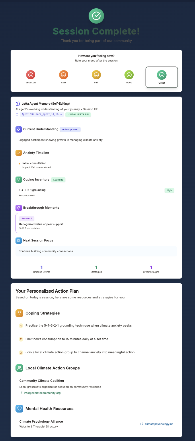
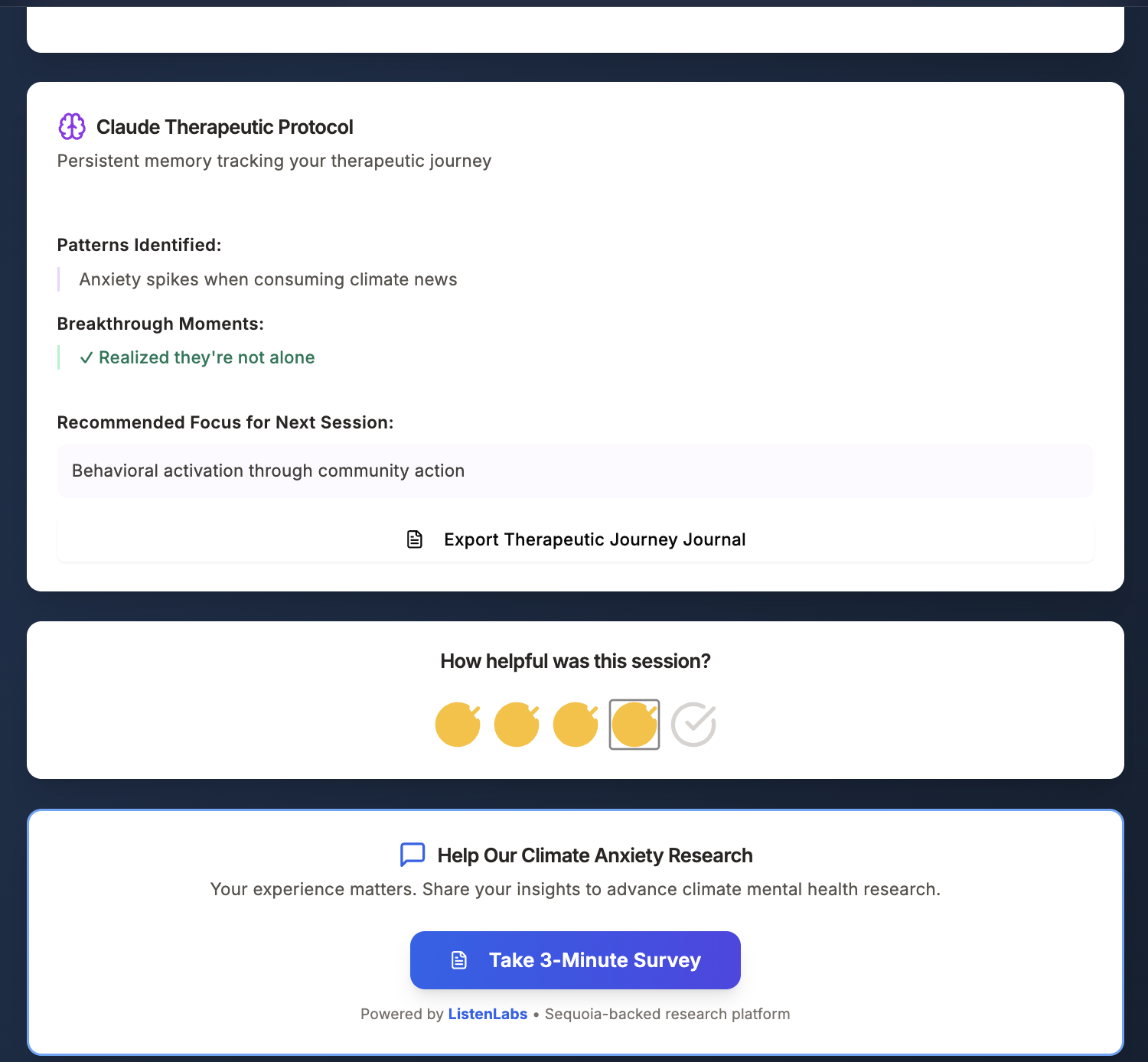
- claude
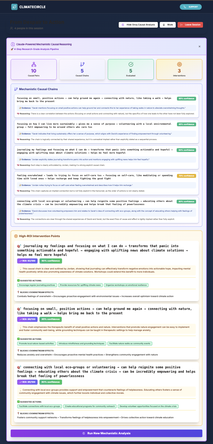
- groq
- heroku
- javascript
- labs
- letta
- listen
- postgresql
- python
- railway
- react
- redis
- render
- typescript


Log in or sign up for Devpost to join the conversation.