


Climate Transition Pathways Explorer
Exploring the Global Transition to Net Zero Through Interactive Data Storytelling
💡 Inspiration: From Idea to Impact
When we talk about climate change, we often discuss goals — limiting global warming to 1.5°C, achieving net-zero emissions by 2050 — but rarely do we see the pathways behind those numbers.
I wanted to create a dashboard that doesn’t just show end outcomes but lets people interactively explore how different policy, technology, and economic choices shape those climate futures.
What happens if countries delay their transition?
How do renewables rise while coal declines?
Which scenarios keep us below 2°C — and which push us into a “Hot House World”?
The Climate Transition Pathways Explorer aims to bridge that gap — from static climate models to an interactive global narrative powered by data, design, and discovery.
📊 About the Dashboard
Built using Plotly Dash, this dashboard visualizes the IMF–NGFS Climate Transition Pathways dataset, which models how global energy, emissions, and economics evolve under different climate policy scenarios.
It’s not just a dashboard — it’s an exploration engine for climate futures.
Across 141 countries, 7 scenarios, and 3 climate models, it helps users visualize:
- How energy sources shift across decades,
- How carbon emissions evolve across models,
- How countries’ temperature trajectories differ under varying policy ambitions.
With 10 comprehensive interactive visualizations, it unpacks complex data into intuitive, story-driven insights.
🌐 Key Highlights
- 79,379 total records, spanning 2020–2050 projections
- Covers 141 countries and regions
- Compares 7 transition scenarios from “Below 2°C” to “Hot House World”
- Integrates 3 major climate models and multiple energy systems and variables
- Interactive 3D surfaces, sunbursts, and globe maps powered by Plotly
🔍 Detailed Overview: Visualizations Explained
Each visualization answers a critical question about the climate transition story.
1️⃣ Climate Transition Pathways Overview
“How do emissions, temperature, and CCS evolve under each climate pathway?”
A dual-plot combining temperature rise (top) and emissions breakdown (bottom) for different transition scenarios.
Users can compare how policies like “Net Zero 2050” or “Fragmented World” diverge in both warming and mitigation patterns.
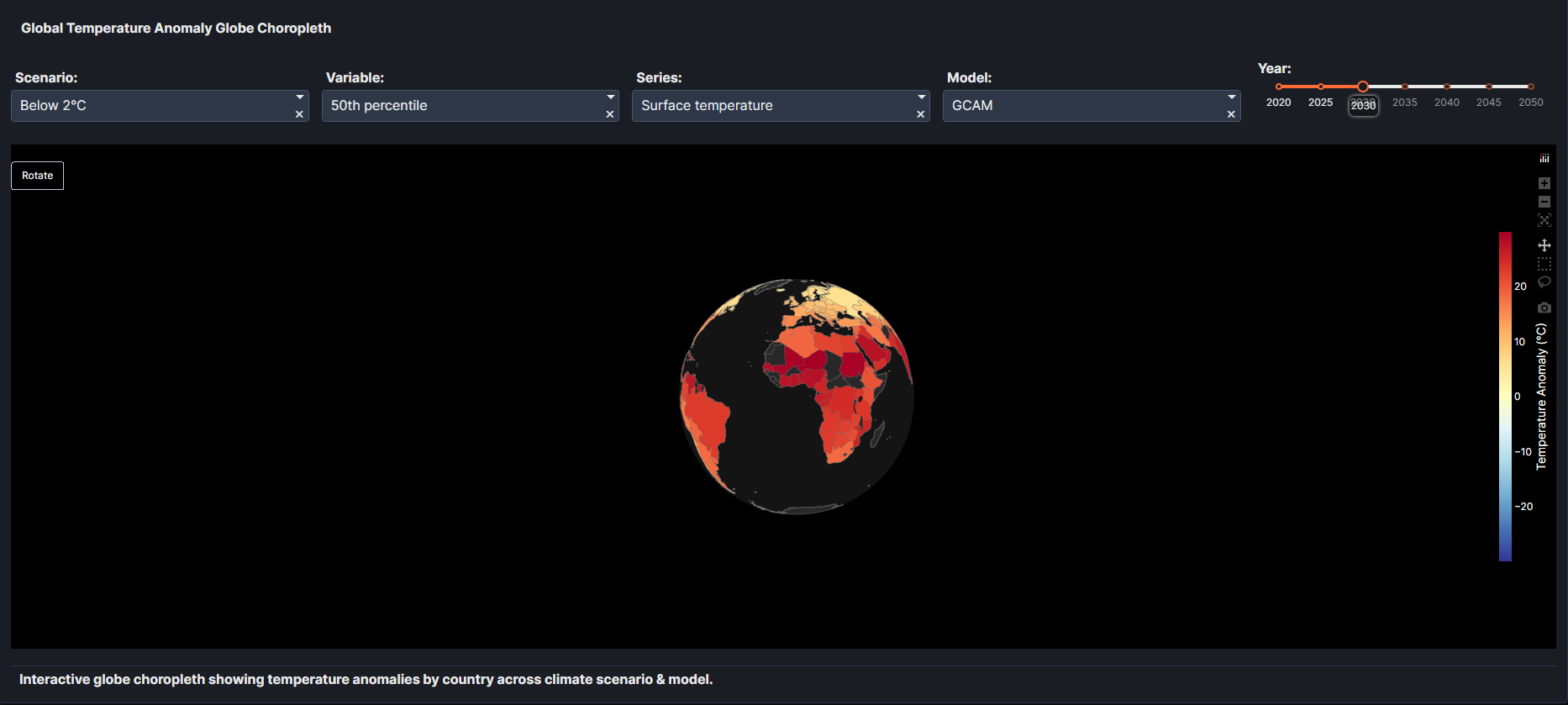
2️⃣ Global Temperature Anomaly Globe
“Where will the world heat up most under different scenarios?”
A rotatable 3D globe choropleth visualizing surface temperature anomalies by country and model.
Users can animate through years to see the planet literally heat up — Africa and South Asia light up fastest under “Current Policies”.
3️⃣ Energy Mix Evolution Over Time
“Which energy sources rise, and which decline on the path to 2050?”
Stacked area chart showing coal, wind, biomass, and electricity evolution over time.
You can isolate countries to see how renewables overtake fossil fuels, making the energy transition visible.
4️⃣ Global Trajectories for Selected Countries
“Do all countries follow the same warming trajectory?”
A multi-line plot showing median temperature projections (5th–95th percentile bands) for each scenario.
For example: under “Current Policies,” India’s temperature rises faster than the global mean.
5️⃣ Regional Fuel Dependency Sunburst
“Which regions still depend most on coal, gas, and oil?”
A hierarchical sunburst chart visualizing 2050 fuel dependencies under the “Net Zero” scenario.
Hovering reveals that China and India remain coal-heavy, while the U.S. shifts toward renewables.
6️⃣ Nuclear & Geothermal Energy Over Time
“Are alternative sources like nuclear and geothermal gaining ground?”
An animated bubble chart comparing nuclear and geothermal energy shares across countries and time.
Bubble size represents energy magnitude — Japan and France dominate nuclear reliance, while emerging economies expand geothermal.
7️⃣ 3D Climate Emissions Surface
“How do emission trajectories differ under multiple scenarios?”
Interactive 3D surface that shows how bioenergy with CCS emissions rise or fall across time and policy.
The “Hot House World” layer visibly peaks higher and stays there — a sobering visual of delayed mitigation.
8️⃣ 3D Climate Transition Surface
“How do countries differ in their temperature response?”
A second 3D view comparing temperature anomalies across countries and years.
For instance, China and India’s surfaces steepen sharply — highlighting the unequal heat burden across the Global South.
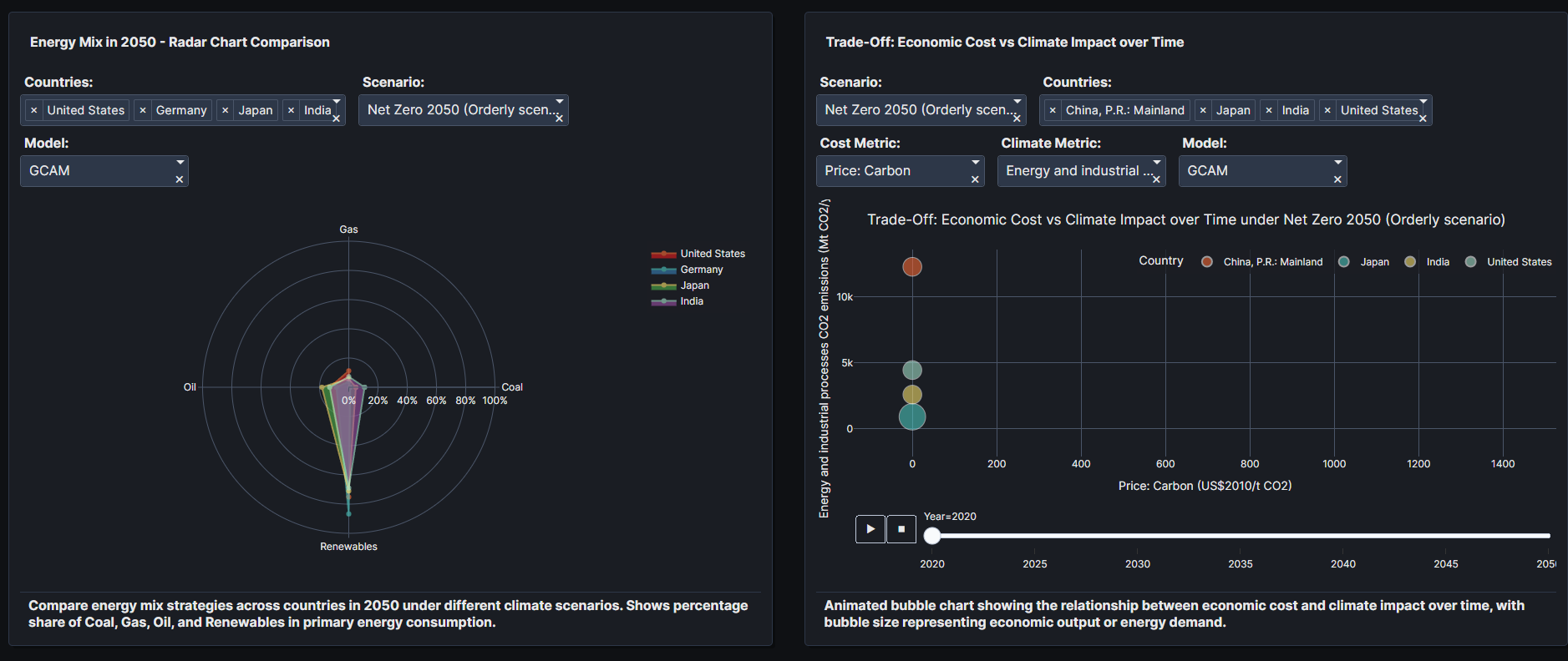
9️⃣ Energy Mix in 2050 – Radar Comparison
“What does each country’s energy mix look like by 2050?”
Radar chart comparing coal, gas, oil, and renewables for countries under the Net Zero scenario.
Germany leads in renewables, while the U.S. and China show lingering fossil dependence.
🔟 Economic Cost vs Climate Impact
“What trade-offs exist between carbon prices and emission reductions?”
Animated bubble chart showing how rising carbon prices correlate with emission declines over time.
Countries like Japan and the U.S. demonstrate early economic costs but long-term climate payoffs.
🧾 About the Dataset
Dataset Source: IMF Climate Data Portal — NGFS Transition Pathways
The dataset models transition pathways to net zero across multiple global scenarios, created by the Network for Greening the Financial System (NGFS).
It covers:
- Energy production and consumption by fuel type
- Emissions (CO₂, CH₄, N₂O, etc.)
- Temperature projections
- Economic and policy assumptions
This dataset provides a rare chance to quantify the global energy transition under alternative policy worlds, serving as the foundation for sustainable development analytics.
⚙️ Challenges Faced
Dataset Complexity:
Handling ~80k records with multiple dimensions (country, year, scenario, model, variable) required extensive data cleaning and efficient caching.3D & Temporal Visualization:
Creating animated and interactive 3D surfaces that render smoothly in Dash without lag was one of the toughest challenges.Scalability in UI Design:
Ensuring filters (country, scenario, model, variable) dynamically updated without cross-callback issues — required refactoring callbacks for parallel interactivity.Narrative + Technical Balance:
The goal wasn’t just analytics — but storytelling.
Achieving that balance between visual clarity, analytical depth, and interactive usability took careful iteration.
🔗 Live Dashboard:
👉 Climate Transition Pathways Explorer
📊 Dataset:
IMF–NGFS Climate Transition Pathways Data
👨💻 Created by:
Aditya Shukla


Log in or sign up for Devpost to join the conversation.