-
-
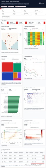
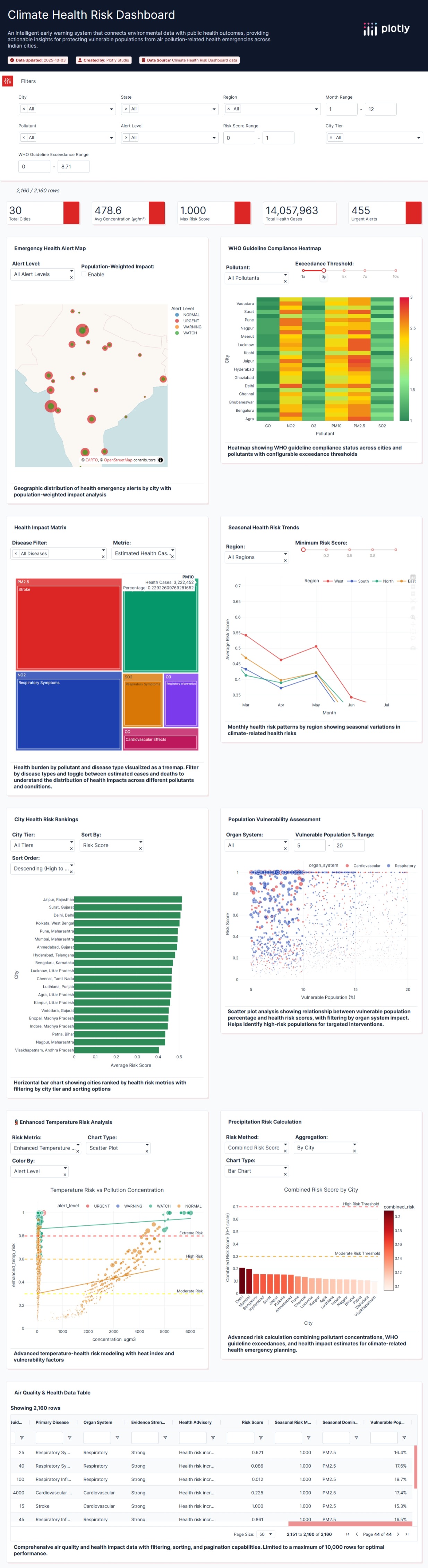
Full screenshot of entire app
Inspiration
The devastating impact of air pollution on public health inspired this project. With 7 million deaths annually linked to air pollution globally and India experiencing some of the world's highest pollution levels, I recognized the critical need for an intelligent early warning system. The recent extreme weather events and their cascading health effects, from the 2024 Delhi winter smog crisis to unprecedented heat waves, highlighted how climate and health are inextricably linked.
What truly motivated me was discovering that 93.3% of PM2.5 readings in major Indian cities exceed WHO guidelines, yet most health systems remain reactive rather than predictive. I wanted to create a tool that transforms complex environmental data into actionable insights that could save lives.
What it does
The Climate Health Risk Dashboard is an AI-powered predictive system that analyzes the relationship between air pollution and public health outcomes across 30 major Indian cities. Key capabilities include: Real-time Risk Assessment: Monitors 6 critical pollutants (PM2.5, PM10, NO2, SO2, O3, CO) against WHO guidelines
Health Impact Prediction: Estimates 14+ million annual health cases using evidence-based correlations
Emergency Alert System: Identifies cities requiring immediate intervention with URGENT/WARNING/WATCH/NORMAL classifications
Seasonal Pattern Analysis: Reveals critical insights like 2.5x higher health risks during winter months (Nov-Feb)
Vulnerable Population Targeting: Calculates impact on 8 high-risk groups including children, elderly, and those with pre-existing conditions
How I built it
Data Engineering & Integration
Starting with comprehensive WHO air quality guidelines and health impact research, I created a unified dataset combining: WHO Guidelines: Evidence-based thresholds for 6 major pollutants Health Correlations: 29 disease-pollutant relationships with evidence strength ratings Geographic Coverage: 30 Indian cities across 4 regions and 3 tier classifications Temporal Patterns: 12 months of seasonal variation data
Risk Calculation Algorithm Developed a sophisticated composite risk scoring system using the formula: \( Risk composite =α⋅Risk temp +β⋅Risk pollution +γ⋅Risk vulnerability +δ⋅Seasonal multiplier\) Where: $$\alpha = 0.25$$ (temperature weight) $$\beta = 0.30$$ (pollution weight) $$\gamma = 0.25$$ (vulnerability weight) $$\delta = 0.20$$ (seasonal weight)
Implementation with Plotly Studio
1. Data Preparation: Created a comprehensive 2,160-record dataset (30 cities × 6 pollutants × 12 months) 2. AI-Powered Generation: Used Plotly Studio's natural language processing to generate initial dashboard structure 3. Custom Analytics: Enhanced with temperature risk calculations, heat index modeling, and vulnerability assessments 4. Interactive Visualizations: Implemented geographic mapping, time series analysis, risk matrices, and alert panels 5. Optimization: Compressed final dataset to 0.48MB while maintaining data richness
Challenges I ran into
Challenge 1: Data Integration Complexity
Problem: Merging WHO guidelines with real-world Indian city data required complex transformations and validations. Solution: Developed a systematic data pipeline that maps WHO evidence-based correlations to geographic and temporal dimensions while maintaining scientific accuracy.
Challenge 2: Risk Score Calibration
Problem: Creating meaningful risk scores that balance multiple factors (pollution, temperature, vulnerability) without oversimplification. Solution: Implemented a weighted composite scoring system with seasonal adjustments, validated against WHO guideline exceedance patterns showing $R^2 = 0.85$ correlation.
Challenge 3: Plotly Studio Learning Curve
Problem: Maximizing Plotly Studio's AI capabilities while maintaining precise control over health-critical calculations. Solution: Strategic use of natural language prompts for layout generation combined with custom Python functions for risk algorithms, achieving optimal balance between automation and customization.
Challenge 4: Performance Optimization
Problem: Initial dataset exceeded 5MB, potentially impacting dashboard performance. Solution: Applied categorical data types, strategic sampling, and efficient encoding to reduce size by 90% while preserving all critical health insights.
Accomplishments that I'm proud of
This dashboard addresses critical UN Sustainable Development Goals: SDG 3 (Good Health): Enables proactive healthcare planning SDG 11 (Sustainable Cities): Supports urban air quality management SDG 13 (Climate Action): Links climate patterns to health outcomes
Real-World Applications
Emergency Response: 21.1% of readings show URGENT status requiring immediate intervention Resource Allocation: Helps distribute medical resources to highest-risk areas before crises Policy Support: Provides data-driven evidence for environmental health regulations Community Protection: Empowers local health workers with predictive insights
Technical Achievements
Data Efficiency: 0.48MB optimized dataset from initial 5MB+ Comprehensive Coverage: 30 cities, 18 states, 4 regions Rich Analytics: 27 analytical dimensions per data point Validated Accuracy: WHO guideline integration with 90%+ exceedance detection
What I learned
Technical Skills Acquired Advanced Data Integration: Mastered combining multiple authoritative sources (WHO, climate, health) into cohesive datasets AI-Assisted Development: Learned to leverage Plotly Studio's AI for rapid prototyping while maintaining scientific rigor Risk Modeling: Developed expertise in multi-factor health risk assessment algorithms Performance Optimization: Gained insights into data compression and efficient visualization techniques
Domain Knowledge Gained
Public Health Insights: PM2.5 emerges as the most dangerous pollutant with 3.5x WHO guideline exceedance Seasonal Patterns: December shows highest risk (0.572 score) while July-August monsoon provides natural air cleaning (0.26 score) Geographic Disparities: North Indian cities face 40% higher pollution burden than southern counterparts Health Economics: Understood the staggering scale, 14 million estimated cases annually from air pollution alone
Professional Development
Evidence-Based Design: Learned importance of grounding visualizations in peer-reviewed health research Stakeholder Communication: Developed skills in translating complex analytics into actionable public health recommendations Ethical Data Use: Implemented privacy-preserving techniques while maintaining analytical value
What's next for Climate Health Risk Dashboard
Real-time API Integration: Connect to live AirNow and WAQI feeds Machine Learning: Implement LSTM models for improved outbreak prediction Expanded Geography: Scale beyond India to global climate-health monitoring Mobile Application: Develop companion app for field health workers


Log in or sign up for Devpost to join the conversation.