-
Website page

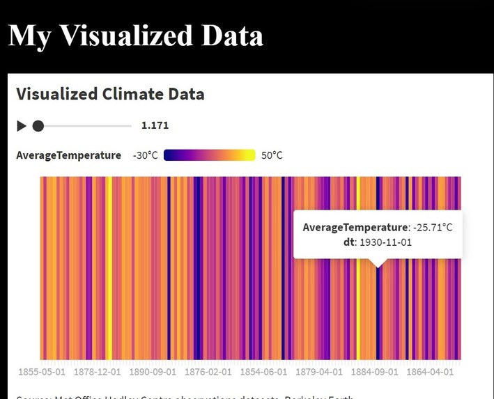
Inspiration
Seeing the changes between cold and warm in the past to the recent years.
What it does
Creating a simple webpage to see the data
How we built it
Using Flourish to create a visually pleasing data
Challenges we ran into
The data is not well analyzed due to the rows of the countries are not separated into columns
Accomplishments that we're proud of
Visually Pleasing Data
What we learned
Using Flourish and getting sources from the Internet
What's next for Climate Data Visualization
The data will later create a more visualized location through the different graphs.

Log in or sign up for Devpost to join the conversation.