-
-
Main Page
Inspiration
I’ve always been fascinated by Earth visualizations from Google Earth, Apple, and NASA, but none quite captured what I had in mind. I wanted to take a shot at it myself. Turns out, rendering a realistic, interactive Earth in just a day is way harder than expected! I made solid progress, but there’s still so much more I want to refine.
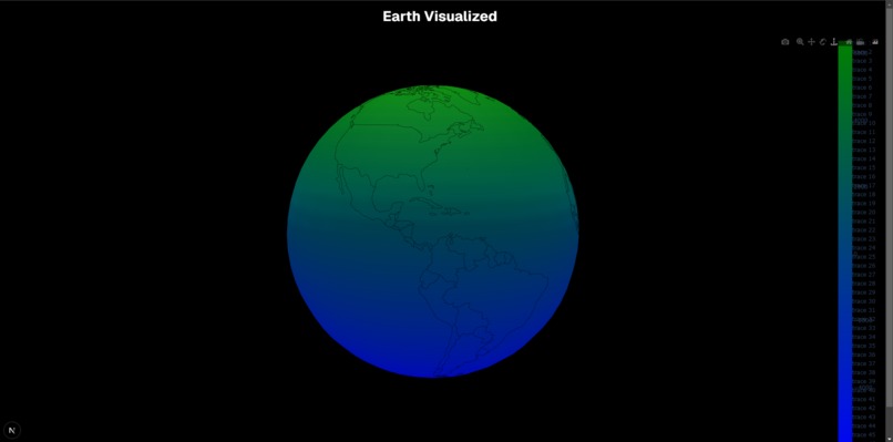
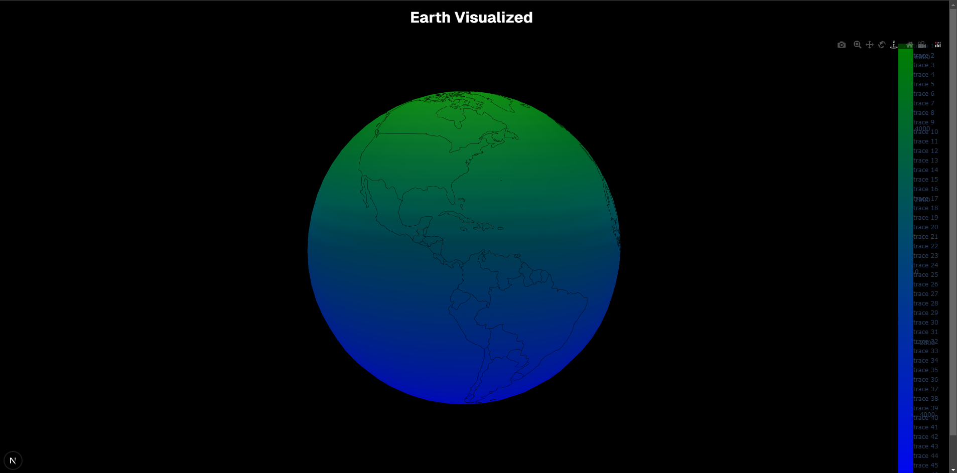
What it does
You can explore the Earth in full 3D! Rotate, zoom, and navigate with intuitive camera controls. The foundation is set for more advanced features like real-time data overlays and detailed geographic insights.
How I built it
The project is built using the T3 stack, which provided a streamlined setup, letting me focus on the real challenge—the globe itself. I integrated Plotly for 3D rendering and structured the backend to support potential data-driven enhancements.
Challenges I ran into
I mainly had three challenges: Rendering issues: Getting the globe to display correctly, with the right colors and smooth interactivity, took a lot of tweaking. Performance optimization: A fully interactive 3D model can be heavy on resources, so making it efficient was a challenge. Limited time: One day just wasn’t enough to get it to the level I envisioned!
Accomplishments that I'm proud of
Successfully rendering a fully interactive 3D Earth in the browser. Setting up a solid foundation that can be expanded with climate data, real-time changes, or other enhancements. Learning a ton about 3D visualization, coordinate mapping, and rendering performance.
What I learned
3D graphics take a lot of work! Even a simple globe involves complex math and rendering challenges. How to integrate Plotly’s 3D capabilities into a web-based visualization. The importance of optimization and efficiency when working with real-time 3D environments.
What's next for Earth Visualization
Adding real-world data overlays like climate change trends, population heatmaps, or deforestation impacts. Improving the visual design—better textures, lighting, and a more realistic atmosphere. Exploring alternative 3D frameworks for better rendering performance and customization.
Tragedy
This was originally supposed to be climate change visualized with the Earth being shaded in with different colors depending on how the dataset I found online. I went on Kaggle and found this dataset that has CO2 emissions by tons across all countries in the world since the 1900ish. That's was an amazing dataset so I had to visualize it. However, this is a one day hackathon, the most I could do was the globe. So I had to pivot, hope you guys still enjoy!
Built With
- drizzle
- nextjs
- plotly
- postgresql
- react
- t3
- tailwind
- typescript
- uploadthing
- vercel

Log in or sign up for Devpost to join the conversation.