The problem
The International Dyslexia Association estimates that 15–20% of people show some symptom of dyslexia (slow or inaccurate reading, poor spelling, trouble with similar-looking words), while only about 6–7% of students ever receive a formal diagnosis and the accommodations that come with it (IDA, Dyslexia Basics). That gap is most of the point: the other roughly 10% of readers are told nothing is wrong and given nothing to help. Reading friction shows up outside that group too: ADHD readers who lose their place mid-paragraph, tired eyes at 11pm, anyone reading a dense PDF on a phone in bad light.
Most consumer fixes for this ("install a dyslexia font," "turn on bionic reading") are sold as a single universal solution. They're not. That gap between the confident marketing and the mixed research is what pushed this toward a tool with several small, adjustable knobs instead of one big feature.
What the evidence actually says
I looked this up rather than assumed it, because a project claiming to help readers should be able to back its choices:
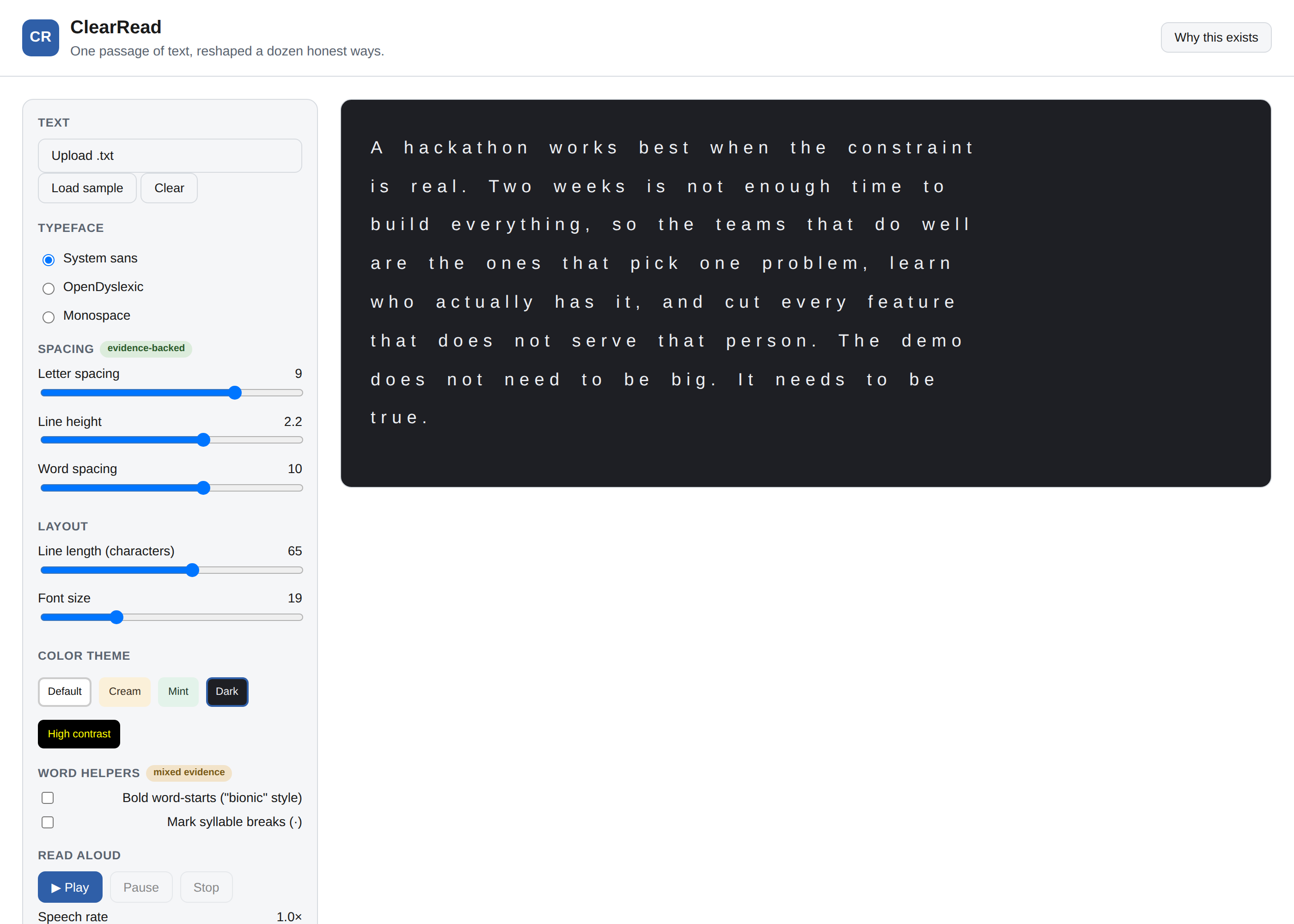
- Letter and word spacing has real controlled-study support. Zorzi et al. (2012, PNAS) found that extra-large letter spacing improved reading speed and reduced errors for children with dyslexia, independent of any font change (paper). That's why spacing is the one control section in the app labeled "evidence-backed," and why it's the one most people should try first.
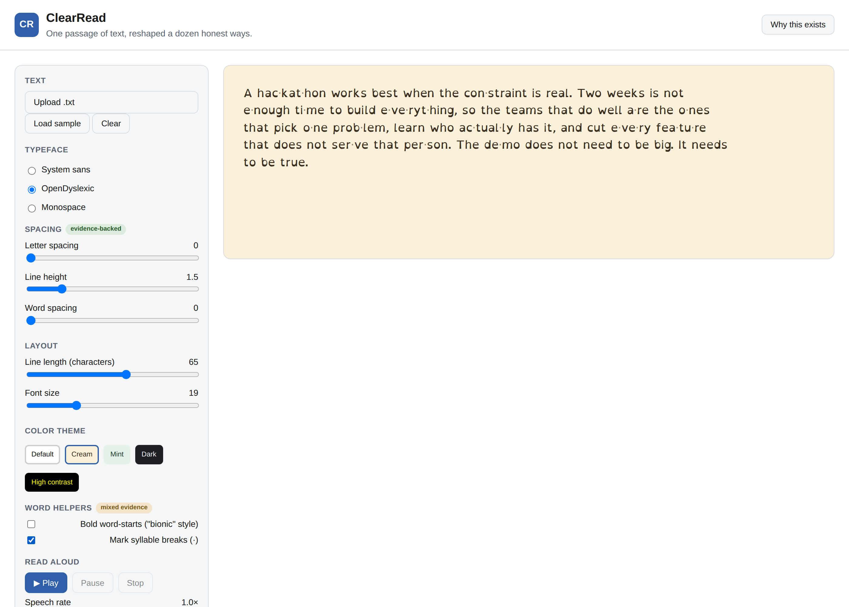
- OpenDyslexic and similar typefaces have a mixed record. Some small studies report a comprehension benefit; other controlled comparisons find no advantage over a standard font once spacing is held constant. The app includes OpenDyslexic as an option because plenty of readers prefer it and preference is worth something on its own, but it isn't presented as a proven fix.
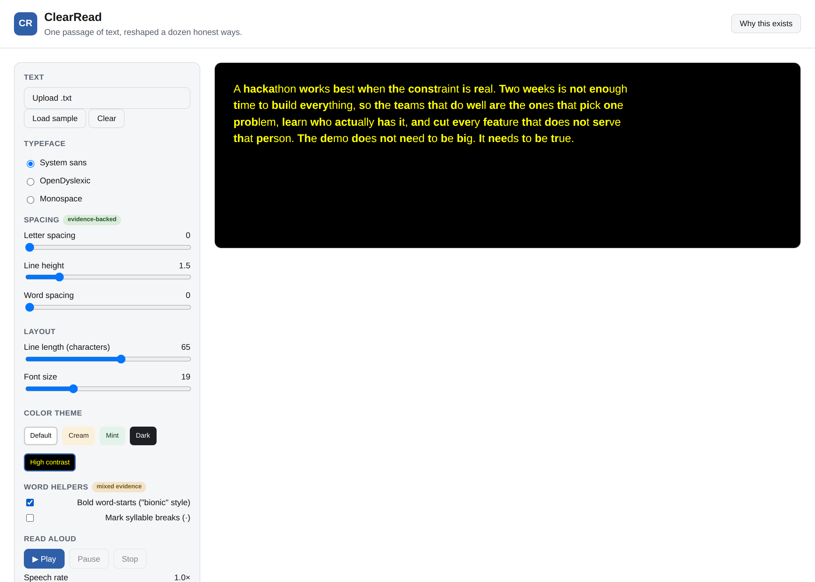
- Bionic reading (bolding the first portion of each word) has the weakest evidence of the three. A 2,000-reader test by Readwise found no speed improvement and a very slight slowdown, and the technique's own creator has not published the study his marketing claims are based on. It's included in ClearRead as an optional, off-by-default toggle, labeled "mixed evidence" in the UI, because some readers report it helps them skim even though the controlled data doesn't back that up. Try it and judge for yourself; the app is not telling you it works.
- Text-to-speech doesn't need a citation. Reading text aloud while highlighting each word as it's spoken is a long-established accommodation, and it's the feature in ClearRead most likely to matter to someone who struggles with reading rather than someone who just prefers a nicer font.
What it does
- Paste text directly, or upload a
.txtfile. - Switch between a system sans-serif, OpenDyslexic (bundled locally, not loaded from a CDN), and a monospace font.
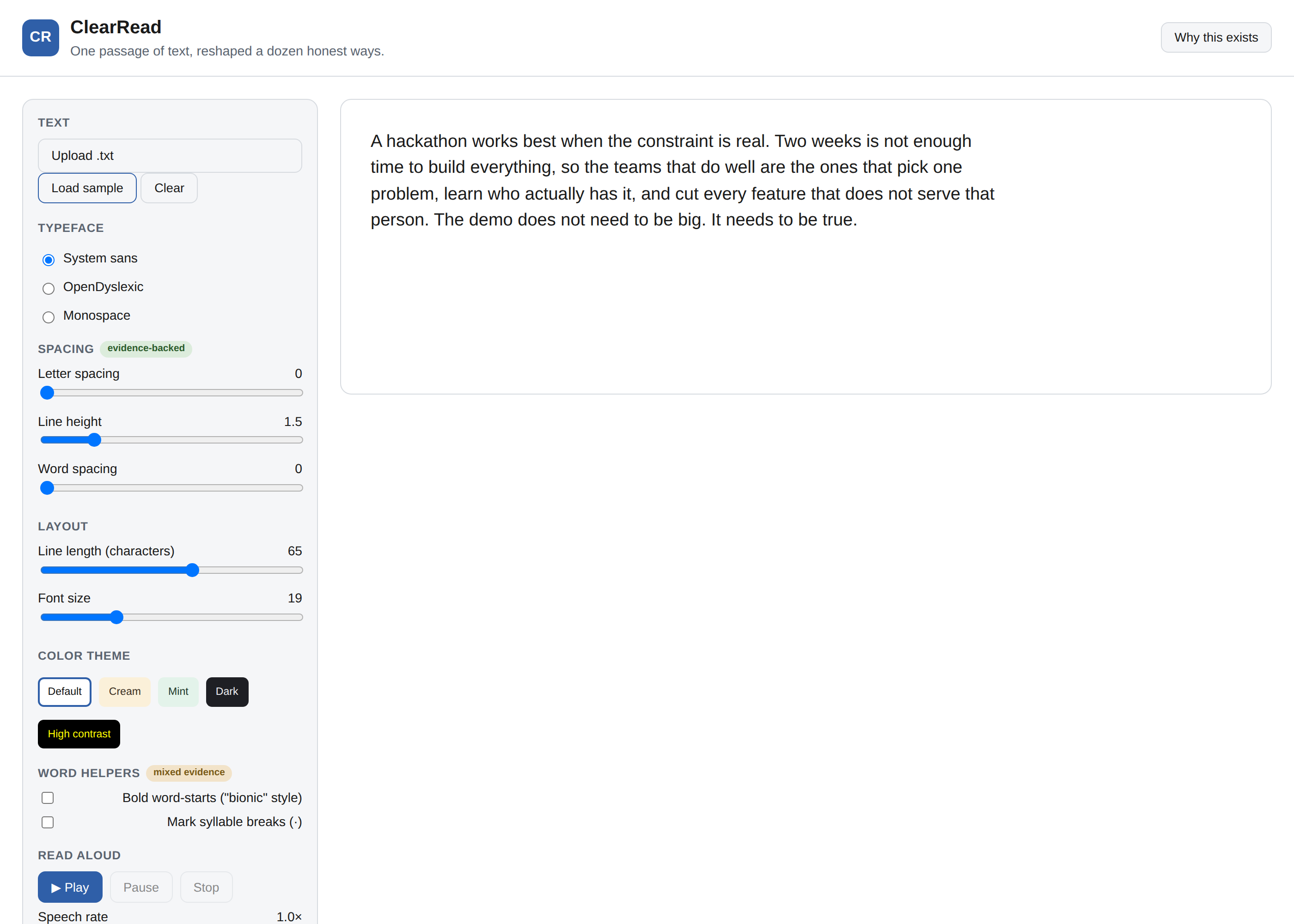
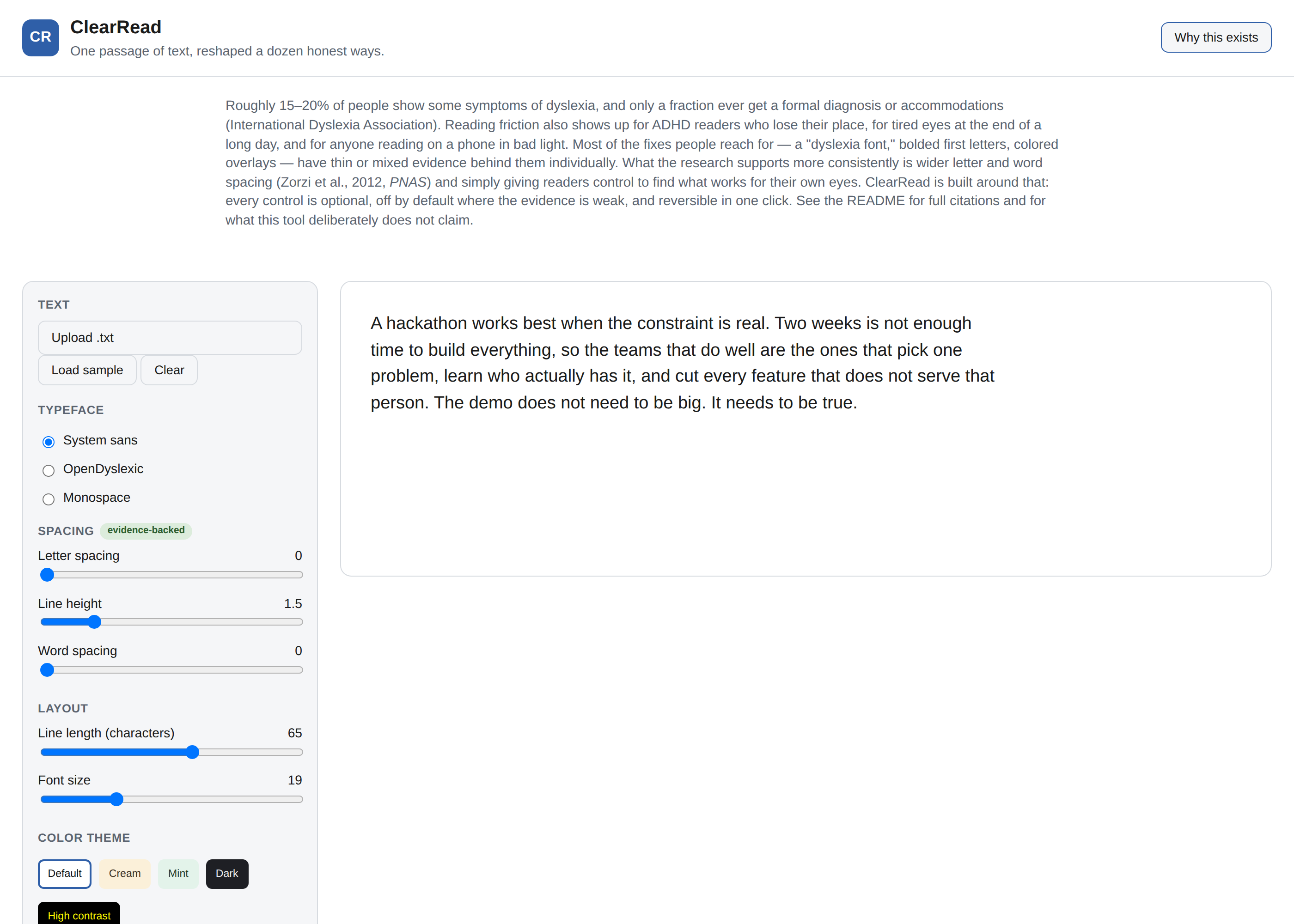
- Adjust letter spacing, word spacing, line height, line length, and font size with sliders, each showing its current value.
- Pick from five color themes, including a high-contrast mode and a dark mode.
- Turn on syllable marks, which split long words at likely syllable boundaries using a small rule-based splitter (not a dictionary; see
js/syllables.jsfor exactly what it can and can't do). - Turn on bold word-starts ("bionic" style), with the caveat above built into the interface itself.
- Play the text aloud using the browser's built-in speech synthesis, with the word currently being spoken highlighted live, and a speed control.
- Everything renders through the same rendering pipeline, so any combination of the above (dark theme, OpenDyslexic, syllable marks, and read-aloud, all at once) works together.
What it deliberately doesn't do
There's no login, no saved documents, and no cloud sync. Settings reset when you reload the page. That's a real limitation for someone who'd want their preferences to persist, and the honest fix is localStorage or IndexedDB, both about an hour of work. It's left out here because a from-scratch reading tool with working spacing, fonts, syllable splitting, and synced read-aloud was already the right amount of scope for the time available; persistence didn't change whether the core idea worked.
Track fit: Software Development
This is judged as software, so here's where the actual engineering lives:
- Functionality. All eleven interactions above work end to end: file upload via
FileReader, live re-rendering on every setting change, word-accurate text-to-speech highlighting built by mappingSpeechSynthesisUtteranceboundary events back to character offsets computed from the same source string, and a syllable splitter with its own unit tests. - Architecture. Plain HTML/CSS/JS, loaded as ES modules, no framework and no build step.
js/syllables.jsis a pure function with no DOM dependency, which is what makes it independently unit-testable;js/app.jshandles all the state and rendering. CSS custom properties (--letter-spacing,--line-height, and so on) are set from JavaScript and read by the stylesheet, so the two stay decoupled. - Testing.
tests/syllables.test.mjsruns under Node's built-in test runner and checks the splitter against real words, including a test that documents a known failure case rather than hiding it.tests/smoke.mjsdrives the actual page with Playwright against a real headless Chromium, checking that every control changes the DOM the way it's supposed to, that a file upload works, and that the page throws no runtime errors. Both are how I caught a real bug during development: the first version of the syllable splitter only handled single consonants between vowels, so it silently failed to split "wonderful" at all. The test that caught it and the fix are both in the commit history. - Version control. This is a real git history, not one commit at the end (see
git log).
Accessibility notes
Every interactive control has a label. The "skip to reading pane" link at the top is a real skip link, not decoration. The read-aloud highlight uses both color and a background shape change, not color alone. The one place accessibility and my own judgment pulled in different directions: the output region uses aria-live="off" rather than "polite", because with live re-rendering on every keystroke, a live region would announce the entire passage to a screen reader on every character typed. That's a deliberate tradeoff, not an oversight.
Running it
No build step and no dependencies to install for normal use:
open index.html          # macOS
xdg-open index.html      # Linux
or double-click demo/clearread-standalone.html for a single-file version.
To run the tests (requires Node 18+ and, for the browser smoke test, Playwright with a Chromium build available):
node --test tests/syllables.test.mjs
node tests/smoke.mjs
Credits
OpenDyslexic font by Abbie Gonzalez, distributed under the SIL Open Font License, bundled locally in fonts/. Spacing research: Zorzi et al., "Extra-large letter spacing improves reading in dyslexia," PNAS 109(28), 2012. Dyslexia prevalence figures: International Dyslexia Association. Bionic reading evidence summary drawn from Readwise's published reader study, cited in js/app.js comments and above.## Inspiration
