-
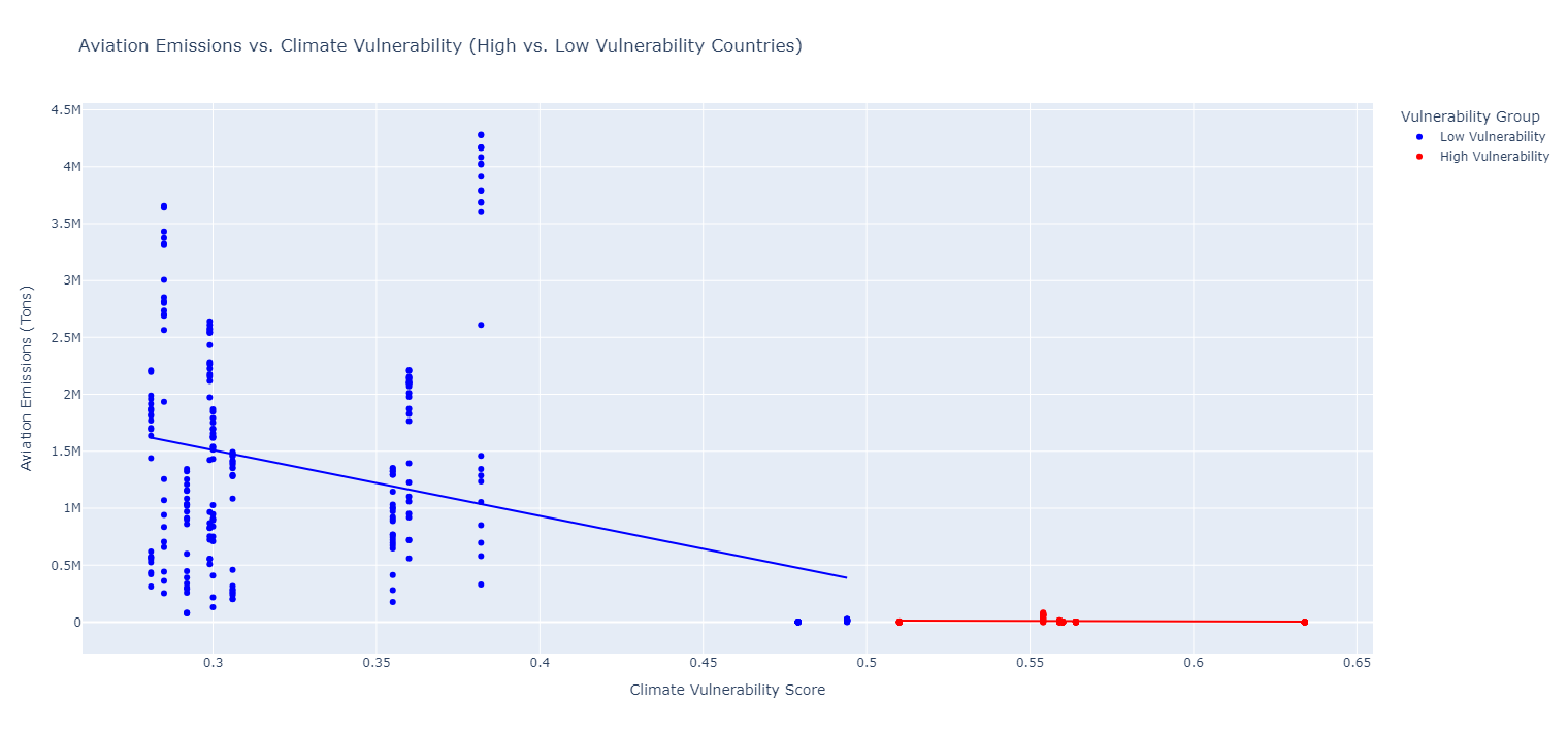
Aviation Emissions Vulnerability
-

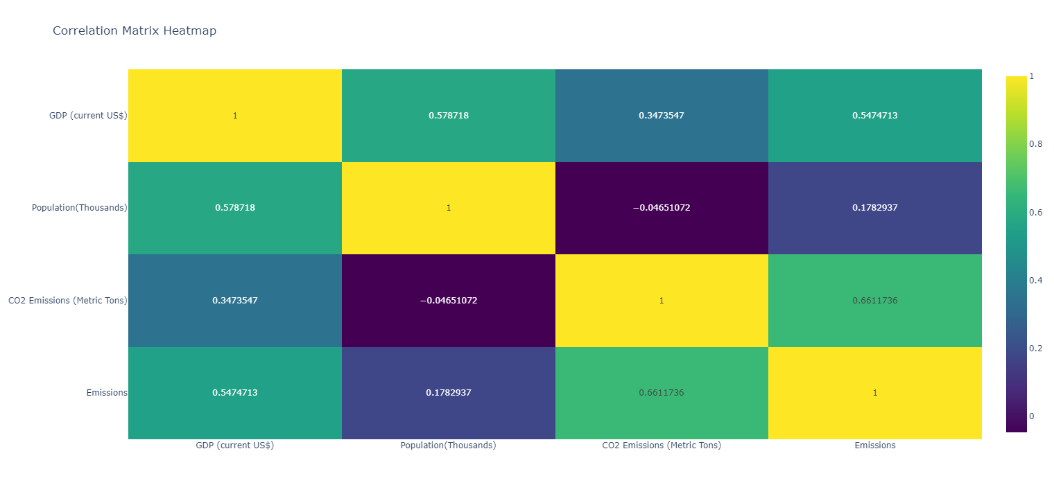
Correlation Matrix
-
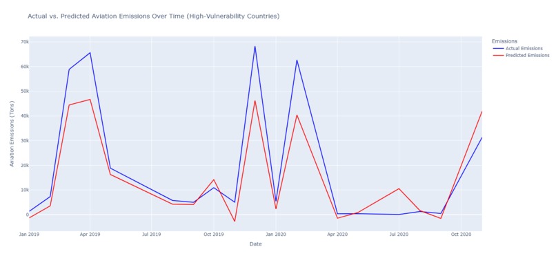
Actual vs Predicted High vulnerability
-
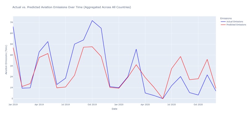
Actual vs Predicted Total Emissions
-
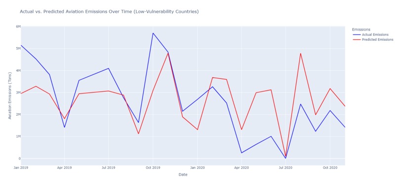
Actual vs Predicted Low vulnerability
-
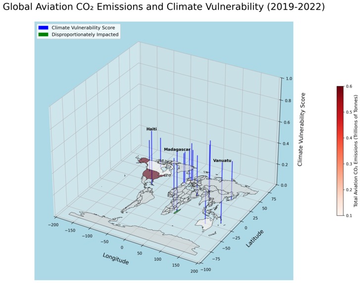
3d Heat Map
-

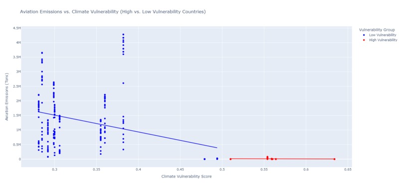
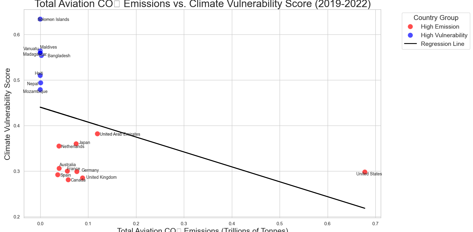
Total Aviation emissions Vulnerability Scatter plot
-

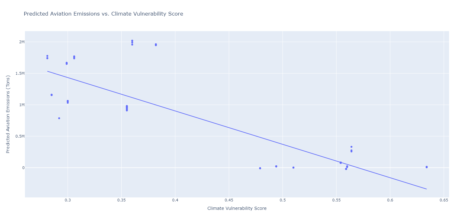
Predicted vs Vulnerabiilty


Inspiration The project was inspired by the realization that countries most vulnerable to climate change contribute the least to global emissions, yet they face the worst consequences. Aviation emissions, though only a small part of global CO2, are an important factor. I wanted to explore how aviation emissions disproportionately impact vulnerable countries and highlight the need for more equitable climate policies.
What it does The project analyzes aviation CO2 emissions and climate vulnerability across 186 countries. It uses data visualizations and predictive models to show that high-emission countries are less vulnerable, while low-emission countries face significant climate risks. It makes a case for focusing on climate justice in global aviation policies.
How I built it I used aviation emissions data from OECD and combined it with climate vulnerability scores. With Python, I built predictive models with other datasets(GDP, population, and CO2 emissions)to estimate future aviation emissions and created visualizations using Plotly and Matplotlib. The goal was to make the data accessible and highlight the disparities between emissions and climate vulnerability.
Challenges I ran into One challenge was merging different datasets with varying structures and timeframes. Another was creating a model that could predict emissions for countries with little aviation activity but high vulnerability. Finally, presenting the data in a clear and impactful way was critical but difficult.
Accomplishments that I’m proud of I’m proud of the visualizations, especially the 3D map that clearly shows global inequalities in emissions and vulnerability. The predictive model is another achievement, providing meaningful projections for future emissions. I’m also happy with how the project communicates the concept of climate justice effectively.
What I learned I learned a lot about the uneven distribution of climate impacts and how aviation emissions play a role in that. I also improved my skills in data analysis, machine learning, and visualization. Most importantly, I gained a deeper understanding of how to communicate complex data in a way that tells a compelling story.
What’s next for Clearing the Skies Next, I’d like to refine the model with more real-time data and explore collaborations with climate organizations to push for policy changes. There’s also potential to expand the project to cover other sectors or create an interactive platform that lets users explore the data themselves.

Log in or sign up for Devpost to join the conversation.