Inspiration
Complex applications can be intimidating, especially when instructions are filled with formal language, unfamiliar terms, and long lists of documents. People may struggle to understand what is being asked of them or what they should do next.
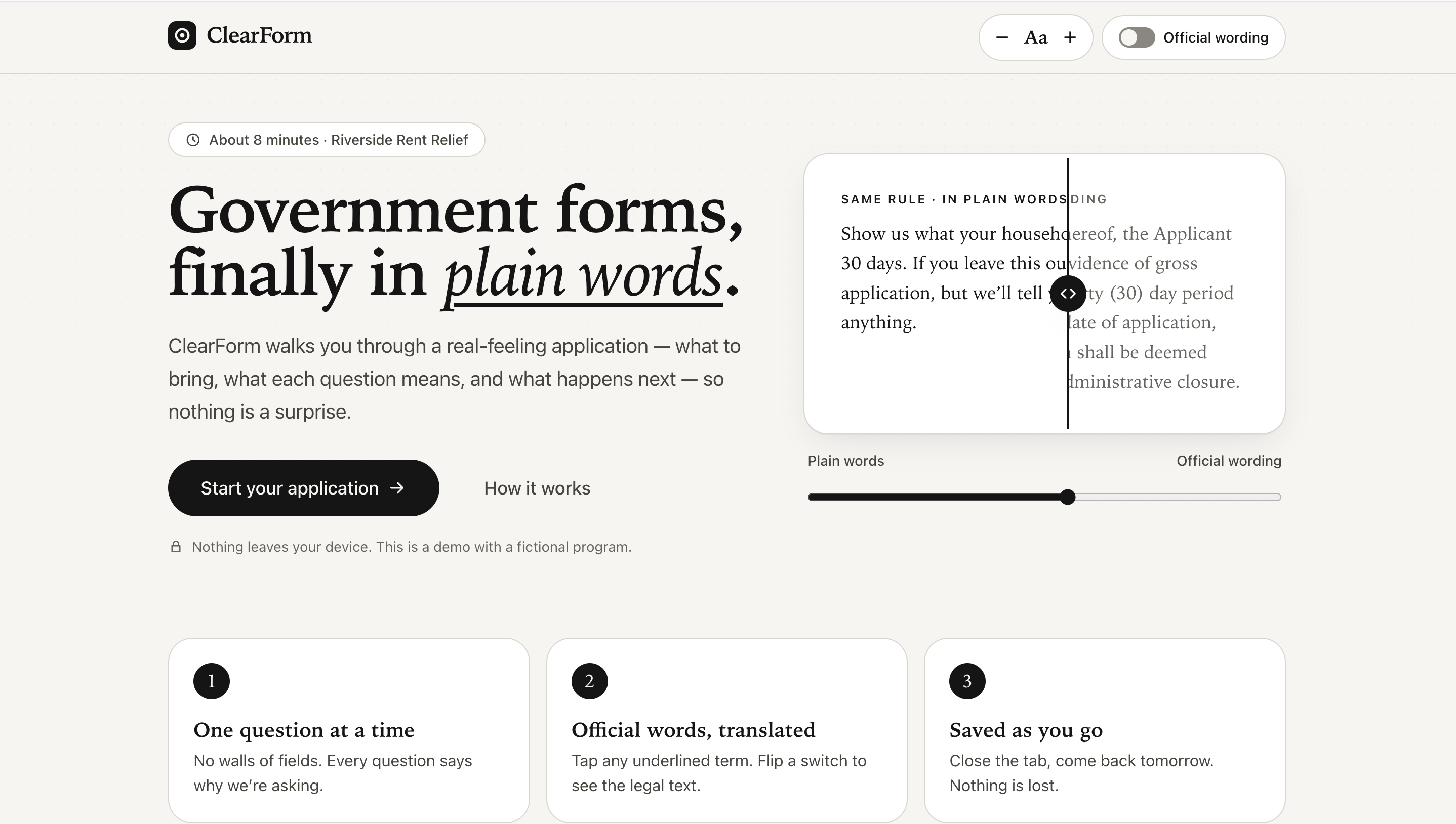
That inspired us to build ClearForm: a guided application experience that turns a confusing process into a series of clear, manageable steps. We wanted to explore how thoughtful design and accessible language could make digital services feel more human.
What It Does
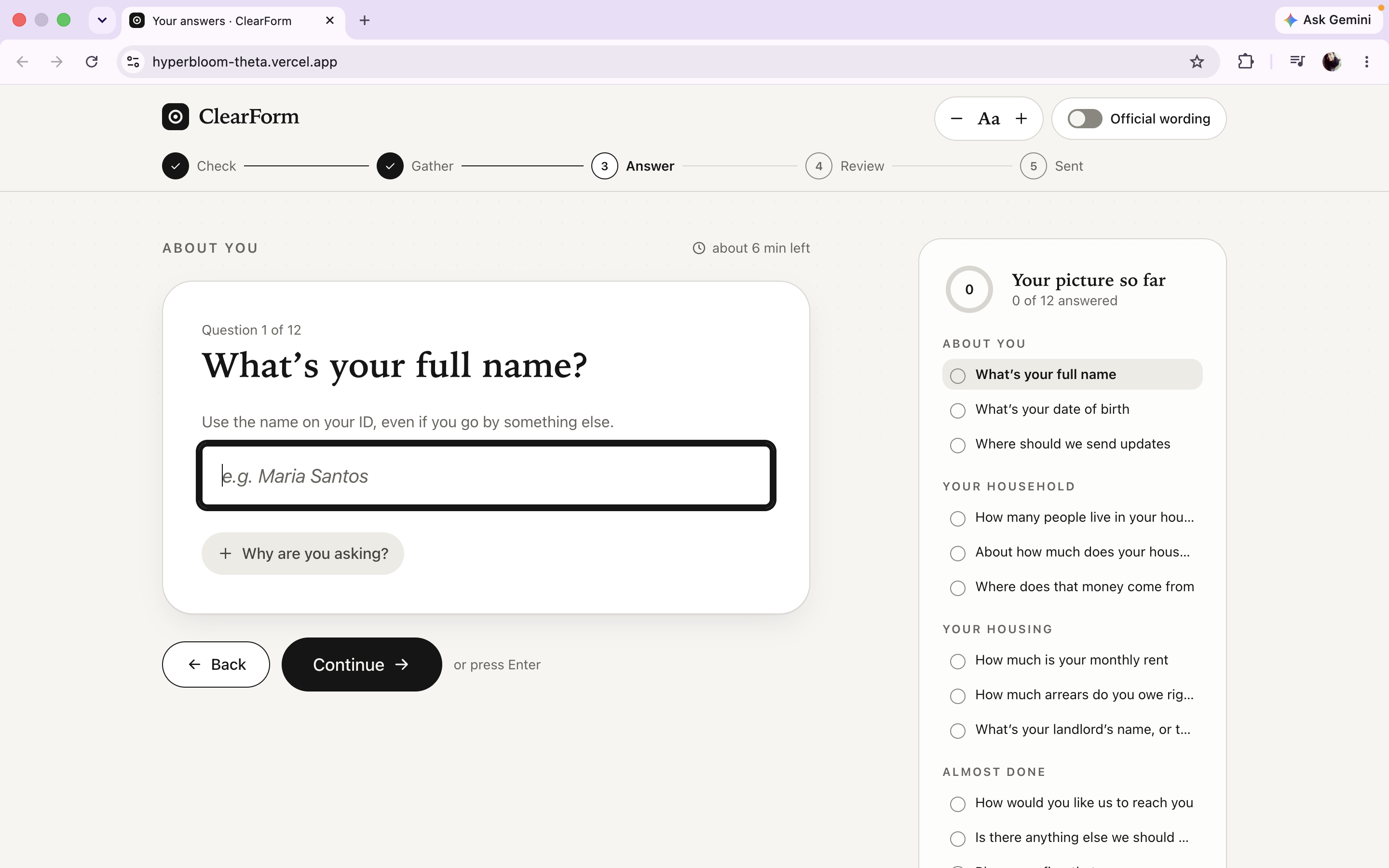
ClearForm demonstrates a fictional rent-relief application journey. Users can explore eligibility questions, review document requirements, complete a guided questionnaire, understand why information is requested, and review their answers before reaching a final summary.
The interface includes plain-language explanations, a progress indicator, contextual glossary definitions, validation messages, and a document checklist. Users can also revisit answers and track their progress throughout the experience.
ClearForm is a frontend prototype. The rent-relief program and its requirements are fictional; the application does not submit real applications or connect to a government service.
How We Built It
We built ClearForm as a responsive web application using React, TypeScript, Vite, and Tailwind CSS. The interface follows a restrained, warm, monochromatic visual direction, with a focus on readable typography, clear hierarchy, and consistent spacing.
We implemented reusable UI components and interactive application states to support the complete journey, from the welcome screen to the final receipt. We also focused on accessibility through keyboard navigation, visible focus indicators, text-size controls, reduced-motion support, and clear form feedback.
Challenges We Faced
One of the biggest challenges was making the experience both visually polished and genuinely usable. A design can look clean at first glance but still create problems when users navigate with a keyboard, increase text size, encounter validation errors, or use a narrow mobile screen.
We tested the application across different screen sizes and interaction states, then refined the layout, focus behavior, form validation, and glossary popovers. We also improved how users resume progress and edit answers without accidentally keeping discarded changes.
What We Learned
Building ClearForm reinforced that good UX is about more than attractive screens. The wording of a question, the timing of feedback, the ability to recover from an error, and the clarity of the next step can all shape a user's experience.
We also learned the importance of testing beyond the initial happy path. By examining edge cases, keyboard interactions, and smaller screens, we were able to identify and fix issues that were not immediately visible in the initial design.
What's Next
Future improvements could include testing with real users, expanding the range of application workflows, and exploring ways to adapt explanations to different reading needs. Any real-world implementation would also require appropriate privacy, security, and program-specific validation.
Built With
- accessibility
- css
- html
- javascript
- react
- responsive
- tailwind
- typescript
- vite

