-
-
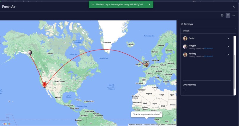
Los Angeles is best location for a meeting between these 3 teammates.
-

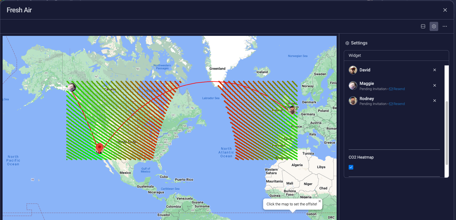
Heatmap of best locations. Green is better than Red.
-
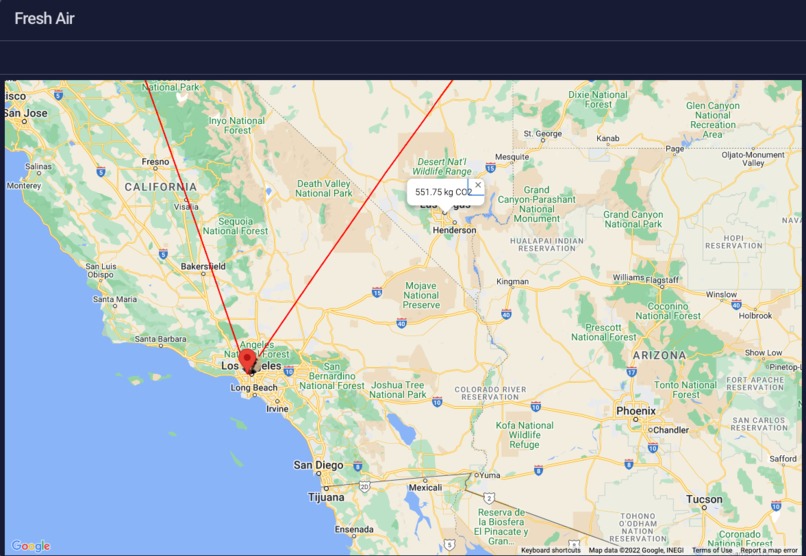
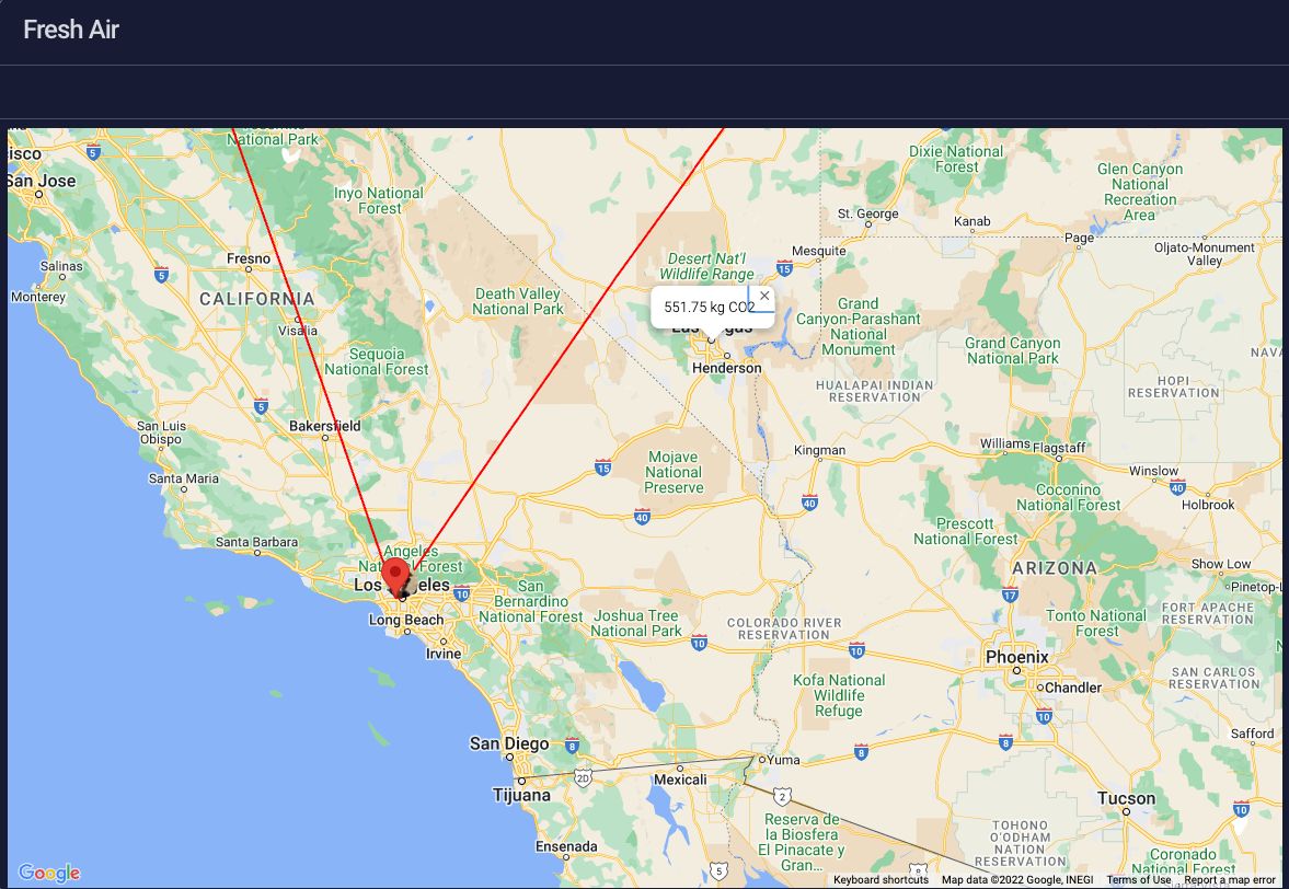
Clicking on las vegas provides the CO2 emitted for an event at that location.

Inspiration
The COVID lockdowns caused the largest drop in CO2 since WW2 source. As the world reopened, so did the greenhouse gas emissions. Many firms adopted a remote-first approach to work that has greatly impacted the CO2 emitted by commuters. As restrictions have subsided, more firms are planning in-person events for their teams. The climate impact is brushed to the side when planning these events since it's calculation is time-consuming and nebulous.
What it does
Clear Skies reads a list of teammates and locations from their monday.com profiles and visualizes this data as markers on a map. The total CO2 emission is calculated across a set of points for the distance each member must travel to attend. The city with the least calculated CO2 emitted is returned. If an alternative location is proposed, simply clicking on the map returns the CO2 emitted to travel to that city.
How we built it
- A static, one-page html site hosted on AWS cloudfront.
- Google maps to display the data.
- Google Geocoder to transform city names to lat, lng coordinates and vice versa.
- The CO2 calculation is based on a polynomial regression of observed CO2 output from ICAO's emission page.
Challenges we ran into
Initially built a UI within the application to select/deselect teammate information and to toggle the heatmap. This did not match the look and feel of monday.com so instead, used the fields in the settings to manipulate the app.
Accomplishments that we're proud of
- A lightweight, single page application written in pure javascript that is minimal and informative.
- Delivering the necessary information to the user without any hassle.
- Providing a heatmap to visually offer alternative locations.
What we learned
Widgets should ideally be long-living displays of changing information on a user's dash. The spirit of this widget is to use it when needed, then uninstall it to reduce clutter. This might not be the most intuitive setup.
What's next for Clear Skies
The heapmap is composed of Google Maps circles which is not the best presentation when viewed zoomed in. Migrate the circles to the Google Maps heatmap overlay.


Log in or sign up for Devpost to join the conversation.