-
-
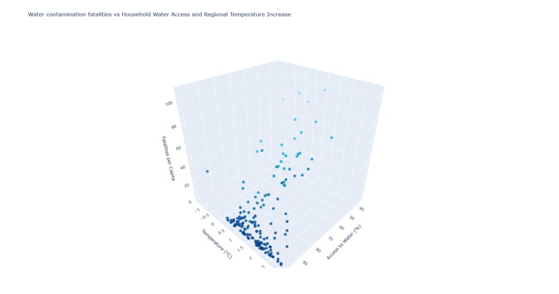
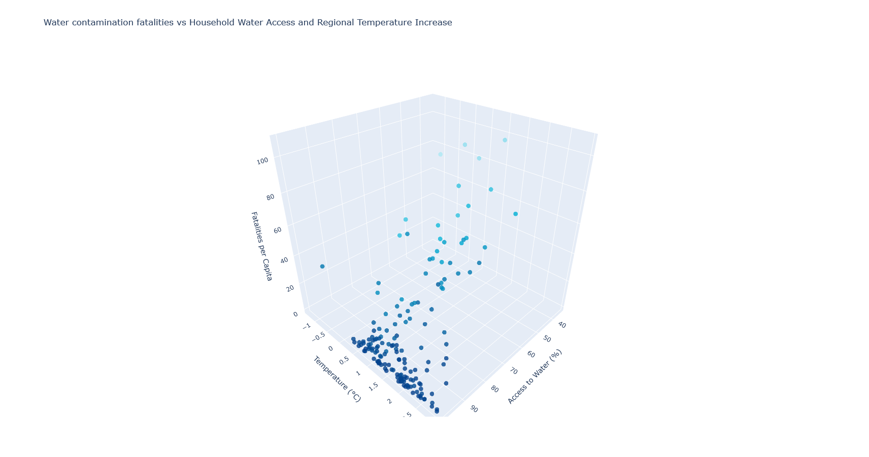
Water contamination fatalities vs Houshold Water Access and Regional Temperature Increase
-
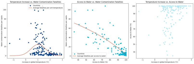
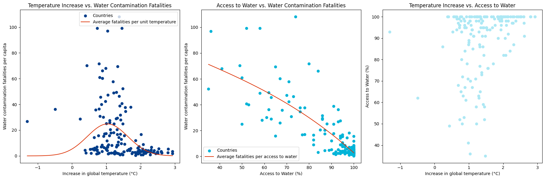
Orthogonal projections of the 3D graph
Inspiration
In Canada, although water is prominent, water contamination is still common and causes public health safety warnings, despite our many water sanitation centers. We want to explore the situation in countries where clean water is less available and how it affects their general health. Through our research, we found that increase in temperature proliferates the spreading of waterborne diseases and temperature increase is caused by global warming. We wish to establish a correlation between two global issues: the scarcity of clean water and climate change.
Our Story
Canada has the world’s 7% of renewable fresh water and 20% of total fresh water (Government of Canada); water does not seem like a scarce resource. However, on the global scale, only 1 in 10 people have access to clean water (World Vision). This scarcity and contamination of potable water causes millions of deaths each year. Global warming on the other hand, increases the temperature and waterborne diseases proliferate in these conditions. How does the increase in temperature affect the death rates due to water contamination?
In our graphs, we collected data from 2022 regarding access to clean water, increase in global temperature and water contamination fatalities across 162 countries. Our data allowed us to output a 3-dimensional graph, for which we spliced its orthogonal projections. From the first splice, we established that gaining access to clean water diminishes the deaths caused by water contamination. And as it follows, an increase in temperature also increases water fatalities. Our second splice reveals that water casualties peak when global temperatures increase by 1 degree celsius, which is still significant. The last graph does not seem to have a significant correlation since our main focus is on diseases rather than temperature increase vs. water access.
Behind the Story: Our Data Analysis
To tell our story, we found three different data sets. One includes the percentage of population having access to clean water, one includes the death per capita due to unsanitary consumption and the last one has the mean average increase in temperature. All these three data sets are per country name and their ISO3 codes. Since our sets of data come from different sources, the number of countries is different due to state recognition and void data. To match the countries and its data and eliminate void entries, we prompted ChatGPT to join the three files including each ISO code and their matching data (which we converted to CSV from Excel). From our 3D graph, we spliced it to further correlate our data through a regression line. From there, we have 3 2D graphs. The line of the “temperature vs. water contamination deaths” is approaching a bell curve at a peak of death at an increase of 1 degree Celsius. The curve for the “water contamination deaths vs. the access to water” is a decreasing parabola showing that death from water contamination decreases as households have more access to clean water. The third slice is unrelated to our story so there is no curve to represent it and no significant correlation between data.
What are our data sources?
Annual surface temperature change
Percentage of people having access to clean water
Death per capita by contaminated water
How did we use ChatGPT?
The SDGs given were broad therefore we used ChatGPT to generate topics related to clean water and sanitation. Through the topics, we were able to narrow down and find correlations between various factors which led us to our final idea: how does water contamination deaths relate to climate change and access to clean water. For data cleaning, since the “match” and “vlookup” functions on excel were not functioning properly to filter our sets of data, we resorted to using ChatGPT to do the work for us which turned out to be an efficient alternative. We sent all of our data sets to CSV, each of them containing a column with the ISO codes of the countries each data value was assigned to, and we uploaded them to ChatGPT. We used the join prompt to eliminate the “excess” countries that were not common on all three data sets by comparing ISO codes. Then, we manually eliminated countries with void data after the join CSV file was outputted by ChatGPT. Our data set is now cleaned and ready to graph. To graph, we wished for a 3D graph. To begin, we attached our finalized data set, a color palette for the points and the label for the axis and prompted ChatGPT to generate a python code to do so. Firstly, to facilitate reading and analysis, we prompted ChatGPT to write code to generate a graph through plotly. This will serve as our main graph to demonstrate the effects of household water access and global warming on the number of deaths caused by pathogenic water contamination.
As our graph was three dimensional, it is more difficult to read first hand, so we decided to splice the projection of our graph into each of the three dimensional planes. So, we separated our main table into three two-dimensional subtables, and we inserted them into ChatGPT to convert these tables into two-dimensional graphs. To demonstrate a trend between the variables, we also asked ChatGPT to plot us different types of regression lines on each of the graphs depending on its general appearance. So, we opted for a gaussian regression on the splice representing Temperature Increase vs. Water contamination fatalities and a polynomial regression for the splice representing Access to water vs. Water Contamination fatalities. We asked ChatGPT to not illustrate a regression line for the graph representing Access to Water vs. Regional Increase as we deemed it unnecessary, as establishing a relation between water access and regional temperature increase wouldn’t help us understand their respective influences on water contamination related fatalities. Finally we asked ChatGPT to juxtapose each of the graphs in the same file so that it will offer a better visual understanding of each variable on each other.
Here are some chat logs with ChatGPT:
4. Plotting appropriate graphs
What we learned
This is our first time using ChatGPT 4.0 so we got to familiarize ourselves with its differences from ChatGPT 3.5. We learned that to acquire the information needed, we must know the right prompts and keywords to feed ChatGPT. With the teacher’s help, we now know some keywords such as join/inner join. Also, ChatGPT 4.0 was our first time experimenting with LLMs that are able to analyze files and interpret data from outside sources. This helped us a lot when it came to interpreting our filtered data that we exported into CSV files and converting it into visual graphs coded by ChatGPT. Using GPT 4.0’s ability to interpret data from outside sources also helped us clear some doubts and answer some questions we had about said data in order to get a clearer picture of what direction we should be going with the analysis of our graphs.

Log in or sign up for Devpost to join the conversation.