

Inspiration
Clario was inspired by a simple but deeply relatable experience: miscommunication over text. As a couple (and a team), we noticed how often tone gets lost or misread in digital conversations, leading to unnecessary confusion, anxiety, or even conflict. Whether it’s with a partner, friend, boss, or parent, how a message is perceived can change everything. We wanted to build a tool that makes emotional clarity as easy as spellcheck.
What it does
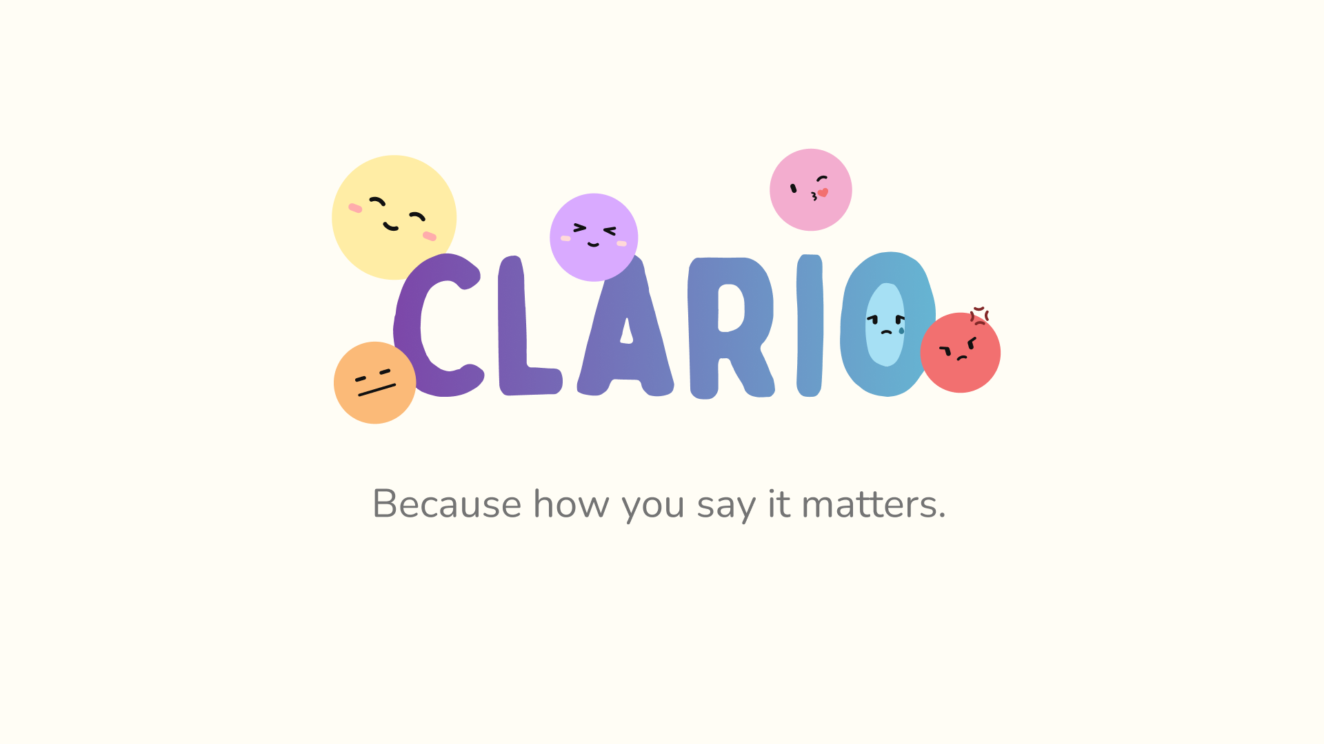
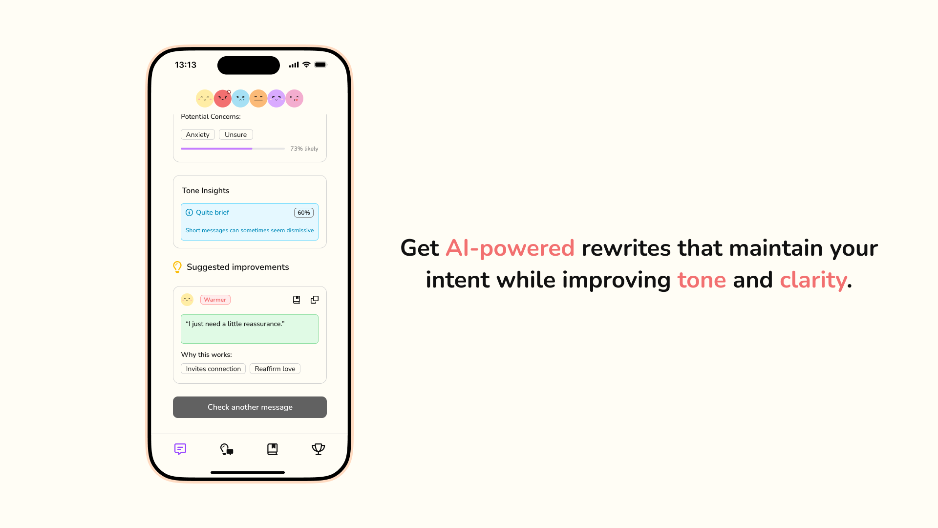
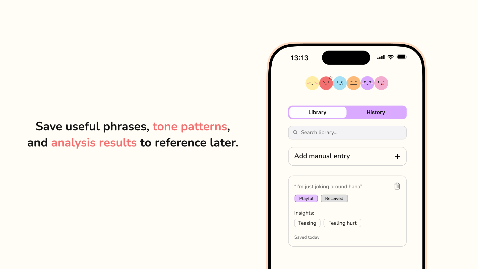
Clario is an AI-powered tone analyzer that helps users send clearer, kinder, and more intentional messages. Users simply paste or type their or received message into the app to preview how it might emotionally land. The app offers real-time tone insights, such as whether a message might come off passive-aggressive, dismissive, or cold, and provides AI-generated rewrites and suggestions that better align with the sender’s intended tone. Clario also includes persona presets (like “partner,” “boss,” or “parent”) that simulate how different types of people might interpret the message, helping users tailor their tone more effectively.
How we built it
Our focus during the hackathon was on product design, user experience, and storytelling. We built an Hi-fidelity Figma mockup to demonstrate the full user flow, from writing a message and previewing tone, to exploring AI rewrites and choosing how to move forward. We also created a full pitch deck that outlines the problem space, our solution, competitive landscape, market sizing, and go-to-market strategy. While we didn’t build a working product or interactive prototype, we focused on validating the idea through design thinking, user scenarios, and branding.
Challenges we ran into
One of our main challenges was scoping a product that felt technically realistic within mobile constraints, especially with Apple’s strict rules around accessing iMessage data. We wanted the user flow to feel intuitive and helpful without requiring people to drastically change their texting habits. Another challenge was refining tone feedback so it felt human, not robotic or judgmental. Designing a product that gives emotionally sensitive feedback required careful thought around UX and language.
Accomplishments that we're proud of
We’re proud of how well we captured a nuanced problem in a clean, intuitive product experience. In just one weekend, we took an emotional challenge people face every day and designed a solution that feels not only innovative, but usable. We’re also proud of how our pitch deck, brand, and Figma designs all tie together into a compelling story, especially since we tackled this challenge together as a couple.
What we learned
We learned how powerful design and storytelling can be, even without code. This project showed us that building a great product starts with empathy, understanding the problem deeply before rushing into solutions. We also learned how to scope an MVP based on technical constraints and how to craft a pitch that blends both logic and emotion.
What's next for Clario
We plan to build an interactive prototype and MVP, then test the concept with real users. Our next steps include more user interviews, expanding the tone library, and mapping out what a lightweight MVP could look like using a mobile web interface or browser plugin. In the long term, we hope to build a keyboard extension for iOS and Android that brings Clario’s tone insights directly into the messaging experience. We believe Clario has the potential to help millions communicate more clearly and kindly, and we’re excited to keep building toward that vision.
Built With
- figma
- git
- typescript


Log in or sign up for Devpost to join the conversation.