Inspiration
After appointments and discharges, individuals are often given dense written instructions, portal messages, and insurance communications that are difficult to interpret. This confusion leads to missed follow-ups, delayed care, and overlooked warning signs, not due to lack of effort but because the information is inaccessible. CLAIRITY focuses on the critical moment after a visit or decision, providing clear, structured guidance when understanding and timely action matter most.
What it does
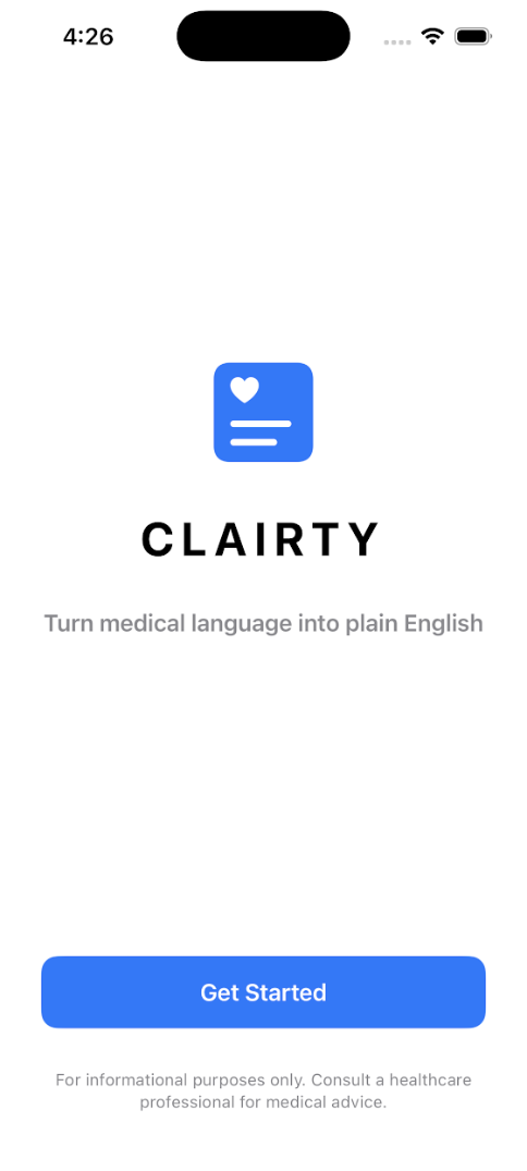
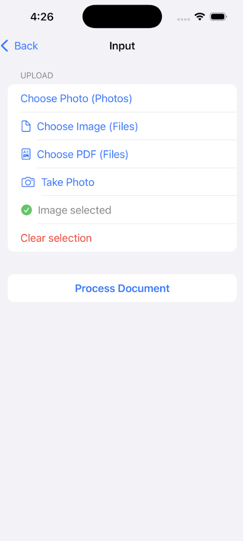
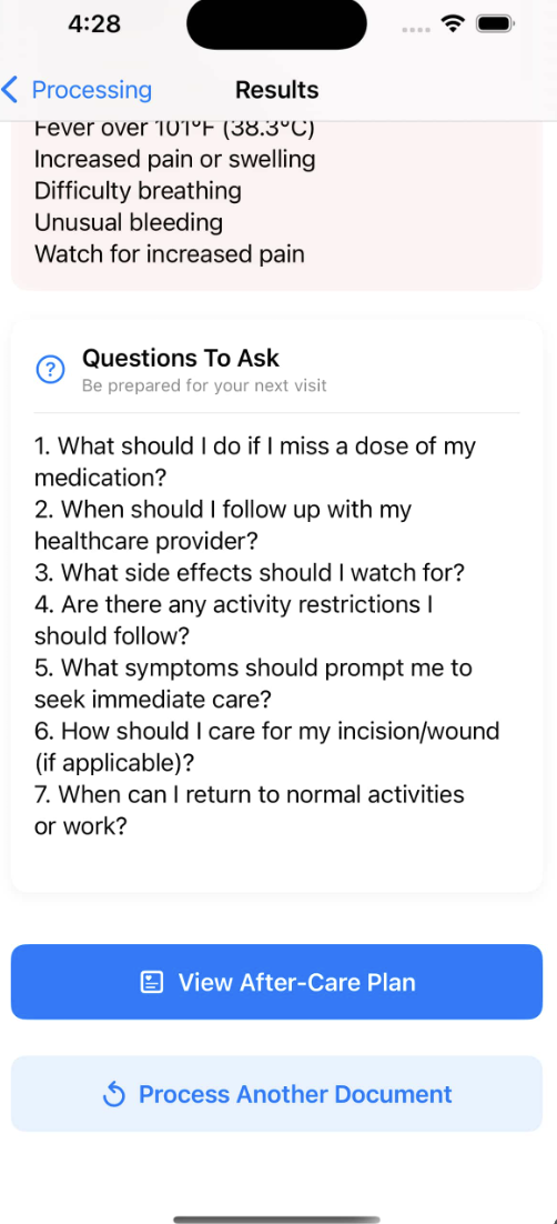
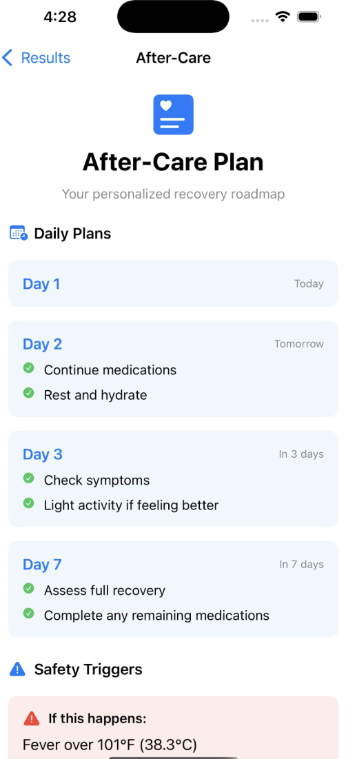
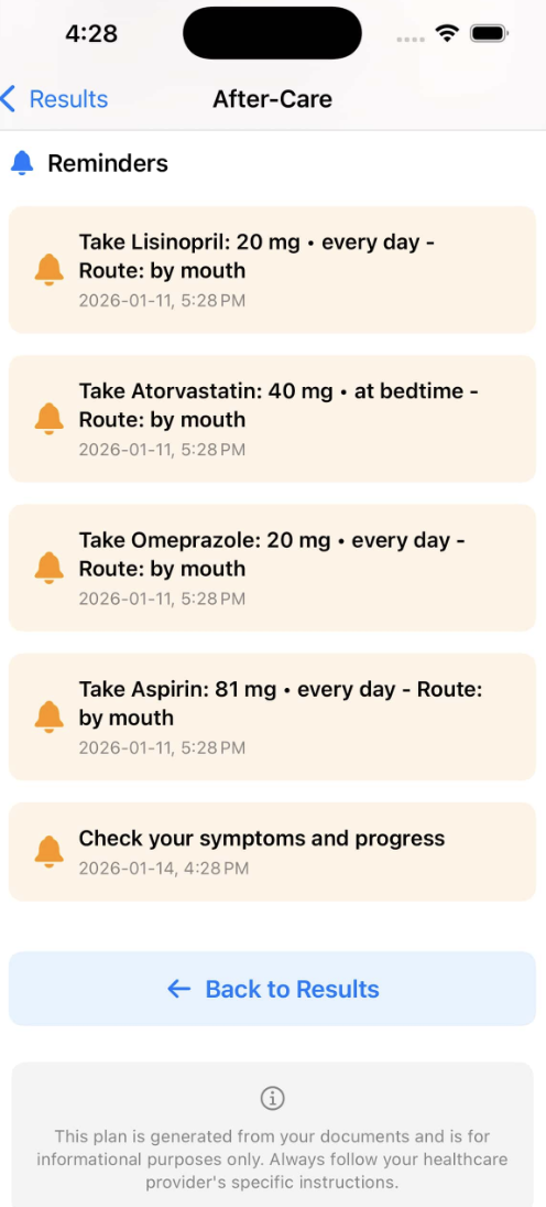
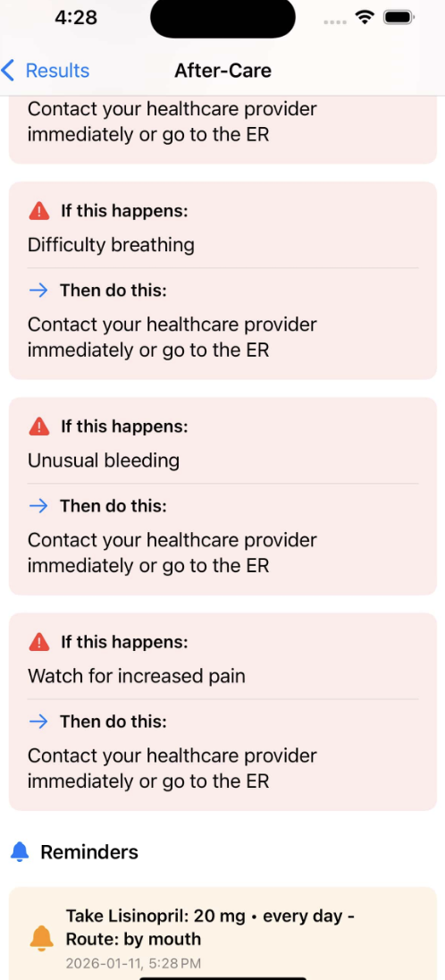
CLAIRITY translates complex medical, insurance, and institutional language into clear, actionable guidance at the moment people need it most: after a visit or decision. Users first identify the context, such as a GP visit, ER discharge, specialist consult, hospital discharge, or insurance determination, then paste the exact text they received. CLAIRITY analyzes the information and presents it as structured output cards, including a concise plain-English interpretation, a prioritized action checklist, time-based follow-up guidance with explicit triggers, a distinction between required and optional steps, clearly defined warning signs with escalation instructions, and copy-ready questions and communication scripts to support accurate follow-through and informed decision-making.
How we built it
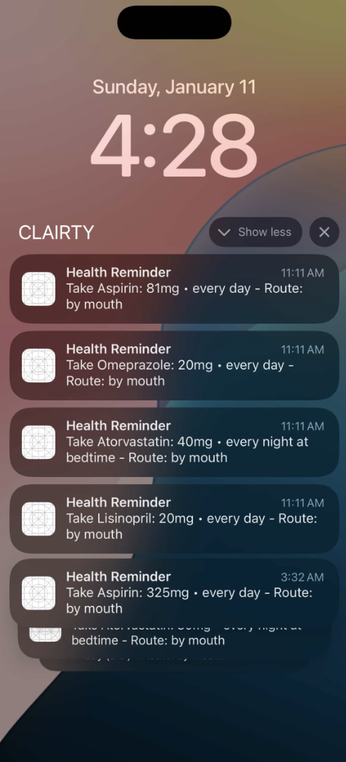
We built clarity as a privacy-first iOS app that converts dense medical, insurance, and institutional language into plain-English action steps and structured after-care plans. The app is written in Swift with SwiftUI and uses an LLM (Gemini) as the reasoning engine to simplify complex documents, extract medications and timelines, and generate recovery plans with follow-up triggers, safety checks, and questions to ask. For documents and paperwork, we integrated OCR services (Vision/Textract/Azure) to process PDFs and photos, while clinical NLP APIs (Comprehend Medical, Azure Health, Google Healthcare NLP) identify diagnoses, dosages, and clinical instructions. The resulting information is decomposed into output cards such as “what this means,” “what to do,” and “what matters vs optional,” enabling users to navigate post-visit care without accounts or data storage. All processing is transient, inputs are discarded after use, and no personal health information is retained, making clarity both highly usable and privacy-conscious for the most confusing moment in healthcare after you leave.
Challenges we ran into
One of the primary challenges was handling highly inconsistent and unstructured inputs. Medical and insurance documents often lack clear ownership, timelines, or explicitly stated next steps, requiring careful interpretation and prioritization. We also had to balance clarity with responsibility, ensuring outputs remained direct and actionable without sounding alarming or providing unsafe guidance. Designing for offline functionality imposed additional constraints on scope and architecture, requiring us to focus on the most essential features for a reliable demo experience. Finally, maintaining UI clarity was critical; presenting too much information at once risked recreating the same confusion the product is designed to solve, so we had to make deliberate decisions about hierarchy, phrasing, and visual structure.
Accomplishments that we're proud of
We delivered a fully functional, end-to-end demo built in Xcode that demonstrates the complete user flow from text input to actionable output. The interface presents information through clean, structured cards that communicate value immediately and remain easy to understand under time pressure. We implemented timeline-based and trigger-driven guidance that converts passive instructions into concrete next actions, reducing ambiguity and follow-up failure. The product was designed with a privacy-first architecture, storing no personal data, history, or user accounts, which strengthens trust and lowers adoption barriers. We also developed copy-ready scripts and question templates that reduce friction during follow-ups with providers or insurers, enabling users to act with confidence and clarity rather than uncertainty.
What we learned
We learned that structure is more effective than volume when delivering post-visit guidance. Users engage more consistently when instructions are broken into concrete, prioritized, and time-bound steps rather than long explanations. Features such as “questions to ask” and ready-to-use communication scripts significantly improve follow-through because they remove the initial barrier of knowing how to start a conversation with providers or insurers. We also learned that strong privacy constraints improve product quality; designing without data storage or tracking forced clearer outputs, tighter scope, and more intentional user flows, resulting in a more focused and trustworthy experience.
What's next for CLAIRITY
Next, we plan to expand CLAIRITY by adding additional visit templates and condition-specific checklists to improve accuracy across a wider range of care scenarios. We aim to strengthen timeline guidance through smarter deadline and follow-up extraction, allowing the system to surface clearer escalation points and reminders. We also plan to support photo-to-text intake for printed discharge instructions to reduce manual entry and improve accessibility. Multilingual output will be added to better serve diverse patient populations. Finally, we will run targeted usability tests with students, caregivers, and clinic staff to validate card ordering, language clarity, and safety triggers, ensuring the guidance remains clear, responsible, and easy to act on.

Log in or sign up for Devpost to join the conversation.