About the project
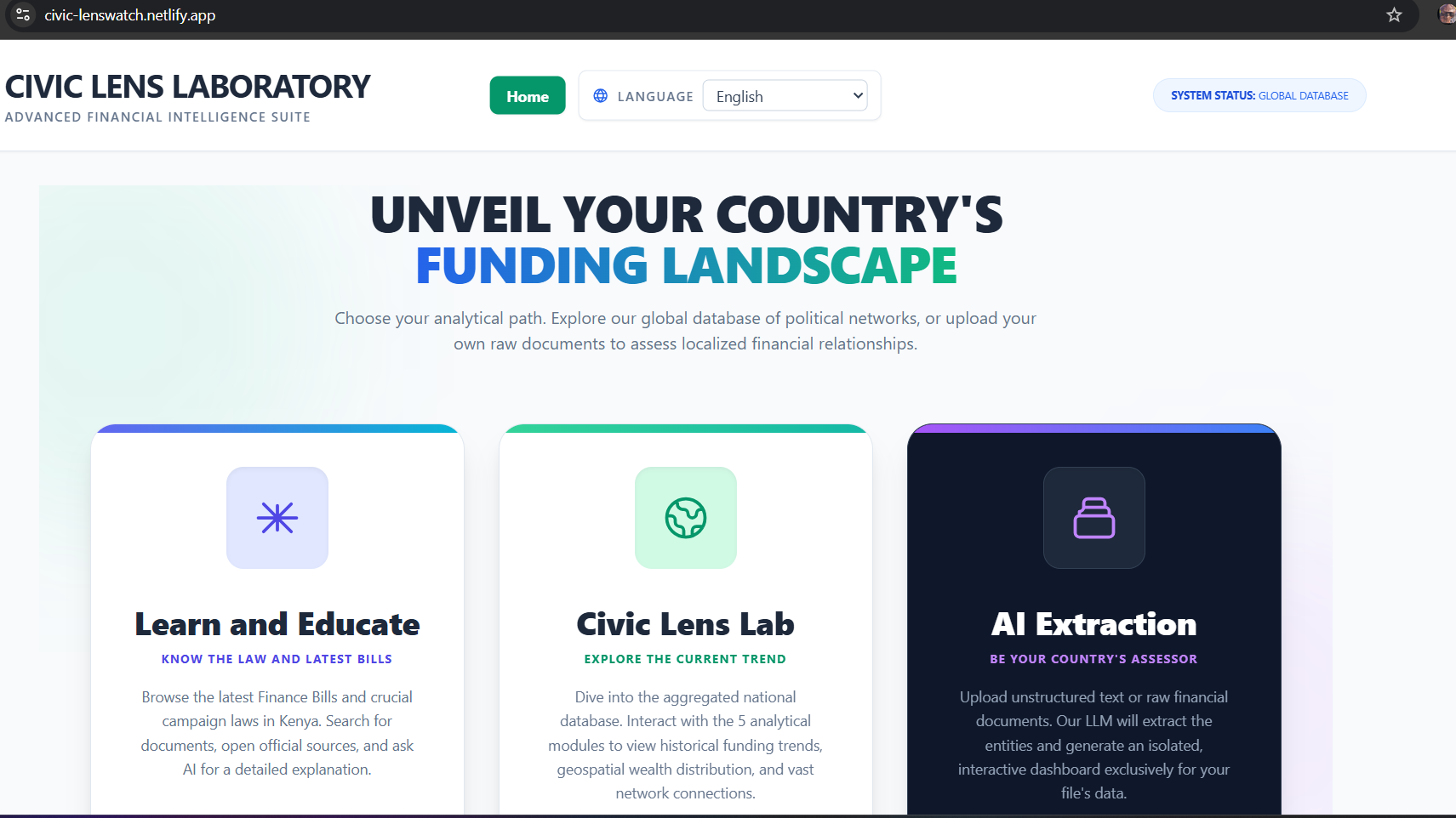
Civic Lens was inspired by a simple question: why is it still so hard for ordinary citizens to see how money, influence, and public decisions connect? We wanted to make civic finance data understandable, not just available. Instead of another static dashboard, we set out to build an interactive platform where users can explore political funding trends, map relationships, simulate policy outcomes, and learn through localized explainers.
Our core motivation was trust through transparency. If people can follow the flow of money and influence, they can make better decisions, ask better questions, and participate more meaningfully in democracy.
How we built it
We built Civic Lens as a full-stack web app:
- Frontend: React + Vite for a fast, interactive user experience
- Backend: FastAPI for APIs and data services
- Data layer: Structured civic datasets, geospatial county data, and simulation parameters
Features:
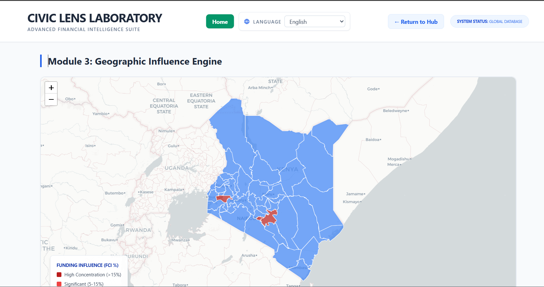
- Interactive map visualizations for regional patterns
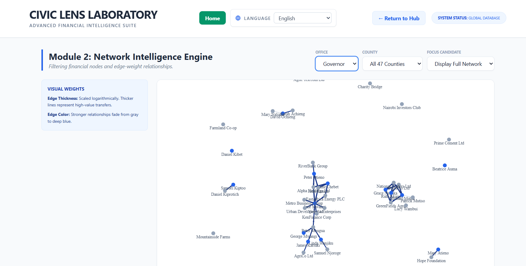
- Influence/network graph exploration
- Funding trend analytics
- M-Pesa and policy simulators for scenario testing
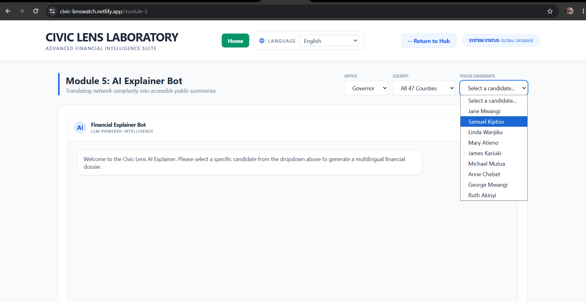
- AI explainer components to make complex insights easier to understand
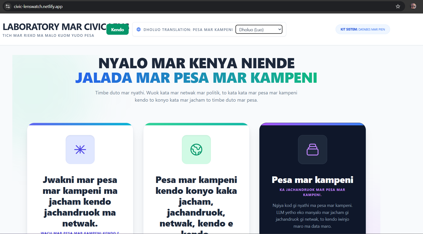
- i18n/localization support to improve accessibility for diverse users
The architecture was designed to keep data processing and API logic in the backend, while the frontend focused on clear exploration and storytelling through visuals and simulation tools.
What we learned
This project taught us that technical correctness is only half the challenge. The other half is interpretability.
Key lessons:
- Data quality and normalization matter more than flashy charts
- UX decisions shape public understanding of civic data
- Localization is not a “nice to have” in public-interest tools
- AI explainers need careful framing to avoid overconfidence and preserve nuance
- Simulation interfaces must communicate uncertainty, not false precision
For example, we framed simulation outputs as directional insights rather than deterministic predictions:
$$ Impact = \sum_{i=1}^{n} w_i \cdot x_i $$
where $x_i$ represents normalized civic factors and $w_i$ represents tunable policy weights. This helped us communicate trade-offs transparently.
Challenges we faced
We ran into several real-world challenges:
- Messy, inconsistent source data across multiple files and schemas
- Balancing analytical depth with a simple, understandable interface
- Designing network and map visualizations that remained readable on smaller screens
- Avoiding performance bottlenecks with larger relationship graphs
- Preventing simulation tools from being interpreted as “ground truth”
- Aligning deployment and environment configs across local and cloud setups
One of the hardest parts was deciding what not to show. Civic systems are complex, and overloading users with every variable can reduce clarity. We iterated heavily to focus on actionable insight rather than raw volume.
Why this matters
Civic Lens is our attempt to turn abstract civic finance data into something people can actually use. We believe transparency should be interactive, educational, and accessible. This project is a step toward helping citizens, journalists, researchers, and students ask better questions about power, policy, and accountability.
Built With
- alembic
- fastapi
- geopandas
- langchain
- networkx
- openai
- pandas
- postgresql
- python
- python-louvain
- react
- sqlalchemy
- uvicorn


Log in or sign up for Devpost to join the conversation.