-
-
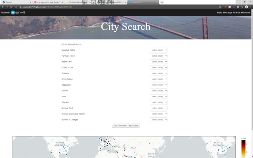
Snapshot of the web app we coded
Inspiration
We are students that have to yet to enter the workforce full time, and with the current Covid-19 situation where we can work from anywhere in the world, there are just too many cities that we can move to after we graduate from college. This program takes data about cities around the world to help us discover the optimal city for us to live in given our preferences.
What it does
This program takes datasets about from various different sources about cities around the world and orders the cities based on how well it fits the aspects that the user deems is very important about where they live. It then returns an interactive map where the cities are marked with different colored dots based on how well it fits the user's preferences.
We added a whole new feature where the user can set the number of colleges in the city as one of the important traits to be factored into calculating how well a city would fit their lifestyle. This is very important in case we want to live in a place where we can further our own knowledge and education, as well as get involved in a learning community.
It determines how well the cities fit the user's preferences using the k-means algorithm to cluster cities that score similarly in how closely it aligns with the factors that the user selects. It then assigns each cluster a color and marks each city on the map for the user to see the results more clearly. When they hover their cursor over a city marked on the map, it expands a menu with the characteristics of the city, like the cost of living, quality of life and crime rating there. This ensures that the user is able to make an informed decision about which city they want to move to.
How I built it
We started with the backend using pandas, numpy, plotly.express, anvil.server, and sklearn. The datasets came from MoveHub City Ratings: https://www.kaggle.com/blitzr/movehub-city-rankings?select=movehubqualityoflife.csv and also Colleges and Universities in the US: https://hifld-geoplatform.opendata.arcgis.com/datasets/colleges-and-universities/data. This gave us access to an abundance of data that we used to analyzed the characteristics of the various cities and rank which ones would best fit the user's preferences.
We used a k-means algorithm to cluster the cities based on how closely they aligned with the user's preferences, then color coded each cluster before displaying it on the interactive map for the end user.
The user's preferences were collected from a form hosted on Anvil's web app platform. Those preferences were sent to a server where the calculations were made to determine which cities aligned the closest with the characteristics that the user prioritized. After the algorithm determined and categorized the cities, it creates an interactive html which is sent back to the Anvil platform where it is displayed for the user to view and interact with.
Challenges I ran into
Some of the challenges we ran into were passing data between the front end and back end programs. The documentation on Anvil's web app platform were not that comprehensive and there was a lack of community support for the platform leading to unresolved issues passing and displaying data on the front end.
The algorithm took a great deal of time to design and optimize based on the user's inputs. We went through multiple iterations to make sure we returned the best possible dataset to the user based on the characteristics that they value the most in the city they reside in.
Accomplishments that I'm proud of
We successfully implemented the k-means algorithm and took into account additional data that we felt would be beneficial to the user when making an educated decision as to where they want to move to. We experimented with passing html data between the front end and back end, and learned a lot from that even though we failed to resolve technical issues we had displaying the html that was returned from the back end algorithm.
What I learned
We learned how to utilize the k-means algorithm to categorize results, as well as how to utilize a web app hosting platform to collect user inputs through a simple and friendly user interface. We also got exposure to Colab and Plotly, which we found were very useful and had rich feature-sets that we can utilize in various projects in the future.
What's next for City Cluster
When we have more time, we will expand the datasets that we can take into account and alter the algorithm to take more hyperparameters into account to better fine tune the results to fit our user's preferences even more closely. We would also like to experiment with more clustering algorithms to give out users more information and factors to take into account before deciding where they want to move in the future. One change that we also want to make a more usable graphical interface to deliver a better experience to the user.

Log in or sign up for Devpost to join the conversation.