-
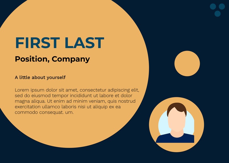
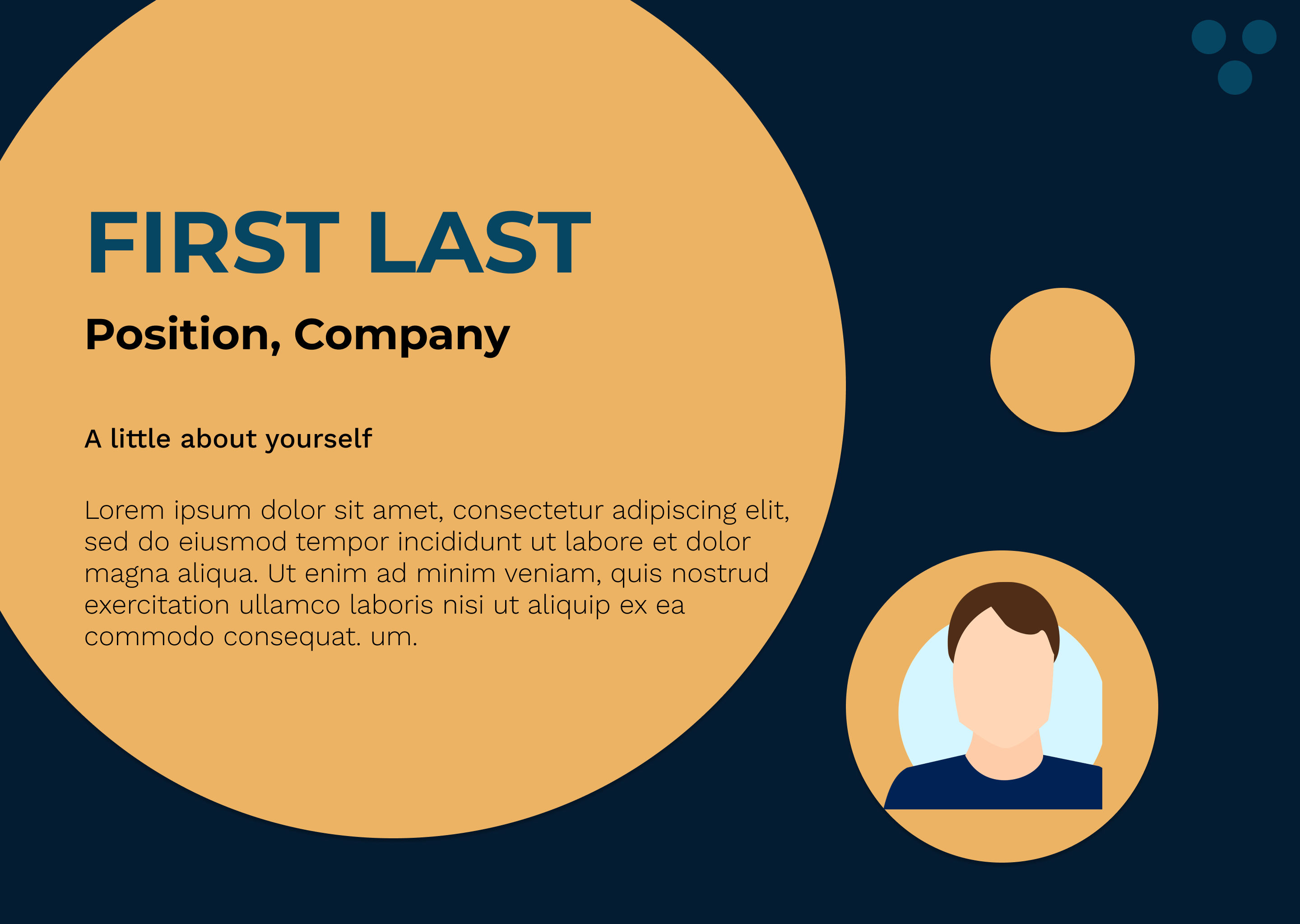
The picture here is mean to be be an image of YOU! Not violating the three color rule.
-
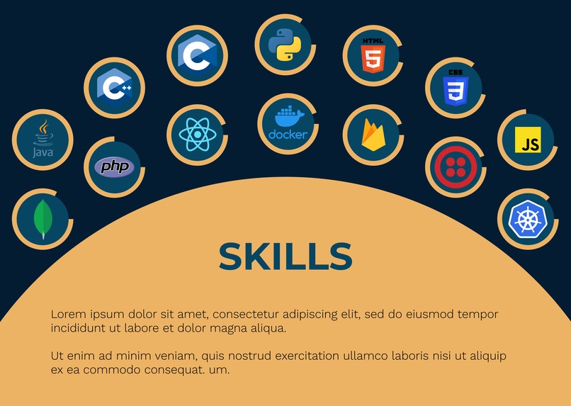
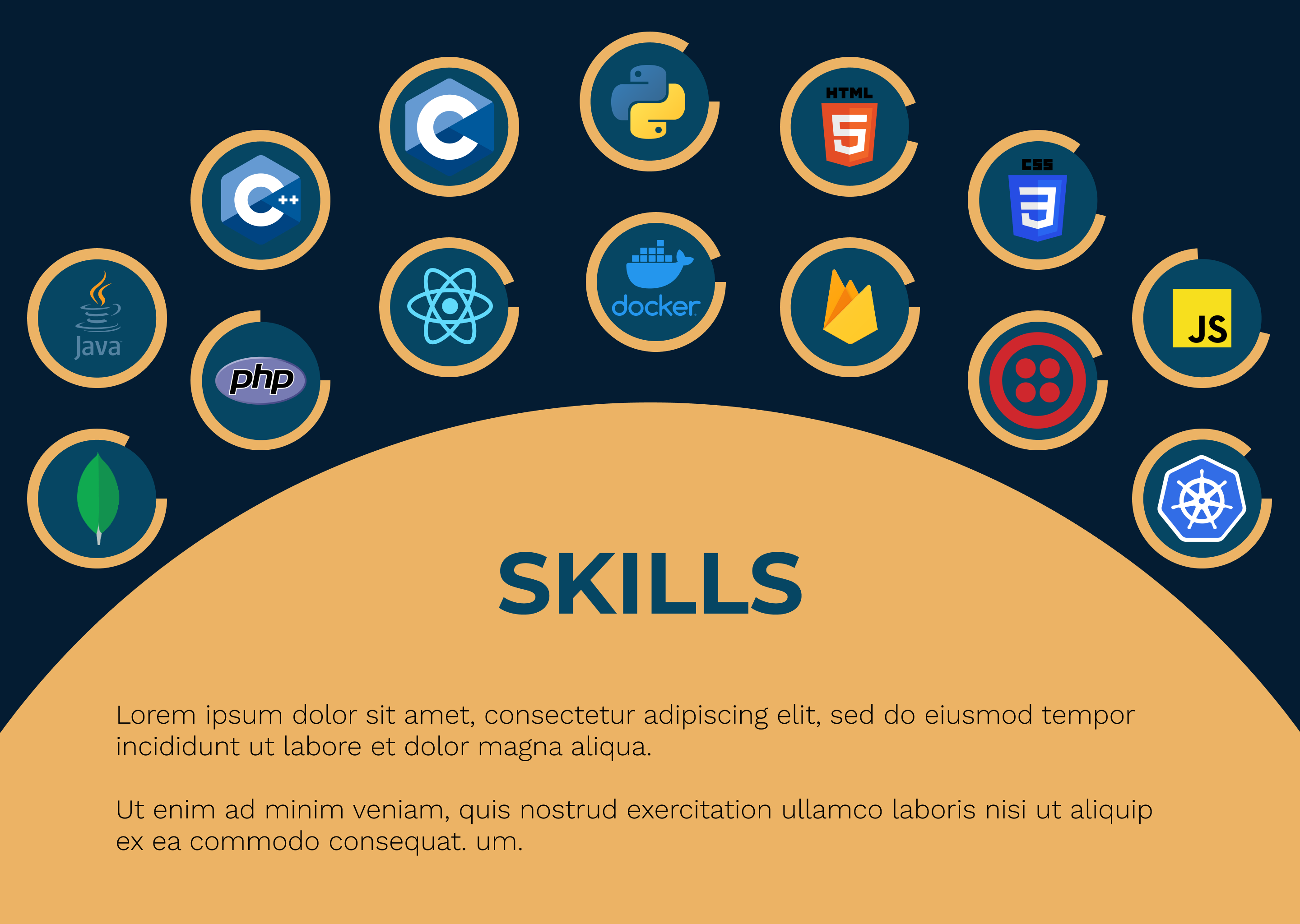
Here the skill icons are brands! Cannot take away their color and misrepresent them.
Inspiration
I didn't have a portfolio design since I was too busy and wanted to make as good as possible. MLH Build has given me some inspiration to make a clean but impressive looking mockup.
Only used Circles - except the background! We don't have circular screens yet. Also, only used the following basic colors (except for the logomarks) ECB365 041C32 064663
What it does
A simple website mockup to make it cleaner.
How we built it
Using Figma, a tool to create website mockups
Challenges we ran into
How to give enough contrast and menu icons with just circles, but I managed to get a good color combination and some beautiful ideas
Accomplishments that we're proud of
The way in which I modified the hamburger menu to work in a different way.
What we learned
Anything is possible if you have the right color combination and simple shapes. Portfolios don't always have to be flashy or colorful. Simple designs can speak a lot.
Built With
- figma


Log in or sign up for Devpost to join the conversation.