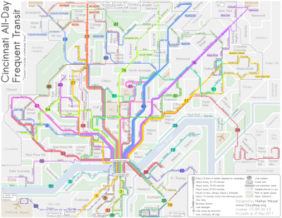
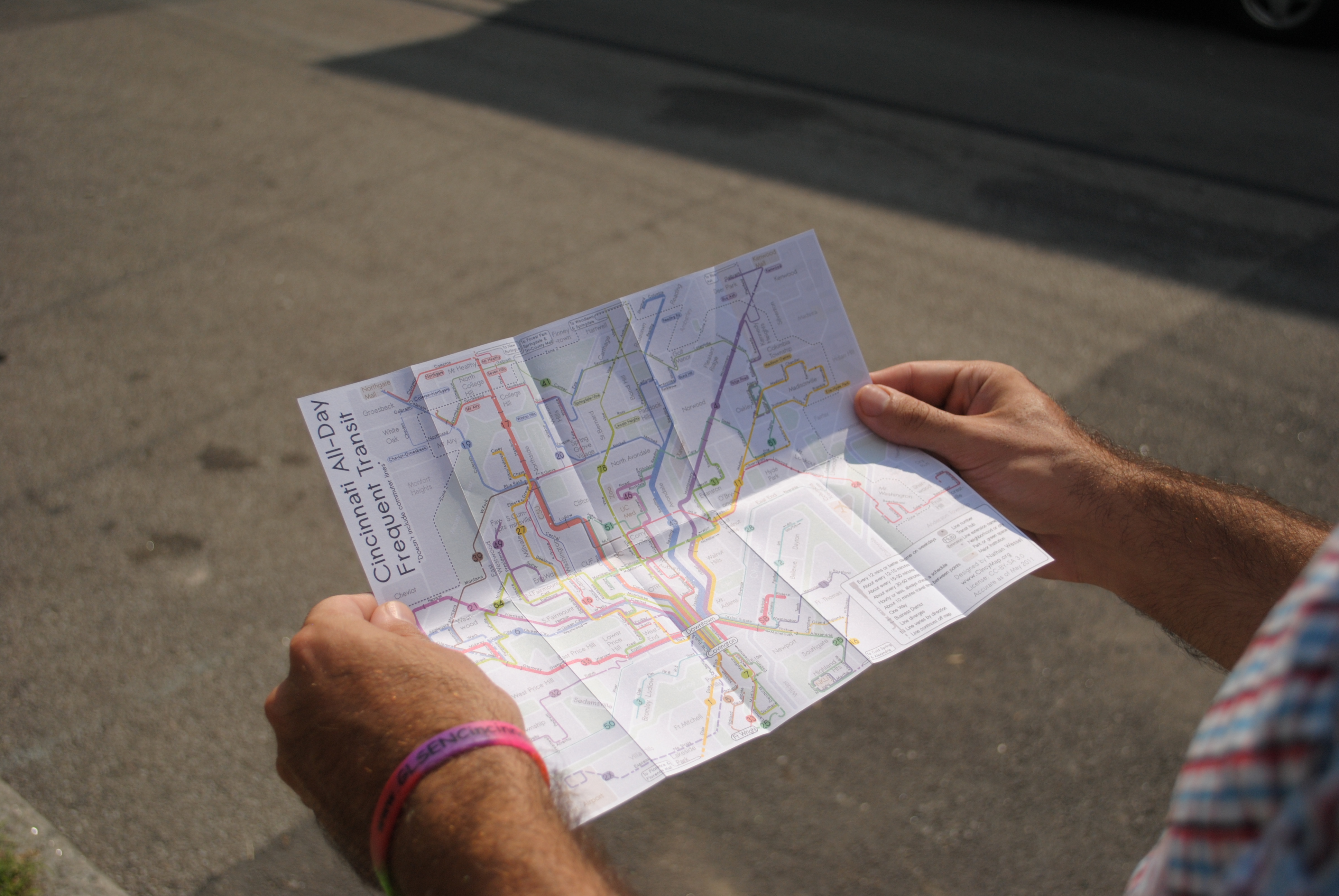
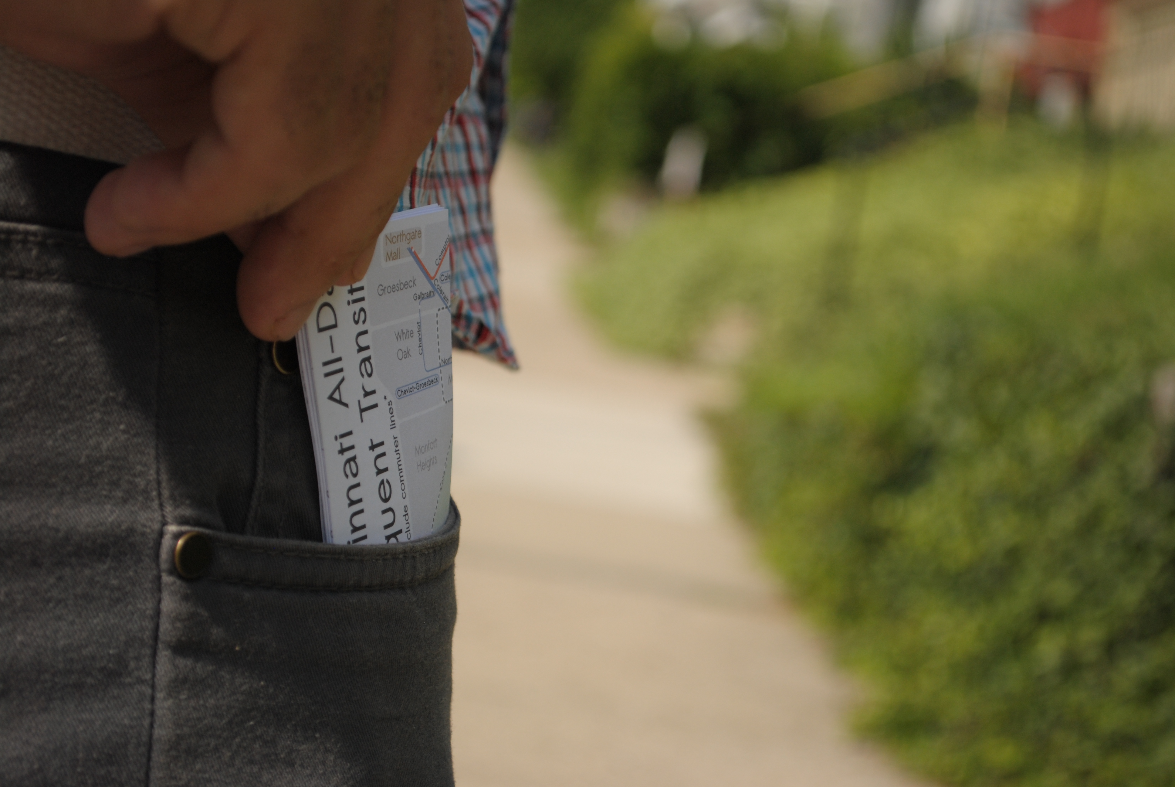
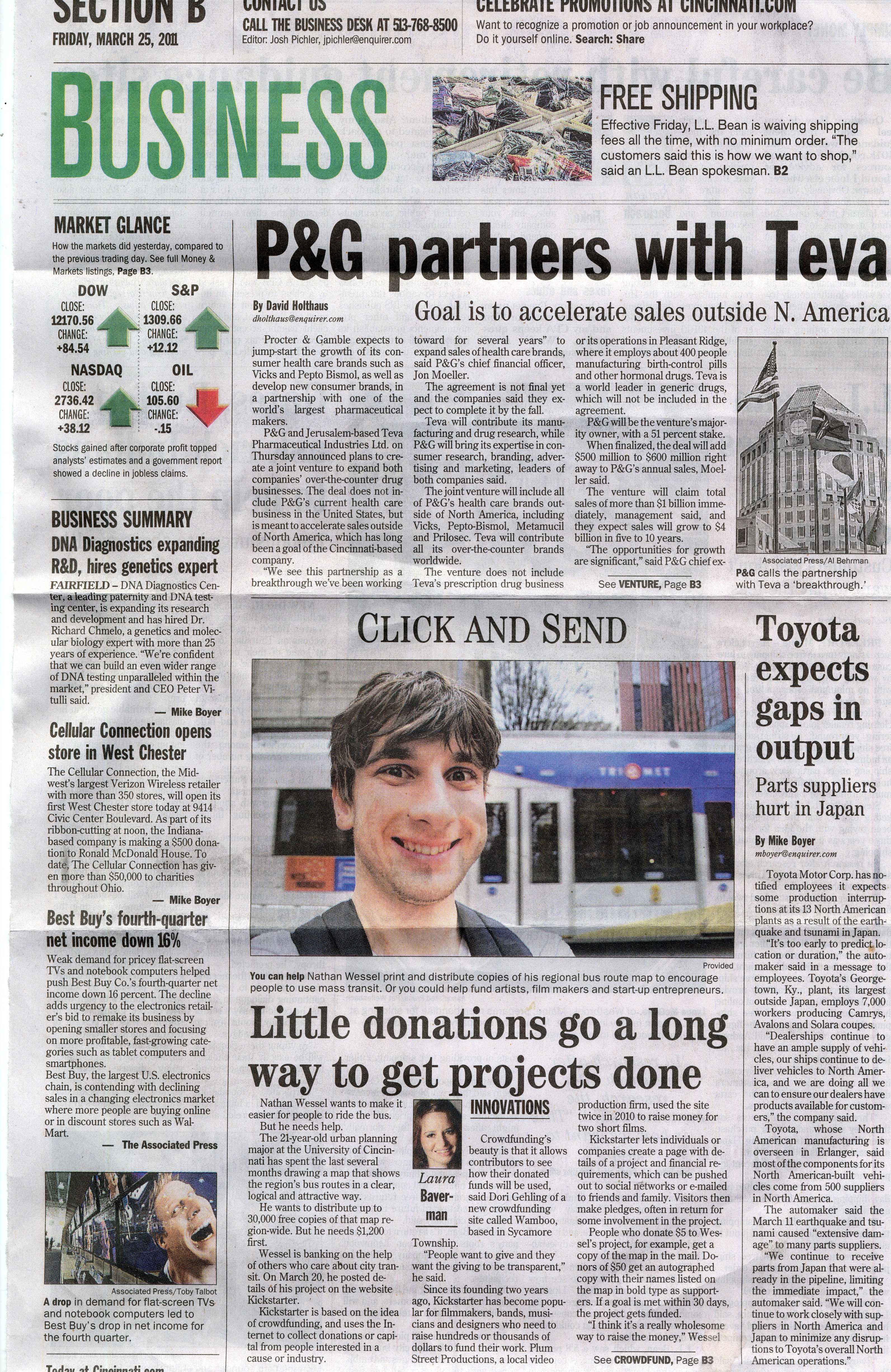
The Cincinnati Frequent Transit Map is a project that grew out of my frustration with the absence of any legible description of Greater Cincinnati's system. I first began tinkering with Cincinnati's transit data in late 2011. I wanted to get clear in my own mind just what services were useful, what neighborhoods had better transit service, and how they were all connected. SORTA, the primary transit agency serving the region, hadn't published a system map in over four years. The old map on their website was not only inaccurate, but so overwhelmingly illegible that most new riders were scared off. http://www.go-metro.com/maps/broadbandmap.pdf After a couple days of entering most of the data from individual paper route schedules into GIS over a shapefile of regional streets I was able to see the basic structure of transit system. I included rough data drawn from the schedules on frequency and was able to highlight areas with more frequent service. I was intrigued by what I found, so I started drawing some simple sketches, at first just the most frequent routes. After getting some positive feedback I ran with it. I started including more routes and details. I reduced the wild curves of Cincinnati's hilly streets to 45 degree angles and smooth corners. By analyzing GIS data for all of the regions buildings, zoning codes, and census data, I was able to include meaningful information about the location of neighborhood business districts. By interpreting schedules one at a time, I was able to give a rough estimate of the time between two points on a given route. As I poured more effort into the project I decided I couldn't leave it as just an academic exercise. A couple of recommendations led me to Kickstarter.com, a website that helps to raise money for creative projects. After just five days I had raised over $1,200. Less than a month later, I had raised $2,300 with the support of more than a hundred donors from Cincinnati and around the world. That money was used to print 30,000 pocket-sized maps and several hundred posters. http://www.kickstarter.com/projects/1057319855/a-frequent-transit-guide-for-cincinnati?ref=live Thousands of maps have been distributed by individuals, businesses and organizations around Greater Cincinnati. The University of Cincinnati even printed 6,000 of their own maps for their 2012 freshman class, the Public Library of Cincinnati and Hamilton County has maps at forty branch locations and both regional transit agencies are distributing the maps directly to their customers. The map is a diagrammatic illustration of the Greater Cincinnati's transit system that shows where, when, and how one can travel by bus. It's nearer to New York City's Subway Map or that of London's Tube in design than to the more to-scale and more difficult to read maps of most Midwestern cities. Like the New York map, this map highlights the important frequent and convenient transit lines over services that are infrequent, specialized or too complex to readily apprehend. The map communicates compactly not only where all routes go in relation to each other and the neighborhoods, but by including frequency information, how long one can expect to wait for the next bus. The basic idea behind a frequency map is that transit service doesn't only exist in space, but in time. You may know the line you want is on Vine Street, but you can't expect to catch the bus at midnight the same way you can at noon. A bus map that locates routes in space but not in time is not very valuable unless it is accompanied by schedules for every route. I hope to allow people to understand what good service exists, and where it can take them so that they can not only begin to use public transit, but understand it in a way that lets them have an informed discussion about how to improve it. You can hardly demand better transit service when you don't even know what exists!
Cincinnati Frequent Transit Map
Updates

Leave feedback in the comments!
Log in or sign up for Devpost to join the conversation.