Inspiration
Two utilities can spend hundreds of millions building parallel transmission lines a few miles apart, or across the same right-of-way, because nobody has ever put every proposed project on one map. We kept finding news stories about contested corridors and stalled permits, and realized the first problem is even more basic: nobody can see the overlap. So we built the map we wished existed.
What it does
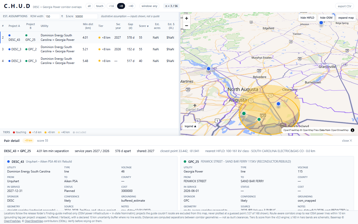
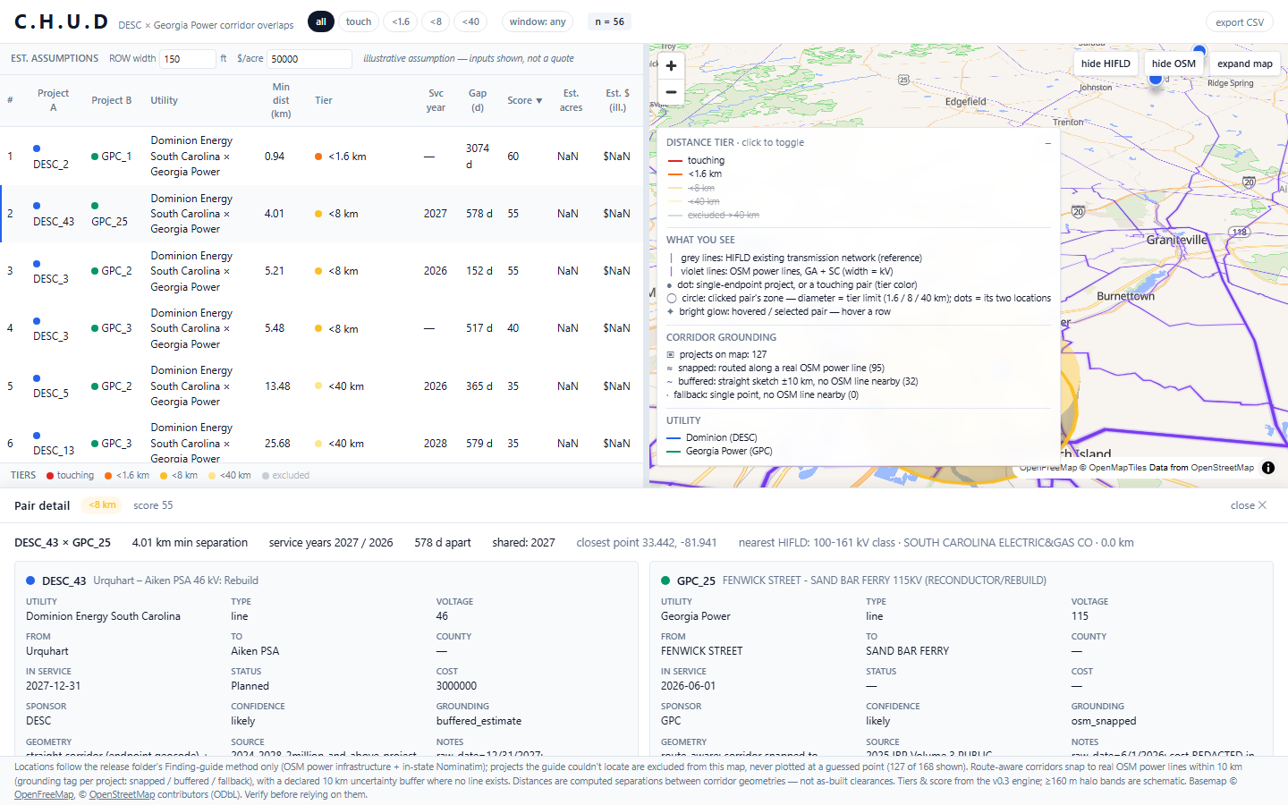
CHUD loads every transmission project proposal from Georgia Power and Dominion, pins each one to real geography, and computes every pair of projects whose corridors touch or come within 40 km. Pairs are tiered, physically crossing, under 1.6 km, under 8 km, under 40 km, and ranked with a score that blends distance, in-service timing, and row capacity.
The interface is one screen: a sortable ledger of conflicts on the left, a tilted 3D map on the right where power lines glow off the basemap and every project hovers as an icon you can inspect, and a detail drawer that opens on any pair with both projects' full specs side by side. Click a project icon and the ledger filters to only the pairs it's tangled up in.
How we built it
- Backend: FastAPI + pandas/GeoPandas. Project records were extracted from utility planning guides and geocoded under a strict rule: if we couldn't verify a location against OSM or a hinted-state lookup, we dropped it rather than plot a guess. Corridors are snapped to real OSM power lines within 10 km (with a declared uncertainty buffer when no line is nearby), and every pair's shortest gap is computed in projected coordinates, not lat/lon.
- Reference layers: HIFLD's electric transmission dataset (6,611 lines cached for GA + SC) and OSM power=line ways from Overpass, both toggleable, styled by voltage class.
- Frontend: React + MapLibre GL. The map runs pitched at 60° so pair zones extrude into visible domes, project icons bob above their anchors with the full record on hover, and a spotlight effect dims everything except the row you're on.
Challenges we ran into
- Location honesty. 41 projects couldn't be confidently located. It was tempting to slap them at a state centroid and move on, instead we excluded them and ship a manifest of what's missing and why.
- Corridors aren't straight lines. Straight-line distance between two project "centers" is a lie. Snapping proposals onto actual OSM grid geometry (and admitting when you can't) took several passes.
- Map legibility. Two overlapping 6,611-line overlays plus hundreds of project points is visual soup. The hover spotlight, tier toggles, and dimming pass were the difference between "impressive demo" and "actually readable."
- Scale of the data. 9–10 MB overlay fetches that can fail silently, we surfaced every one as a visible status chip instead.
Accomplishments that we're proud of
- Every pair on screen is backed by real computed geometry, shortest-line gaps in EPSG:5070, not eyeballed distances.
- The guide-only location policy: the map never shows a project we couldn't verify, and tells you about the ones it left out.
- One-screen workflow: spot a conflict in the ledger → see it collide on the 3D map → open the full side-by-side in one click.
What's next for CHUD
- An AI copilot, plain-English questions like "which pairs go live the same year?" answered over the same data. The parsing layer is designed for it; it's not wired up yet.
- More utilities and states, the pipeline is per-state, and the interesting conflicts are interstate.
- Exportable conflict briefs for permitting and planning teams.
What we learned
Ground truth beats convenience. Every shortcut we were tempted to take, guessed coordinates, straight-line corridors, unverified overlays, would have made the demo smoother and the product worthless. The exclusions, the buffers, and the status chips aren't limitations; they're the product.
Built With
- fastapi
- geopandas
- maplibre
- pandas
- python
- react
- taiwlind
- typescript


Log in or sign up for Devpost to join the conversation.