Inspiration
Tower defense has been stuck on one question for years: do I have enough damage? You out-scale enemies with bigger numbers and watch them melt. I wanted to replace that with a more interesting question, in what order?, and build a mobile TD where the type and order of your damage rewrites each enemy as it dies, so every wave becomes a puzzle you author through placement rather than out-spend.
What it does
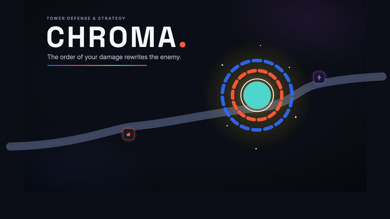
CHROMA is a mobile tower-defense game built around a single idea: colour is the interface. Enemies ("Husks") are stacks of coloured shells. Each shell wears a primed element (a coloured aura set by the primer zone it's passing through), and the element that breaks it transforms the shell beneath via a balanced 4×4 reaction matrix. Break shells in a resonant clockwise order and you bank Resonance and chain bonuses; break them dissonant and the enemy hardens. The whole game lives in choosing that order, and because the system is fully deterministic, you author the outcome through where you place towers, never gamble on it.
The submission is a complete pre-production package: a Game Design Document, a Player Journey Map, a Visual Concept Package, and a Production Plan.
How I built it
I designed the whole system around three constraints: it had to be legible at a glance on a 6-inch phone, deterministic (same placement, same outcome), and deep at the wave level rather than the single-enemy level. The reaction matrix is a balanced circulant: every row and column holds exactly one resonant, one dissonant, two neutral results, so no element is a trap or a crutch. The visual system does double duty as the mechanic and the accessibility model. Each element carries four redundant cues (hue, silhouette, luminance, label) plus a luminance-led colour-blind remap, so the board reads even in motion or without colour.
Challenges I ran into
The hardest problem was making the core mechanic feel authored, not random. An early version decided the "breaking element" by whichever tower dealt the majority of a shell's damage, a real-time damage race that turned out fiddly and contention-prone. I rebuilt it into a deterministic prime-and-detonate system: priming is binary and instant on zone occupancy, detonation breaks the shell, and the reaction reads the visible aura. No timing race, no invisible math. That single pivot turned the riskiest part of the design into its strongest, and let me delete a whole layer of UI band-aids in the process.
What I learned
That legibility and depth aren't opposites. Keeping the rule-space tiny (four elements, one small matrix you can hold in your head) is exactly what creates room for depth at the wave level, where conflicting enemies force genuine spatial triage. And that the discipline of making every document agree with every other one, the numbers, the terminology, the scope, is what separates a pitch from a plan.
What's next
A 16-week vertical slice that front-loads the one thing that must feel right: a go/no-go prototype gate on the core reaction, before anything else gets built.
Built With
- accessibility
- figma
- game-design
- mobile
- systems-design
- tower-defense
- ux-design


Log in or sign up for Devpost to join the conversation.