Inspiration
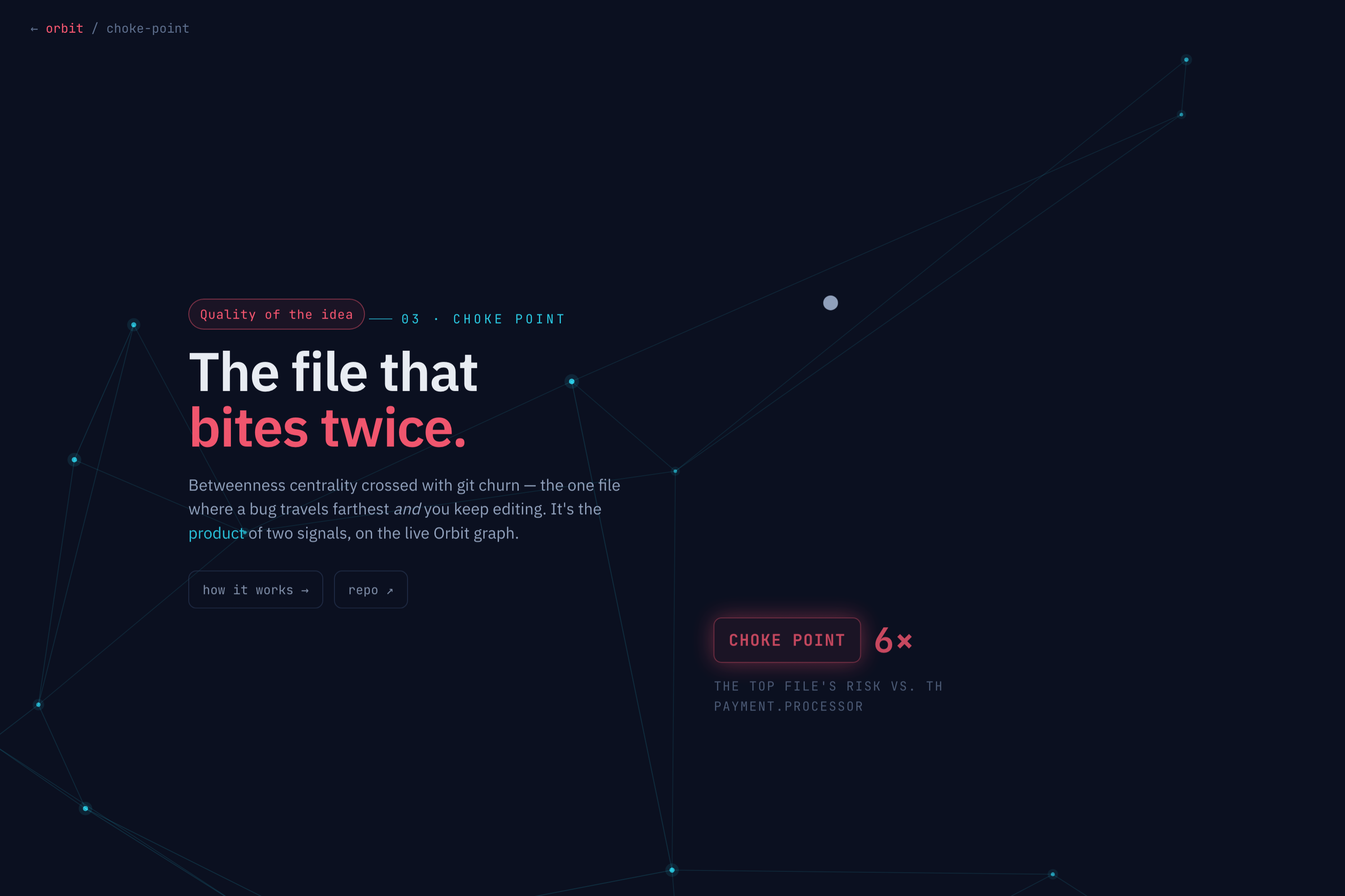
I've watched a one line change take down half a system, and I've also spent a whole day hardening a file that turned out not to matter at all. The problem is that the two signals everyone reaches for each lie on their own. Churn, how often you edit a file, flags a lot of harmless code you just happen to touch a lot. Centrality, how connected a file is, flags the stable core you never actually change. Look at either one alone and it sends you to the wrong file. The file that actually bites is the one that is high on both: a bug there travels far, and you keep introducing bugs because you keep editing it. I wanted to find that file automatically instead of learning it the hard way.
What it does
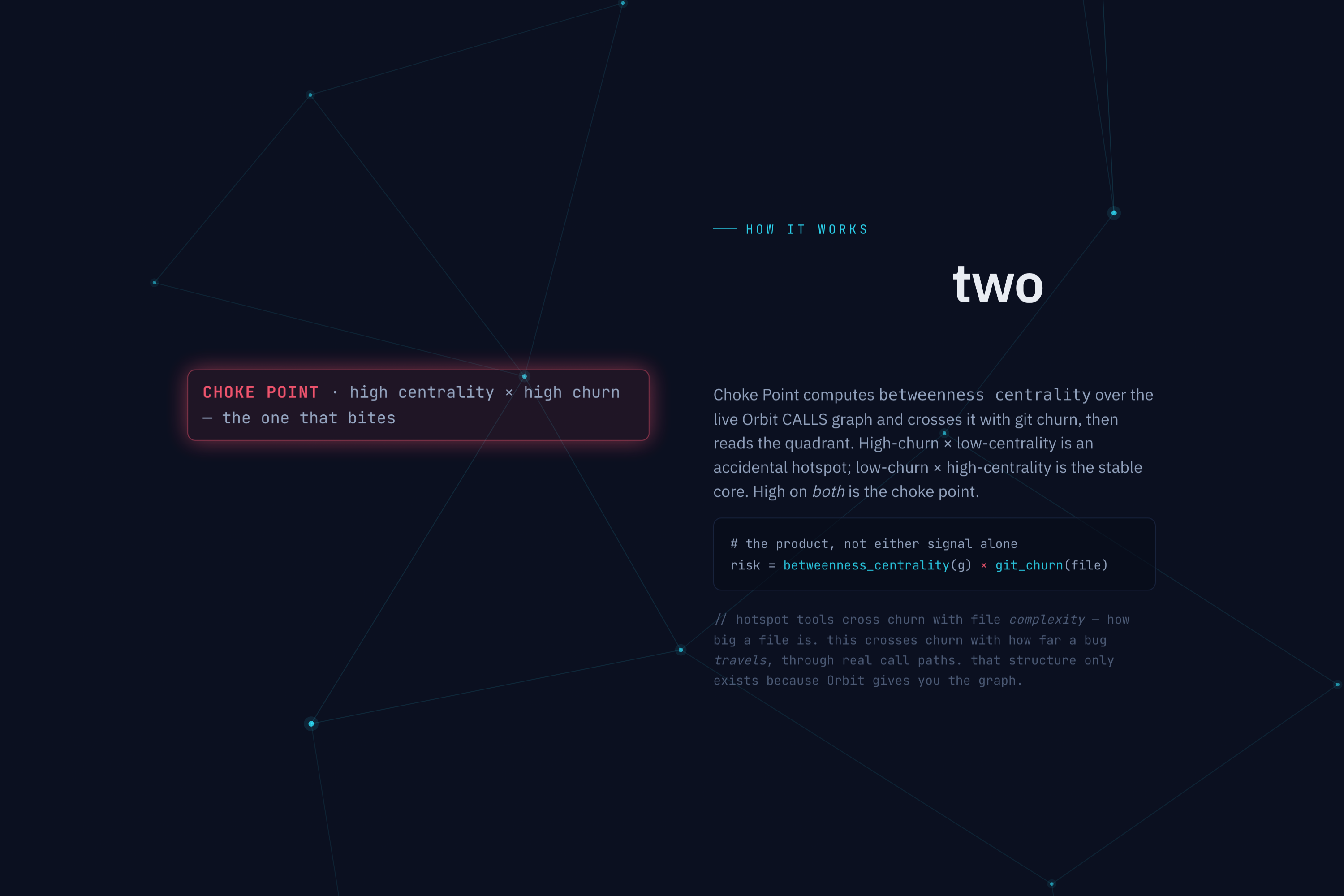
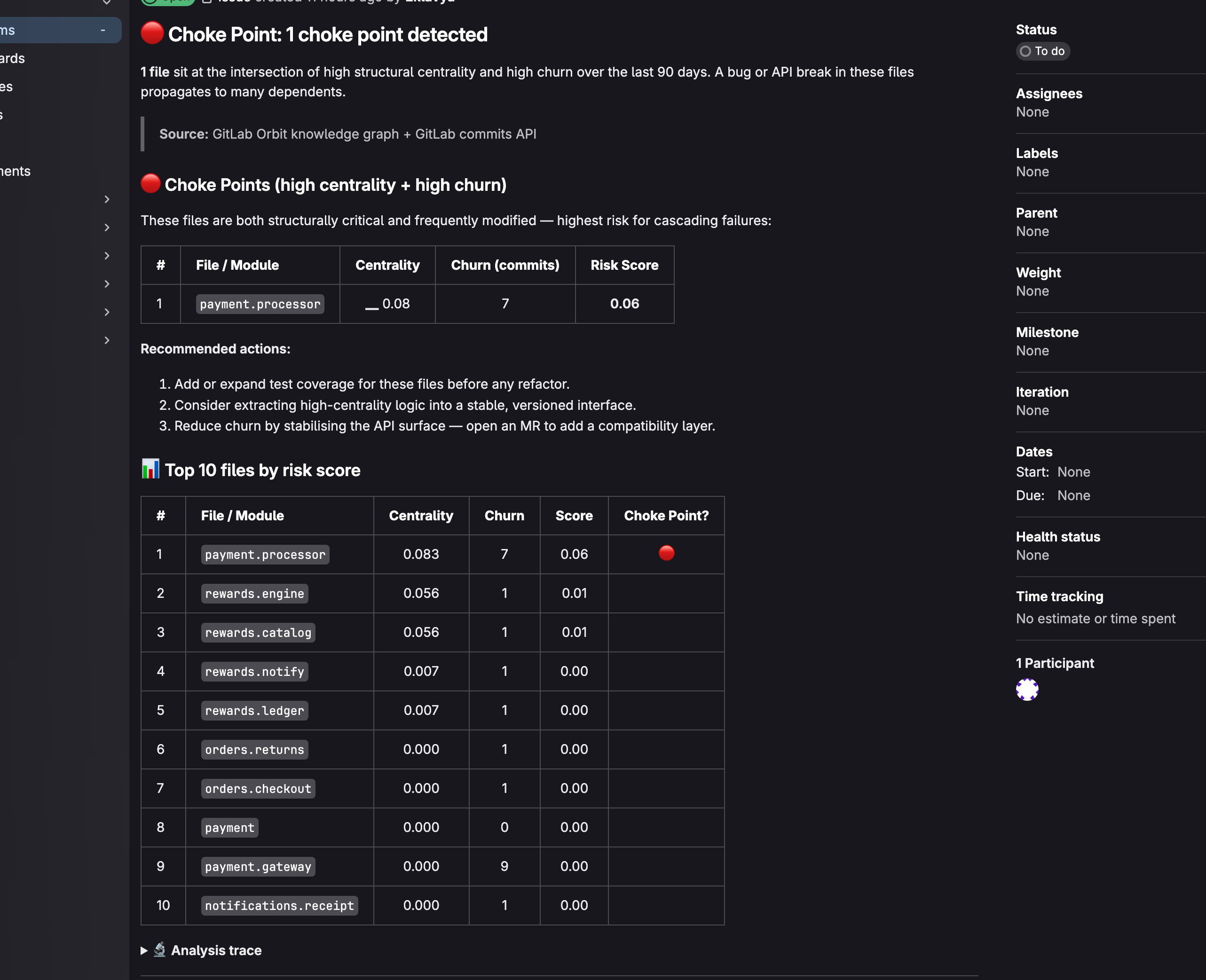
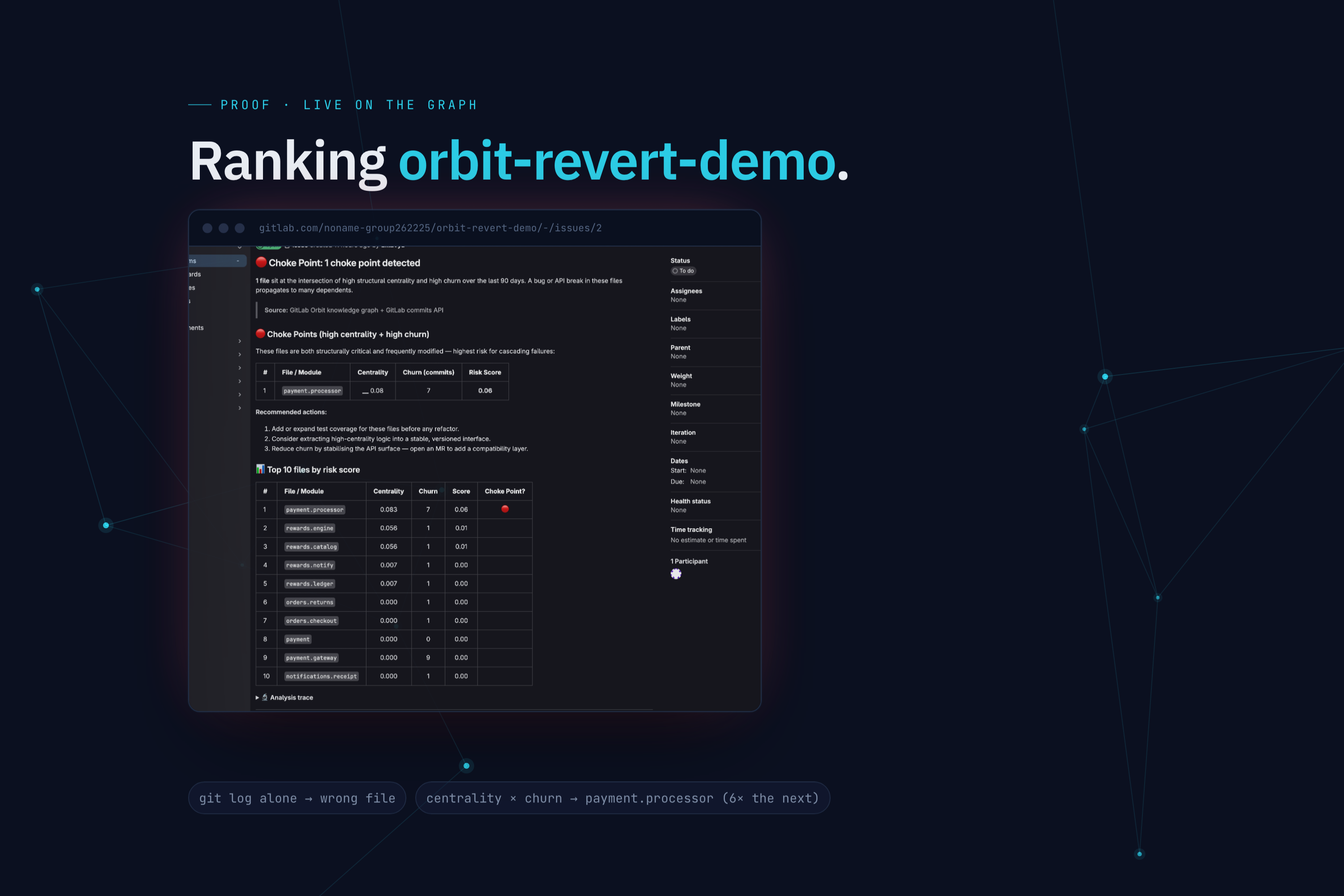
Choke Point ranks the files in a repo by risk and posts the ranking as a GitLab issue. Risk is betweenness centrality, measured on the real call graph, times how much the file has changed recently.
The headline is the one file that is high on both axes. On my demo that is payment.processor.
The part I like is what it does not pick. The single most edited file in the demo is payment/gateway.py, with 9 commits, more than anything else. Churn alone would put it at the top. But it is a leaf, nothing routes through it, so its centrality is basically zero and Choke Point scores it at zero. The git log says gateway. The graph says processor. That difference is the whole idea, and you can only see it because Orbit gives you the actual call paths.
How we built it
It's Python. It pulls the call graph from Orbit, builds a directed graph of modules, and computes betweenness centrality. This is the one tool that uses a library, networkx, for the centrality math, everything else is standard library. For churn it asks the GitLab commits API how many times each file changed in the last 90 days. Risk is the product of the two, normalized.
A couple of deliberate choices. Centrality is computed over production code only: test files import the things they test, so leaving them in inflates the graph and dilutes the numbers, and a test file is never going to be your choke point anyway, so I drop them. The label and the ranking use the same rule: a file only gets called a choke point if it is high on both centrality and churn, which is what the "high on both" picture in the pitch actually says. An earlier version flagged anything with high centrality and at least one commit, which let low churn files sneak in and muddied the idea. And if Orbit is unreachable it exits red instead of printing "no choke points found," because an outage and a clean repo should not look the same.
Challenges we ran into
Making the graph signal earn its place. On a small demo, betweenness and a plain import count rank things almost the same, so it is fair to ask why bother with the fancier metric. I fixed that by building the gateway case on purpose: a file that churn loves and the graph ignores. Now the demo shows the graph changing the answer, not just agreeing with git log.
Multiplying two different scales. Centrality is a 0 to 1 graph metric, churn is a raw commit count. Treating the product as an AND gate, where zero on either axis means zero risk, is the honest reading, and I had to say that out loud rather than just multiply and hope it meant something.
Owning the prior art. Crossing churn with a structural measure is not brand new, behavioral code analysis has done churn times complexity for years. The thing that is different here is the structural axis: real call-graph betweenness from a semantic index, which is about how far a bug travels, not how big or tangled a single file is.
Accomplishments that we're proud of
The counterfactual. The most churned file is not the choke point, and the report shows exactly why. That is the moment the idea proves itself instead of just asserting itself.
It runs on the real graph and posts a real, ranked issue, not a mockup.
The scoring is defensible and stated plainly, including why test files are excluded and why the product is the right way to combine the two signals.
What we learned
Two cheap signals that are each fairly useless alone can be sharp when you multiply them, but only if you are honest about what each one is and is not.
Centrality is only meaningful if it is measuring the real thing. Betweenness on a graph polluted with test imports is noise. Cleaning the graph mattered more than the formula.
The same Orbit query I used in my other tools built this graph too.
What's next for Choke Point
A third signal, test coverage. A central, churned file that is also thinly tested is the genuinely scary one, and Orbit plus coverage data could say that. Weighting churn by lines changed or distinct authors instead of a raw commit count. And trend over time, so you can see a file creeping toward the danger corner before it gets there.


Log in or sign up for Devpost to join the conversation.