-
-

Purple Hope
-

Data Visualization
-

Data Visualization
-
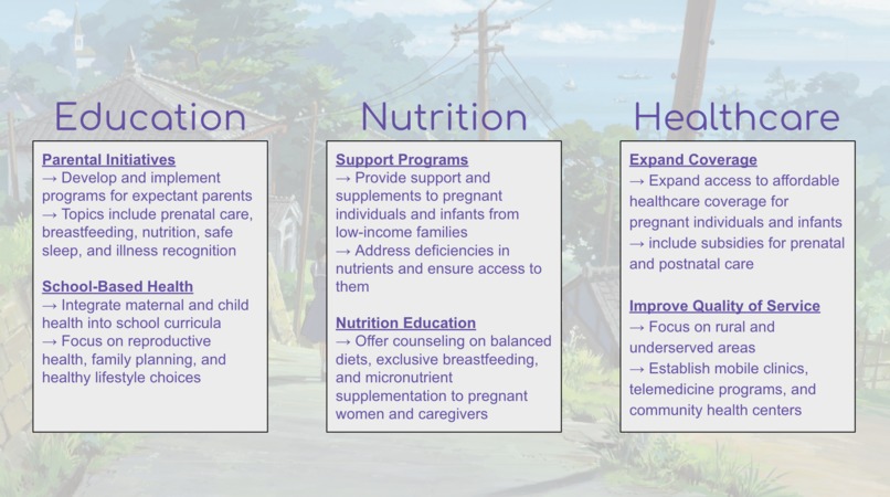
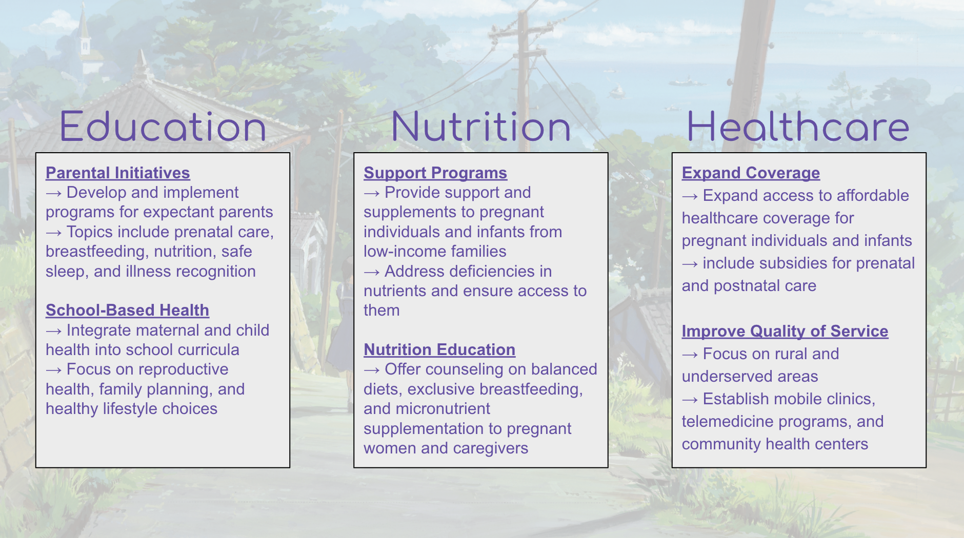
Prevention Plan
-
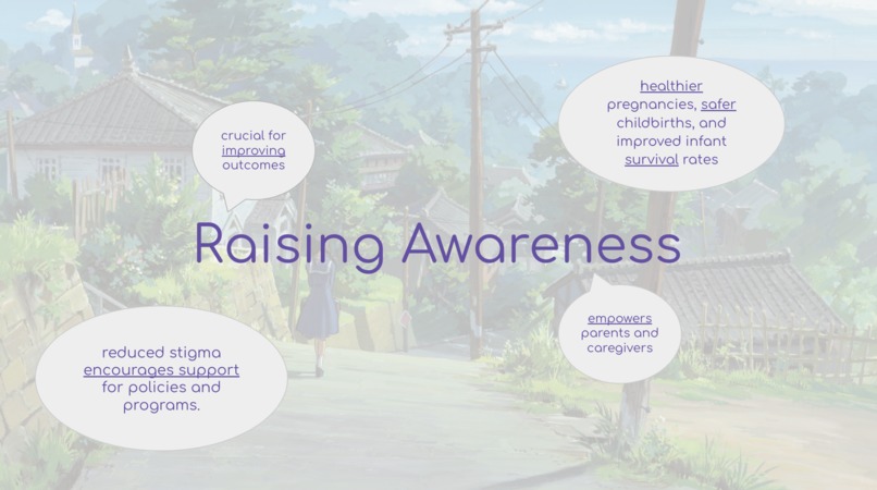
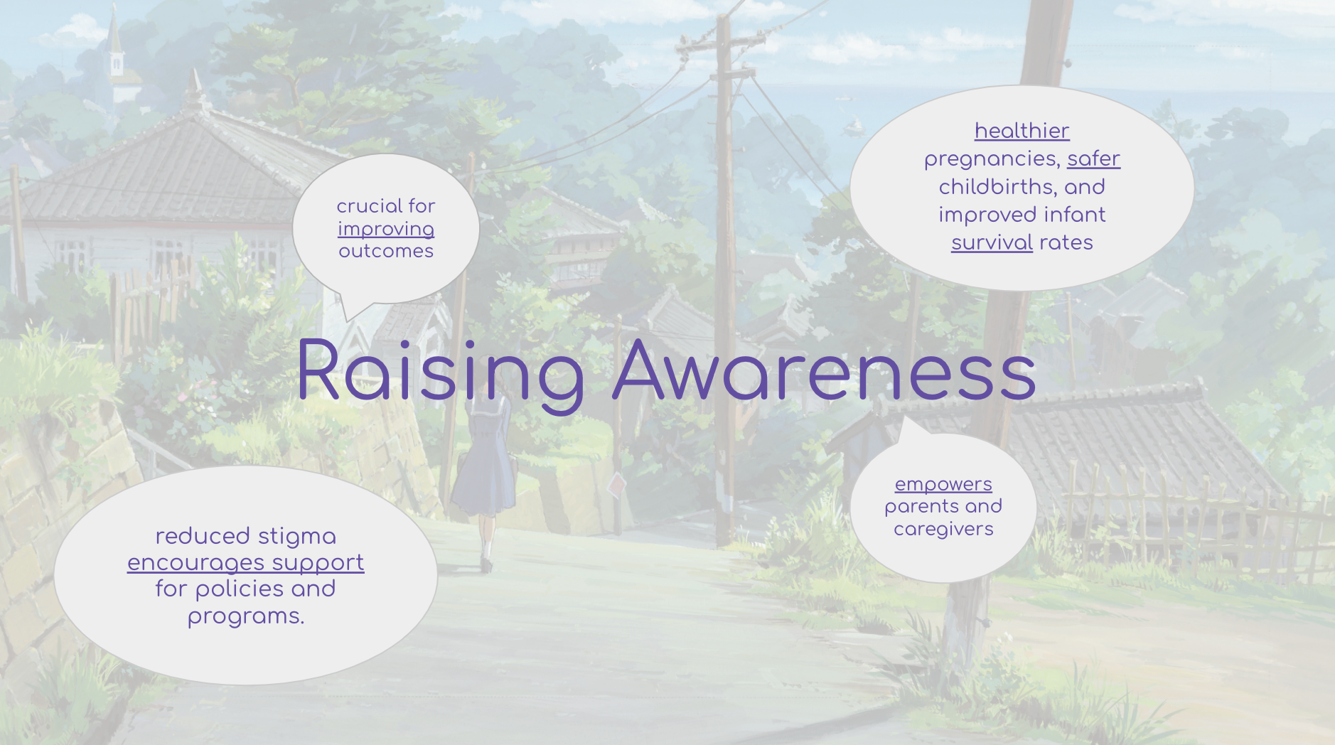
Raising Awareness
-

Support Purple Hats <3


Inspiration
Our ultimate inspiration for this project was the meaning behind the Purple Hats Project and their dedication to raising awareness regarding Shaken Baby Syndrome. The compassion and strength demonstrated by the Purple Hats Project and their advocacy inspired us to take action and explore the complex factors that surround childhood mortality around the world, and explore potential preventative measures. By analyzing these datasets, we ultimately sought to identify key factors that contribute to child mortality, including those related to Shaken Baby Syndrome, which can inform strategies for prevention.
What it does
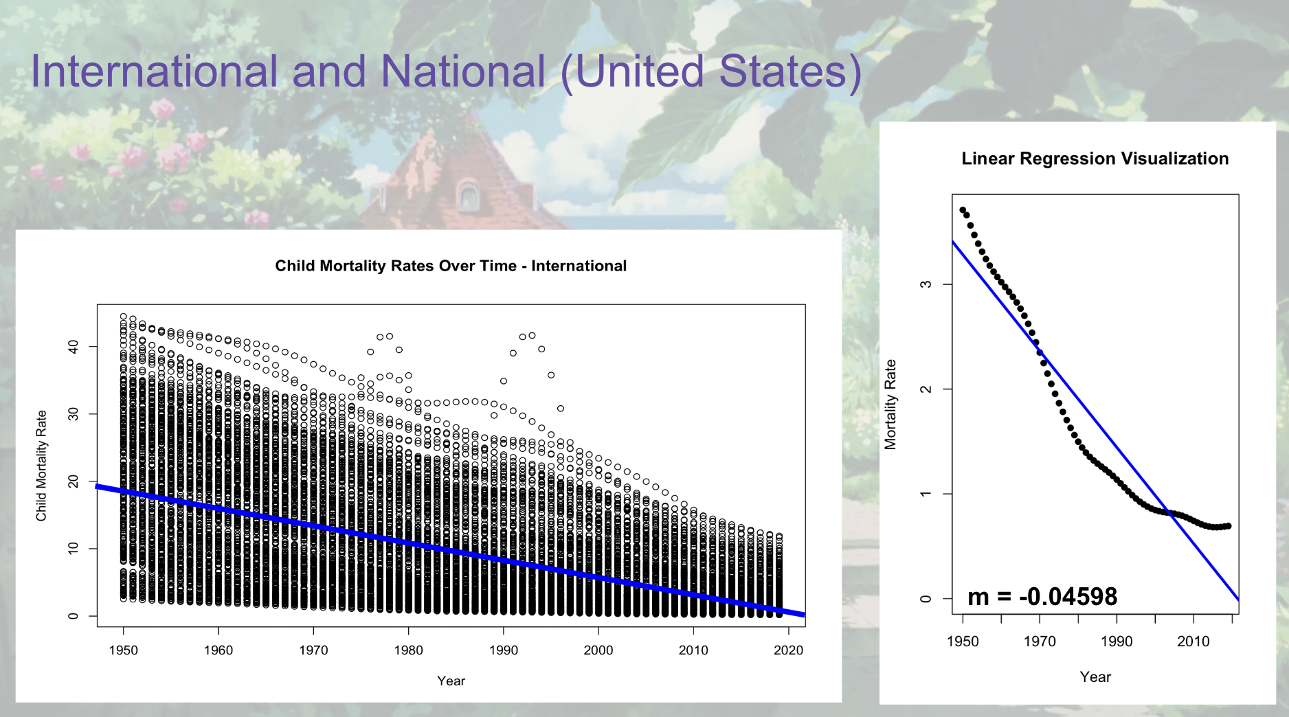
This project ultimately provides a visual model to illustrate the trend in child mortality in the past 70 years between 1950 and 2019. We used linear regression models to analyze the trend of child mortality over time and we were able to demonstrate that mortality rates decreased as years increased, which can be attributed to various factors.
How we built it
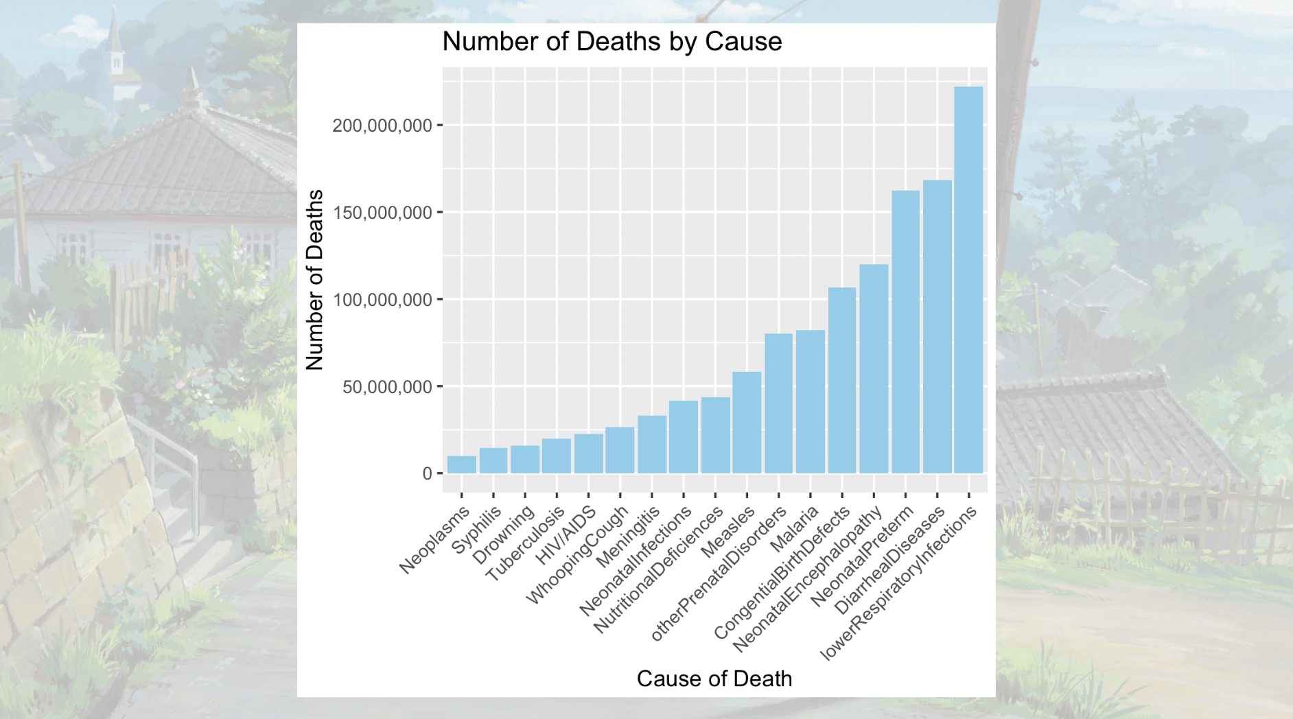
In order to build this project, we utilized two Kaggle datasets and uploaded those datasets to R studio. From there, we utilized the data frames that were dependent on the type of information we were aiming to represent. Then we used linear regression models to illustrate the relationship between time and mortality rates. Additionally we used a dataset conveying causes of infant death by region and year. We were able to consolidate the data of the regions and years in order to see what the highest causes of death were and how to better outline our prevention plan.
Challenges we ran into
One of the main challenges we ran into was creating the causes of death bar chart. Our initial plan was to create a bar chart of the causes of death for each year and to compare that against each other. However upon testing this, we realized that this was not the most optimal way to present the causes of death as, within our dataset, we would be comparing 70 years of data per country. Instead, we chose to consolidate the data so that we could look at the most common causes of death in children overall, instead of year by year. In this way we were able to create a more concise and readable visualization that ultimately is more straightforward and easier to understand.
Accomplishments that we're proud of
We were able to use R and our growing knowledge of data science in order to create linear regression models and barplots to visualize data regarding trends and causes in child mortality. Through the data visualization, we were able to create a detailed plan whose implementation prevents infant mortality. We are proud that we were able to use this data and present it in a way that allows us to emphasize the importance of raising awareness on this issue.
What we learned
Having taken data science classes over a year ago, we were initially not confident in our approach to using linear regression models and creating data visualizations. We both felt that we were facing a significant learning curve in creating and designing our project. However, after a lot of trial and error, as well as doing research on additional topics, we were able to learn new skills to better analyze and present the data.
What's next for Purple Hope
In the future, we aim to use our analysis of the data to continue raising awareness and begin implementing the plan we designed to keep children safe!
Built With
- kaggle
- r
- rstudio
- studio-ghibli


Log in or sign up for Devpost to join the conversation.