Inspiration
I’ve worked with many of Chicago’s open datasets before and this time around I decided to give Food Inspection Data another shot because I enjoyed working with it before. It connects data to something deeply relatable—where we eat and how safe it is. In the past, I did some simple analysis on it, but for this hackathon’s “vibe coding” theme with Plotly, I wanted to go beyond numbers and turn it into an interactive story of food safety across the city. The goal was to visualize not just which places passed or failed, but why—and what that says about neighborhood health overall.
What it does
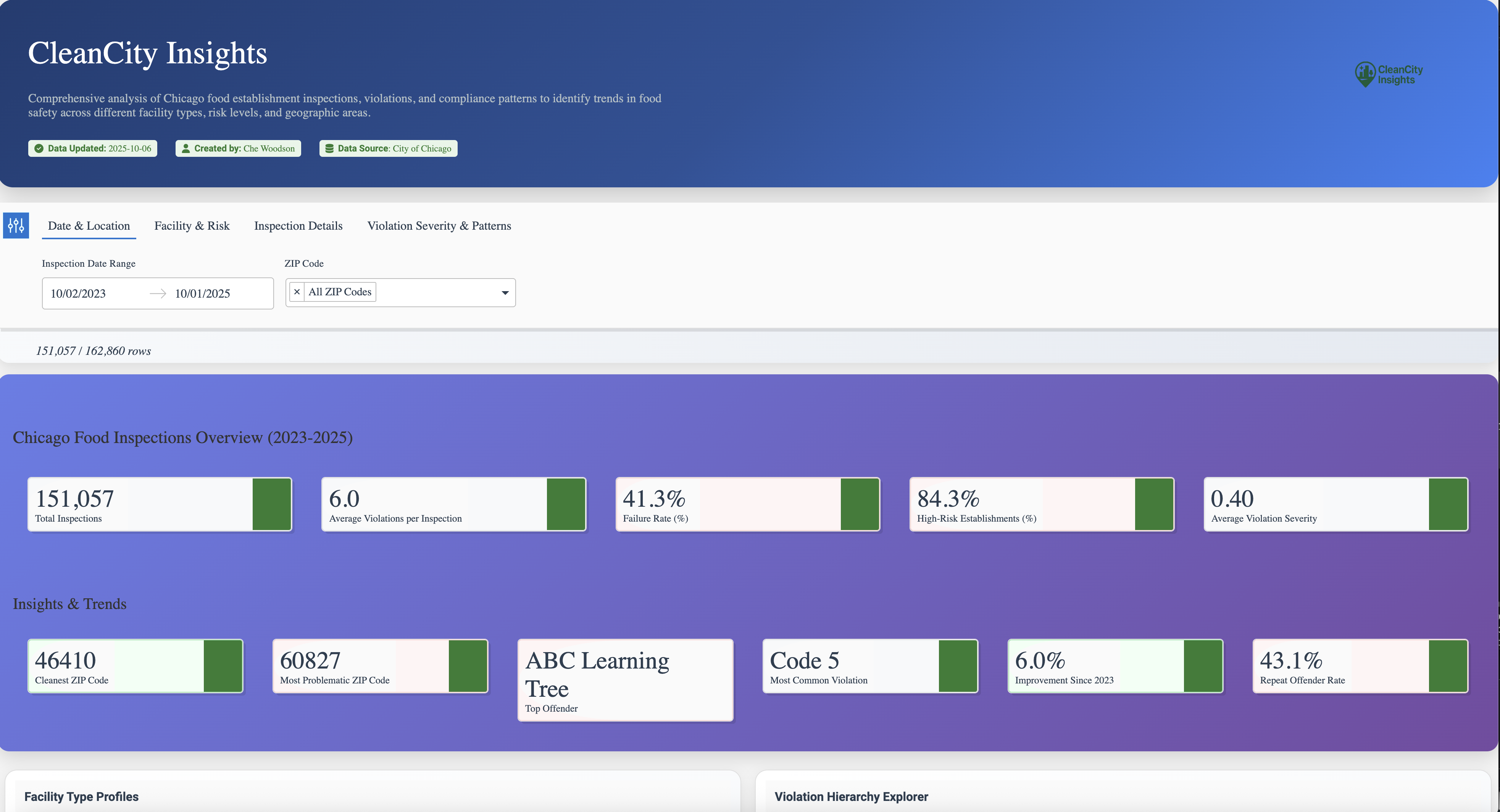
CleanCity Insights transforms thousands of inspection records from 2023–2025 into an interactive dashboard that maps food safety across Chicago. It turns raw inspection data into something anyone can understand — where their community stands, from spotless kitchens to areas that need attention.
How I built it
The core dataset had all the essentials (date, license, location, inspection results), but one field stood out: Violations — a long, free-form text column that included inspector comments and violation codes.
The problem was that the codes only mapped to broad categories, while the comments described how severe the issue really was.
I turned the inspector notes into something everyone can understand. I pulled out each issue mentioned, gave it a simple 0–1 “how serious is this?” score using a clear rubric, and bundled those scores into a clean table for every inspection. That way, the dashboard doesn’t just show where problems happened—it shows how big those problems were.
Finally, I built the dashboard in Plotly Studio, combining map visualizations, timeline charts, and filters to bring everything together. The result is a dashboard that feels alive — you can move around the city, zoom into a ZIP code, and instantly see patterns in cleanliness and safety.
Features
Global Filters
- Filter inspections by date range, facility type, risk level, result, and inspection type.
- Includes ZIP code selector, “Near Me” option, and severity score slider.
- Quick clear-all button with active filter chips.
Data Cards
- Key metrics: total inspections, avg. violations, failure rate, % high-risk, avg. severity.
- Highlights: cleanest ZIP, top violation category, and improvement since 2023.
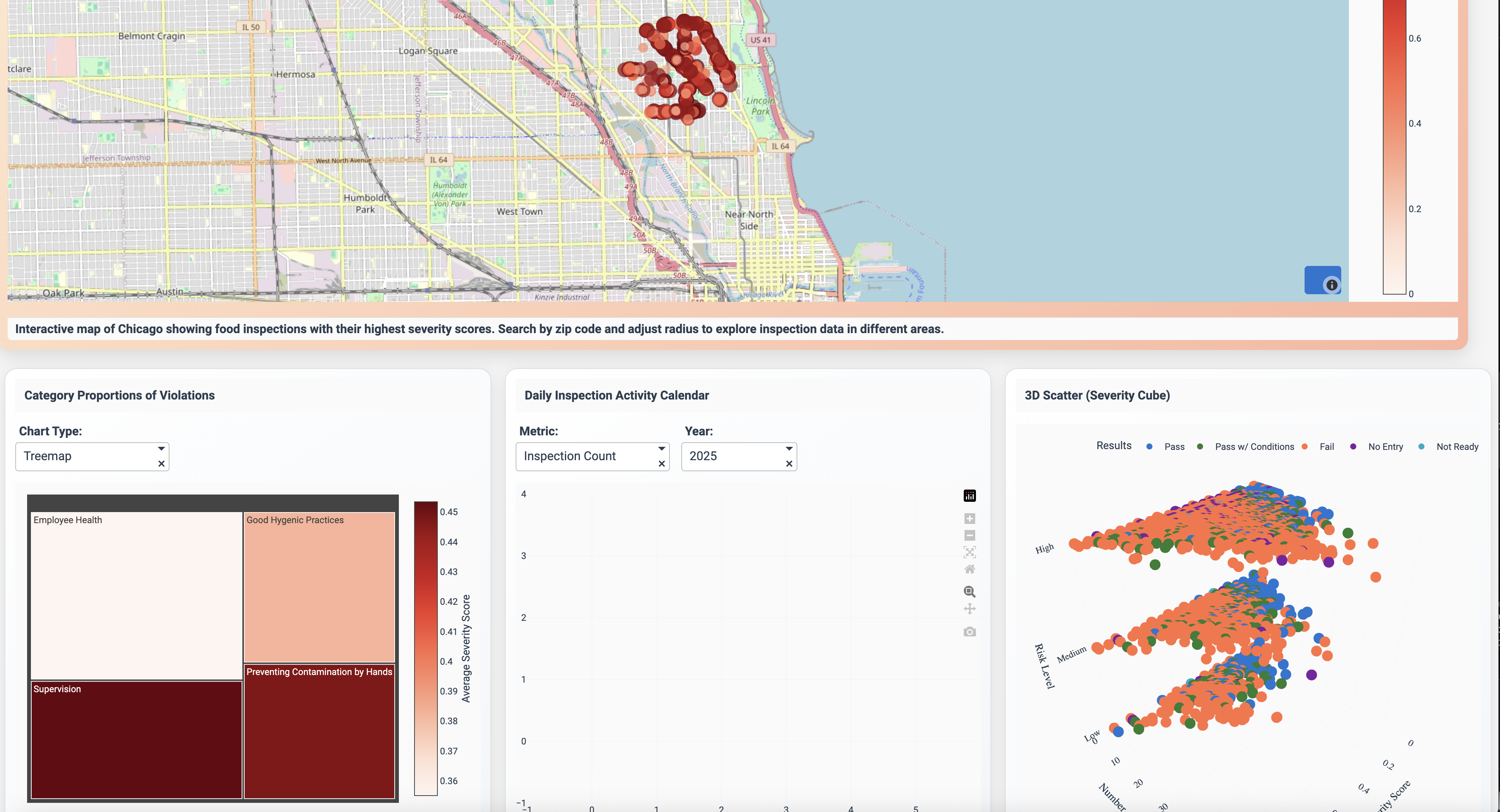
Nearby Restaurant Performance
- Lists restaurants in a selected ZIP with their latest results.
- Displays severity score, outcome badges, and quick detail popovers.
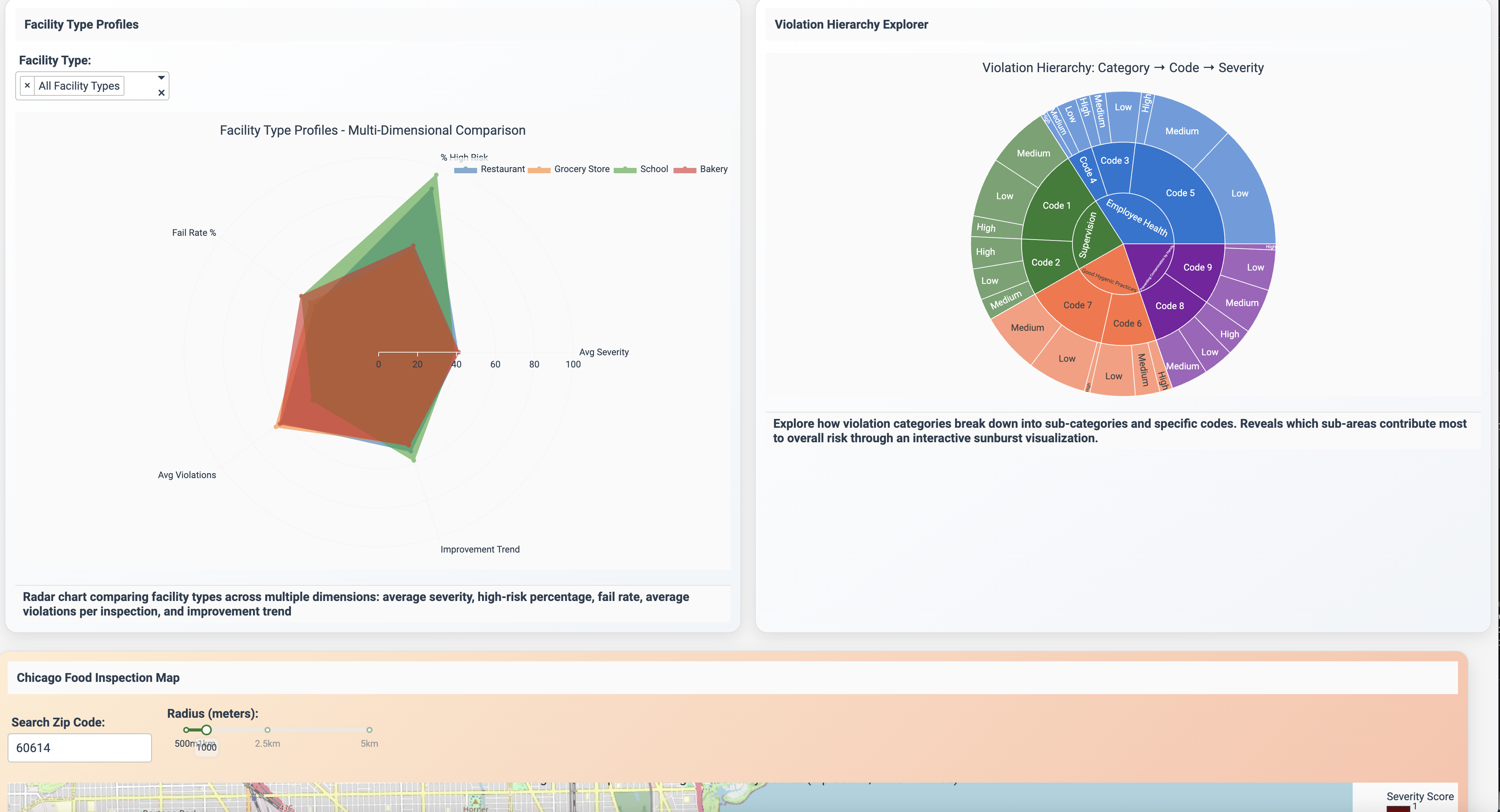
Violation Severity Timeline
- Tracks average severity scores over time.
- Highlights peaks and allows citywide vs. neighborhood comparison.
Violation Categories
- Ranks violation categories by frequency or severity.
- Interactive bars filter the rest of the dashboard.
Sankey Diagram
- Visualizes inspection outcome flows across visits (e.g., Fail → Pass).
- Flow width reflects frequency; supports chain vs. independent toggle.
...and more!
Challenges I ran into
I had to spend time figuring out how to describe my data clearly enough for it to produce meaningful charts. Choosing chart types, layouts, and filters that made the dashboard not only functional but easy and pleasant to explore. Sometimes the plots looked great but didn’t tell the story clearly, so I iterated a lot to balance clarity and style
Data Source
Original dataset was retrieved from the City of Chicago's data portal. https://data.cityofchicago.org/Health-Human-Services/Food-Inspections/4ijn-s7e5/about_data

Log in or sign up for Devpost to join the conversation.