-
-
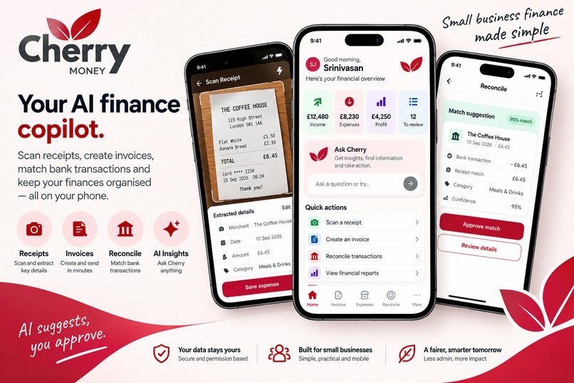
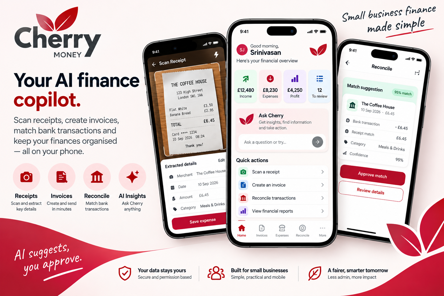
Your Ai finance copilot
-
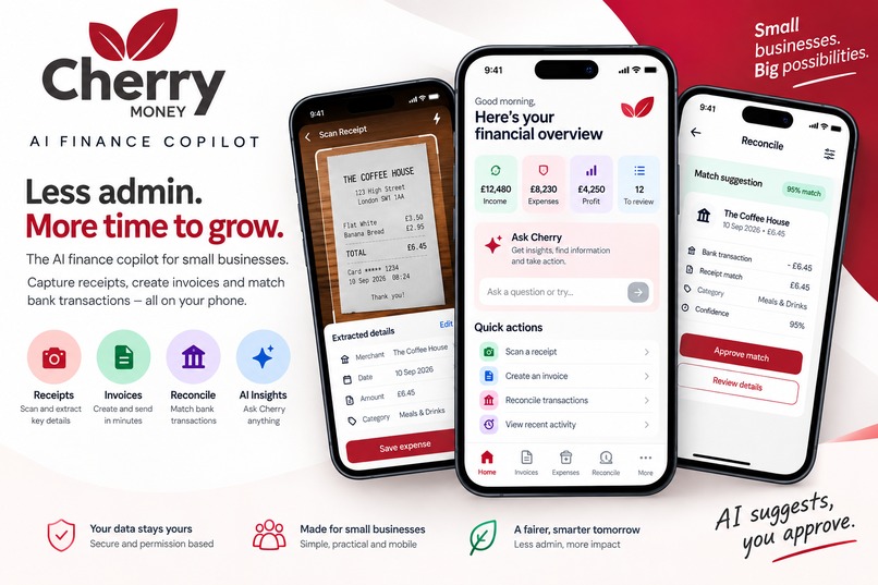
Less Admin, More time to grow
-
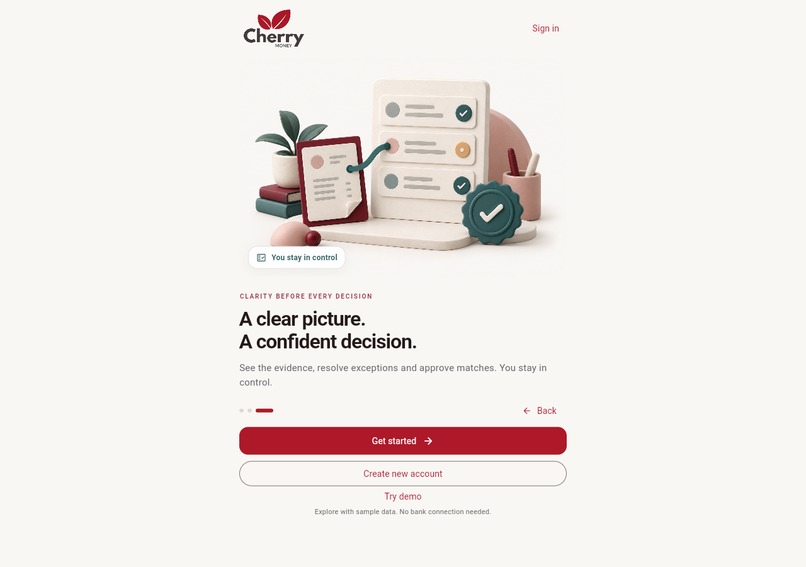
onboarding -2
-

onboarding -1
-
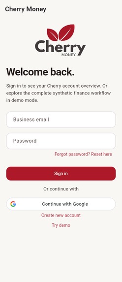
Google enabled login
-
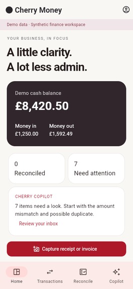
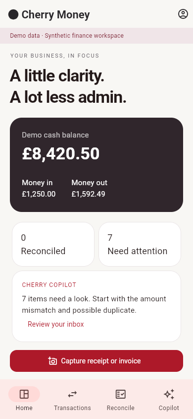
Dashboard
-
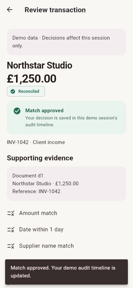
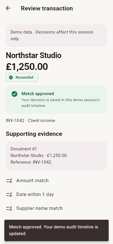
Review transaction - Approved
-
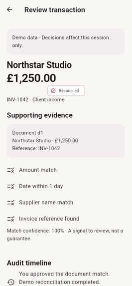
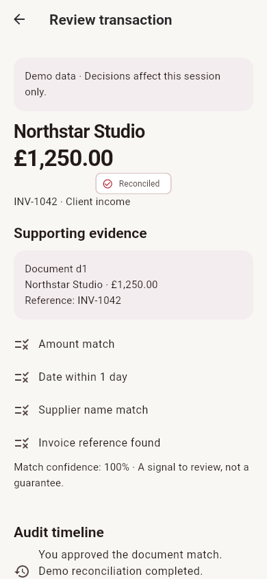
reconcilled
Inspiration
Cherry Money grew out of our experience running small businesses and community organisations. We wanted to spend our time building services and supporting people—not chasing invoices, checking bank statements and reconstructing what a payment was for months after it happened.
The problem was not simply missing software. It was the work between the tools: a receipt on a phone, an invoice in another system, a transaction in a bank account, and someone having to connect them all.
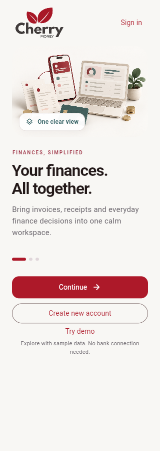
That led us to a simple idea: bring the paperwork, the financial context and the next decision into one mobile workspace.
Cherry Money Mobile is our answer: an AI finance copilot that helps owners capture information, understand what needs attention and review suggested actions without giving up control.
Our guiding principle is “AI suggests, you approve.”
What it does
Cherry Money Mobile brings everyday finance tasks into a phone-friendly workflow:
Capture → understand → match → review → approve.
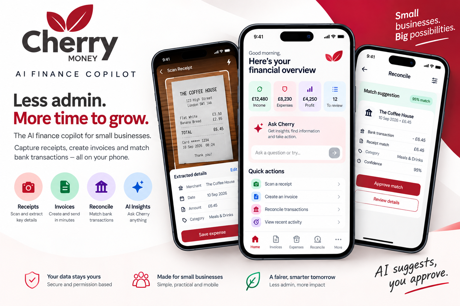
Users can photograph or upload a receipt image, receive extracted information, correct the fields and confirm an expense with its receipt attached. Instead of treating extraction as unquestionable, the review step keeps the user responsible for checking the result.
The app also includes invoice, quotation and expense creation, together with access to customer, product and payment records. Ask Cherry lets users ask questions about their business information and enter guided workflows. Actions that create records use structured fields and confirmation screens rather than relying on an unrestricted chat instruction.
For reconciliation, users can view bank activity available through their connected company account, request a match suggestion, review the supporting information and approve a prepared proposal. Recording a reconciliation is separate from transferring money: this workflow does not autonomously move funds.
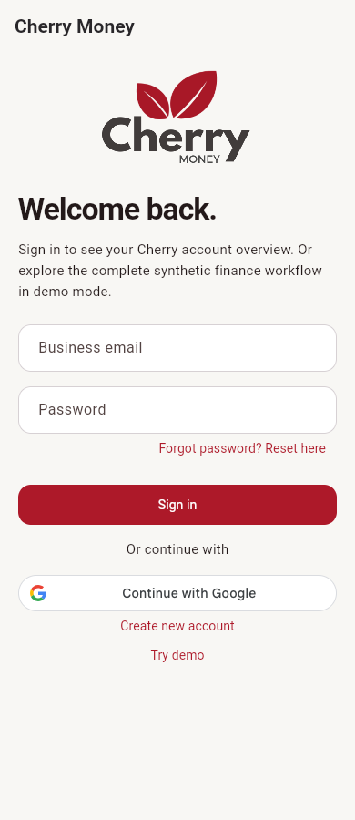
A clearly labelled demo workspace lets people explore the experience without connecting their bank or uploading private business records. Its sample receipts, transactions and exception scenarios are synthetic.
RevenueCat provides the prototype Free-to-Pro journey, including product loading, purchase, restore and entitlement refresh. The current Test Store build demonstrates expanded demo allowances and a premium insight screen; commercial store billing and broader live premium functionality remain release milestones.
How we built it
We built the mobile application in Flutter and Dart, using Riverpod for state management, GoRouter for navigation, Dio for API communication and secure native storage for authentication tokens. RevenueCat’s Flutter SDK handles the subscription integration.
We did not start with an entirely new business platform. Cherry Money already had a web application, backend services and an earlier Ionic/Angular mobile implementation. Those provided the foundation and feature references. This project’s contribution is the separate Flutter experience, the focused review-and-approval workflow, mobile API additions and RevenueCat integration. The existing PHP/Laravel backend remains part of the architecture.
Receipt images pass through authenticated mobile endpoints to server-side extraction, which returns editable structured information. Ask Cherry and the finance workflows reuse backend services and company permissions. Sensitive provider credentials remain on the server rather than inside the app.
We also kept the distinction between native and web functionality visible. Core mobile workflows have dedicated screens; advanced features that still belong to the existing website open there rather than being presented as completed native features.
Development included automated tests, static analysis, Android builds and browser-based interaction checks. We used the browser preview to iterate on layout and navigation, while treating native permissions, device behaviour and store purchases as separate verification tasks.
Challenges we ran into
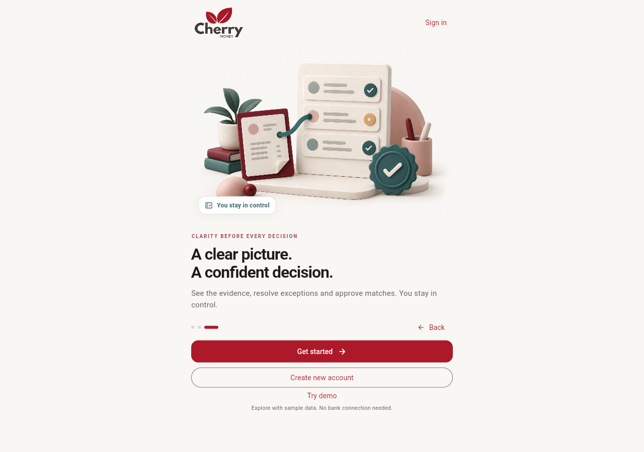
Making assistance useful without making it overconfident. A plausible match is not necessarily a correct match. We designed the experience around editable information, visible evidence and explicit approval. The goal was to help someone make a decision—not conceal uncertainty behind a confident-looking result.
Turning an existing product into a focused mobile experience. Bringing a broad finance platform onto a small screen required choices. We prioritised capture, everyday record creation and reconciliation, while retaining clearly identified web routes for advanced work. Authentication, API permissions and navigation also needed attention; a mobile rebuild is more than a visual redesign.
Treating subscriptions as more than a paywall. Loading an offering is only one part of the journey. We had to handle purchase results, restoration and entitlement refresh without pretending a purchase succeeded. The prototype also exposed work still needed for commercial release: linking subscriptions to authenticated accounts and replacing device-local usage limits with server-side enforcement.
Keeping the demonstration honest. Demo data made it possible to show the workflow without exposing private financial information, but it needed a clear boundary. Sample extraction is labelled as sample extraction, and fixture-based tests are not presented as proof of live customer transactions.
Accomplishments that we're proud of
We are proud of bringing the central experience together in a Flutter application: capture a document, inspect information, review a proposed match and make an explicit decision. It gives the project a coherent workflow rather than a collection of disconnected finance screens.
Our recorded validation milestones include 48 passing Flutter tests, successful Android builds and an Android-emulator RevenueCat Test Store purchase that activated Pro access. Restoring purchases retained the active entitlement. These are development milestones—not production sales or Apple/Google store-billing verification.
We also made room for interface details that matter: readable financial amounts, clear loading and approval feedback, larger-text layouts and reduced-motion behaviour. Browser checks covered narrow screens and enlarged text rather than only a polished default screenshot.
Most importantly, the project preserves a deliberate boundary: help the user do the work, but keep consequential decisions with the user.
What we learned
We learned that a useful finance copilot needs more than an AI response. It needs context, clear permissions, understandable evidence and a reliable way for the user to confirm or correct the next action.
We also learned to distinguish different kinds of progress. A passing test, a working browser demonstration, an emulator purchase and a verified real-account workflow each answer different questions. None should automatically stand in for the others.
Building the mobile experience reinforced the value of focus. The most useful screen is not necessarily the one with the most information; it is the one that makes the next task understandable.
Finally, monetisation sharpened the product question: what useful, repeatable value are people upgrading for? Our aim is to make Pro valuable through everyday financial work, not simply through a more prominent upgrade button.
What's next for Cherry Money Mobile - AI Finance Copilot
Our immediate priority is release readiness: completing real-account end-to-end checks, native camera and permission testing, Apple/Google store configuration, signed sandbox purchase testing and the remaining privacy, account-management and subscription controls. Current live-workflow verification includes automated and fixture-based checks; real-account validation remains an important milestone.
We then plan to strengthen account-linked Pro access, server-verified entitlements and cross-device usage controls, while extending premium value into the live finance workflows.
After that, we want to pilot the app with small businesses and community organisations, using their feedback to improve receipt handling, reconciliation review and the tasks that still require a switch to the website.
We plan to measure practical outcomes: time taken to complete a task, how often suggestions need correction, whether users understand the evidence, and whether the app becomes part of their regular routine.
Our ambition is simple: less financial administration, clearer decisions and more time for the work that made someone start their organisation in the first place.


Log in or sign up for Devpost to join the conversation.