-
-
cover photo for the project
** 1. Prototype link ** [https://www.figma.com/proto/IeDzBSjSq3yqugfw0fkBFl/rice-25?node-id=70-3463&starting-point-node-id=70%3A3463&t=jZ5RGxEjLO6VwFqe-1]
** 2. Describe your project (max 150 words)** Our project is a mobile app that acts as a unified platform for sharing and accessing resources in natural disasters or extreme weather events. Organizations or individuals can make posts calling for donations/resources they need from the community, and supporters can view these posts and take action. The main features focus on empathy and time sensitivity.
As two UCLA students, this project was inspired by our community’s experience with the past month’s Palisades and Eaton fires. This event had a shocking impact on many of us, burning down the homes of some faculty and students, and interrupting instruction. Our app aims to reduce the overwhelming stress and confusion that come with these sudden events, and to help foster a sense of community and security amidst uncertainty.
** 3. Describe your research process and findings. If you conducted any surveys or interviews, please include the survey form and/or interview questions here. If you conducted secondary research by pulling from online sources, please include a link to your sources. (Max 500 words) ** Our research entailed a survey, interviews, secondary research (competitor analysis), and personal experiences.
To be human is to maintain empathy, community, and accessibility to living necessities. The prompt to address human needs reminded us of Maslow’s hierarchy of needs. Inspired by our recent challenges with the fires in Los Angeles, we saw a large potential impact in making an app for natural disasters, in which large communities need resources, but may find it overwhelming and confusing, especially across multiple platforms not designed for these specific situations. The app addresses four of the pyramid’s basic and complex human needs: ESTEEM, by maintaining empathy and hope through charity; SOCIAL, connecting and caring for our communities, and SAFETY, trustworthiness with organizations and individuals; and PHYSIOLOGICAL, increasing accessibility to living necessities.
SURVEY & INTERVIEW FINDINGS Link to questions for survey [https://docs.google.com/forms/d/e/1FAIpQLScKHRlr8Tctx0tbndbL81TVnpdczJ86OxZJiz6-A-UgiaO4Hg/viewform] and interview [https://docs.google.com/document/d/1lW3XNNaZdctiaLhk8wctQ2O6jXm3noOT0SJPCGN7vuc/edit?tab=t.0].
The most common difficulties with finding resources were:
1) Information Overload: When an event has suddenly impacted a large community, it’s overwhelming and stressful to figure out the status of safety, learn how to prepare for the conditions, and find the best sources to get what you need.
2) Lack of official sources & specific information: It can be difficult to find trustworthy and safe sources when many organizations and individuals open their own drives. Resources are also shared across many platforms, on Instagram (word of mouth within users’ private and public networks), Google, Reddit, TikTok, Facebook.
SECONDARY RESEARCH: COMPETITOR ANALYSIS GoFundMe shares a similar objective to share information in a time-sensitive manner and encourage actionable engagement.
Some helpful intentions and corresponding features were: 1) Relaying empathy for the user in emotionally-vulnerable situations:
- using empathetic language and “empathy takeover” screens
- make decision-making less overwhelming by reducing the cognitive load category filter layout
2) Encouraging the community to take action:
- communicating urgency to inform donors & encourage taking action soon: date banner above the listing, ex. stating “3 days until funeral service.”
- floating take action button that follows the user across pages
Links [https://medium.com/gofundme-stories/helpful-and-empathetic-design-for-when-people-need-us-most-d3ea18ff764b] & [https://medium.com/gofundme-stories/designing-a-new-look-for-the-internets-take-action-button-f60799737a9c]
Your most important design decisions (Max 500 words) Encouraging the community to take action:
- verified badges on organization/individual profiles to confirm the trustworthiness
- timeliness badges to show how current a post is, so that users have confidence that it’s still active and not outdated (ex. “New Today,” “3 days ago”)
- floating “Help out” button so that it’s always clickable to contribute, at any point the user is viewing a post
Relaying empathy and fostering a less overwhelming experience
- empathetic language in prompts and explanations (create a post user flow)
- progress bars for progress in reaching a donation goal, and finishing the steps to create a post
** 4. Describe your most important design decisions. What research findings and/or user testing results led you to make these decisions? (Max 500 words) ** Our design decisions were guided by user research, competitive analysis, and usability principles to ensure a seamless experience during times of crisis. Below are the most critical design choices we made:
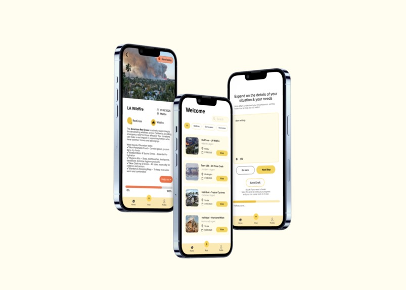
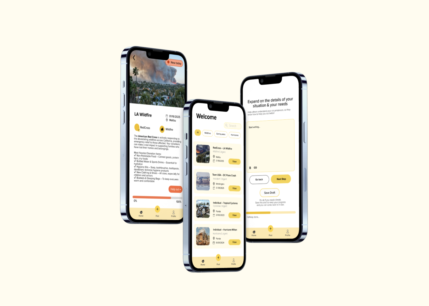
** 1. Centralized Donation Event Page** Decision: We consolidated all disaster relief donation events and resources into a single page, eliminating the need for users to navigate multiple platforms.
Research Insight: Our user survey revealed that people experienced information overload during disasters, as updates were scattered across different sources (social media, news sites, and nonprofit organizations). This lack of a unified platform made it difficult for users to access and act on critical information quickly. By aggregating all resources in one place, we streamlined the donation process and improved accessibility.
** 2. Urgent Action Indicators ** Decision: We introduced a "Current/New" badge system to highlight ongoing and time-sensitive donation events, ensuring users could quickly identify urgent opportunities for support.
Research Insight: Our competitive analysis of the GoFundMe app showed that people are more likely to donate when a fundraiser conveys urgency. By incorporating real-time status updates, we enhanced clarity and prompted immediate action from users who wanted to contribute.
** 3. Reducing Overwhelm Through Simplified UI ** Decision: We implemented design elements that reduced cognitive load and made the donation process feel more manageable, including:
- Progress Bars: Clearly showing the impact of donations to encourage continued contributions. Minimal Text & Buttons: Simplifying calls to action to prevent decision fatigue.
- Single Photo Per Event: Using one powerful image per donation request to evoke empathy without overwhelming users.
- Research Insight: Our usability testing revealed that users often felt emotionally overwhelmed by excessive images, long descriptions, and multiple action buttons. To address this, we followed UX best practices focused on progressive disclosure—providing essential information upfront while allowing users to explore details at their own pace.
Built With
- figjam
- figma

Log in or sign up for Devpost to join the conversation.