-
-
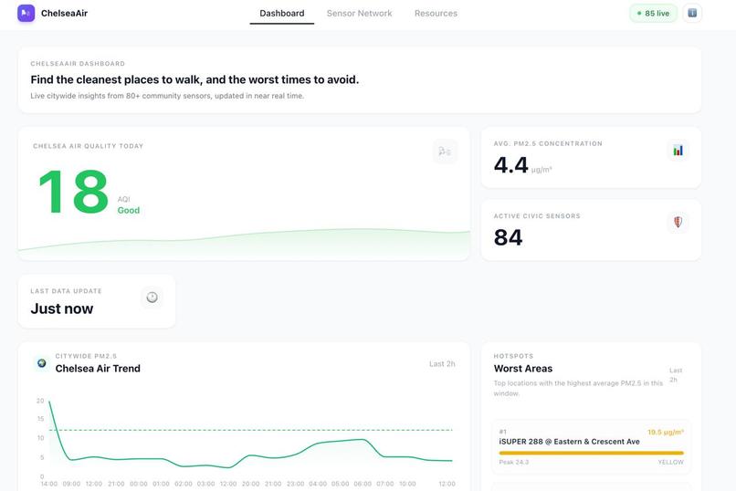
ChelseaAir Dashboard: real‑time AQI, trends, and hotspots at a glance
-
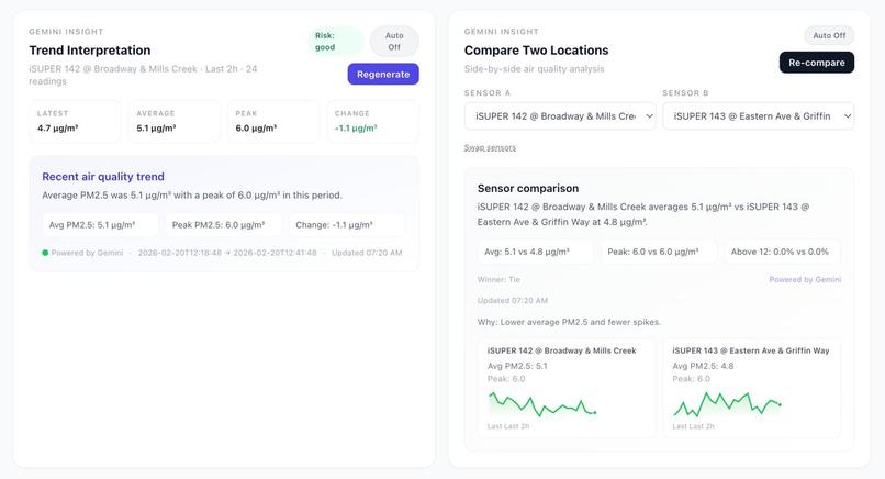
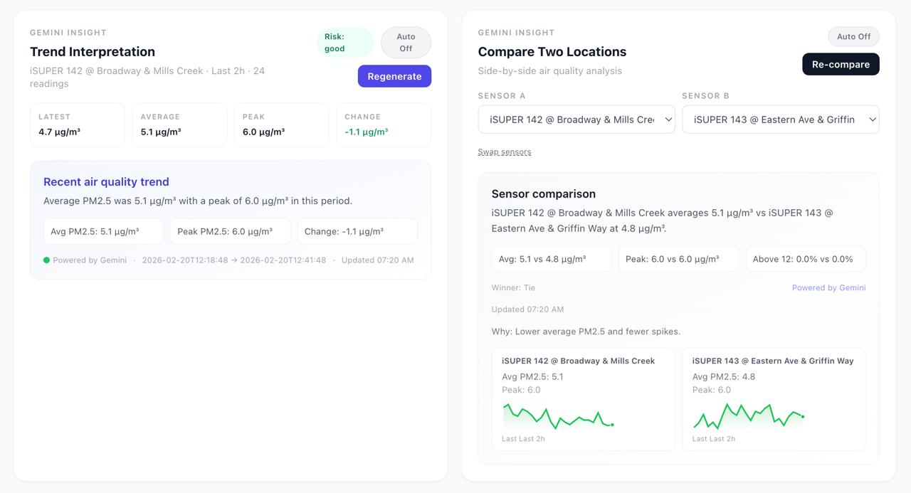
AI‑generated explanations of air‑quality trends and location comparison
-
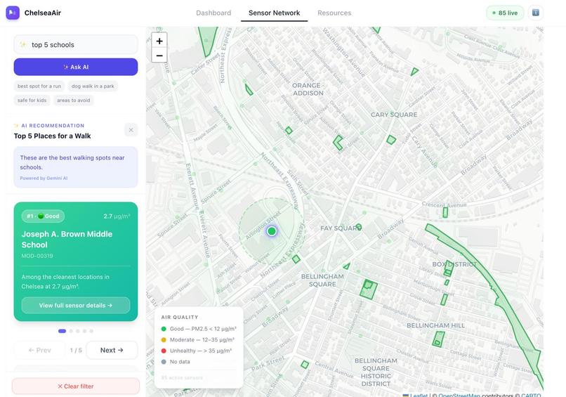
Ranked clean‑air locations on the map

Inspiration
We built ChelseaAir because community members in Chelsea need air‑quality data that is clear, local, and actionable. GreenRoots and the iSUPER sensor network make real‑time data available, but raw readings don’t answer the question people actually ask: “Where and when is the air worst — and what should I do today?” Our goal is to translate high‑frequency sensor data into visual insight and plain‑language guidance.
What We Built
ChelseaAir is a visual dashboard + AI‑assisted map experience:
- Citywide trends, hotspots, and an hourly heatmap to show when air quality is worst.
- Sensor network map for location‑specific context.
- AI search (e.g., “safe for kids near playgrounds”) that maps natural language to recommendations.
- Gemini insights that interpret trends and compare two locations in plain language.
We aggregate minute‑level readings into meaningful summaries and keep the UI focused on what residents and organizers need: cleanest routes, worst areas, and clear explanations.
How We Built It
- Frontend: React + data‑viz components for trends, hotspots, heatmap, and map layers.
- Backend: Spring Boot API aggregating 80+ sensors, generating citywide insights, and caching results.
- Data: iSUPER / QuantAQ sensors with high‑frequency PM2.5 data.
- AI (Gemini):
- Converts natural‑language requests into structured intent:
activity + location filter. - Generates readable summaries and comparisons from sensor statistics.
- Converts natural‑language requests into structured intent:
We compute key metrics like citywide average PM2.5 using:
$$ \overline{PM}{2.5}(t)=\frac{1}{n}\sum{i=1}^{n} PM_{2.5,i}(t) $$
These values feed the trend lines, hotspot ranking, and hourly heatmap.
Challenges We Faced
- Latency & scale: Pulling data from 80+ sensors can be slow. We solved this with parallel requests and caching.
- Data sparsity: Some hours have missing data. We explicitly show “no data” in the heatmap to avoid misleading users.
- Interpretability: Raw numbers are hard to understand. We added Gemini summaries, risk labels, and clear thresholds (e.g., 12 and 35 µg/m³).
- Trust & ethics: We keep data sources transparent and provide plain‑language explanations to avoid “black box” AI decisions.
What We Learned
- How to translate raw environmental data into meaningful stories.
- Building fast, user‑friendly visualizations for civic audiences.
- Using Gemini responsibly as a structured insight generator, not just a chatbot.
- Designing for community impact: clarity, accessibility, and transparency matter more than flashy features.
Built With
- java
- javascript
- quantaq
- react
- spring
- vite

Log in or sign up for Devpost to join the conversation.