-
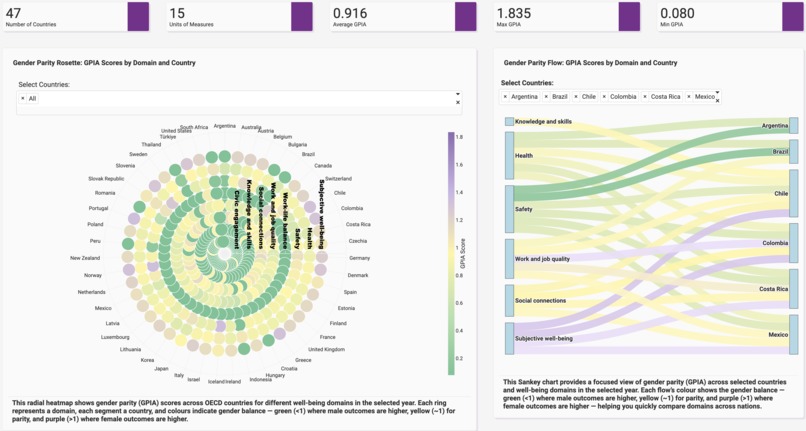
Innovative and unconventional visualizations to depict gender parity by domain and country
-
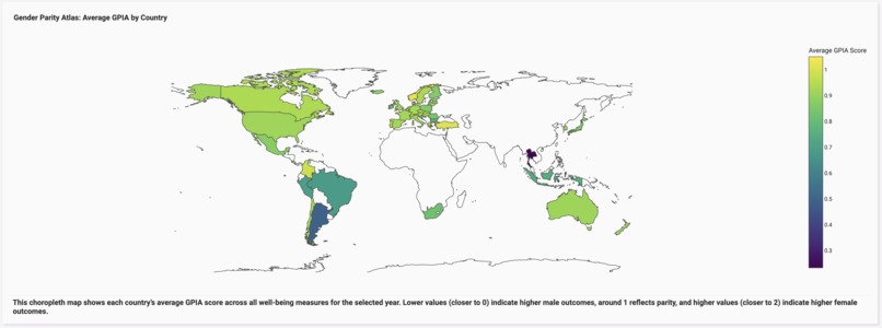
Global view of gender parity per year
-

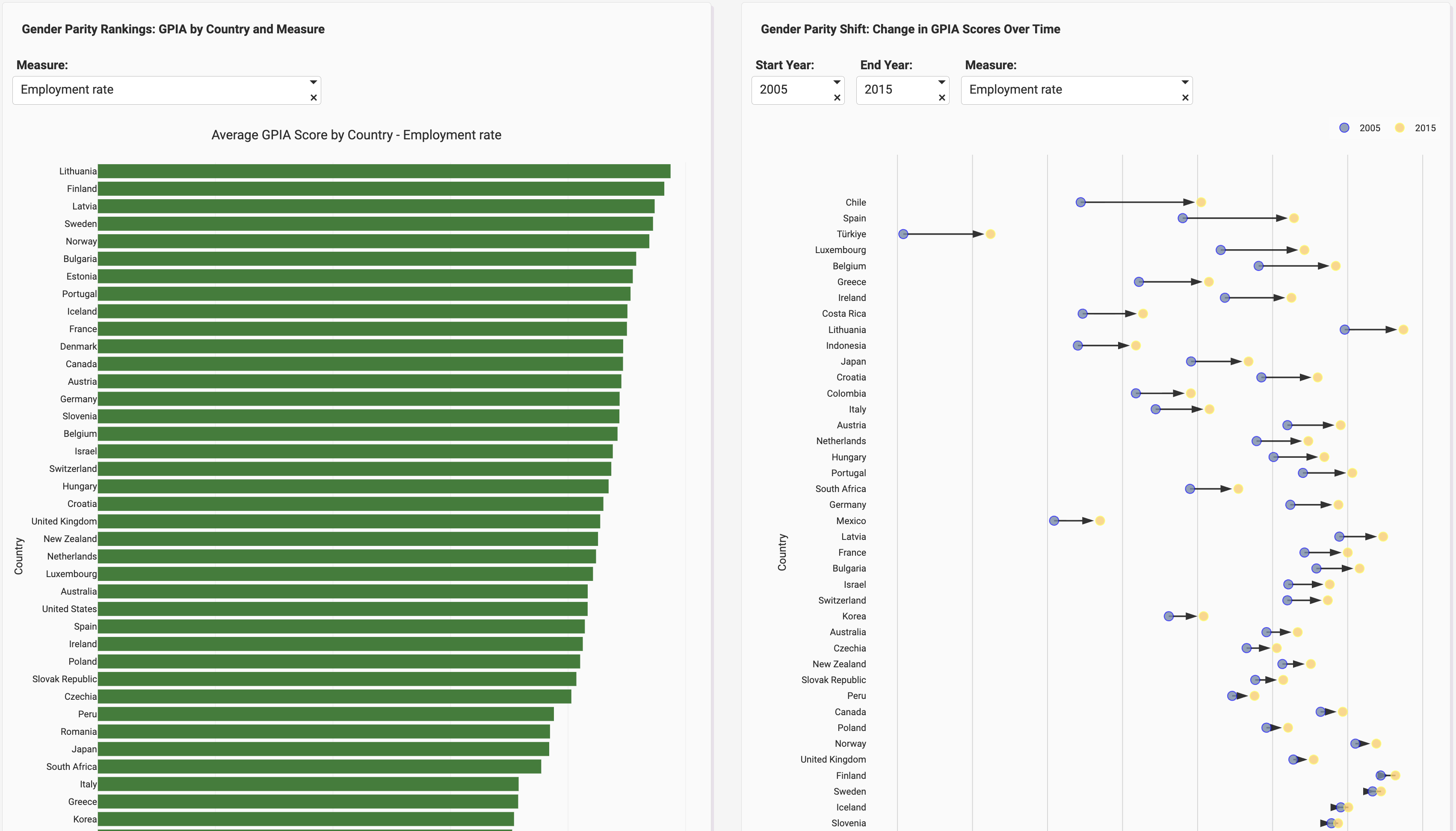
Countries ranked by gender parity per measure and visualizing shifts of gender parity over time
-
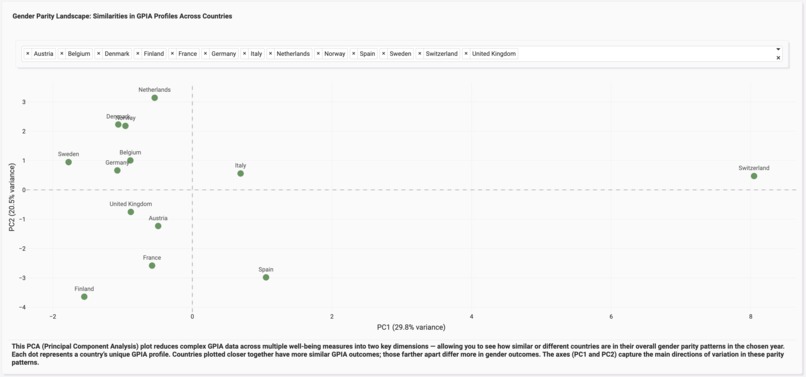
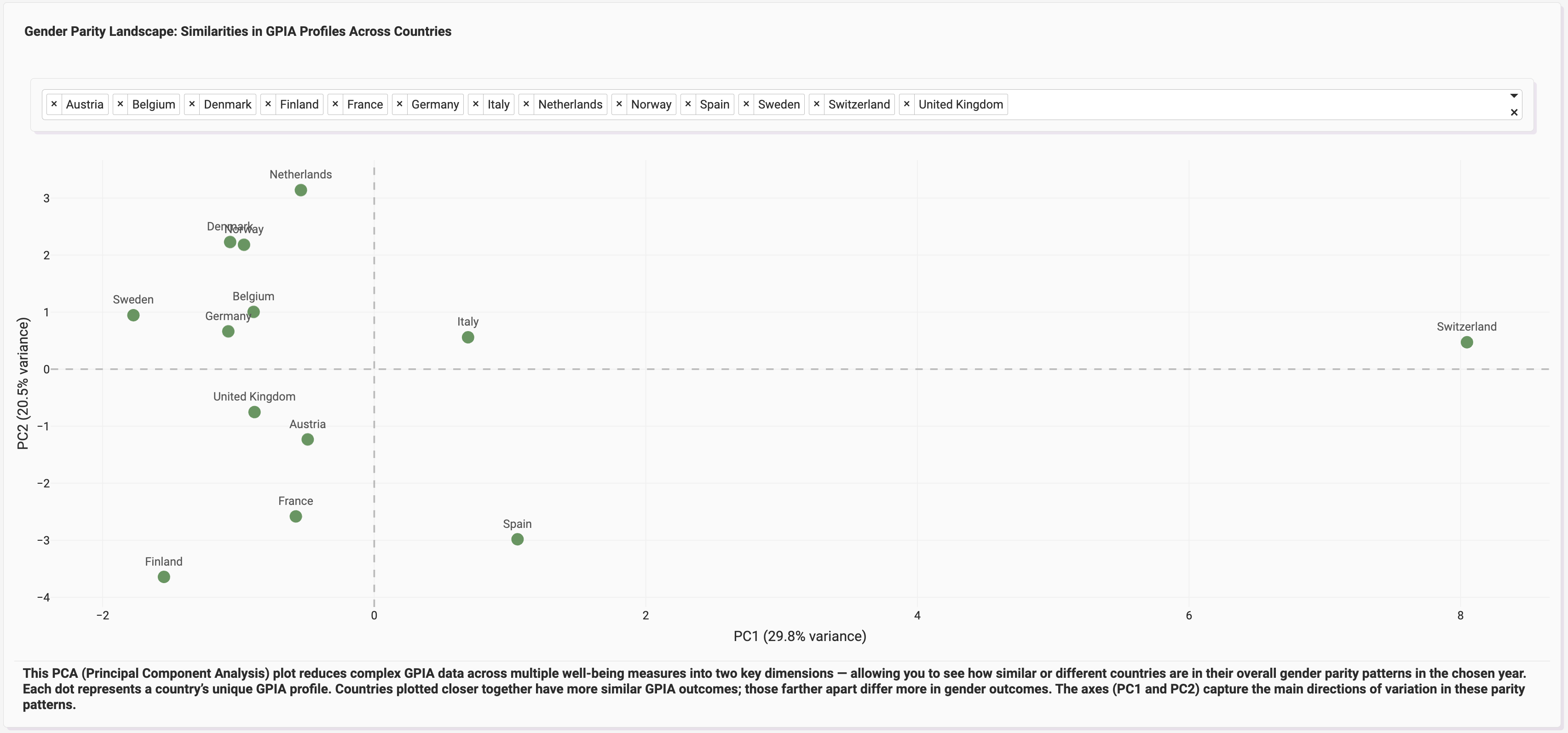
Principal Components Analysis (PCA) to view similarities and dissimilarities within countries based on their gender parity profiles

Inspiration
The inspiration for Charting Gender Parity came from Caroline Criado Perez’s groundbreaking book Invisible Women. The book reveals how gender inequality often stems not from deliberate bias alone, but from the absence of gender-disaggregated data — the simple act of not measuring women’s experiences. For decades, data systems have failed to capture the nuances of how men and women experience the world differently. When I explored the OECD Well-Being dataset, I saw an opportunity: here was a dataset rich with gendered measures — a chance to make the invisible visible.
This dashboard was born from a simple question:
What if we could clearly see where gender parity stands — across countries, domains, and time — using real, comparable data?
What it does
Charting Gender Parity visualizes gender parity across well-being domains such as health, education, work, and safety, using the Adjusted Gender Parity Index (GPIA). The GPIA quantifies how male and female outcomes compare for each indicator, making results symmetrical around parity (1).
GPIA Calculation
$$ \text{GPIA}=\min\left(\frac{\text{Female Value}}{\text{Male Value}},\,2-\frac{\text{Female Value}}{\text{Male Value}}\right) $$
How I built it
I began by filtering the OECD Well-Being dataset to retain only gender-disaggregated indicators. Using Python, I calculated GPIA scores for each measure, country, and year, producing a clean dataset structured for analysis.
The dashboard was built entirely in Plotly Studio, where each visualization was iteratively refined. I made targeted code edits to improve visual precision whenever AI-generated outputs missed finer details. Every chart was designed to tell one part of the gender parity story — together forming a cohesive analytical narrative.
Challenges I ran into
The main challenge was prompt precision and layout control. It was often difficult to make the AI understand the finer visualization details I wanted — particularly when adding new charts later in the process. Getting the layout right, ensuring charts were ordered logically, and achieving aesthetic balance required manual code adjustments and patient iteration.
This process taught me to communicate more clearly with AI systems — and to blend automation with human oversight for best results.
Accomplishments that I am proud of
- Transforming raw well-being data into a clear, interactive narrative on gender parity.
- Creating a symmetrical and interpretable index (GPIA) that captures differences in outcomes without bias.
- Building the entire dashboard using AI-assisted design while maintaining human-level quality control.
- Shedding light on gendered well-being data in a way that is accessible, evidence-based, and visually engaging.
What I learned
I learned that data visualization is storytelling with evidence. The challenge is not just to present data, but to frame it responsibly — to respect the nuance behind each number while making insights intuitive. I also learned how to collaborate effectively with AI tools, translating analytical ideas into compelling visuals while retaining creative control.
What's next for Charting Gender Parity
This version focuses on OECD countries, but the goal is global. Next steps include:
- Integrating UN and World Bank datasets for broader coverage.
- Extending analysis to developing countries for a more complete global picture.
- Incorporating machine learning clustering to reveal hidden parity patterns.
- Enabling policy insights and recommendations based on data trends.
Ultimately, Charting Gender Parity aims to evolve into a global, living dashboard — one that empowers data-driven decisions toward true gender equality.
Built With
- plotlystudio


Log in or sign up for Devpost to join the conversation.