-
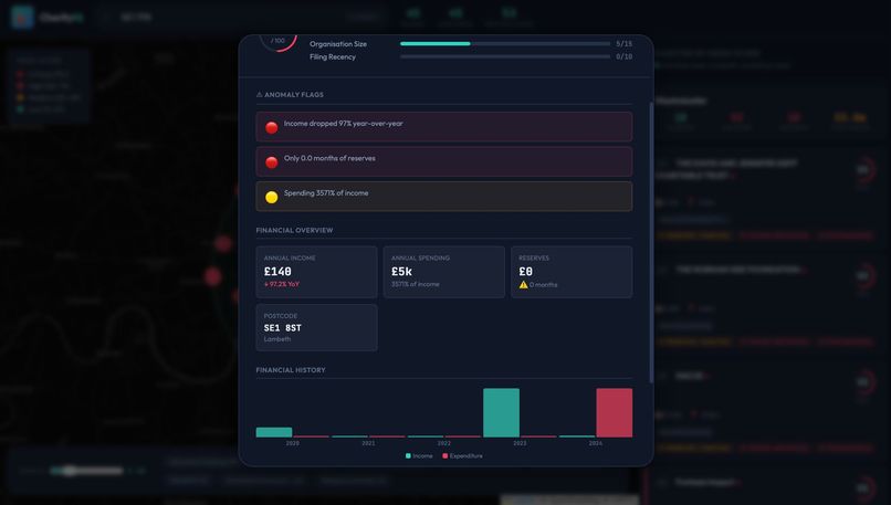
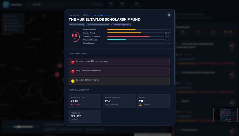
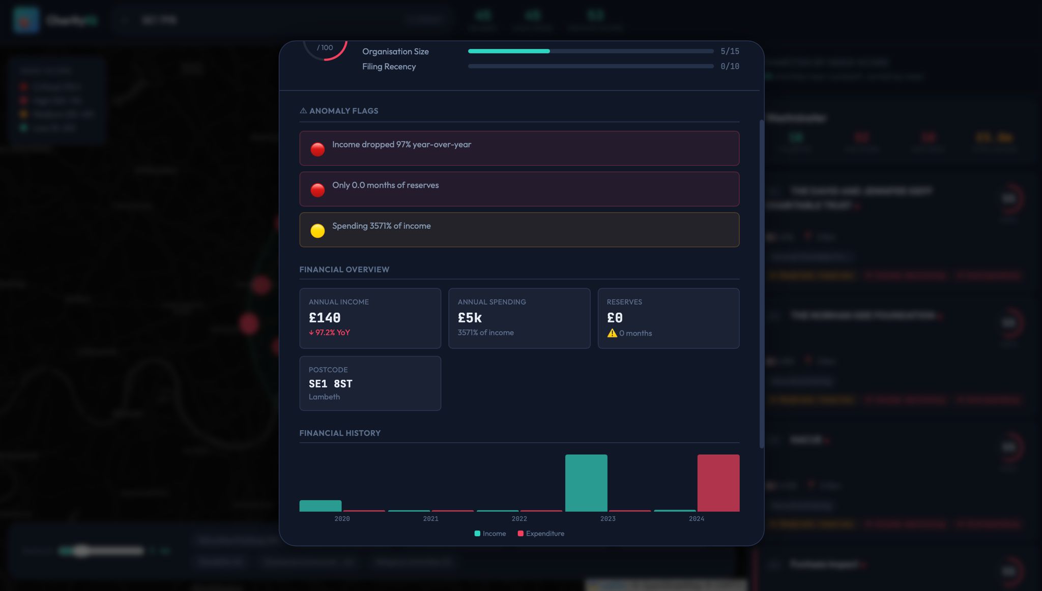
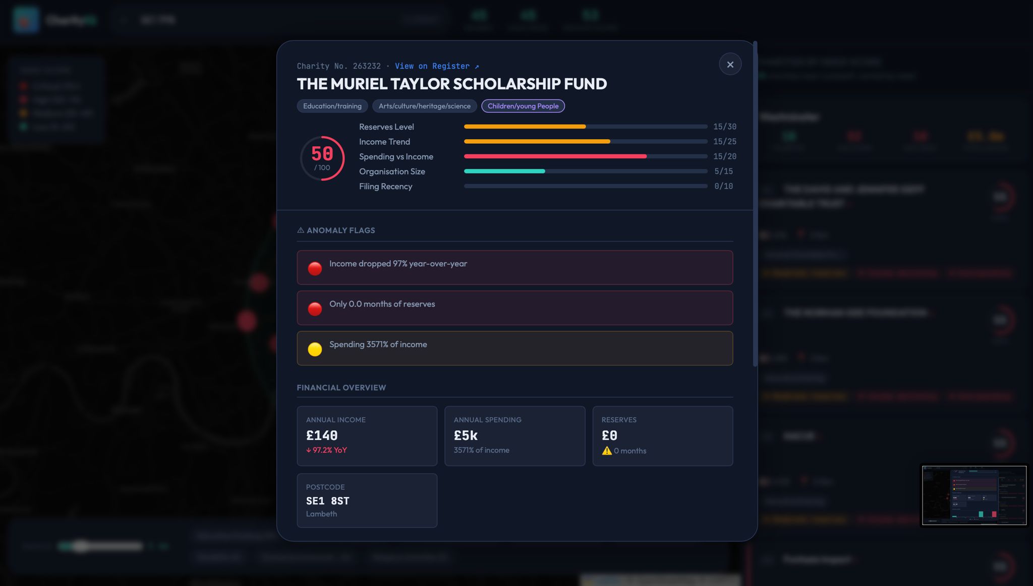
Information about the charity's recent funding and spending
-
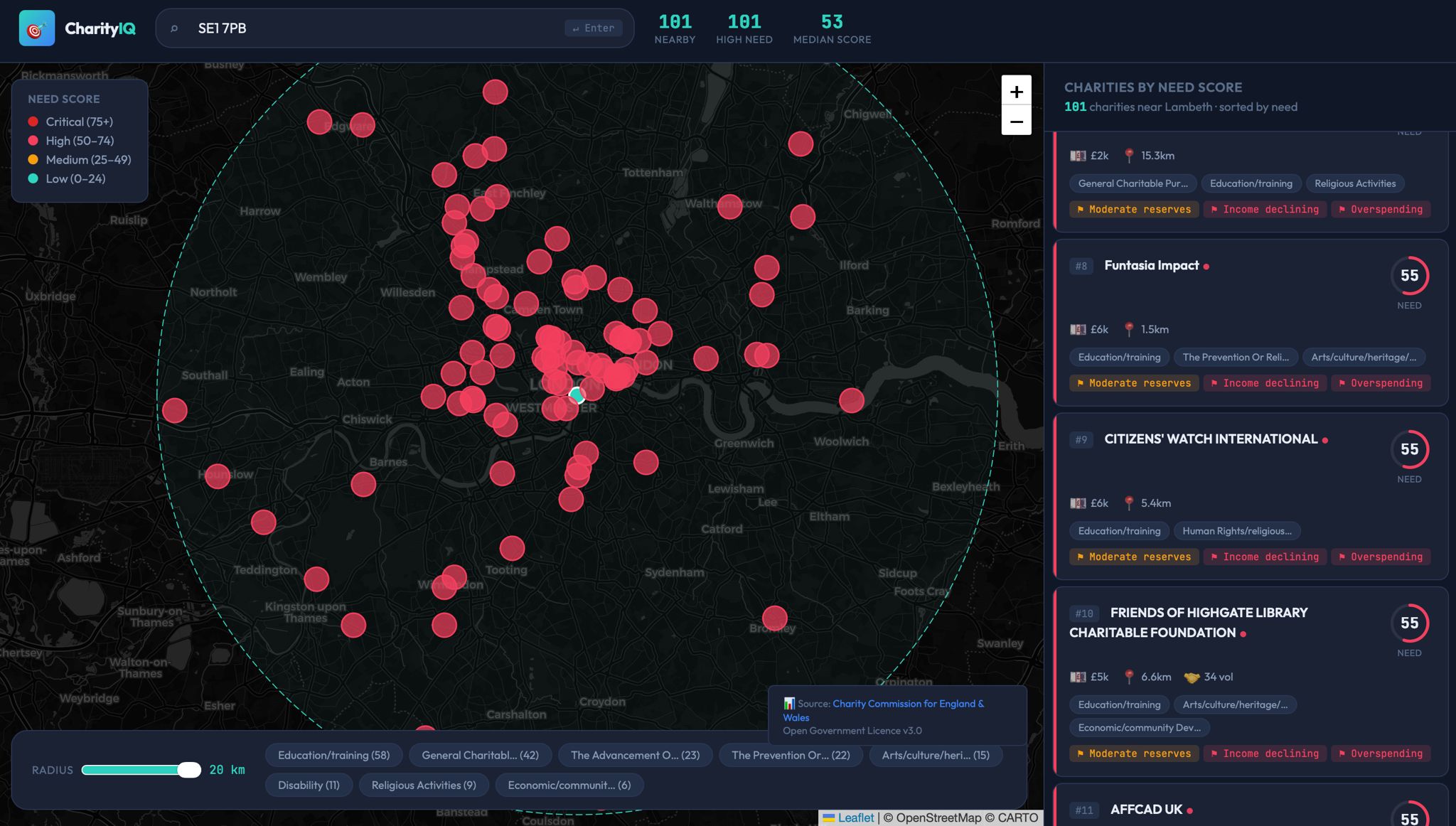
Charity information key
-
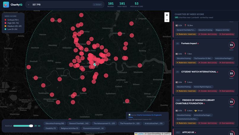
Location of charities in a nearby radius to the postcode
\documentclass{article}
\begin{document}
\title{Charity Intelligence Map for Local Giving} \author{Dipesh Dhavala \ Om Patel \ Rohan Chakra} \date{\today} \maketitle
\section{Inspiration} Local giving is surprisingly hard to do well. If you want to donate near you (or pick a charity for a society or corporate volunteering day), you usually end up with search results and whoever has the best marketing. That can miss smaller charities that do important work but look financially fragile. We wanted a decision tool that answers the question of charitable allocation when faced upon a choice using transparent, explainable signals rather than vague impressions.
\section{What it does} Charity Intelligence Map for Local Giving is a local impact discovery tool. A user enters a UK postcode, and the tool: \begin{itemize} \item Finds nearby registered charities and maps them by distance \item Groups them into cause areas (for example homelessness, youth, mental health) \item Computes an explainable Need or Urgency Score using interpretable signals such as: \begin{itemize} \item Reserves runway (reserves divided by monthly spending) \item Income volatility and income trend indicators \item Spending contraction and spending stability signals \item Local concentration indicators for small-area charities \end{itemize}
\item Produces a ranked shortlist with an explainability panel for each charity \end{itemize}
The tool is not claiming certain charities are better. It is reporting that, if the goal is marginal impact locally, some charities appear more constrained by funding based on objective signals.
\section{How we built it} We deliberately kept the data surface small and manageable: \begin{itemize} \item Charity Commission for England and Wales Register API as the main source (charity details, activities, and financial signals from filings where available) \item Postcodes.io as an optional utility to convert a postcode into latitude and longitude for distance calculations and map placement \end{itemize}
Pipeline: \begin{enumerate} \item User input to location: postcode converted to latitude and longitude \item Fetch local charities: retrieve charities within a chosen local radius or relevant administrative area \item Text to cause clustering: lightweight NLP on charity descriptions and objectives to label mission areas \item Compute Need Score: derive a small set of features (runway, volatility, trends) and combine them into a weighted score \item Explainability layer: for each ranked charity, show the top feature contributions in plain English \item UI: map view plus a filterable list (high-need, by cause, by distance) designed to be demo-friendly \end{enumerate}
\section{Challenges we ran into} \begin{itemize} \item Data completeness and consistency: not every charity has uniform or recent financial fields available, so we needed fallbacks and careful handling of missing values \item Avoiding unfair rankings: a single metric can bias against certain charity types, so we kept features interpretable and designed the score to be adjustable rather than absolute \item Cause classification with messy text: objectives vary widely in wording, so clustering needed to be robust and lightweight \item UX clarity: we had to ensure the tool feels like guidance, not judgement, especially around concepts like need and fragility \end{itemize}
\section{Accomplishments that we're proud of} \begin{itemize} \item Built a real decision tool rather than a directory by producing a ranking with clear reasons \item Designed a transparent scoring system with human-readable explanations \item Created a local-first flow: postcode to map to shortlist to filters to charity choice \item Kept the build manageable with one core API plus one optional utility API while still delivering meaningful computation \end{itemize}
\section{What we learned} \begin{itemize} \item Explainability often beats complexity in domains like charity giving \item Data-driven tools need careful framing: the goal is to surface constraints, not to judge worthiness \item Even simple features like reserves runway can be useful when paired with good UX and guardrails \item Building with real public data requires serious attention to edge cases and data hygiene \end{itemize}
\section{What's next for Charity Intelligence Map for Local Giving} \begin{itemize} \item Watchlists and alerts: notify donors or societies when a watched charity's runway drops below a threshold or new filings change the score \item Donation planning mode: allow users to allocate a fixed amount across a portfolio of local charities with a generated rationale \item Better gaps analysis: incorporate additional public datasets (for example deprivation indices) to highlight underserved areas more rigorously \item Partner workflow: provide a society or corporate sponsor view to build a local charity portfolio aligned to ESG themes and track stability proxies over time \item Borough-level insight summaries that show top causes, fragility hotspots, and where funding appears concentrated or missing \end{itemize} \end{document}
Built With
- claude
- javascript
- national-charity-api
- python

Log in or sign up for Devpost to join the conversation.