-
-
Splash Screen
-
Interface
-
Splash Screen
-
Splash Screen
-

Splash Screen


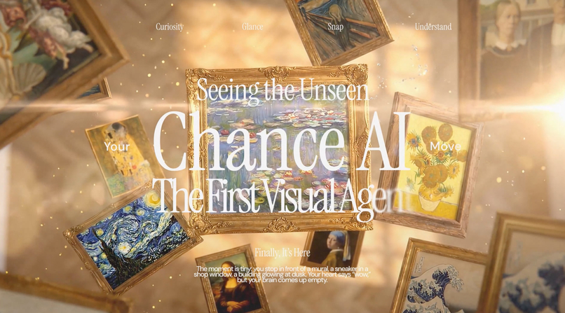
Chance AI: Seeing the Unseen
Inspiration
Chance AI noticed something about the way people interact with the world around them, there's a quiet gap between seeing something interesting and actually understanding it. A mural on a side street, an unfamiliar building, a vintage object at a flea market. The curiosity is there, but the friction of pulling up a search engine and typing the right query kills the moment. Chance Vision's idea: point your camera, get instant context, felt like the right answer to that problem.
But when we looked at the existing app, the technology was far ahead of the experience. The AI was powerful (multi-agent visual reasoning, a "harness engineering" architecture), yet the interface felt like every other AI tool on the market: cool-toned, clinical, forgettable. For a product that's supposed to make the world feel more accessible — to help anyone, anywhere, understand the culture and history around them — the UI needed to carry that same sense of openness and warmth.
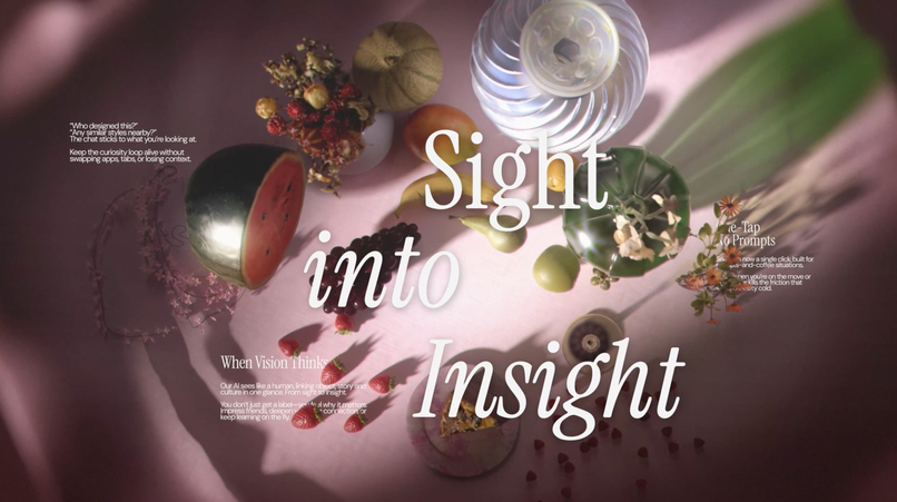
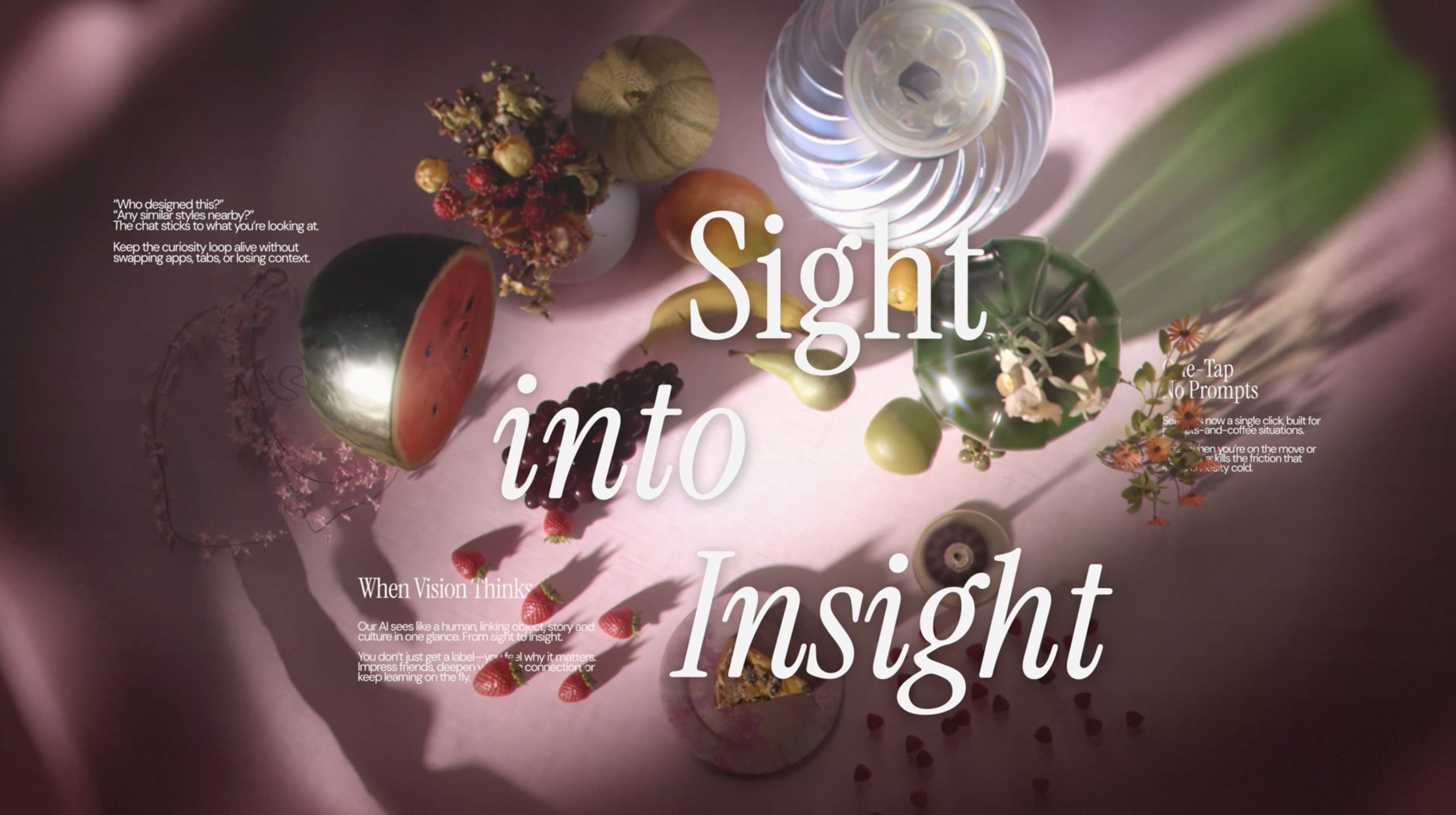
Our design direction came from: David Hockney's California paintings. The sun-bleached pastels of A Bigger Splash, the pool blues, the terracottas of Mulholland Drive. There's a generosity in Hockney's color language, it invites you in rather than keeping you out. We wanted Chance Vision to feel the same way. Not a tool for experts, but a companion for the curious. A design that feels as welcoming to a first-generation college student exploring a museum for the first time as it does to a seasoned art lover.
What it does
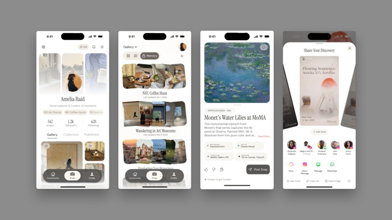
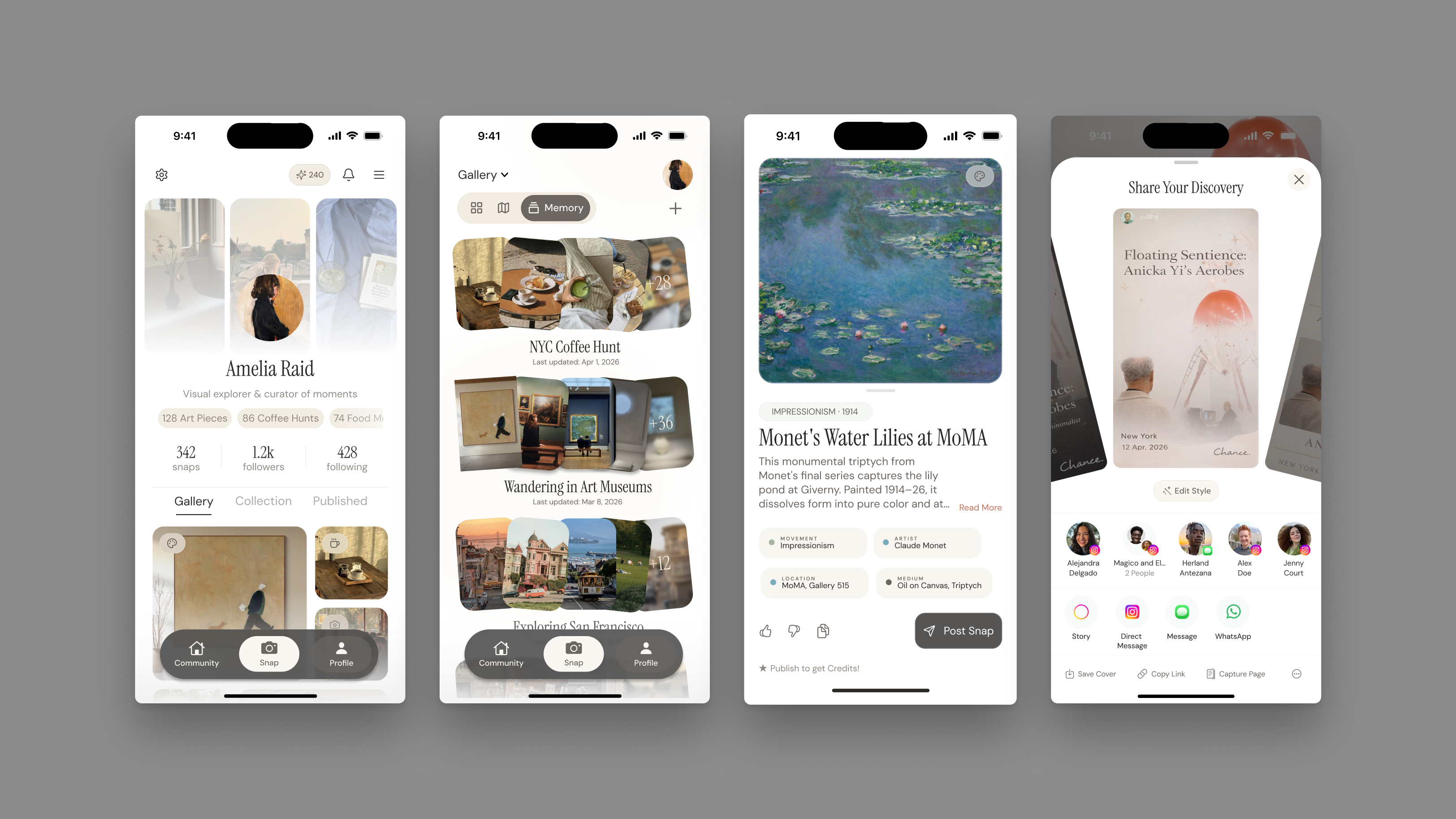
Chance Vision is the world's first Visual Agent: an AI camera app that replaces the search box entirely. Point your phone at anything: a painting, a building, a plant, a sneaker, and receive rich cultural, historical, and personal context delivered as a narrative story, not a data dump.
Our UI/UX redesign wraps that powerful AI in a design language we call "Warm Glass": Hockney-palette translucency, editorial typography, and generous breathing room. The redesign addresses three core UX challenges:
Profile Memory — The profile becomes a Visual Memory Journal, a mosaic of everything you've seen and learned. Auto-collections cluster scans into emergent themes ("Street Art," "Botanical," "Vintage Fashion") or you can create your own "Memory": an album of sorts, and a map graph notes your evolving interests as a personal visual fingerprint.
Loading UX — The ~15-second AI processing time is reframed as a signature brand moment. A three-phase "Warm Pulse" progressively reveals what the AI is seeing, surfacing partial signals early so users feel like they're watching the AI think rather than waiting for it to finish. The user can see the full thought process and even learn fun facts during the wait.
Share Feature — Three branded Instagram Story templates (Minimal, Editorial, Collage) turn every scan into shareable content. The AI auto-generates captions with images and fun facts. Two taps from discovery to post. We've also included a creative way to browse through templates, giving the users the agency to reframe their snap, however they want.
The result is an app that makes knowledge feel approachable, lowering the barrier between curiosity and understanding for anyone with a phone camera.
How we built it
We started by establishing the "Warm Glass" design language — a systematic fusion of Hockney's warm color palette with restrained glass morphism. This involved defining a 10-color palette with clear semantic roles: Soft Coral for primary actions, and Pool Blue for informational accents.
We built a comprehensive design proposal documenting every aspect of the redesign: borrowed from Chance AI's philosophy, mission; created our own color system, typography (a two-tier hierarchy of Instrument Serif and DM Sans), component language, user flows, and screen concepts.
For the loading experience, we brainstormed the animation as treating AI processing time as contemplation rather than delay. This guided the motion design: sine-wave easing curves, organic accumulation rather than mechanical progress bars, and a "breathing" micro-animation on insight cards.
We then prototyped the full flow in both HTML/CSS/JS and Figma. The HTML prototype uses a modular CSS architecture (tokens.css, glass.css, animations.css, screens.css) with custom cubic-bezier easing for standard transitions, especially for the loading screen process. The Figma prototype uses Smart Animate wiring across most frames for seamless design handoff, built on an iPhone mockup artboard.
Challenges we ran into
15 Seconds Loading Time Fifteen seconds is an eternity in mobile UX. Every standard approach — spinners, skeleton screens, progress bars — makes users more aware of the wait. We went through dozens of timing variations before the three-phase "Warm Pulse" rhythm felt natural. The breakthrough was treating it as a three-act story rather than a loading state.
Warm Glass Cool-toned glass with high blur looks sleek but sterile; warm-toned glass with low blur looks muddy. Finding the exact opacity, and border treatment (cream-white instead of pure white) that reads as both translucent and sun-lit took significant iteration.
Making AI Feel Human. Instead of "Processing... 45%," our interface says "seeing texture…" and "connecting meaning…" Instead of data labels, results lead with narrative headlines. Every word choice was a design decision, and finding the right voice that felt curious, warm, and quietly premium required us spending a lot of time on thesaurus.com.
Accomplishments that we're proud of
We're proud that the "Warm Pulse" loading experience turns what is typically the worst moment in an AI app into potentially the best one that signifies branding, a signature ritual that's visually compelling enough to screen-record and share.
We're proud of the design system's specificity. We have a production-ready specification where every glass component, every color role, every typographic choice is documented with exact values. A developer can pick up the handoff document and build without guessing.
We're proud that the share feature doesn't feel bolted on. The branded Instagram Story templates are a natural extension of the design language, and the auto-generated captions remove the "what do I even write?" friction that kills most share flows.
And we're proud that the overall design feels warm. In a landscape of cold, clinical AI products, Chance Vision's redesign proves that technical sophistication and emotional intimacy aren't at odds, we tried emphasizing that an AI experience can feel like a conversation with a knowledgeable friend rather than a query to a database. If that warmth makes even one person feel more comfortable walking into a museum or exploring a neighborhood they wouldn't have otherwise, the design did its job.
What we learned
We learned that UI design for AI products is fundamentally an emotional problem. The technology can be great, but if the interface makes people feel like they're operating a machine, you've lost. Every design decision — from the Hockney palette to the poetic loading text — was in service for the users.
We learned that constraints are gifts. The 15-second processing time, the glass morphism restriction, the Gen Z target audience, the emphasis on unique sharing, and creating a profile page that truly feels like a personal collection of exhibits — each constraint narrowed the design space in ways that produced more focused, more distinctive work than an open brief would have.
We learned that typography is tied directly to user experience. The two-tier type system does more for brand personality than color or layout. Instrument Serif for moments of discovery, DM Sans for warmth and together they give the app a personality that feels like a real knowledgeable person, not a product.
And we learned that progressive disclosure changes perception. By surfacing partial AI signals as floating glass chips by second 7 of the loading flow, users feel the wait is shorter even though the actual processing time hasn't changed and potentially can increase trust in the results as they are in sync with what the AI is viewing and thinking.
What's next for Chance AI — UI/UX Track
The redesign is scoped into three implementation phases. Phase 1 (Core Experience) covers the camera interface overhaul, Warm Pulse loading state, and redesigned Insight Card with narrative headlines. Phase 2 (Profile & Memory) transforms the profile into the Visual Memory Journal with mosaic grid, curiosity graph, and "Rediscover" prompts. Phase 3 (Share & Brand) delivers the Instagram Story template system, app icon redesign, and shareable content pipeline.
Beyond the current scope, we see opportunities to extend the design language into features like collaborative scanning (friends scan the same object and compare what the AI sees), seasonal memory recaps ("Your Spring of Curiosity" visual summaries), and deeper overhauls and innovations in community features, where it's a shared gallery where users contribute scans of their neighborhoods, campuses, and cities, gradually building a collective map of cultural knowledge that benefits everyone.
How we incorporated Adobe Express
We used Adobe Express in the following:
Team Introduction — Designed a polaroid-style team page using Adobe Express's image layout and typography tools to introduce our team members in a visual, on-brand way that echoes the Hockney-inspired warmth of the project itself.
QR Code — Generated a QR code using the Quick QR Code add-on, linking directly to our Figma prototype so judges and viewers can experience the full 16-frame loading flow interactively.
Built With
- adobe
- adobe-express
- aftereffect
- figma
- screenstudio


Log in or sign up for Devpost to join the conversation.