-
-
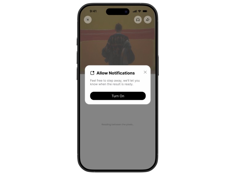
Allow Notifications Pop-up
-
Loading Screen
-
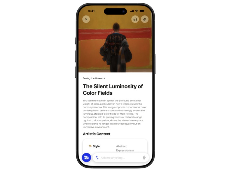
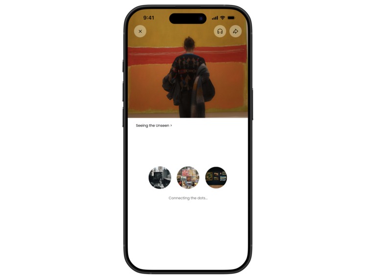
Results Screen
-
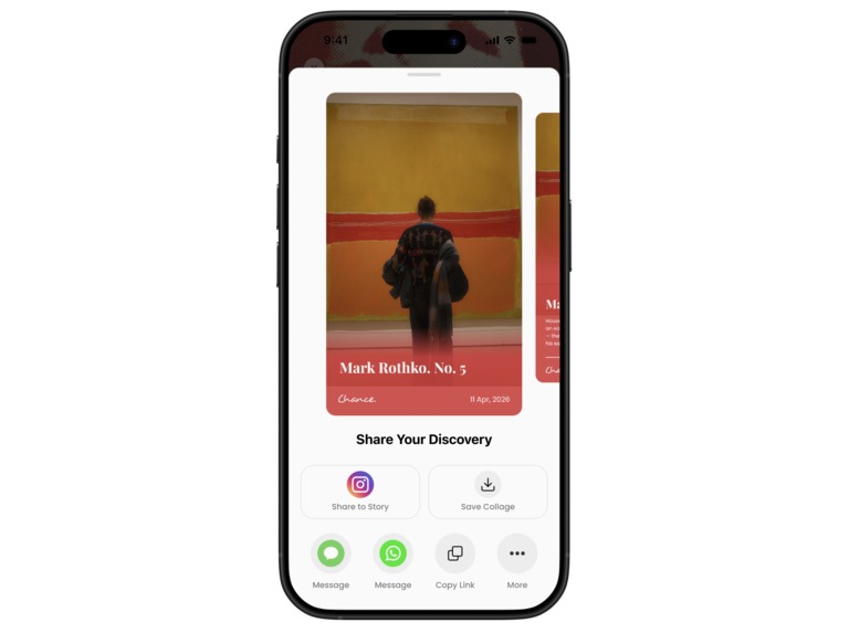
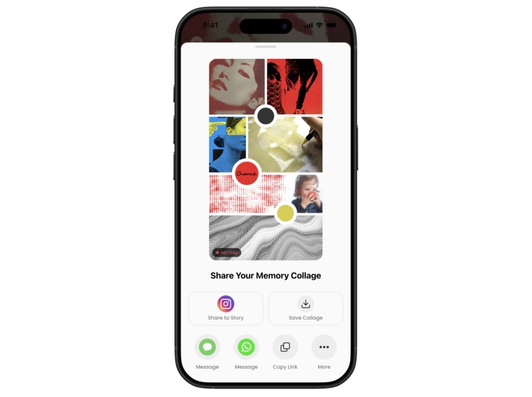
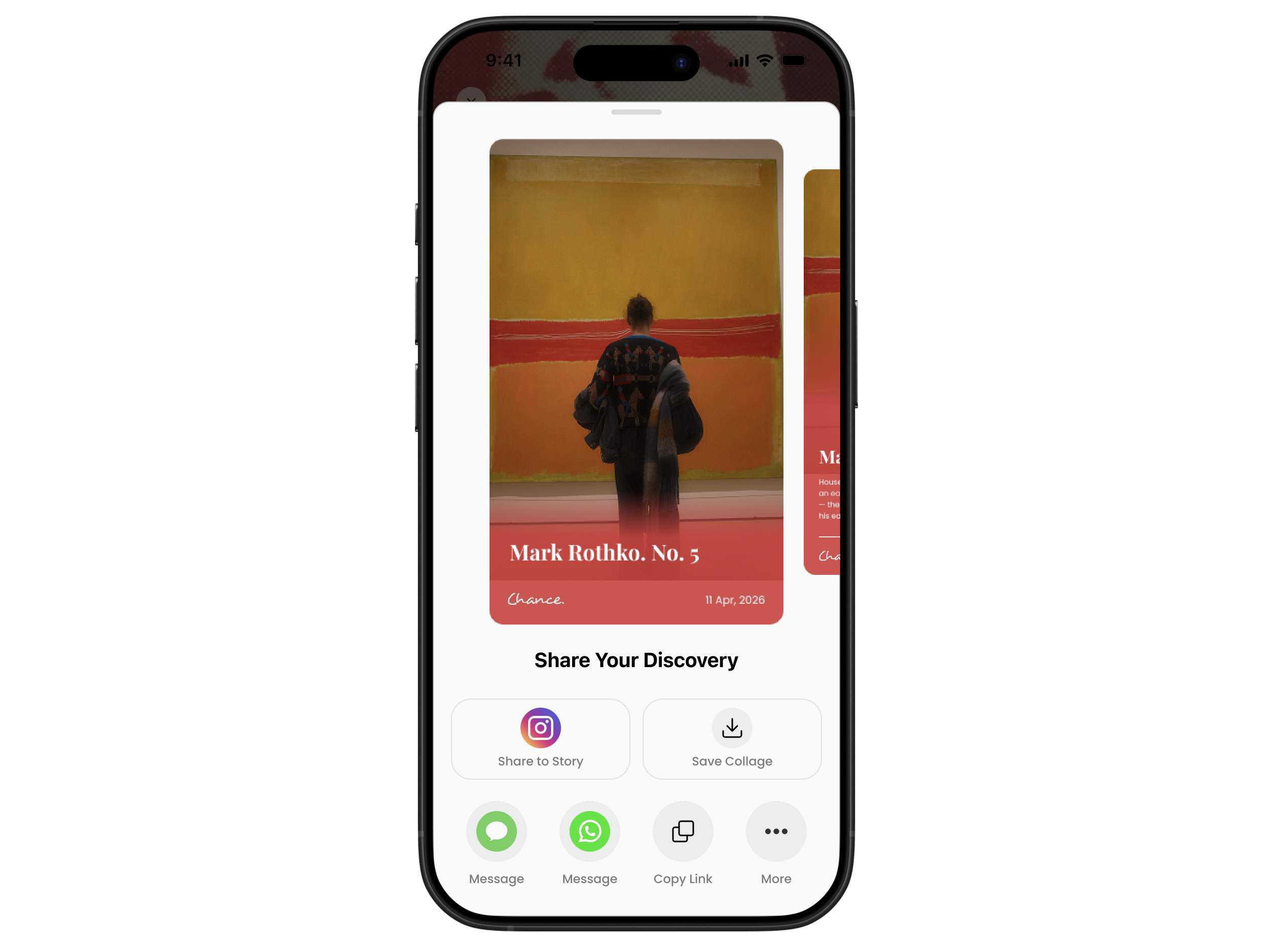
Share Results Screen
-
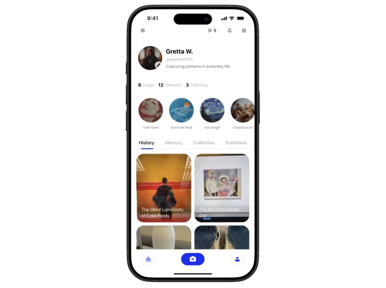
Profile Page (History) Screen
-
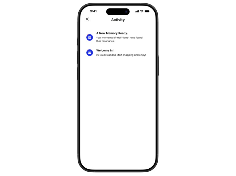
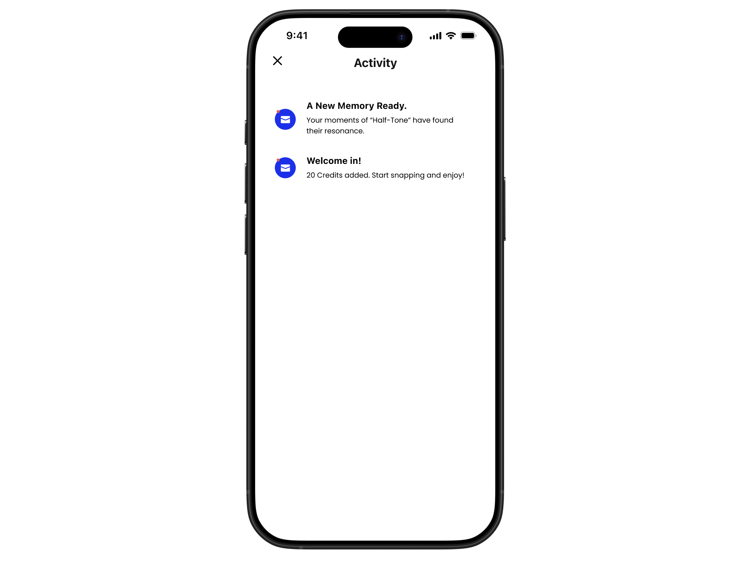
Alerts (Notifications)
-
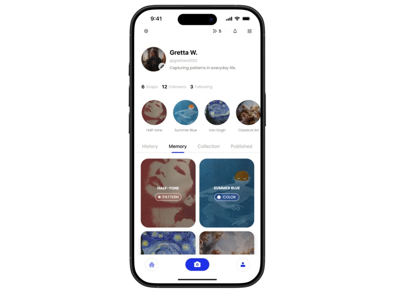
Profile Page (Memory) Screen
-
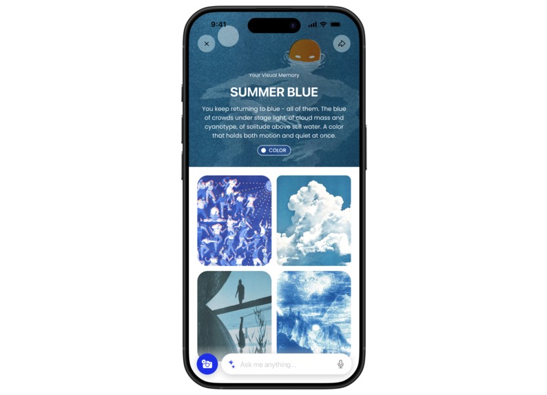
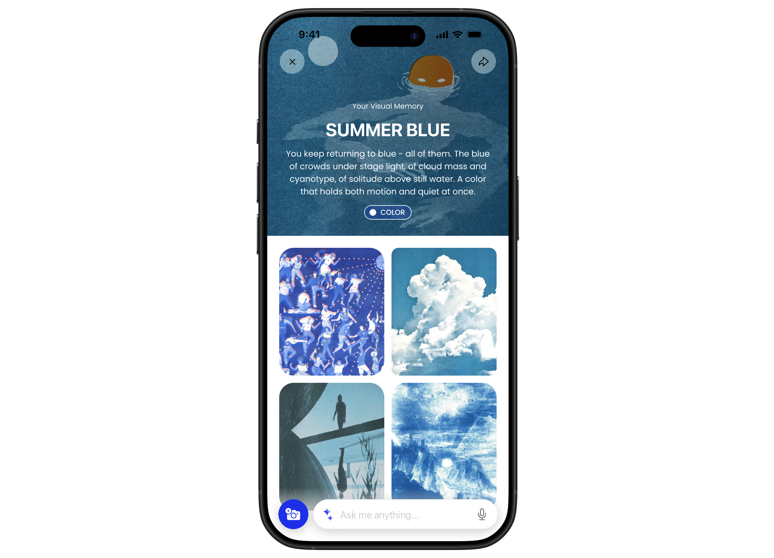
Memory Screen Color
-

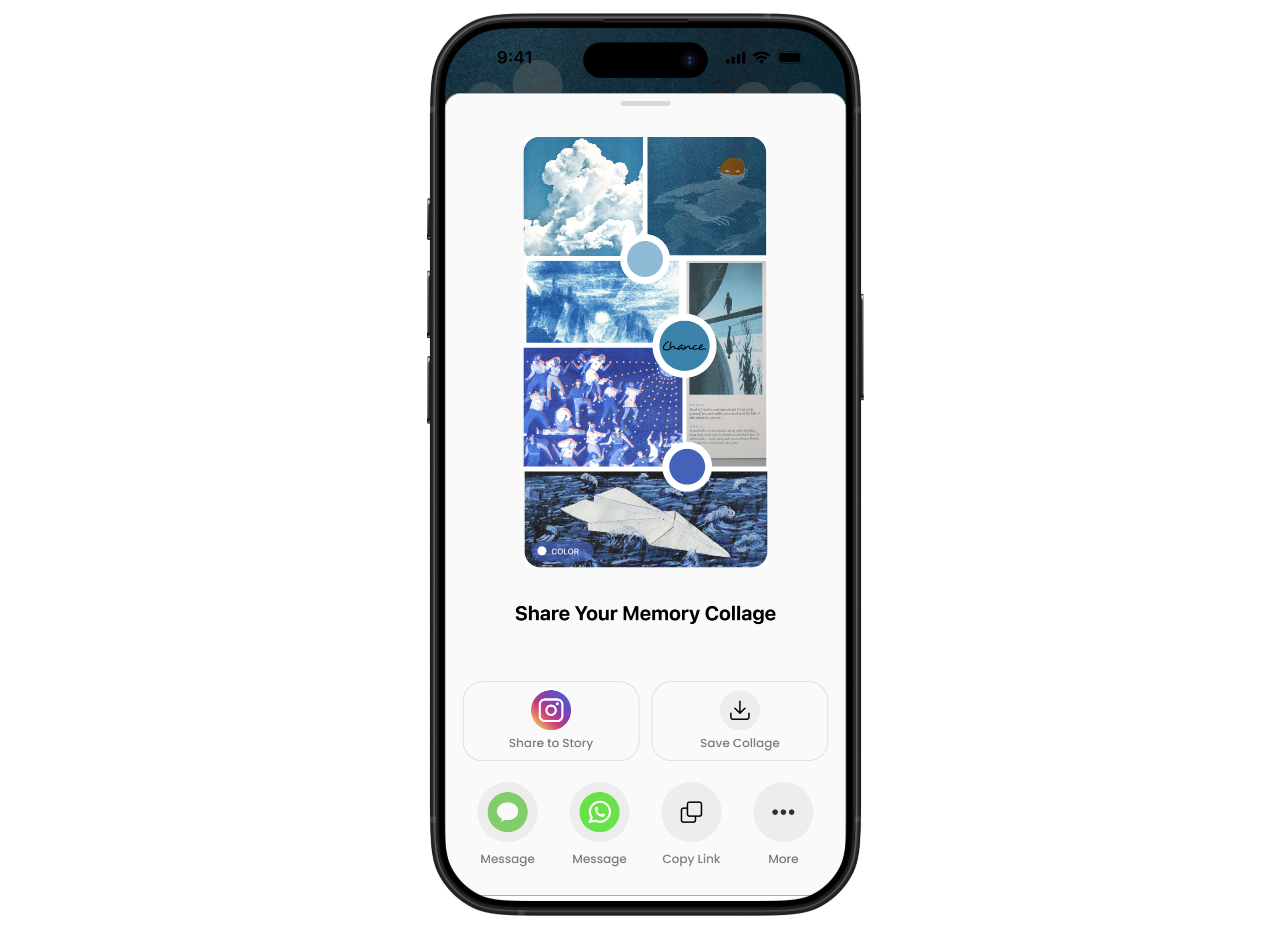
Memory Collage Share Screen Color
-

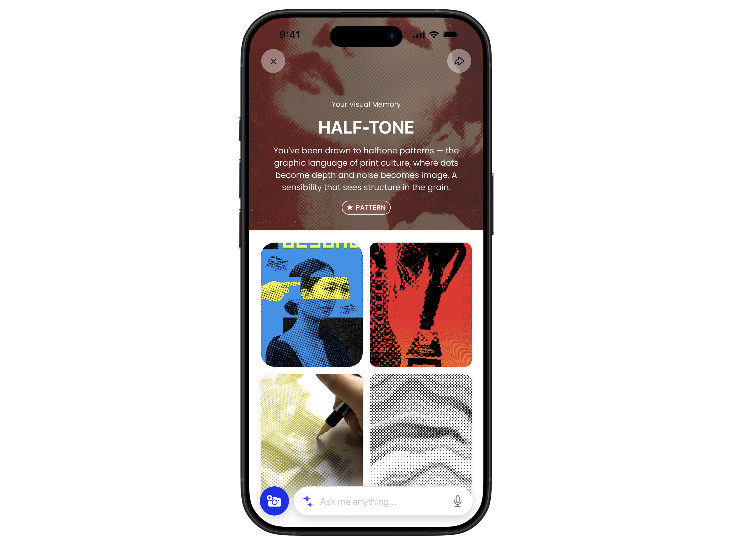
Memory Screen Pattern
-
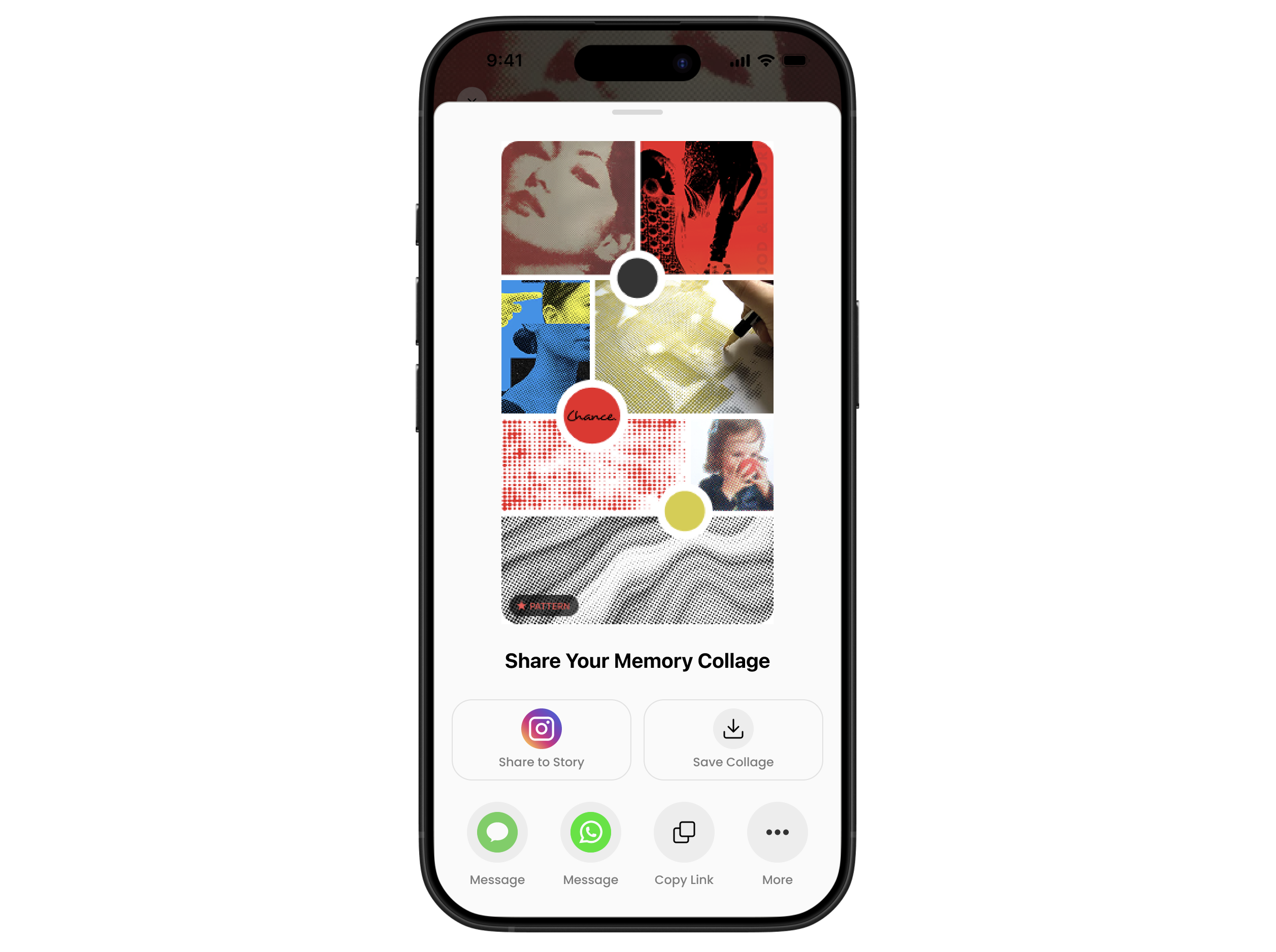
Memory Collage Share Screen Pattern


The Brief
Chance is a camera-first visual AI that turns curiosity into understanding. Our task was to improve the UX, specifically focusing on the profile memory feature, the loading UX, and the sharing feature.
Our Approach
Instead of treating these as three separate design challenges, we found the thread connecting them: Chance can see patterns in what you love and notice, but it isn't highlighted in its features. We wanted to approach the design by unifying memory, loading, and sharing, making the user experience feel engaging, personal, and worthy of sharing with others.
The Process
We started with a close audit of the existing app, mapping each flow against Chance's brand promise. We then identified gaps and opportunities for improvement: the memory feature duplicated what a native photo album already does; the loading state is text-heavy and cluttered, misaligning with the promise of a visual-focused app; and overall, the app lacks engaging, personal, and visually rich content that incentivizes users to share.
From those observations, we distilled three design opportunities, then moved into rapid wireframing - sketching structures for the AI-driven memory collections, the visual loading states, and the auto-generated moodboard share flow. We evaluated the iterations against a key question: Does this create an engaging, smooth, and delightful experience that highlights the unique functions that Chance offers?
After checking in with the Chance team on design guidelines, we developed the high-fidelity prototypes, maintaining visual consistency with the existing app.
Challenges we ran into
Designing for an AI-driven system is difficult, as we can't fully control what the model produces, so the UI has to be adaptive to handle whatever content is generated. Making that feel intentional rather than random was a great challenge. Time management was the other challenge as we made the ambitious decision to tackle all three UX flows at once. However, we felt that a holistic approach is needed as all three challenges are tied together by the philosophy of highlighting Chance's smart, visual-forward identity.
Accomplishments that we're proud of
Finding a key point of view - highlighting Chance's unique visual focus and value among a sea of text-based AI tools - early in the process gave every design decision a clear north star, and we're proud of how consistently that carried through to the final prototypes. The memory collection screens in particular felt like a genuine evolution of the product.
What we learned
Working within a tight brief and a short timeline forced us to prioritize efficiently. We also learned that impactful UX decisions can be made through simply reframing - we didn't overhaul Chance's entire architecture, but shifted how the existing information is presented.
What's next for Chance AI: Seeing the Unseen
The memory feature we designed is just a prototype. We think there is so much potential for a smart, moodboard-like memory system that functions as a living aesthetic gallery, one that grows more precise, personal, and shareable with every image collected. As users snap more, the pattern recognition will deepen, moving from broad themes like color and texture toward more nuanced signatures of personal taste.
Adobe Express use
To present our thinking, we built the slide deck entirely in Adobe Express, using its animation and layout tools to make the presentation itself feel as considered and aesthetic-forward as the product we were designing for. The platform's design tools made it easy to keep our visuals consistent and polished across every slide. We found that working within Adobe Express pushed us to be intentional about layout and aesthetics, which aligned naturally with Chance's own visual-forward philosophy.
Track Selection
UI/UX MVP
Built With
- adobeexpress
- figma
- jitter
- premierepro


Log in or sign up for Devpost to join the conversation.