I live in Bareilly, India, miles away from any coastline. However, in early 2026, I noticed how events in the Red Sea and the Suez Canal weren't just international news—they were directly affecting many things that we need to look at. I realized that most people see Geography and Business as two different subjects, but in reality, they are deeply linked. I wanted to combine Geography with Business Intelligence to show the "Full Picture." I wanted to build a tool that makes invisible risks visible, intuitive, and actionable. That’s how ChainScope was born.
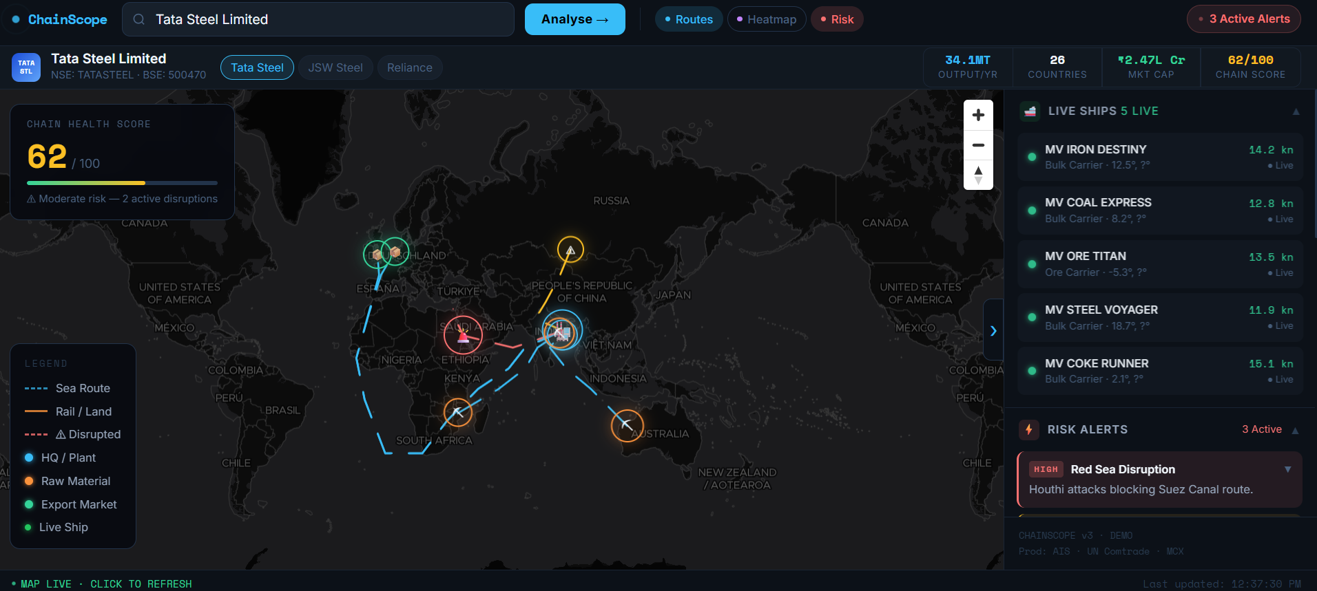
How I Built It: Mapping the Dependencies I didn't have a team or a formal mentor. I taught myself Flutter to understand the mobile ecosystem, but for ChainScope, I went deep into high-performance web mapping. My goal was to visualize everything: the Supply Chain, the Workers, the Industries, and their Dependencies. If a port shuts down, it’s not just a delay; it affects thousands of workers and hundreds of downstream industries.
Geospatial Engine: I used MapLibre GL and MapTiler to render dense vector tiles smoothly. Visualizing thousands of shipping nodes and industrial zones without performance lag was my primary goal.
The Logic: I wrote Python scripts to automate the data pipeline—fetching maritime news signals and correlating them with coordinate-based route plotting.
What I Learned: Data for Better Decisions ChainScope taught me that code is the ultimate equalizer. By visualizing how everything—from raw materials to workers—is connected, we can make better decisions. I learned that when you put data on a map, it stops being a "number" and starts being a "story." I’m not just a student sitting for exams; I am a builder trying to solve global-scale problems by showing the world the full picture of their dependencies
Built With
- allorigins
- bbc-rss-feed
- cloudflare
- maptiler
- world-bank-api


Log in or sign up for Devpost to join the conversation.