-
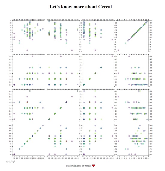
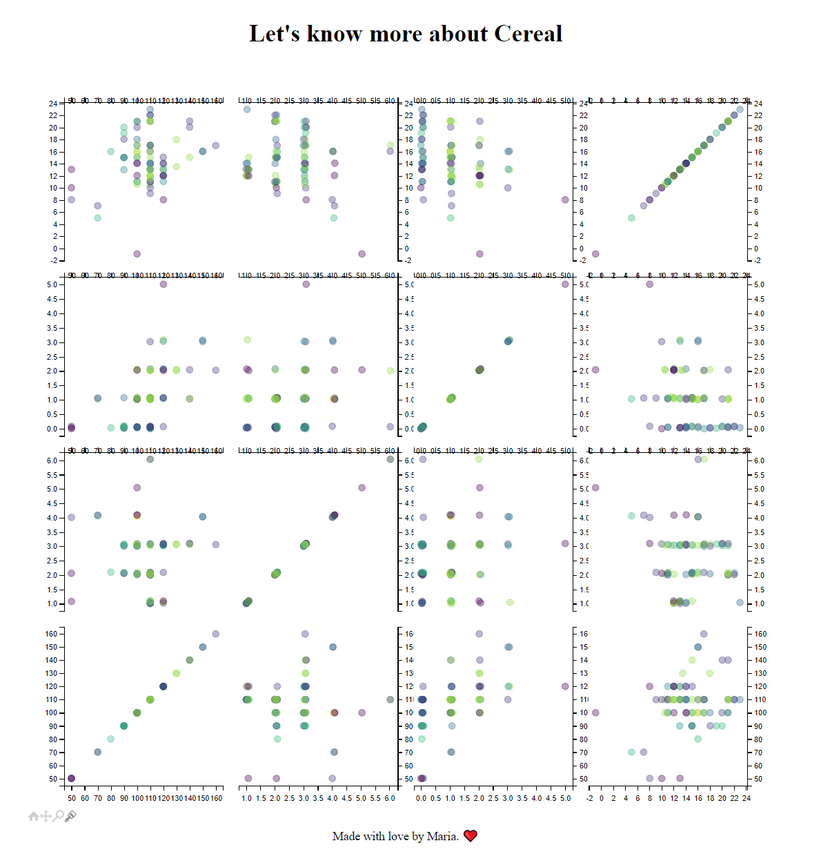
How the small little cute website looks
Inspiration
I was looking for project ideas and fun datasets and got this (fun dataset)[https://www.kaggle.com/crawford/80-cereals] yet simple enough for me to understand. I knew I wanted to work in python so It was a perfect match
What it does
I would like to make it more complex for now just shows the 80 cereals in different plots based on some nutritional values and the colors that are shown are depending on the brand of the cereal.
How we built it
I built it with python and some data visualization libraries.
Challenges we ran into
Right now I am not sure how to build a legend so that's a challenge I have for now
Accomplishments that we're proud of
Understanding some of the matplot librarie since I am interested in data science and would love to get more into this type of libraries
What we learned
How to build graphs and show it in the web a simple with the mpld3
What's next for Cereals by calories,protein,fat,carbo (Data Visualization)
Adding the legend for the values I think that's an important information that's missing


Log in or sign up for Devpost to join the conversation.