-
-
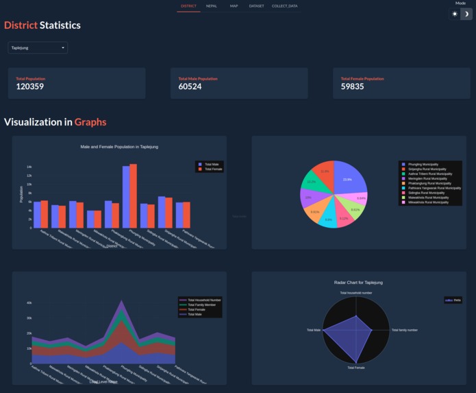
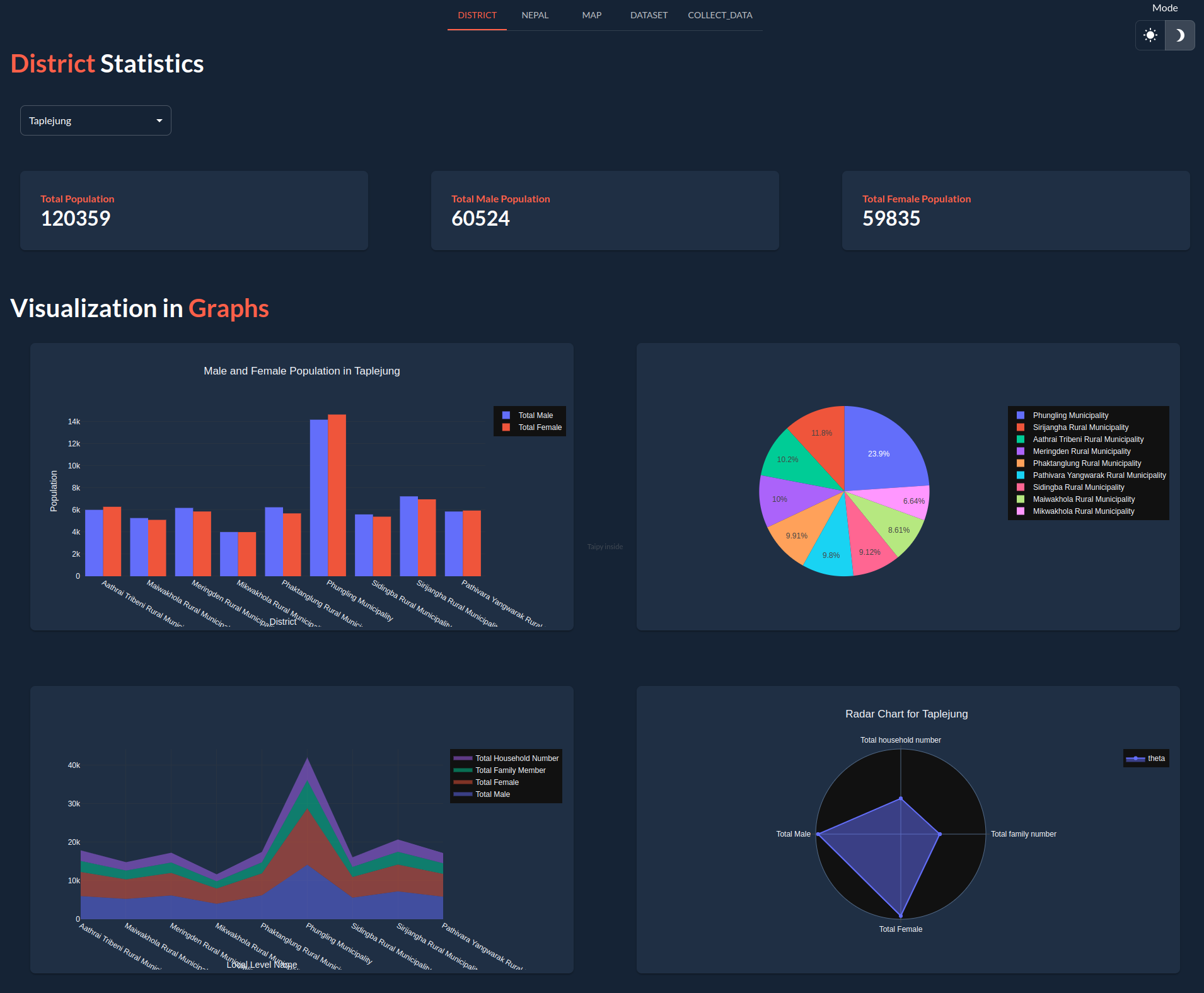
District Page
-
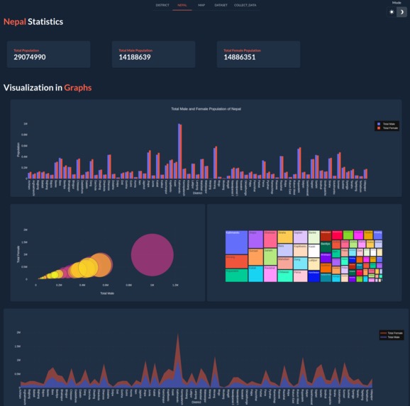
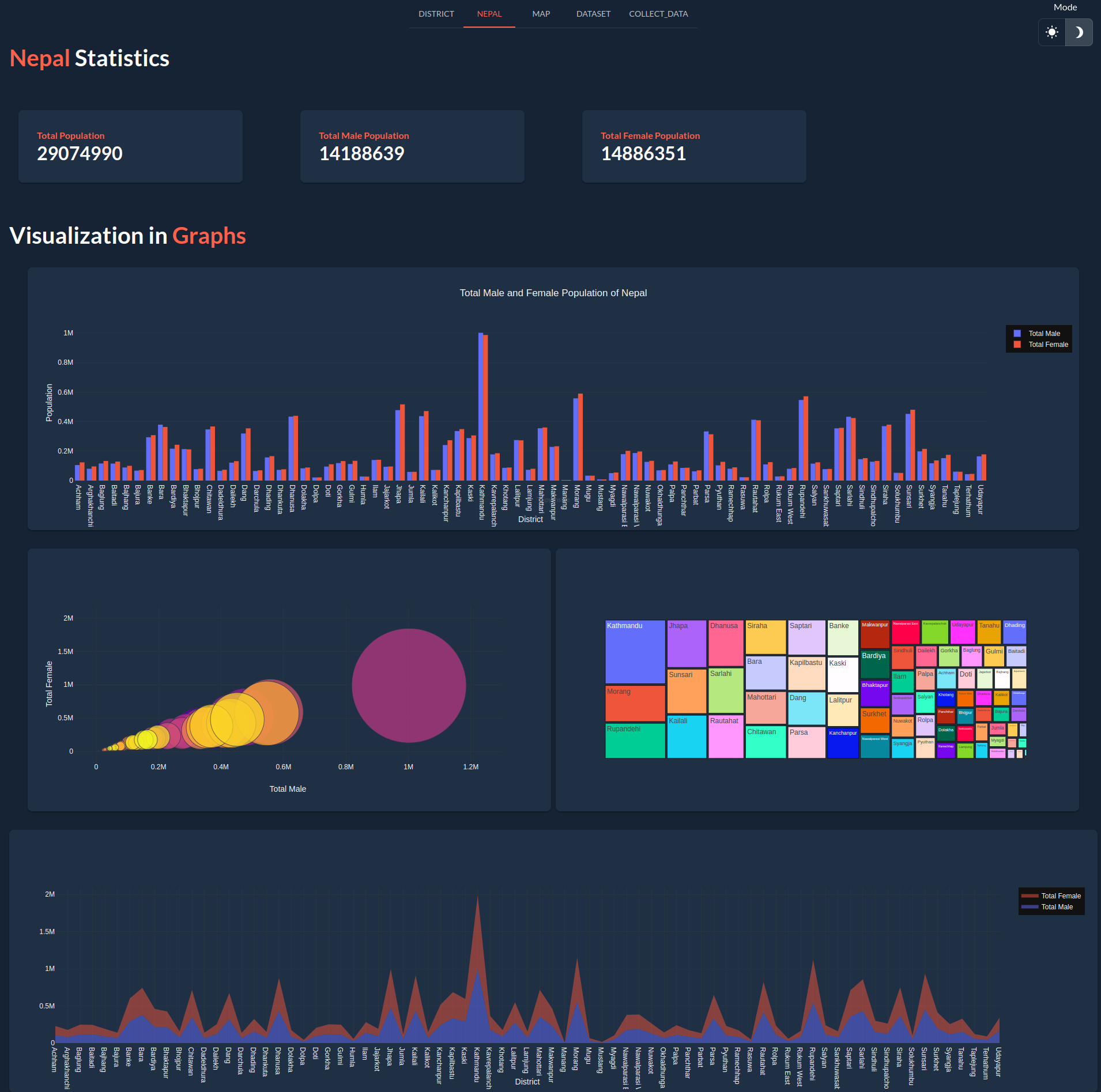
Nepal Page
-

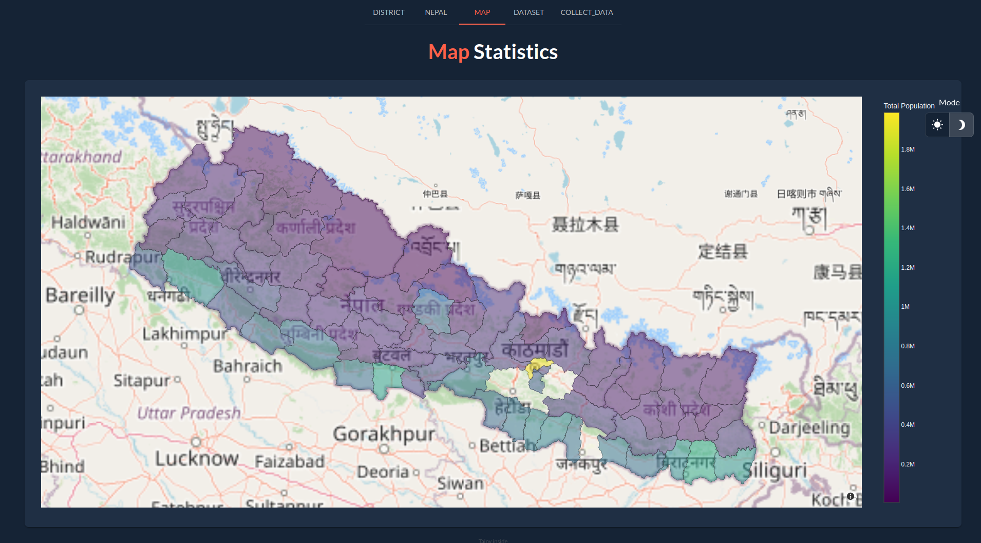
Map Page
-
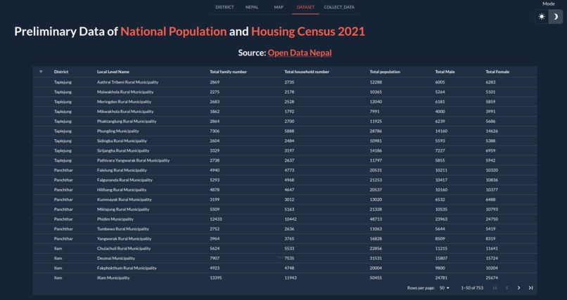
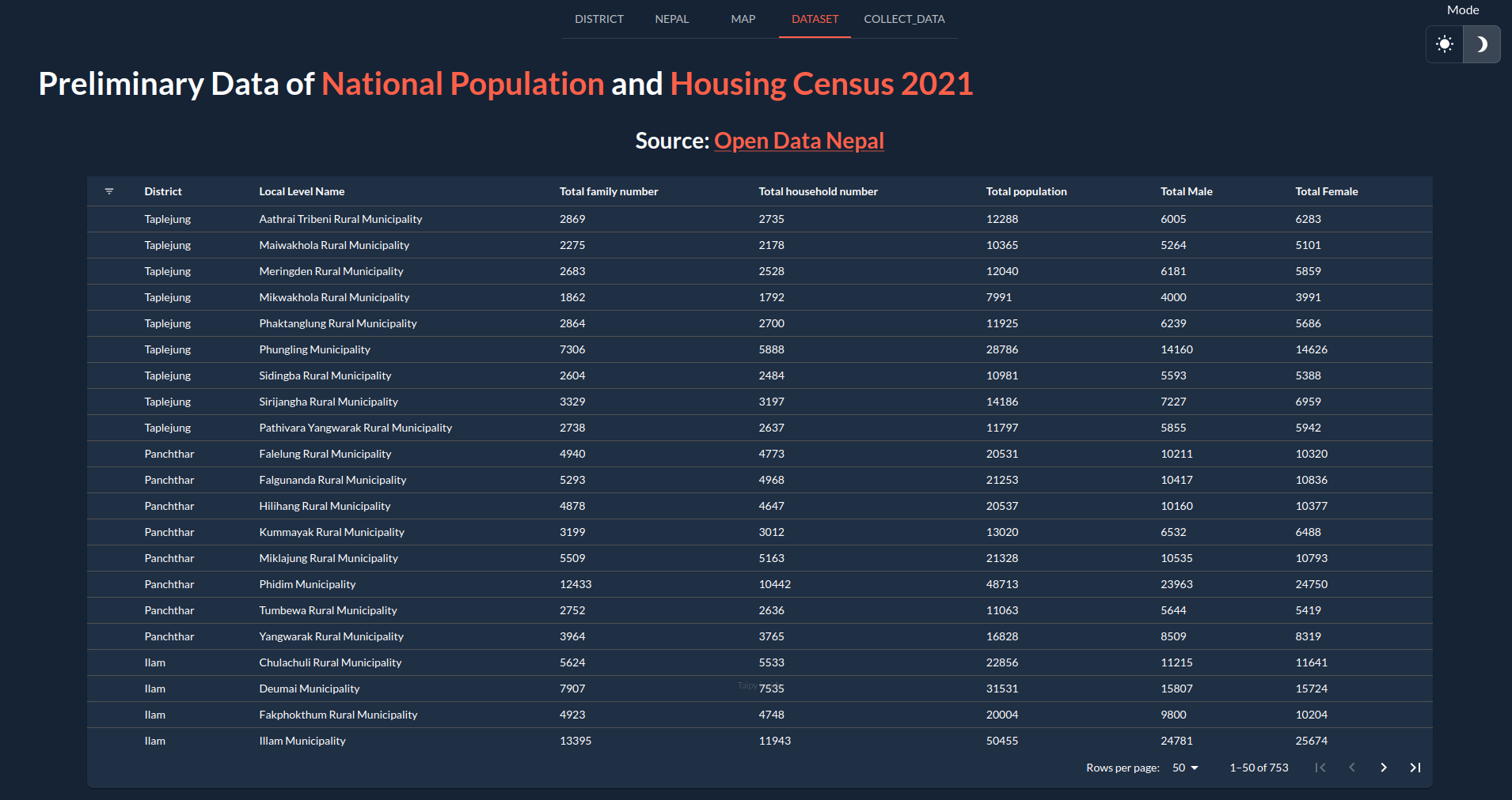
Dataset Page
-
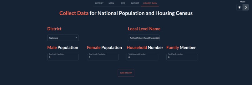
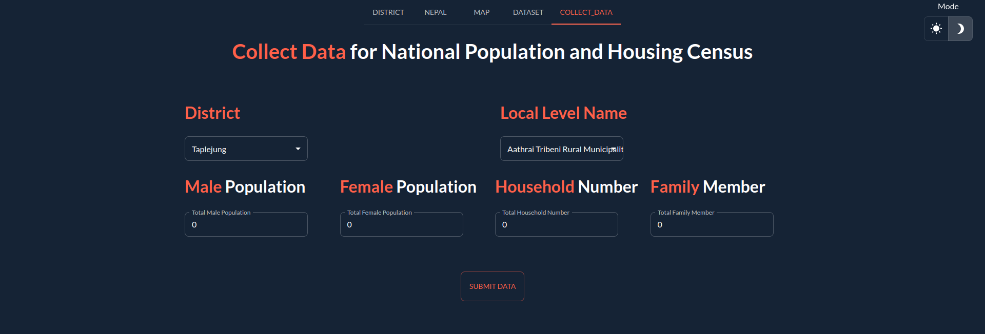
Data Collection Page
Inspiration
I was just exploring about the visualization feature provide by the taipy. I was mazed by the bubble chart, heat map, funnel chart, map plot, and many more. And i decided to give a try and Census is the result.
What it does
Census project utilizes Taipy in Python to transform 2021 housing and household data from Nepal into interactive visualizations. It provides insights into demographic patterns, population distribution, and housing characteristics across different regions, offering a comprehensive understanding of the socio-economic landscape.
How we built it
I have built Census using taipy package.
Challenges we ran into
I had found abit difficult to visualize the data in the map, as I have never worked with the geojson data. Thanks you Taipy community, who have help me out with map plot. Initially, I found the learning curve too be difficult as the development environment wasn't as friendly as other but in the recent release of taipy 3 , the development environment was improved alot, which aid in the speed of project developement.
Accomplishments that we're proud of
I feel proud that I am able to create a good project with one of the package, whom I wasn't familiar with.
What we learned
I have learned about a new python package taipy, data visualization on bubble chart, map plot, overlay graph and another python package plotly.
What's next for Census
I have planning to spend more time over taipy package as I have study Taipy Core throughly.
Built With
- python
- taipy


Log in or sign up for Devpost to join the conversation.