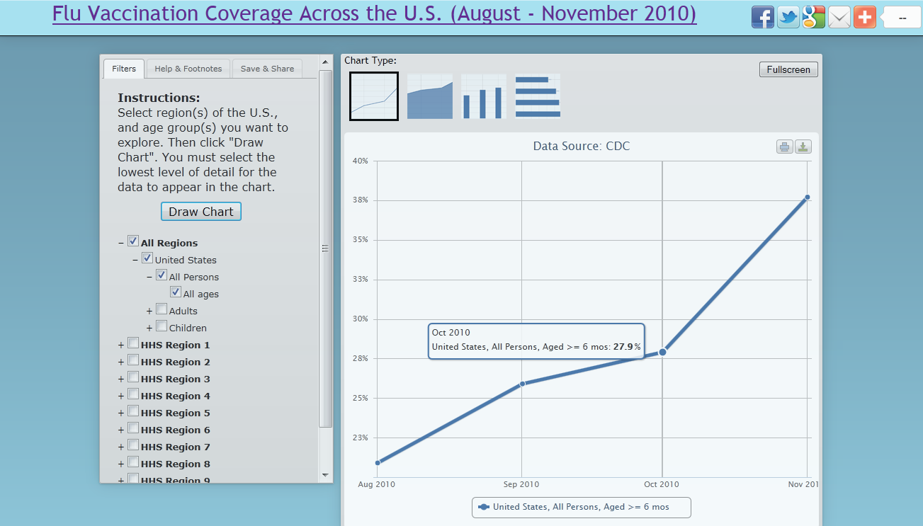
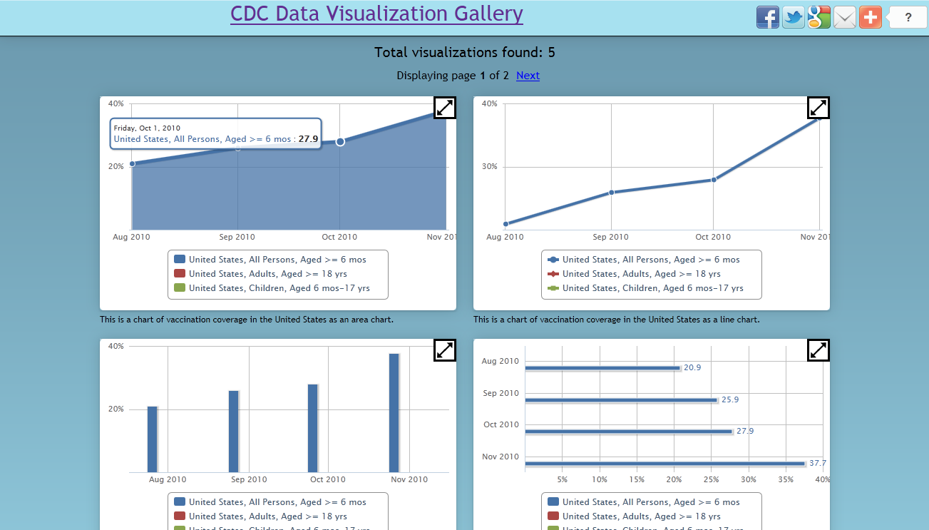
The CDC Visualization Tool is a Javascript and HTML web based solution that allows users to visualize and discover interesting trends from data provided from the CDC. Currently, the tool only provides 2010-2011 vaccination coverage data from across the United States, but more data sets could be loaded in the future. Someone might be interested in answering the question: Is it always true that children are always more vaccinated than adults? Maybe there are regions why this isn't true - why would that be? With this tool, users will now be able to explore vaccination coverage throughout the US by selecting specific regions and age groups. Once a chart is created using the user's selected data sets, he or she can analyze it and draw conclusions about certain regions or age groups. The type of chart can also be changed to a line, area, bar, or column to better help express and display the data. The tool also gives users the ability to save their visualization, providing a description and a password. Once saved, the visualization can be shared with anybody in the world to view (or even modify). If the creator wants others to modify and update the visualization, the password can also be shared. (Also if no password is set, then the world can modify and update the visualization). This gives a user the ability to connect with their social networks (or even the world) and share their thoughts and findings. The visualization gallery can be accessed by anybody in the world to browse through saved visualizations and see what other people have created and shared.
CDC Visualization Tool
Updates
Leave feedback in the comments!
Log in or sign up for Devpost to join the conversation.