-
-
Main page
Inspiration
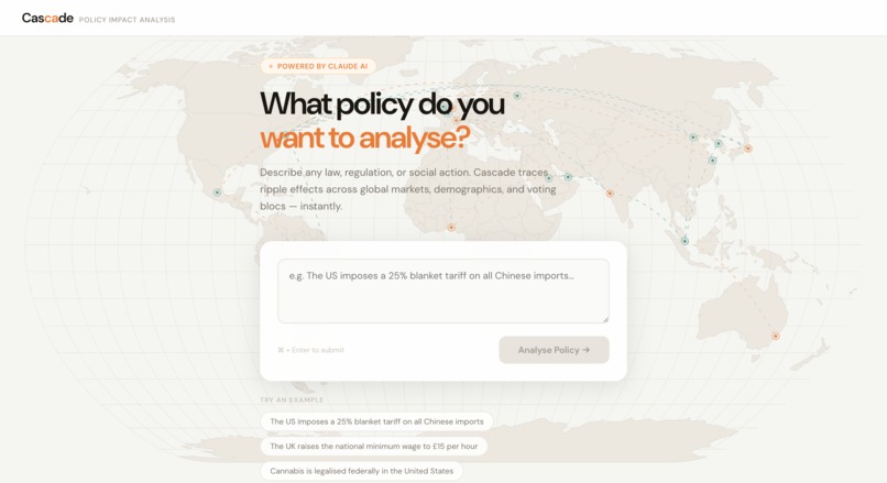
Policy debates are usually loud but hard to follow. Most people can hear a headline about a tariff, tax, or reform and still not answer the practical question: what will this actually change for real people? We built Cascade to make those consequences visible in seconds, not hidden in 80-page reports.
What it does
Cascade takes a plain-English policy description and generates an interactive impact analysis across:
- countries and regions
- trade and market effects
- demographic winners and losers
- second- and third-order knock-on effects over time
How we built it
- Frontend app with React + Vite
- Structured analysis pipeline powered by Claude via the Anthropic Messages API
- A strict JSON contract (ImpactSpec) between AI reasoning and UI rendering
- Visual layers for map, routes, flow graph, demographics, and timeline using Plotly + D3 + TopoJSON
- Fast iteration and UI polish with Tailwind CSS
At a high level, we treat policy shock as a propagation system over regions and causal links:
$$ I_{\text{total}}=\sum_{r} w_r I_r+\sum_{e}\alpha_e\Delta_e $$
This helped us combine direct impacts and knock-on effects in one coherent view.
Challenges we faced
- forcing consistently valid structured output from open-ended prompts
- balancing speed and depth under hackathon time pressure
- representing uncertainty clearly without making results feel vague
- keeping visual complexity readable on one screen
What we learned
- strict schema design is critical for reliable AI-to-UI products
- the biggest value is reasoning quality, not just text generation
- policy tools need to communicate caveats and confidence, not only conclusions
- fixed visual components are often more robust than fully generated UI code in a hackathon setting
Built With
- d3.js
- html5
- javascript
- plotly.js
- react
- svg
- tailwind
- topojson
- vite


Log in or sign up for Devpost to join the conversation.