-
-
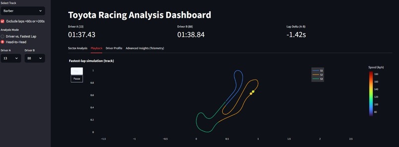
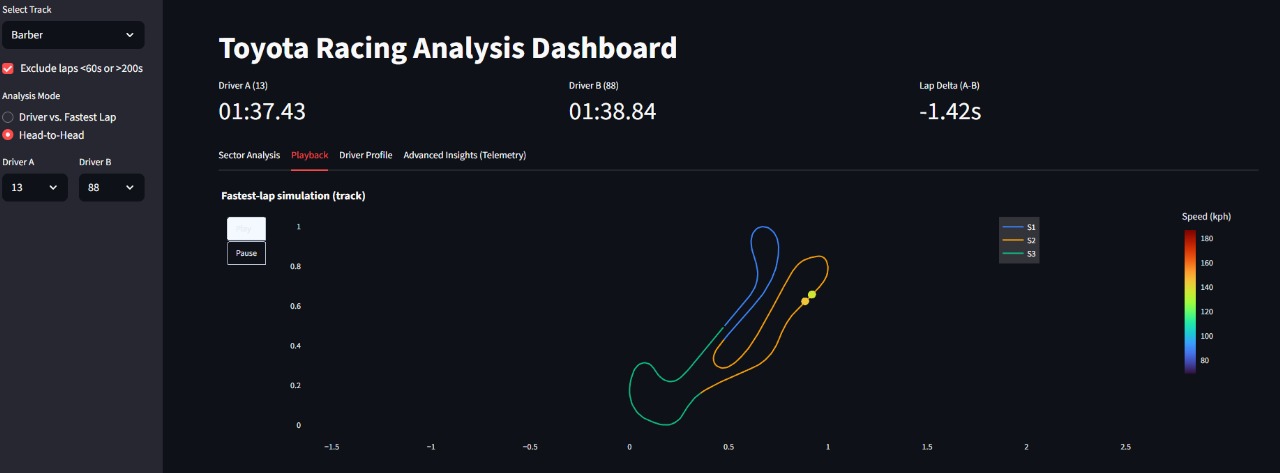
Fastest-lap Simulation
-
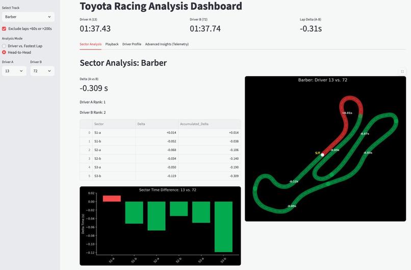
Head-to-Head Analysis

Project Story — Carma: Fastest Lap Intelligence
About the Project
Inspiration
Modern motorsport engineering blends telemetry, racing-line analysis, and sector timing to understand how and why lap times differ. We wanted to bring that experience into a browser-based tool that anyone can use without needing specialized engineering software.
Working with raw Toyota GR data pushed us to build something deeper than a lap-time viewer. We wanted to explain the fastest lap: where time was gained, how the racing line changed, and how throttle and braking influenced the result.
What We Built
Carma: Fastest Lap Intelligence is an interactive Streamlit platform for analyzing fastest laps at Circuit of the Americas (COTA) and Barber Motorsports Park. It merges endurance timing, telemetry, and racing-line reconstructions into a unified analysis suite.
Core Features
- Fastest-lap extraction and ranking
- Micro-sector delta analysis
- Animated fastest-lap “ghost-car” simulation
- Live throttle & brake overlays
- Driver-vs-driver alignment on a shared station grid
- Racing-line comparison and turn insights
- Driver profiling via statistics and radar charts
- Turn detection, coasting analysis, and telemetry heatmaps
How We Built It
Data Processing Pipeline
We designed a unified workflow for both tracks:
- Parsed endurance CSVs to compute
LAP_TIME_SEC, sector splits, and per-driver rankings. - Constructed Barber’s centerline using a GPS reference lap smoothed with cubic interpolation.
- Mapped telemetry (x, y) → station distance (s) using nearest-point projection on each track’s centerline.
- Built fastest-lap datasets (CSV/Parquet) by slicing telemetry to each lap.
- Merged endurance + telemetry through synchronized timestamps and lap triggers.
- Created micro-sectors by dividing the station axis into fine-grained segments (≈200–400 per lap).
How We Reconstructed the COTA Track Using Pixel Calculations
Because COTA lacked GPS-accurate centerline data, we engineered our own using a pixel-based reconstruction:
- Selected a high-resolution COTA diagram.
- Manually traced a racing-line polyline by capturing pixel coordinates for key points (T1 apex, esses, hairpins, stadium section, final corner).
- Extracted each point’s pixel position ( (p_x, p_y) ).
- Converted pixel distances to real-world scale by normalizing total arc length to COTA’s actual 5.513 km track length.
- Applied B-spline smoothing to reduce jitter.
- Resampled the smoothed polyline uniformly (≈1 m resolution).
- Projected telemetry GPS points onto this pixel-derived centerline using nearest-point orthogonal projection.
This gave us a stable reference for:
- Ghost-car animation
- Sector visualization
- Racing-line overlays
- Driver comparisons
- Accurate micro-sector delta computation
The pixel-derived COTA track was proportionally accurate enough that all telemetry mapped smoothly onto it, with clean animation and consistent station alignment.
Visualization & Interaction
We used Plotly for dynamic visuals and Streamlit for UI:
- Sector-colored track maps
- Speed traces and delta bar charts
- Animated fastest-lap simulation
- Racing-line overlays
- Throttle/brake heatmaps
- Turn zoom panels
Simulations followed the transformation: $$ t \rightarrow \text{elapsed} \rightarrow \text{speed} \rightarrow \text{distance} \rightarrow \text{station} \rightarrow (x, y) $$
Analysis Modules
Sector Analysis
- Computes per-micro-sector delta times
- Provides cumulative S1/S2/S3 deltas
- Displays overlays and annotated track maps
Ghost Simulation
- Rebuilds car motion frame-by-frame
- Animates progress along the centerline
- Color-labels by speed with sector transitions
Playback (Barber)
- Scrubbable slider positions both cars at identical station locations
- Shows synchronized throttle, brake, speed, and gear
Driver Profiling
- Quantifies braking %, throttle usage, lift patterns, consistency
- Displays a radar chart of behavior metrics
Advanced Insights
- Turn detection (curvature-based)
- Coasting analysis
- Dual-line racing-line comparison
- Telemetry heatmaps (throttle/brake)
Challenges We Faced
Telemetry Alignment
Telemetry was unevenly sampled and noisy. The (x, y) → s projection required smoothing to prevent jumps in delta calculations and ghost animations.
No GPS-Accurate COTA Centerline
We reconstructed COTA from pixels, which required careful:
- scaling
- smoothing
- curvature validation
- projection testing
Even tiny scaling errors caused major drift in the animations.
Sector Timing Issues
Some endurance files lacked valid sector fractions. To ensure stable visuals, we used a fallback:
$$ \text{If sector fractions are invalid, S1/S2/S3 = equal thirds of total track.} $$
Managing Multi-GB Telemetry
Raw telemetry exceeded GitHub limits. We condensed CSVs by filtering to only the fastest laps for each driver per circuit for their telemetry data, which allowed us to stay within the GitHub limits. However, for a proper analysis, using the original CSV telemetry files provides a better, more holistic view across all drivers and sections.
What We Learned
- How to fuse endurance timing with telemetry at motorsport scale
- How to build both GPS-based and pixel-derived racing lines
- How to simulate fastest laps using speed/time alone
- How to align noisy telemetry across drivers
- How to design intuitive motorsport visualizations in Streamlit
- How to manage multi-GB datasets efficiently
We ultimately built a platform that transforms raw motorsport data into actionable engineering insights, accessible directly in the browser.


Log in or sign up for Devpost to join the conversation.