-

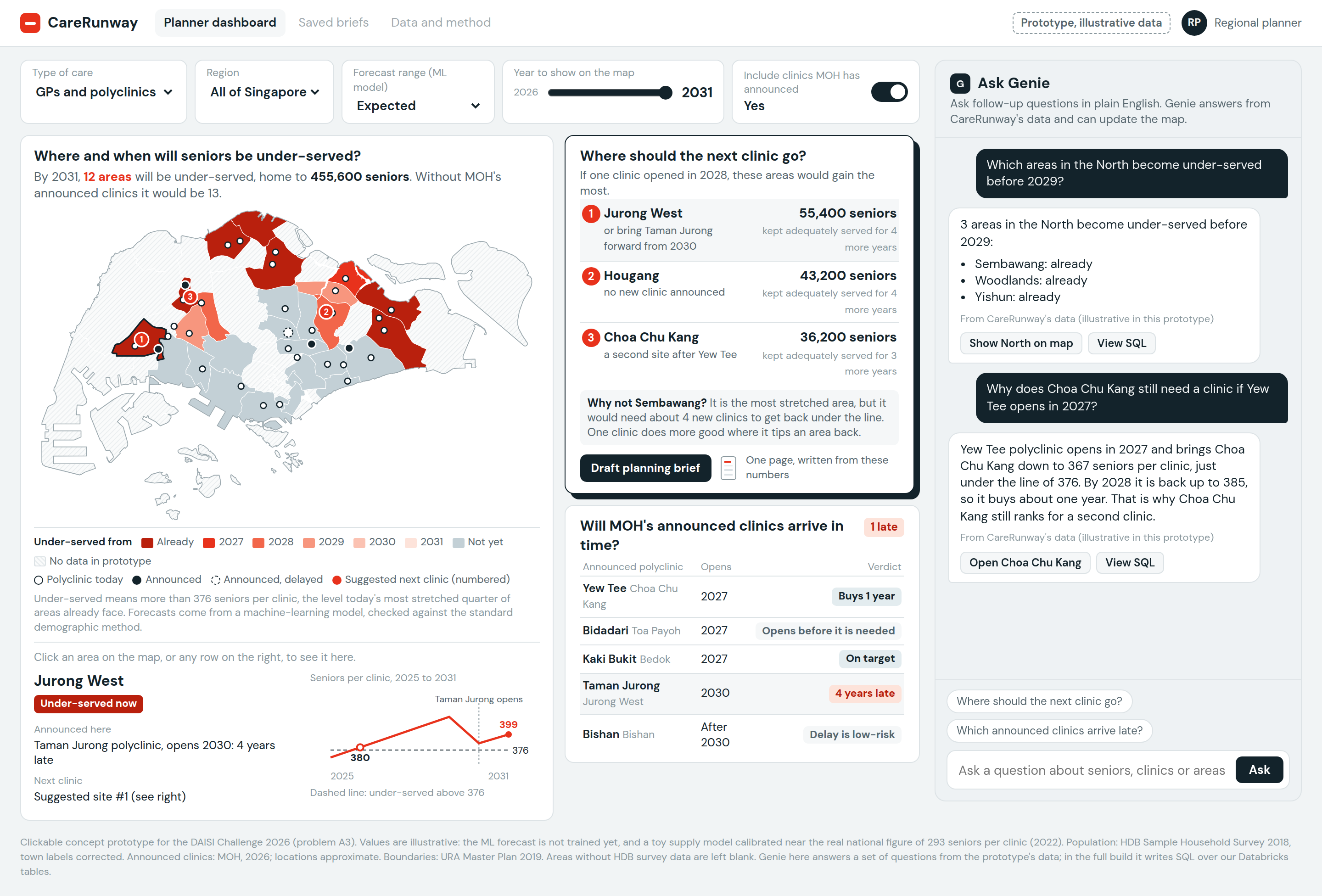
mockup of dashboard
Inspiration
Singapore's senior population is growing faster than its clinics. From 2015 to 2022, the number of people aged 65 and above grew 45%, while polyclinics and GP clinics grew only 28%. Each clinic now serves about 293 seniors, up from 259.
MOH is adding polyclinics (28 today, 32 by 2030) and Healthier SG is moving more care to GPs. But new clinics take years to plan, and the growth isn't even across the island. We wanted to help planners answer one practical question: where should the next clinic go?
What it does
CareRunway is a planning dashboard for the regional health clusters. It:
- Forecasts seniors per clinic for every planning area up to 2031, and shows the year each area becomes under-served.
- Ranks where one new clinic would help the most seniors, and flags areas so stretched they need more than one.
- Checks MOH's announced polyclinics: does each one open in time for the area it serves?
- Answers plain-English questions through Genie, showing the query it used.
- Writes a one-page planning brief for any area, with every figure pulled from our data.
We define an area as under-served when
$$\text{seniors per clinic} = \frac{\text{residents aged 65+ within reach}}{\text{clinics within reach}}$$
rises above the level today's most stretched quarter of areas already face.
How we built it (so far)
- Loaded the DAISI data pack into Databricks Free Edition (Unity Catalog volume, Delta tables) and calculated seniors per clinic from 2009 to 2022 with SQL.
- Designed the full pipeline: Lakeflow ingestion, bronze/silver/gold Delta tables, an ML area forecast tracked in MLflow, a site optimiser, an AI/BI dashboard and a Genie space.
- Built a clickable prototype (illustrative data) showing the planner's workflow.
- Planned the forecast test: train on data up to 2015 to predict 2020, then up to 2020 to predict 2025, and compare the error with the standard demographic method. We only use ML if it's more accurate.
Challenges
- Messy data: the HDB seniors-by-town file had 8 of 26 towns mislabelled (for example, the row labelled "Bishan" was actually Pasir Ris). We found this by cross-checking against two other HDB datasets, and it overturned one of our own early conclusions.
- No public clinic capacity data: we can't know how many patients each clinic can handle, so we use a relative measure (seniors per clinic, compared against today's worst-served areas).
- Fairness vs efficiency: the area that helps the most seniors per new clinic isn't always the most stretched one. We're adding a "help the worst-off first" option so planners can choose.
What's next
If shortlisted, our two-week sprint is:
- Week 1: data pipeline, standard forecast, ML forecast and backtest.
- Week 2: site optimiser, planned-clinics check, dashboard and Genie.
- Stretch: nursing homes, AI planning brief.

Log in or sign up for Devpost to join the conversation.