-

-
-
-
-
-

-
-
mobile_app_1
-
mobile_app_2
-

mobile_app_3
-
mobile_app_4
-
mobile_app_5
-
powerbi_dash_1
-
powerbi_dash_2
-
powerbi_dash_3
-


Inspiration
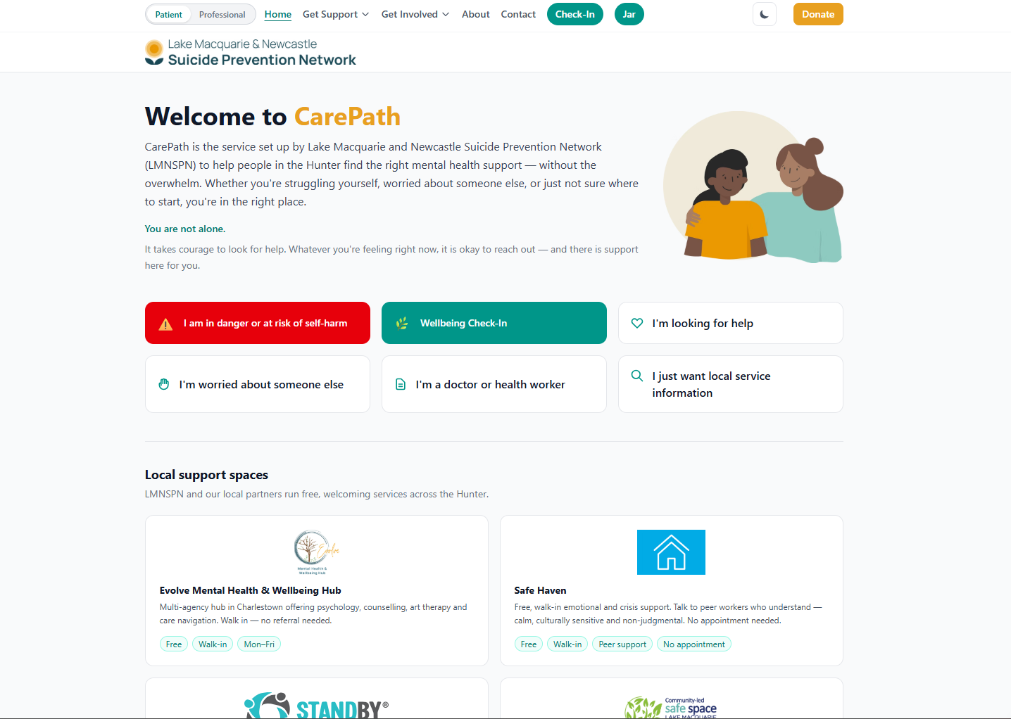
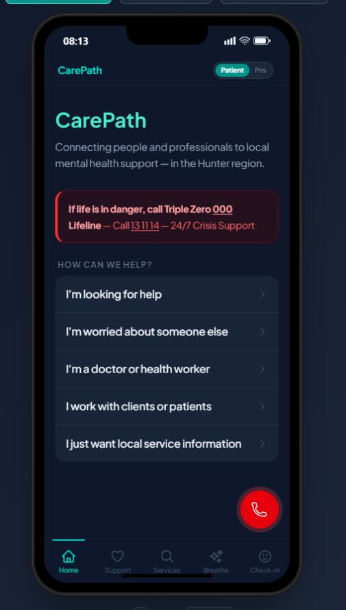
In the Lake Macquarie and Newcastle region of Australia, the LMNSPN (Lake Macquarie and Newcastle Suicide Prevention Network) has been supporting individuals and families impacted by suicide since 2009. They opened the Evolve Mental Health & Wellbeing Hub in Charlestown, run the Connected to Care online resource, and coordinate over 25 partner agencies and approximately 50 volunteers — all working to reduce the incidence and impact of suicide in the Hunter region. But there's a gap. When someone is struggling — whether they're seeking help for themselves, worried about a friend, or a GP trying to make a referral — the existing digital experience can feel like a directory: dense, impersonal, and difficult to navigate when you're already overwhelmed. We asked: what if the digital front door wasn't a directory, but a pathway? What if someone could arrive and, in just a few clicks, feel guided rather than lost? That question became CarePath.
What it does
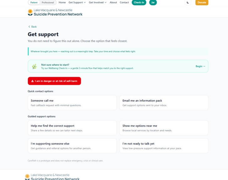
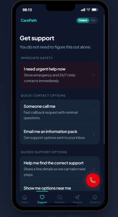
CarePath is a pathway-first website and referral assistant that reimagines how people interact with LMNSPN's services online. Instead of presenting a flat list of resources, CarePath guides users through clear, low-pressure decision pathways based on who they are and what they need.
For the public:
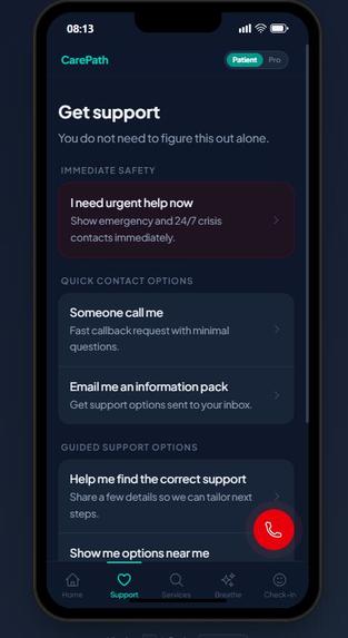
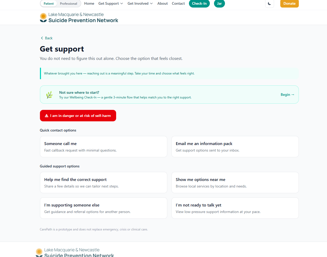
- "I just want someone to call me" — a minimal Quick Callback form that captures only what's needed
- "Send me an information pack" — request tailored local support resources by email
- "I need more detailed support" — a richer intake form with a recommendation engine that scores and surfaces best-fit services from a local dataset
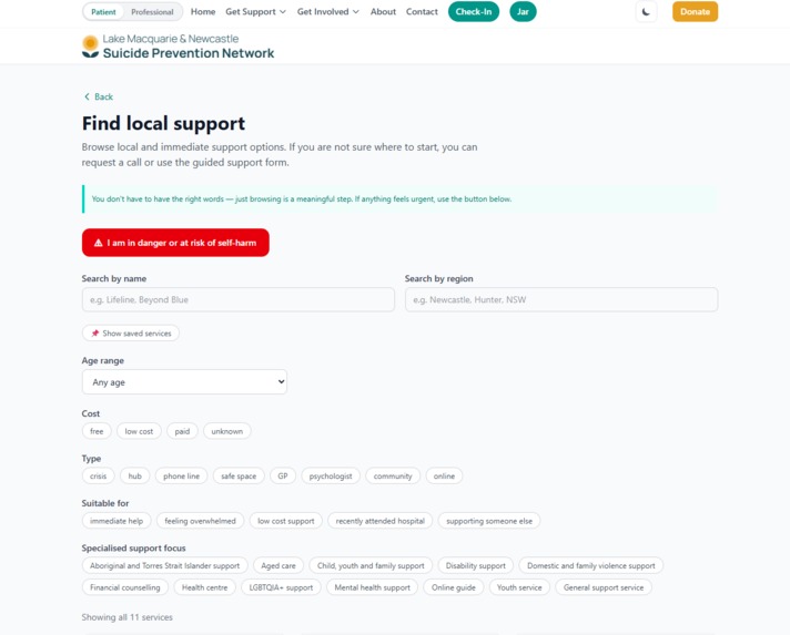
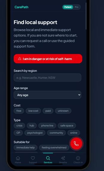
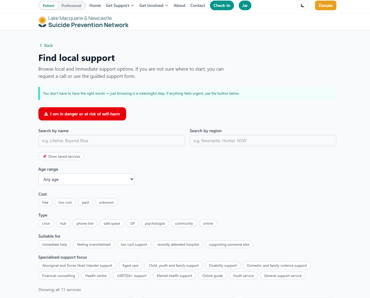
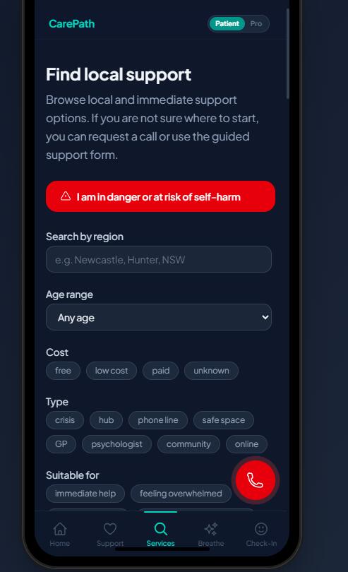
- Service Finder — filterable directory of 9+ local and national services by region, cost, type, age, and focus area ### For professionals:
- A structured Professional Referral Assistant with generated referral summaries, copy-paste notes, PDF export, and printable patient handouts — designed to fit into existing clinical workflows (not replace them) ### For the community:
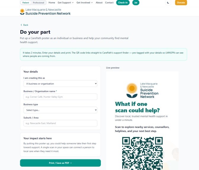
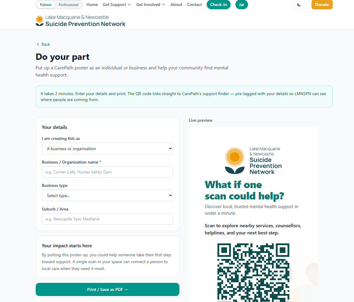
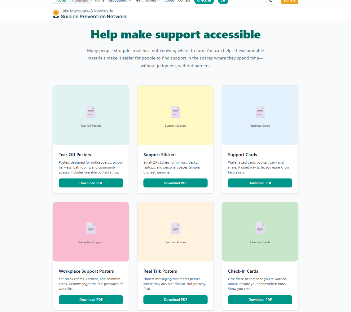
- "Do Your Part" poster generator with QR tracking source tags for campaign attribution
- Service registration intake for local providers wanting to join the network
- Campaign-aware homepage messaging that responds to
?source=query parameters from outreach materials ### Mobile-prototype: - Capacitor-wrapped for iOS and Android app store deployment
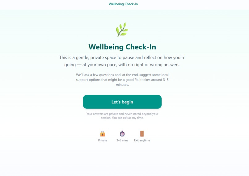
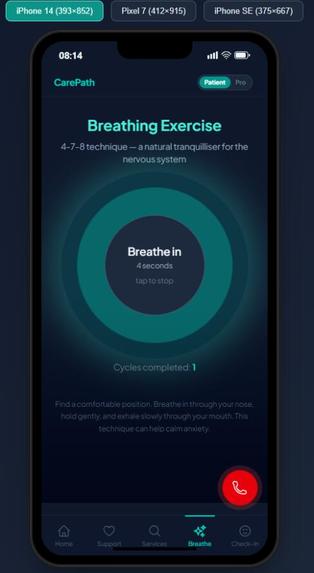
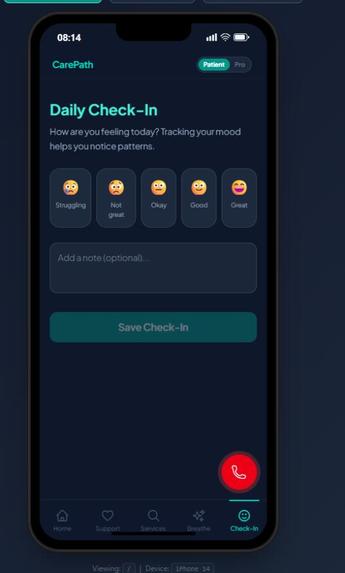
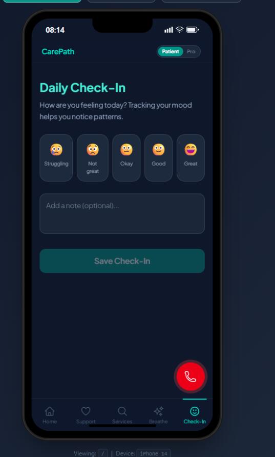
- Mobile-specific features: bottom navigation, breathing exercise, daily mood check-in, crisis FAB (Floating Action Button), and native share integration
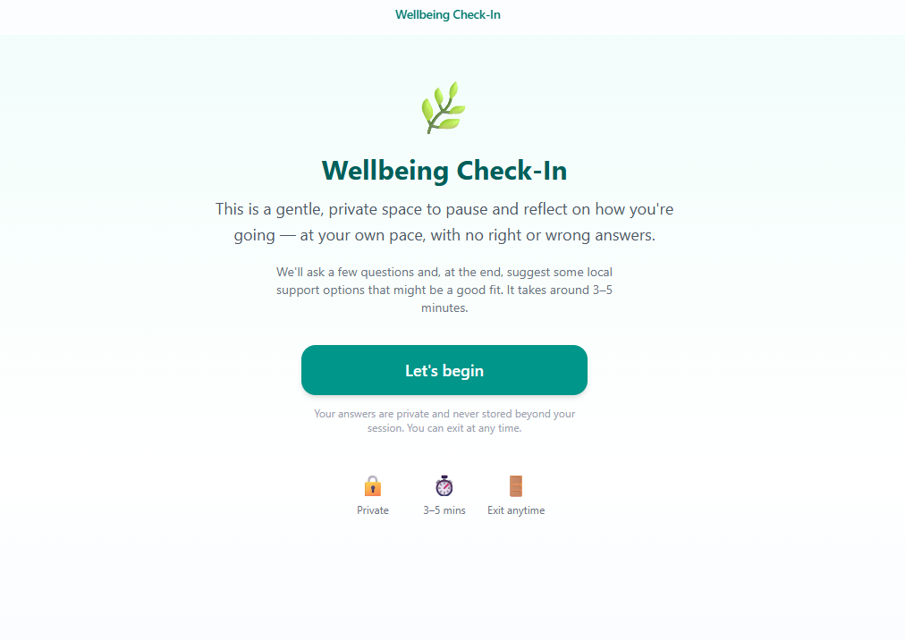
- An interactive Wellbeing Check-In quiz — a full-screen, immersive self-assessment experience ### Always present:
- Crisis Notice with emergency contacts (000, Lifeline 13 11 14, NSW Mental Health Line 1800 011 511) prominently displayed and accessible from every page
How we built it
Tech Stack
| Layer | Technology |
|---|---|
| Framework | React 19 + TypeScript |
| Build | Vite 8 |
| Styling | Tailwind CSS 4 |
| Routing | React Router v7 |
| PDF Generation | jsPDF |
| QR Codes | qrcode.react |
| Animations | Framer Motion |
| Mobile Shell | Capacitor 7 (Android + iOS) |
| Testing | Vitest |
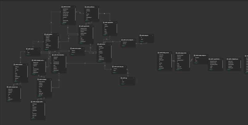
Architecture
The application follows a clean component-driven architecture with clear separation of concerns:
src/
├── components/       # Reusable UI: Layout, CrisisNotice, ServiceCard, SafeImage, etc.
│   └── mobile/       # Mobile-specific: BottomNav, CrisisFAB
├── context/          # React Context for mode switching (public ↔ professional)
├── data/             # Seeded datasets: local services, campaigns, social links
├── hooks/            # Custom hooks (e.g., useBookmarks)
├── pages/            # 18 page components covering all user journeys
├── quiz/             # Immersive wellbeing check-in quiz system
├── services/         # Business logic: mock CRM, recommendations, referrals, summaries
└── types/            # TypeScript interfaces for referrals, services, pathways
Key Design Decisions
- Pathway-first, not directory-first. The homepage presents clear role-based entry points ("I'm looking for help", "I'm worried about someone", "I'm a health worker") rather than a list of services. Every pathway leads to a concrete next step.
- Mode-gated professional tools. A mode toggle switches between public and professional views. Professional routes (referral assistant, CRM preview) are protected with a
ProRouteguard — only accessible in professional mode. - Deterministic recommendations, not AI. The recommendation engine in
recommendationService.tsuses template-based scoring against the local service dataset. No black-box AI — the logic is transparent, auditable, and works offline. - Mock data layer with real interfaces.
mockCrmService.tsdemonstrates the full intake flow with structured payloads. The service layer abstractions mean a future team can swap in a real CRM (Halaxy, Salesforce, etc.) without touching the UI. - Graceful degradation for assets. The
SafeImagecomponent silently hides broken images rather than showing broken placeholders — important for a prototype where not all brand assets are finalised. - Mobile-first with Capacitor. Rather than rewriting for React Native, we wrapped the existing Vite app with Capacitor — achieving 95%+ code reuse and unlocking native features (push notifications, haptics, share sheet) incrementally.
### Design System
We built a cohesive visual language documented in
DESIGN.md: - Brand palette: Teal ($\text{brand-600: #24677a}$) for trust and calm; Sunflower amber ($\text{accent: #e8a020}$) for warmth and call-to-action
- Consistent spacing:
max-w-5xlfor main content,max-w-2xlfor forms — preventing cognitive overload on intake pages - Accessible interactive states: Focus rings (
ring-2 ring-teal-400), clear active/hover states, and a persistent crisis panel withrole="alert"for screen readers
Challenges we ran into
1. Balancing comprehensiveness with simplicity
LMNSPN has a rich ecosystem — 25+ partner agencies, multiple programs (Safe Space, Safe Haven, StandBy, Newy Loves You), professional referral workflows, and campaign tracking. Fitting all of this into a single coherent platform without overwhelming a vulnerable user in crisis was the core UX challenge. We solved it with progressive disclosure: the homepage is simple and warm, and depth is only revealed as users choose to go deeper.
2. Professional workflow integration without real systems
The referral assistant needed to feel useful to a GP or health worker, but we couldn't integrate with real clinical systems (Halaxy, Best Practice, etc.) in a hackathon. We designed the output to be workflow-compatible: copy-paste referral notes, downloadable PDFs, and printable patient handouts — the same formats professionals already use. The mock CRM preview demonstrates what structured data handoff would look like.
3. Crisis messaging without being a crisis service
CarePath is explicitly not a crisis service, but it must handle crisis touchpoints responsibly. Every page includes access to emergency contacts. The crisis panel uses role="alert" for accessibility and is styled with high-contrast red to be unmissable. We had to ensure the messaging was both clear and warm — not clinical or cold.
4. Mobile readiness from a web-first codebase
Wrapping a web app in Capacitor sounds simple, but touch targets, safe area insets, navigation patterns, and performance on low-end Android devices all required attention. We added a mobile bottom navigation bar, a floating crisis action button, and ensured all interactive elements met the 44×44px WCAG touch target minimum.
5. Prototype framing for sensitive content
Mental health data is among the most sensitive. We had to be explicit at every level — in the UI, the README, and the code — that this is a prototype with mock data. No real patient information should ever be entered. This constraint shaped decisions from the mockCrmService naming to the prominent disclaimer banners.
Accomplishments that we're proud of
What we learned
- Design for the worst moment. When someone visits a mental health support site, they may be in the hardest moment of their life. Every design decision — colour, copy, layout, interaction — should reduce friction and increase warmth. "Just having a look is okay" is a valid user journey.
- Pathways beat directories. A filterable list of services is useful for someone who knows what they need. But most people don't. A guided pathway that asks "what brings you here?" and responds with a concrete next step is fundamentally more helpful.
- Clinical workflows are document workflows. GPs don't need a new app — they need a referral note they can paste into their existing system. Designing for copy-paste and PDF export was more practical than any API integration could be at this stage.
- Capacitor is a game-changer for hackathons. Going from web app to app-store-ready mobile app with 4 commands and 95% code reuse let us focus on features rather than platform plumbing.
- Community networks are complex systems. LMNSPN's ecosystem includes walk-in hubs, phone lines, partner agencies, volunteer networks, campaign channels, and professional referral pathways. Modelling this as a coherent digital experience taught us a lot about information architecture for social services.
What's next for CarePath
Built With
- auditable-crm-connections-**authentication-and-role-based-access**-?-so-professional-tools-are-properly-gated-**safety-plan-builder**-?-a-personal
- capacitor
- frame-motion
- jspdf
- on-device-safety-plan-following-the-stanley-brown-model-**ai-assisted-triage**-?-conversational-intake-with-guardrails
- qrcode.react
- react
- react-router
- replacing-form-filling-for-users-who-prefer-it-**peer-stories**-?-anonymised
- tailwindcss
- the-roadmap-includes:-**secure-backend-integration**-?-replacing-mock-services-with-encrypted
- typescript
- vite
- vitest

Log in or sign up for Devpost to join the conversation.