-
-
Making Every Care Decision Feel Simple
-
Know What To Do. When It Matters
-
Guidance When You Need It Most
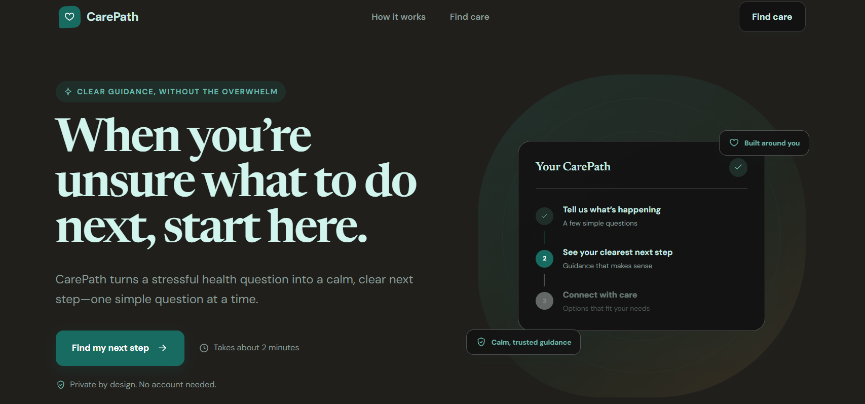
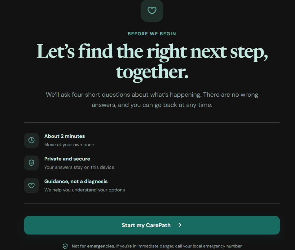
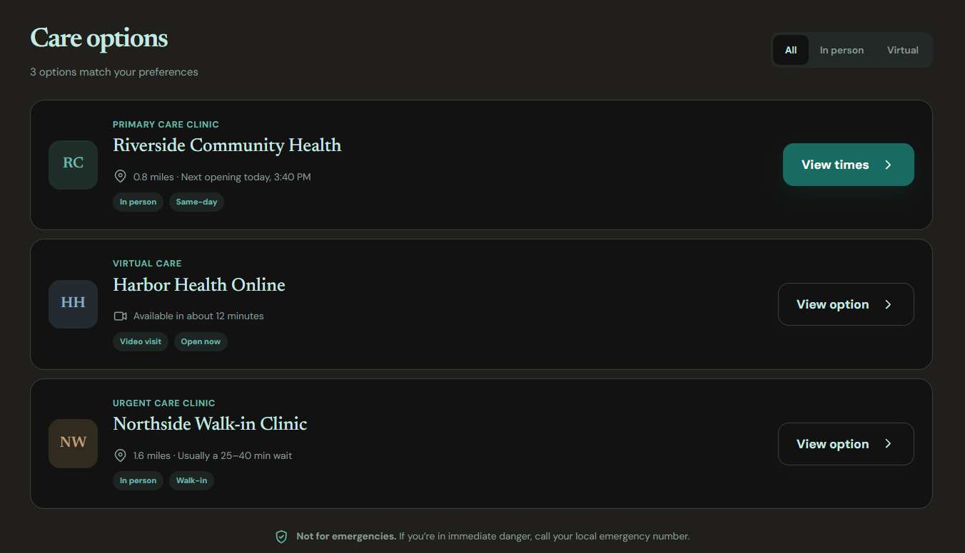
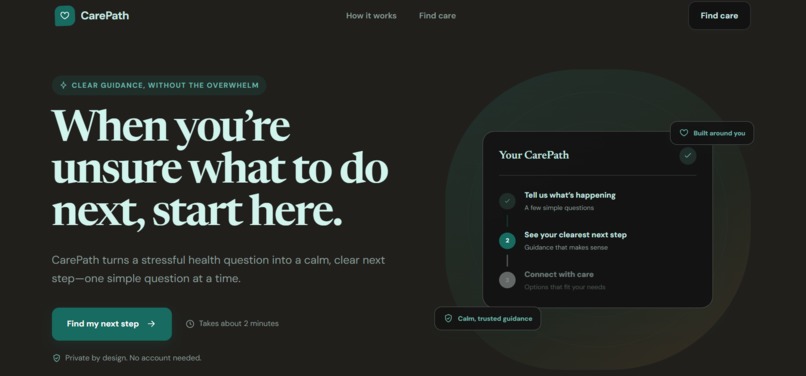
Inspiration: Healthcare can become confusing and stressful, especially when people are unsure about what to do next. Many healthcare platforms provide a lot of information but don't always make that information easy to understand. We wanted to create a calmer and more human experience. CarePath was inspired by a simple question: What if healthcare navigation felt as easy as following a clear path instead of searching through endless information?
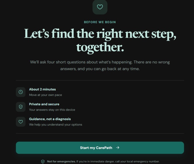
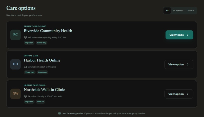
What it does: CarePath is a user-friendly healthcare navigation experience that guides people through a simple visual journey to help them understand their next step. Users answer a few easy questions and are guided toward options such as finding appropriate care, contacting someone they trust, or understanding what to do next. CarePath also includes Care Mode, which simplifies the interface for stressful situations, and accessibility features such as larger text, high contrast, reduced motion, and multilingual support. CarePath is designed for guidance and navigation only and does not diagnose medical conditions.
How we built it: We designed CarePath as a responsive web application that works across desktop, tablet, Android, and iOS browsers. The interface was built around reusable components, responsive layouts, accessible interactions, and a guided step-by-step flow. We focused heavily on information architecture and interaction design so that users always know what to do next. We also created realistic demo data and interactive states so the experience feels like a real product rather than a collection of static screens.
Challenges we ran into: Our biggest challenge was balancing simplicity with useful information. Healthcare can involve complex situations, but putting too much information on the screen can make the experience overwhelming. We also had to think carefully about accessibility, responsive layouts, and how the interface behaves when someone is stressed or using a smaller screen. We overcame these challenges by simplifying the user journey, using progressive disclosure, increasing touch-target sizes, improving visual hierarchy, and testing the experience across different screen sizes.
Accomplishments that we're proud of: We are most proud of creating an experience that feels calm and approachable while still being useful. The guided CarePath journey, Care Mode, accessibility controls, and responsive design were built to work together rather than being separate features. We are especially proud that the project demonstrates how thoughtful UX can make an important and potentially stressful digital experience feel much simpler.
What we learned: We learned that great UX is not about adding more features. It is about removing unnecessary complexity. We also learned how important accessibility is when designing for real people. Larger controls, readable typography, clear language, keyboard support, reduced motion, and high contrast can make a major difference. Most importantly, we learned to design from the user's situation first and the technology second.
What's next for CAREPATH: The next step is to make CarePath more personalized while keeping the experience simple. We would like to add verified healthcare-service integrations, real-time availability information, stronger multilingual support, wearable-device integration, voice navigation, and better accessibility for elderly and differently abled users. Our long-term vision is to make CarePath a trusted digital companion that helps people move from “I don't know what to do” to “I know my next step.”

Log in or sign up for Devpost to join the conversation.