Identifying the Problem
When people feel sick, most of them Google their symptoms before they ever open their health system’s app. Baylor Scott & White already has a tool built for this moment, called Help Me Decide. But people can’t find it, and when they do, it feels like a long clinical questionnaire instead of real help. We were inspired to build a guide that meets people where they already are and helps them feel confident about what to do next. CareCompass was designed to turn the anxious question “is this serious?” into a clear next step.
Insights and Findings
Our research shows how people already handle health worries. A 2024 Pacific Lutheran University survey found that 33% of Americans always search their symptoms before seeing a professional, and a 2025 poll found that 84% have used Google to check symptoms. When an AI called their symptoms low-risk, more Gen Zers said they’d skip or delay care (39%) than book a visit (36%). Our own survey of 61 people matched this: only one had heard of Help Me Decide, people rated how often they Google symptoms at 4.0 out of 5, and 28 rated their confidence choosing care at 3 or lower. Our usability test of the current tool scored 2/10 for effort and needs met, and 72% of respondents said they’d trust an app more if it explained why, which echoes a 490-person study showing that transparency builds trust in AI chatbots.
Our Solution: CareCompass
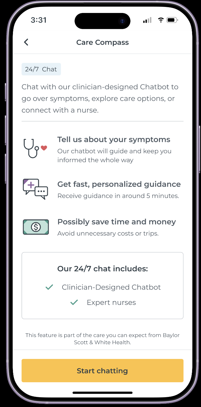
Our goal is to reimagine Help Me Decide as a warm, conversational guide that helps people understand their next step without giving a diagnosis. It also connects them to the emotional support that often comes with a health scare or a major life change.
Identifying the Problem.
When people feel sick or worried, their first question is “Where should I go?” BSW already has a care-navigation tool to help answer it, but it’s buried deep inside the MyBSWHealth app. Most people never find it. The ones who do are met with a rigid question tree. It asks them to repeat information, advises without explaining it, and leaves them to start over when it’s time to book. As a result, people delay care, guess wrong, or end up in the ER for something urgent care could have handled.
Insights and Findings
Our survey and research pointed to the same few patterns. People don’t use tools they can’t find. They describe symptoms in their own words, not in clinical categories. They follow advice they understand and second-guess advice they don’t. Repeating their story is one of their biggest frustrations. Many health concerns also come with an emotional weight that a purely clinical tool ignores.
Our Solution
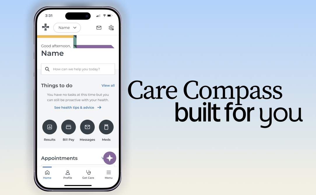
Feature 1: Front and Center on the Homepage: We moved CareCompass from deep inside the app to the MyBSWHealth homepage. It’s there the moment someone is worried, so no one has to go looking for it.
Feature 2: Changing the Name: We changed the name from Help Me Decide to Care Compass, creating a more memorable name that increases recognizability and aligns with Baylor Scott and White's compass logo.
Feature 3: Conversational Guidance and Sentiment Analysis: Every recommendation comes with a reason, like “We’re suggesting urgent care because you mentioned X.” When people understand the advice, they’re more likely to follow it. By implementing sentiment analysis, the chat is able to assess a user's tone and match it to empathize, de-escalate a situation, and respond appropriately to the situation at hand.
Feature 4: Image Scanning: Some symptoms are hard to describe. Users can snap a photo of a rash, cut, or swelling to give CareCompass more context.
Feature 5: Term definition pop-ups: Unfamiliar medical terms or hard-to-understand descriptions lead to a pop-up with an explanatory definition and/or image of the term.
Feature 6: Autofilled Appointments: When it’s time to book, everything from the conversation carries over automatically. Users never have to tell their story twice and are more likely to successfully schedule an appointment.
Feature 7: Support Group Connections: A health concern often comes with an emotional one. CareCompass links users to support groups and community resources, such as groups for new mothers, postpartum depression, or people processing a diagnosis.
Alignment with the BSW Prompt:
This project directly responds to BSW’s challenge to make the care-navigation tool easy to find, trustworthy, and clear about the next step, all without a diagnosis. The homepage placement solves discoverability. Plain language and photo input make it work for every literacy level. Explained reasoning makes it transparent. Support group links treat emotional safety as seriously as clinical safety. And every conversation ends with a concrete next step.
Why It Matters
Health care shouldn’t start with a guessing game. CareCompass gives people a calm, clear path from their first worry to the right care, so fewer people delay treatment or end up in the wrong place.
Challenges We Faced
Our biggest challenge was making the AI feel caring without letting it overstep. CareCompass has to guide people, not diagnose them. Research made this trickier. A study of 490 participants found that a chatbot that is both human-like and transparent can actually lose trust, even though each quality builds trust on its own. We had to balance warmth with clarity. We also worked with two briefs, care navigation and life transitions, and spent time deciding how much to blend them before landing on support group connections as the bridge. Finally, our survey was small and leaned young, so we treated it as a signal and backed it up with national research.
Conclusion
Most health decisions start with uncertainty, and that’s when people need the most support. CareCompass meets users where they already are, talks with them like a person, and shows its reasoning. It carries them all the way from their first question to a booked appointment and a supportive community. CareCompass doesn’t replace care. It helps people know where to go, and why.
Built With
- claude
- figma


Log in or sign up for Devpost to join the conversation.