-
-
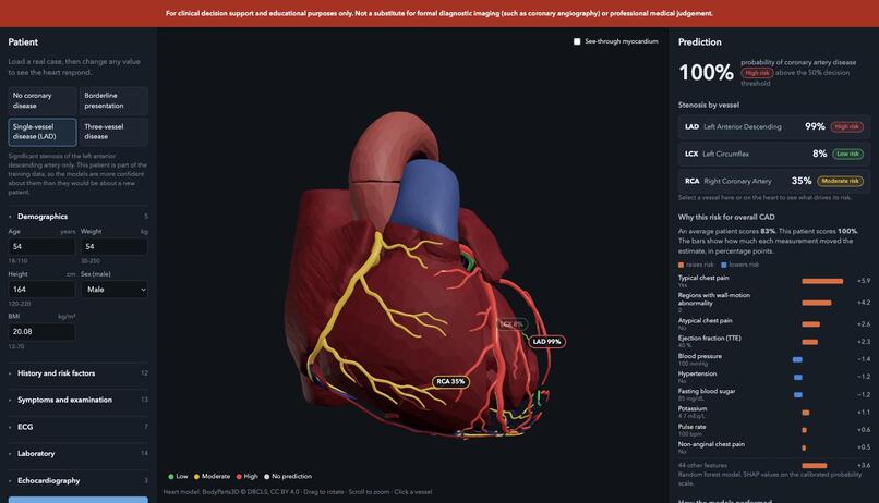
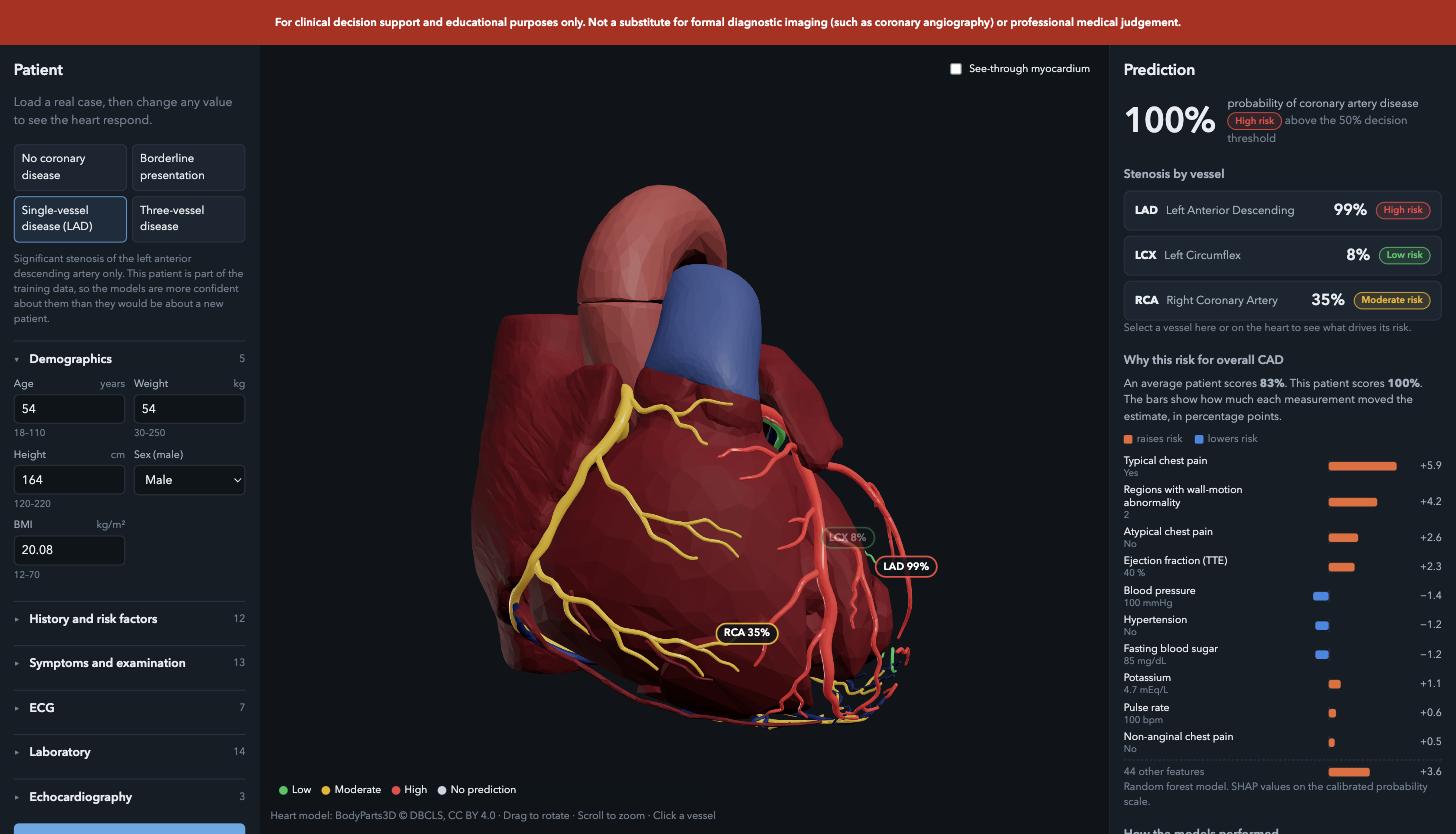
Working Prototype after phase4
-
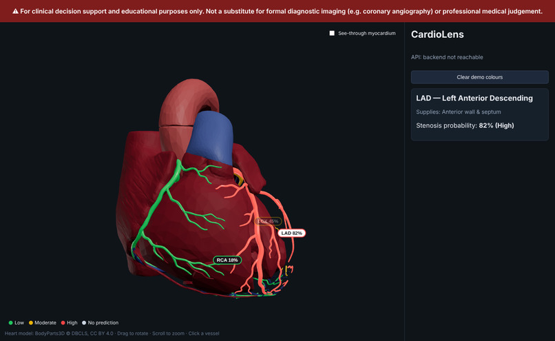
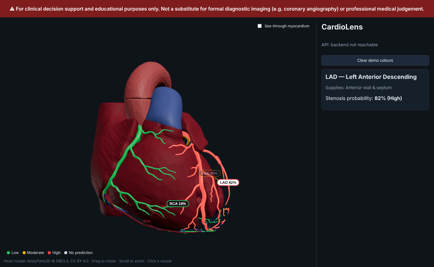
3D heart viewer after phase 1
-
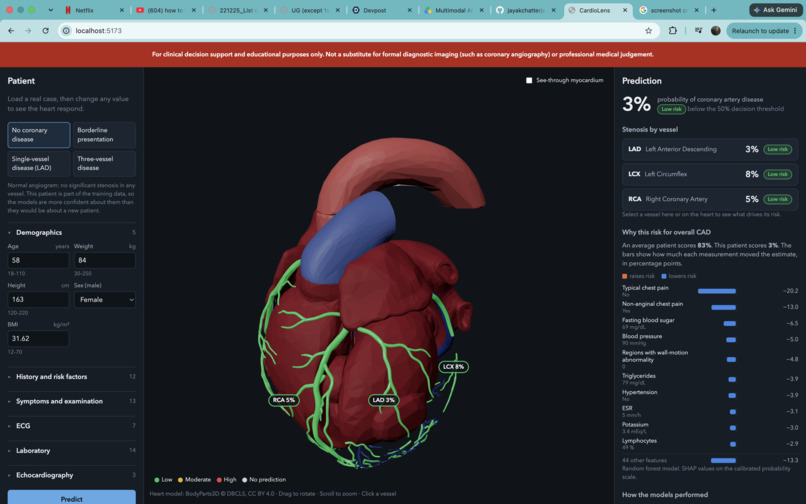
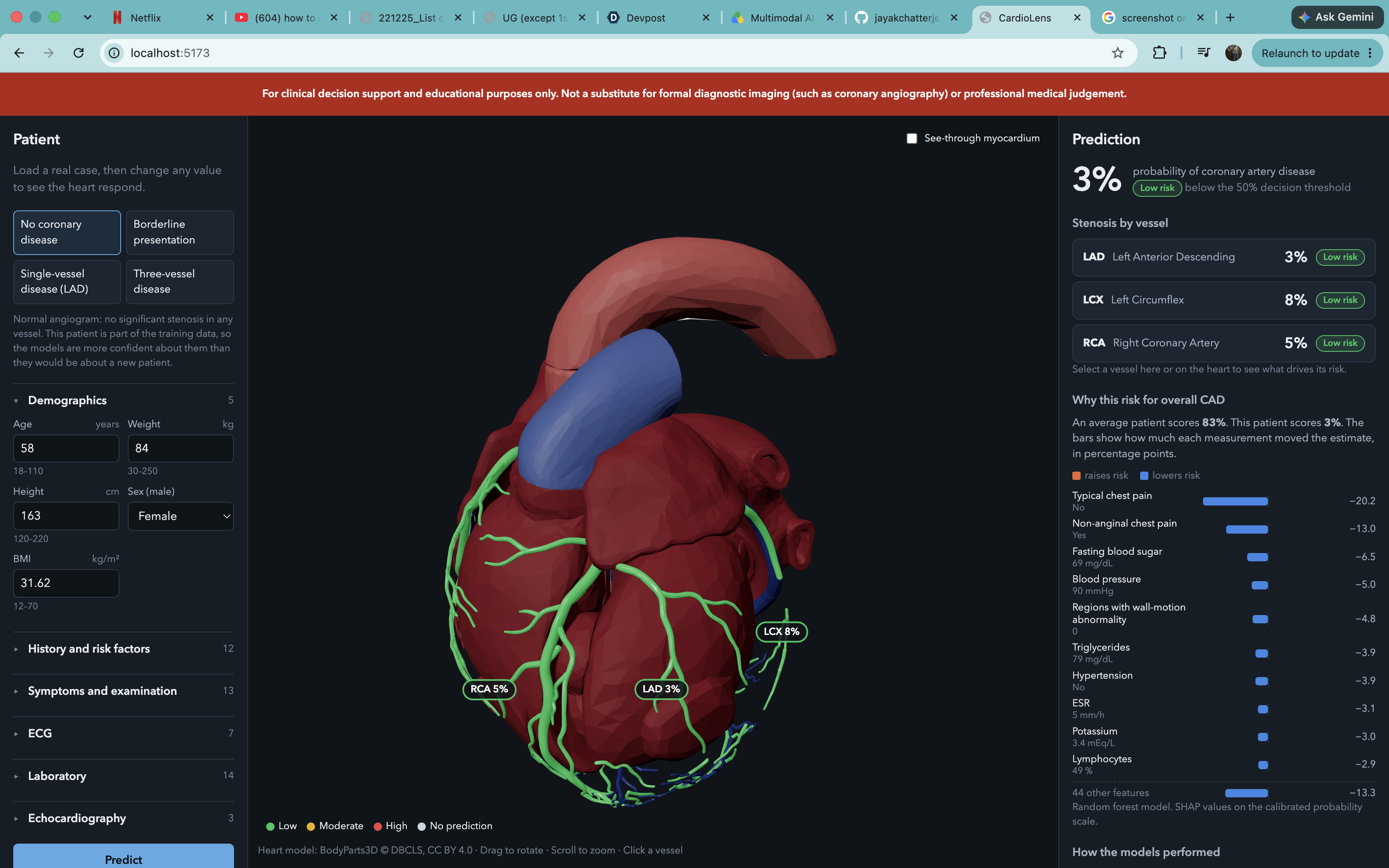
Working Protoype/Thumbnail
-
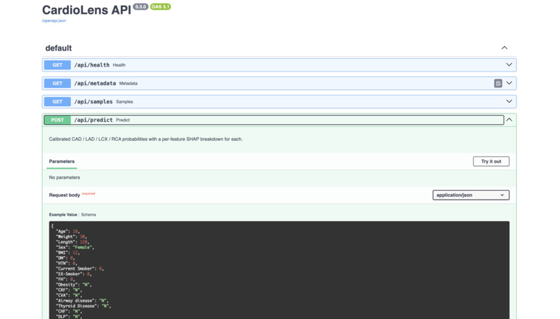
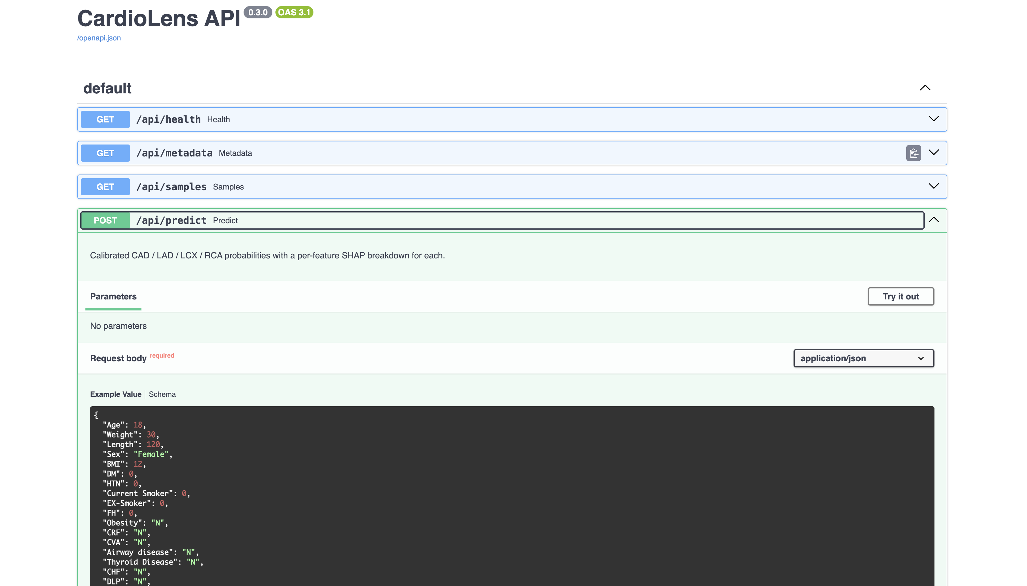
Backend Fastapi doc
Inspiration
** My Grandmother**
This project is personal. My grandmother lived for years with high cholesterol that quietly built up plaque in her coronary arteries. One day it caught up with her — a sudden, severe blockage triggered a heart attack, and she was rushed to the ICU, where doctors operated and placed a stent to reopen the artery.
What stayed with me afterward wasn't just the fear of that day, but a question, what if the warning signs, the cholesterol numbers, the ECG findings, the measurements her doctors already had on file , could have been turned into something we could have actually seen and understood, long before it became an emergency ? Raw lab metrics and numbers don't mean much to most people. But a heart which you can rotate, zoom into, and watch light up where the risk is concentrated , that tells a story numbers alone can't. CardioLens is my attempt to build that, "A bridge between clinical data and the kind of visual, intuitive understanding that might have given us an early intimation and more clarity. "
What it does
CardioLens has two halves that had to stay tightly connected: the predictive pipeline and the 3D clinical dashboard.
Predictive modeling. -- We used the Extension of the Z-Alizadeh Sani dataset, which contains 303 patient records spanning demographics, vital signs, lab values, ECG findings, and echocardiographic measurements. Before training, we explicitly dropped LAD, LCX, RCA, and Cath from the input features to prevent target leakage, these columns only ever appear as labels, never as predictors. We trained separate classification models: one for overall CAD status, and one each for LAD, LCX, and RCA stenosis, so each vessel gets its own independent risk probability rather than inheriting a single blended score. Models were evaluated with accuracy, precision, recall, F1-score, and ROC-AUC, using stratified splits to account for the dataset's class imbalance.
Explainability. -- Alongside each prediction, we generated SHAP values so every risk score comes with a feature-level breakdown showing, for example, how much a patient's cholesterol, ST elevation, or RWMA finding pushed their predicted risk up or down. This output is what feeds the clinical dashboard's explanation panel.
3D visualization. -- The frontend is built with React and React Three Fiber (Three.js under the hood) rendering an anatomical heart/torso mesh. Each coronary artery (LAD, LCX, RCA ) is a distinct, selectable node in the scene graph, color-coded on a risk gradient that updates live from the model's output probabilities. Users can orbit, zoom, and click into a vessel to pull up its localized stenosis probability and SHAP breakdown, all without needing a dedicated GPU. The mesh and shading were kept lightweight enough to run smoothly in-browser.
Integration. -- The ML pipeline (Python3) exposes predictions and SHAP outputs through a lightweight API layer that the React frontend consumes, so a new patient's inputs flow through to an updated 3D risk map and dashboard in real time. The architecture keeps the model layer, the API layer, and the visualization layer decoupled, so new features, models, or anatomical structures can be added later without a full rewrite.
How I built it
CardioLens is built as three layers around one shared data contract. The ML layer (Python/scikit-learn) trains four separate classifiers, overall CAD plus LAD, LCX, and RCA stenosis, on the UCI Extension of Z-Alizadeh Sani dataset (303 patients, 59 clinical features). A single feature registry (ml/features.py) is the source of truth for which of the 54 input features exist, their types, and their clinical bounds; every other module, training, the API schema, the frontend form, reads from it, so the target/feature contract can’t silently drift between training and inference. Each target’s model was selected by comparing Logistic Regression, Random Forest, and Gradient Boosting under repeated stratified 5-fold cross-validation, then calibrated with Platt scaling so the output probabilities are honest, not just well-ranked. SHAP (TreeSHAP for tree models, Permutation SHAP for logistic regression) explains every prediction in probability units, folded back from one-hot encoded columns to the original 54 clinical features.
The backend (FastAPI) loads all four calibrated models and their SHAP explainers once at startup, including a warm-up prediction to absorb the SHAP library’s one-off JIT cost before the first real user ever hits the API and exposes /api/predict, /api/metadata, and /api/samples. The patient input schema is generated directly from the ML feature registry via pydantic.create_model(), so the API can never accept a shape of data the models weren’t trained on.
The frontend (React + React Three Fiber) renders an interactive 3D heart built from BodyParts3D anatomical mesh data, grouped by FMA concept into named nodes (lad, lcx, rca) that correspond 1:1 with the ML targets, a prediction for lad can only ever color the LAD mesh, by construction. A custom hook debounces re-prediction as a user edits patient fields, discards stale in-flight responses if a newer edit supersedes them, and feeds live probabilities into vessel coloring, a SHAP-driven explanation panel, and a cross-validation performance table all pulling from the same /api/predict response.
Challenges I ran into
The dataset is small (303 rows), which makes vessel-specific prediction genuinely harder than overall CAD , LCX and RCA both land around 0.73 ROC-AUC with noticeably lower recall than CAD’s 0.92, and we chose to report that honestly rather than mask it with an unrepresentative train/test split. Preventing target leakage required discipline across the whole pipeline: LAD, LCX, RCA, and Cath all had to be excluded from every model’s inputs, including the other vessel columns when predicting any single one, an easy detail to miss, so it’s enforced centrally in the feature registry rather than trusted to each training run. Getting SHAP values onto the calibrated probability scale, rather than the raw classifier’s uncalibrated output, took care: contributions are rescaled so they still sum exactly to the calibrated prediction, keeping the explanation faithful to what the dashboard actually shows. On the 3D side, mapping real anatomical mesh data (rather than placeholder shapes) to clickable, risk-colored regions that stay visually coherent from any camera angle took more iteration than expected, especially keeping floating vessel labels correctly positioned in screen space as the camera orbits.
Accomplishments that we're proud of
Every prediction in the dashboard is traceable end-to-end: a probability shown on screen can be decomposed, feature by feature, into exactly why the model produced it, in the same units a clinician would read. The system is also honest about its own limits, showing calibrated probabilities, confidence-relevant metrics (ROC-AUC, recall) per vessel, and a persistent clinical disclaimer, rather than presenting a single overconfident number. And the whole pipeline from a raw Excel dataset to a live, interactive 3D risk visualization was built and shipped solo in a tight hackathon window without cutting the predictive-modeling rigor (proper cross-validation, calibration, leakage prevention) that the rest of the system depends on.
What I learned
That explainability is a pipeline problem, not a UI problem, getting SHAP attributions to be correct on the probability scale, correctly folded back from encoded features, and correctly rescaled through calibration mattered more to the final dashboard than any front-end polish. I also came away with a much sharper sense of where small medical datasets genuinely limit what’s responsible to claim: a single ROC-AUC number hides a lot, and reporting recall and calibration alongside it changes how trustworthy a system feels, not just how it looks.
What's next for CardioLens
Near-term: expand the anatomical model beyond three coronary territories toward finer-grained regional risk, and validate the vessel-specific models against a larger, multi-center dataset to see whether the LCX/RCA performance gap narrows with more data. Longer-term: support uploading real patient time-series (serial ECGs, lab trends) rather than a single snapshot, and explore uncertainty quantification so the dashboard can show not just a probability but how confident the model is in that probability for a given patient. Also a building a dedicated database and integrating it, to store patient history and compare the new patient reports with previous ones, to track the patient's progress.
Built With
- claude
- css3
- fastapi
- html5
- javascript
- joblib
- json
- node.js
- npm
- pydantic
- pytest
- python
- python-package-index
- react
- react-three-fiber
- scikit-learn
- shap
- three.js
- uvicorn
- vite
- webgl


Log in or sign up for Devpost to join the conversation.