-
-
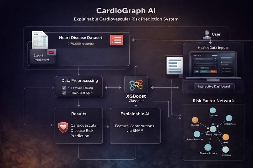
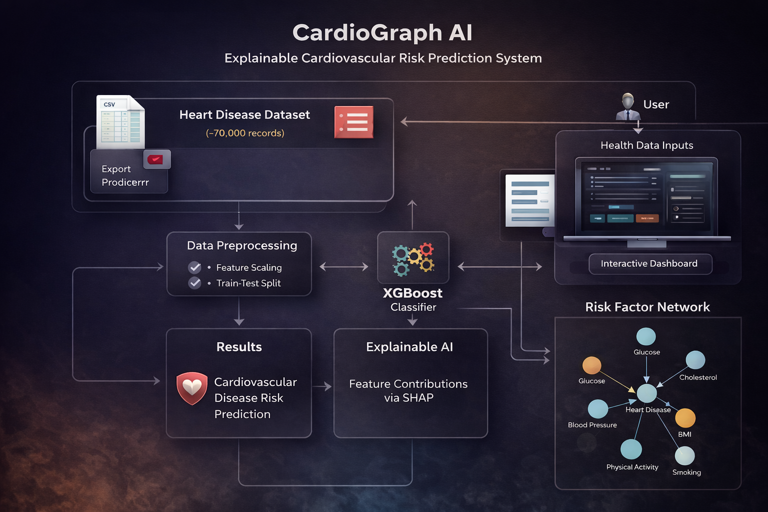
Architecture of our project.
-
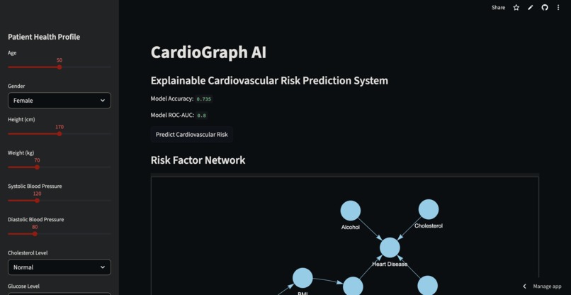
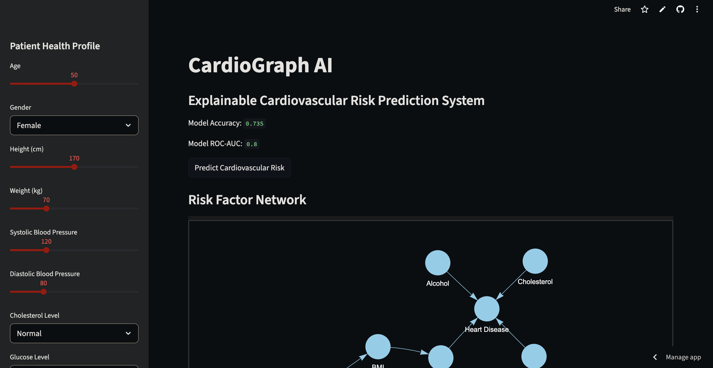
Interactive dashboard where users input health parameters to predict cardiovascular disease risk.
-

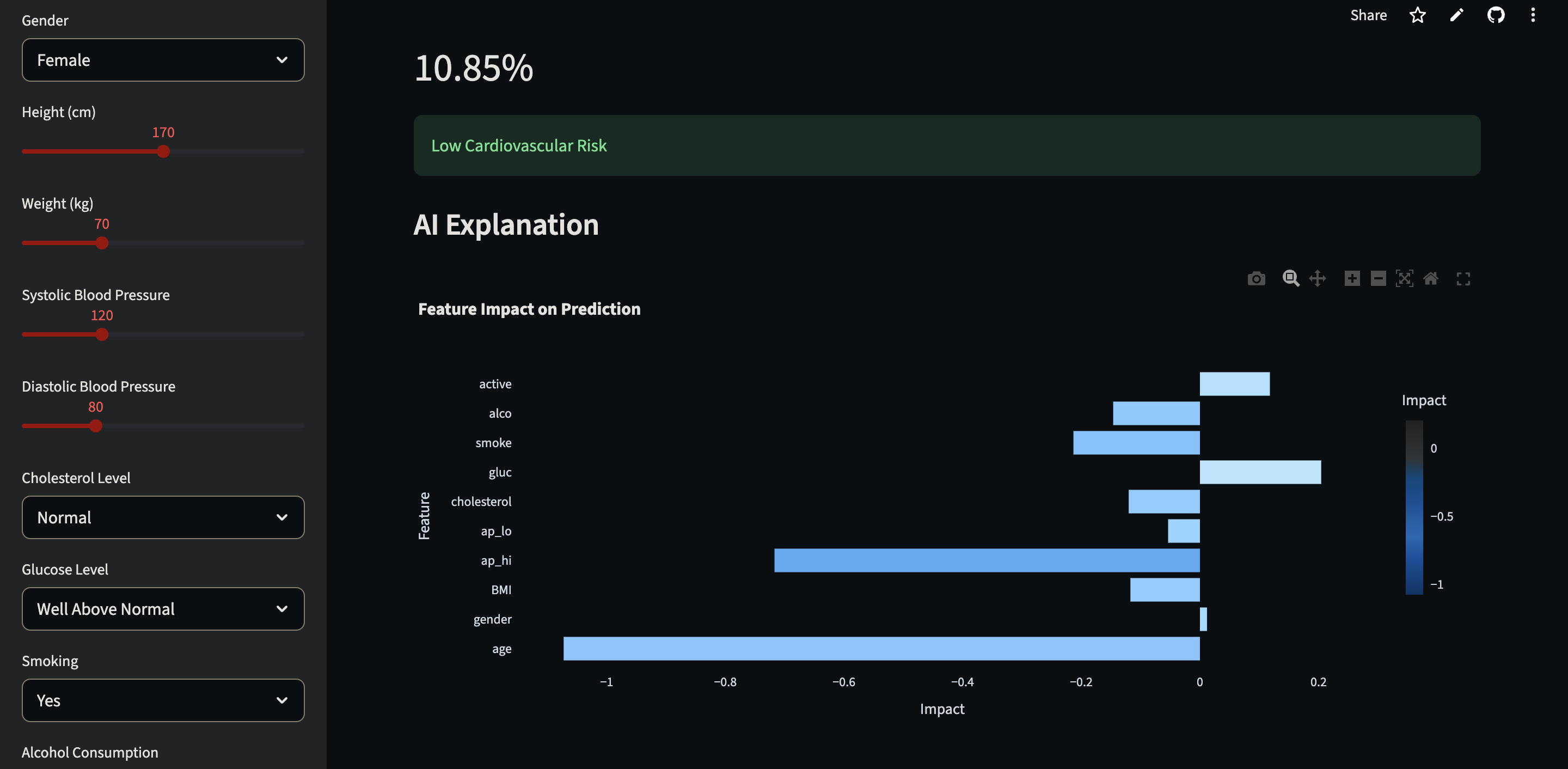
Explainable AI visualization showing how each health feature influences the predicted risk.
-
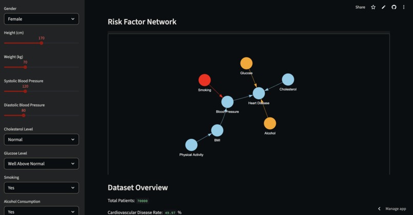
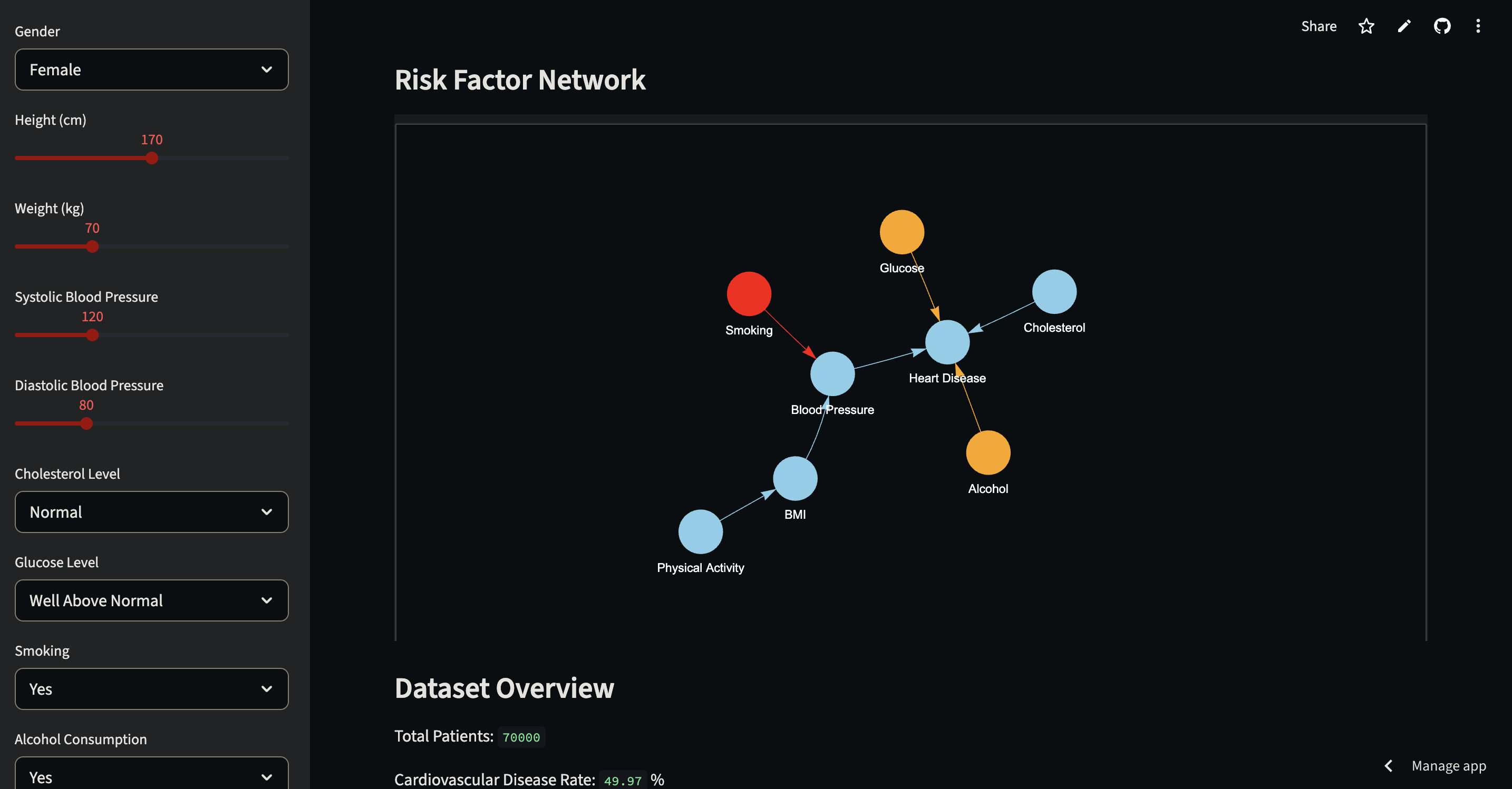
Network visualization showing relationships between lifestyle factors and cardiovascular disease risk.
Inspiration
Cardiovascular disease (CVD) is the leading cause of death globally, responsible for millions of deaths every year. Many key risk factors such as high blood pressure, cholesterol, obesity, smoking, and lack of physical activity significantly increase the likelihood of developing heart disease.
While machine learning models can predict disease risk, most of them operate as black boxes, meaning they produce predictions without explaining why the prediction was made. In healthcare, interpretability and transparency are critical because users must understand the reasoning behind predictions.
CardioGraph AI was inspired by the idea of combining machine learning, explainable AI, and intuitive visualizations to create a system that not only predicts cardiovascular risk but also helps users understand:
- why the risk is high
- which health factors contribute most
- how lifestyle changes can reduce the risk
What it does
CardioGraph AI is an explainable machine learning system that predicts cardiovascular disease risk using clinical and lifestyle data.
Users can input health parameters such as:
- Age
- Blood pressure
- Cholesterol level
- Glucose level
- Weight and height
- Smoking status
- Alcohol consumption
- Physical activity
The system then:
1. Predicts cardiovascular disease risk using a trained XGBoost machine learning model
2. Explains the prediction using SHAP (SHapley Additive Explanations) to show which factors influenced the risk
3. Visualizes feature impact through interactive charts
4. Suggests lifestyle improvements such as reducing BMI or increasing physical activity
5. Simulates risk reduction to show how behavioral changes affect predicted risk
6. Displays a risk factor network graph that visually illustrates relationships between cardiovascular health factors
This makes the system predictive, interpretable, and educational.
How we built it
The system was developed using a machine learning pipeline combined with an interactive web dashboard.
1. Dataset
We used a cardiovascular disease dataset containing approximately 70,000 patient records with clinical and lifestyle indicators.
Important features include:
- Age
- Gender
- Blood pressure
- Cholesterol level
- Glucose level
- Smoking
- Alcohol consumption
- Physical activity
The dataset target variable:
0 → No cardiovascular disease
1 → Cardiovascular disease
2. Feature Engineering
A new feature called Body Mass Index (BMI) was derived from height and weight.
The formula used is:
BMI = weight / (height / 100)²
BMI is a widely used medical indicator of obesity-related cardiovascular risk.
3. Data Preprocessing
The dataset was preprocessed before training the model:
- Relevant health features were selected
- Continuous variables were normalized using StandardScaler
- The dataset was split into 80% training and 20% testing data
- Stratified sampling preserved the distribution of disease cases
4. Machine Learning Model
We trained an XGBoost (Extreme Gradient Boosting) classifier, which is a powerful ensemble learning algorithm designed for structured datasets.
XGBoost builds multiple decision trees sequentially, where each new tree improves upon errors from previous trees.
This allows the model to capture complex nonlinear relationships between health variables.
5. Explainable AI
To make predictions interpretable, we implemented SHAP (SHapley Additive Explanations).
SHAP calculates how much each feature contributes to the final prediction.
For example, the system can show that:
- High blood pressure increased risk
- Cholesterol increased risk
- Physical activity reduced risk
This makes the model transparent and easier to understand.
6. Visualization
We implemented interactive visualizations to make the system intuitive:
Plotly
Used to generate interactive feature contribution charts that show how each health factor impacts the prediction.
NetworkX + PyVis
Used to build a risk factor network graph that illustrates relationships between cardiovascular risk variables such as:
- Smoking → Blood Pressure
- BMI → Blood Pressure
- Cholesterol → Heart Disease
- Physical Activity → BMI
Nodes are color-coded to indicate risk severity.
7. Deployment
The entire system was deployed using Streamlit, creating an interactive dashboard where users can:
- enter health parameters
- view predicted cardiovascular risk
- understand feature contributions
- explore risk factor relationships
- simulate lifestyle improvements
Challenges we ran into
One major challenge was balancing predictive performance with interpretability. While models like XGBoost provide strong accuracy, understanding their predictions requires additional explainability tools.
Integrating SHAP explanations in a way that is intuitive for users required careful visualization design.
Another challenge was building the risk factor network graph in a way that reflects meaningful medical relationships while remaining visually understandable.
Finally, combining machine learning, explainability, visualization, and interactive UI into a single system required integrating multiple libraries effectively.
Accomplishments that we're proud of
We are proud that CardioGraph AI is more than just a machine learning model. It is a complete explainable AI system.
Key achievements include:
- Building a cardiovascular risk prediction model using XGBoost
- Integrating SHAP explainable AI for transparent predictions
- Creating an interactive risk factor network visualization
- Implementing a risk reduction simulator
- Deploying the system as an interactive dashboard
The project demonstrates how machine learning and explainable AI can be combined to build meaningful healthcare applications.
What we learned
Through this project we learned:
- How machine learning models like XGBoost can be applied to healthcare prediction
- The importance of explainable AI in medical decision-support systems
- How SHAP values help interpret complex machine learning models
- How interactive visualizations improve user understanding
- How to integrate Streamlit, Plotly, NetworkX, PyVis, and machine learning models into a single system
Most importantly, we learned that AI systems become far more valuable when users can understand and interact with them.
What's next for CardioGraph AI
Future improvements for CardioGraph AI include:
- Integrating larger and more diverse biomedical datasets
- Improving model performance and calibration
- Incorporating wearable health data such as heart rate and sleep patterns
- Implementing long-term personalized risk tracking
- Enhancing the dashboard with additional medical insights and recommendations
Our long-term vision is to develop CardioGraph AI into a comprehensive explainable AI platform for cardiovascular health awareness and prevention.
Built With
- networkx
- python
- shap
- streamlit
- xgboost


Log in or sign up for Devpost to join the conversation.