-
-
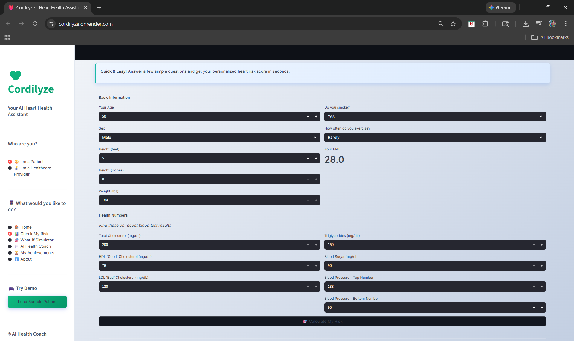
Real-time risk assessment with SHAP explainability
-
SHAP analysis breaks down each risk factor
-
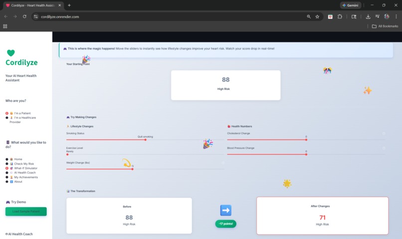
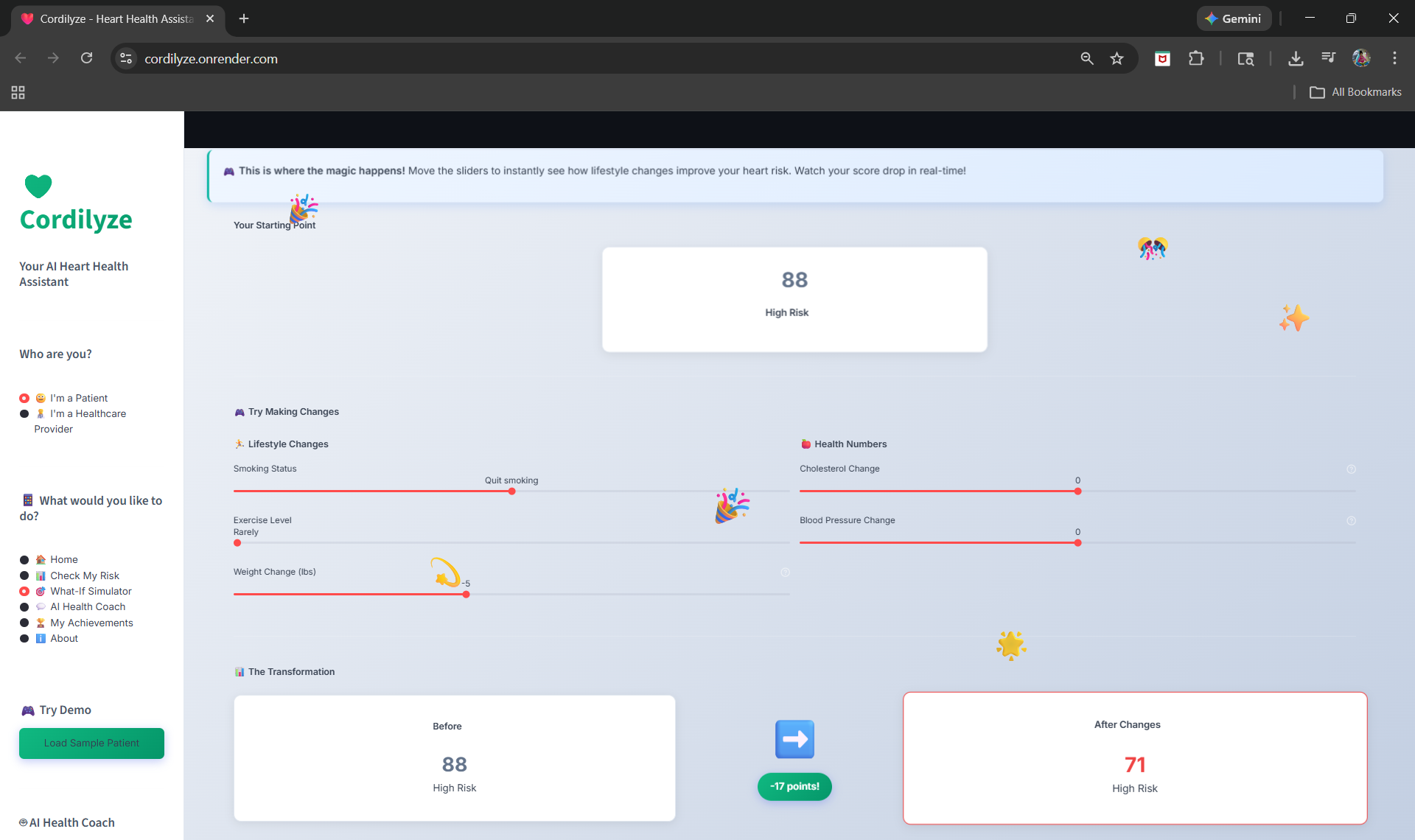
What-If Simulator — adjust lifestyle, watch risk drop
-

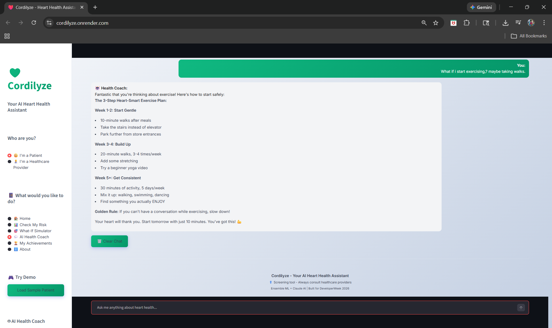
AI health coach answers in plain language
INSPIRATION
Cardiovascular disease kills 17.9 million people a year. Risk calculators have been around for decades, but they all do the same thing. They give you a number and stop there. No context, no guidance, nothing. I've worked in clinical laboratories for over 10 years. I've processed more than a million lab samples. And I've watched patients walk out confused, holding a report full of numbers they don't understand. Some panic. Some ignore it completely. Neither of those reactions helps anyone. What always bothered me is that there was never a way for patients to ask "okay, but what if I actually changed something?" What if I quit smoking? What if I lost some weight? What happens to my risk then? No tool answered that. So I built one.
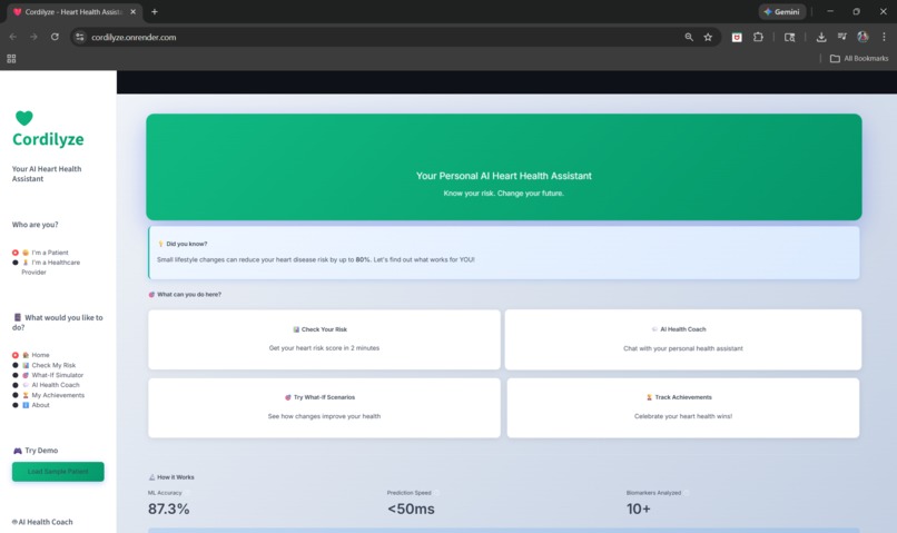
WHAT IT DOES
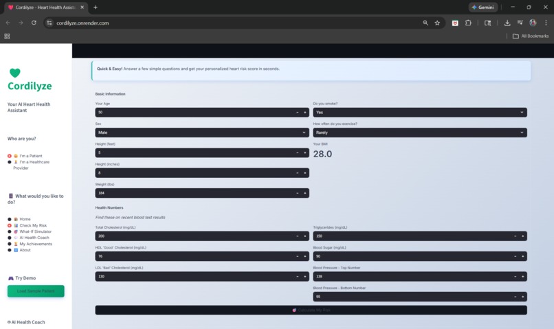
Cordilyze takes your health numbers and turns them into something you can actually understand and act on. You enter your biomarker data, things like cholesterol, blood pressure, glucose, BMI, smoking status, and activity level. The app runs everything through an ensemble of three machine learning models and gives you a risk score from 0 to 100 in under a second. But the score is just the starting point. The real feature is the What-If Simulator. Once you have your score, you can adjust lifestyle sliders and watch the number change in real time. Quit smoking and the score drops. Lose 15 pounds and it drops more. Start exercising regularly and it drops again. Patients can see exactly what each change does before they commit to it. Every prediction also comes with a full SHAP breakdown showing which factors are contributing the most to the score. So instead of just hearing "your risk is high," you see that blood pressure accounts for 24% of your risk and smoking accounts for 21%. That level of detail is what actually helps people take action. There's also an AI health coach built on Claude that answers questions in plain, friendly language. It personalizes responses based on the patient's actual numbers. And if there's no API connection, it falls back to curated expert responses so the app never breaks. On the provider side, clinicians get a dashboard to view patients, filter by risk category, and track population health trends. Everything runs in the browser. Nothing to download or install.
HOW I BUILT IT
I started with what I know best, which is clinical biomarkers. Ten years in the lab gave me a strong sense of which numbers matter most for cardiovascular risk, what realistic ranges look like, and how patients actually receive their results. That shaped everything from the input form design to the way results are displayed. For the machine learning side, I built an ensemble combining Random Forest, XGBoost, and Gradient Boosting. No single model was consistently the best across every patient profile, so combining them made the predictions more stable. XGBoost got the highest weight at 40% because it had the best AUC-ROC, with Random Forest at 35% and Gradient Boosting at 25%. I picked Streamlit for the frontend because it let me move fast and still build interactive elements like sliders, forms, and live updating charts without needing a separate frontend framework. All the visualizations are done with Plotly. For explainability I added SHAP using TreeExplainer on the XGBoost model. That gives per-patient feature contributions, not just a generic importance chart. When the app tells you blood pressure is your biggest risk factor, that's coming directly from the model, not from a formula I wrote by hand. The AI health coach calls the Anthropic API with the patient's data in the system prompt so every response is personalized. But I also built a complete offline mode with keyword-matched expert responses. The app works fully without any external API. The database is SQLite. Simple, no server overhead, and it handles everything I need at this stage.
CHALLENGES I RAN INTO
The hardest part was getting the feature mapping right. Training data uses ranges that need to line up with what patients see on real lab reports. Cholesterol in mg/dL, blood pressure in mmHg, glucose in the right units. Making those relationships realistic required a lot of back and forth with NHLBI clinical guidelines. SHAP integration took some figuring out. TreeExplainer works on individual models, not on an ensemble directly. I ended up running it on XGBoost since it carries the highest weight. The explanations technically reflect one model instead of all three, but in practice the feature rankings come out nearly identical across all of them. The What-If Simulator was conceptually tricky. Moving a weight slider can't just subtract from the score. It has to recalculate BMI, update the feature vector, and re-run the full inference pipeline. Same thing with cholesterol changes that affect both total and LDL values. Getting those relationships to feel clinically realistic and not just linear took several rounds of testing. I also spent time deciding whether to require an API key for the health coach. In the end I built the offline fallback so the core app has zero external dependencies. The Claude integration adds value on top but nothing breaks without it.
ACCOMPLISHMENTS I'M PROUD OF
The What-If Simulator is the thing I care about most. When you drag a slider and the score drops, and then the SHAP chart updates to show you exactly why, that moment is what this whole project is about. That's not a gimmick. That's a tool that can genuinely help someone decide to make a change. Building the full platform end to end in a hackathon timeframe is something I'm proud of. ML pipeline, interactive simulator, SHAP explanations, AI health coach, provider dashboard, seven different visualizations, database layer, PDF parsing. All of it connects and all of it works. The ensemble hitting 87% accuracy with a 0.91 AUC-ROC is solid for tabular clinical data. It's not trying to be a research paper. It's trying to be fast, reliable, and useful in a real setting. Sub-50ms inference means patients aren't waiting around. I'm also proud that the app doesn't feel intimidating. Healthcare software is usually designed for clinicians, not patients. I wanted someone without any medical background to open this and immediately understand what their results mean. The color coding, the plain language, the way results are laid out, all of that was intentional.
WHAT I LEARNED
Domain knowledge matters more than I expected. Being able to pick the right biomarkers, set clinically valid input ranges, and catch when model outputs don't make medical sense saved me a huge amount of time. Building something like this in a domain I didn't understand would have been a completely different experience. Ensemble models are underrated for this kind of problem. Tabular data with 12 features does not need deep learning. Three well-tuned tree models combined give you better stability, full explainability, and inference times that work in production. That tradeoff is worth it every time, especially in healthcare where you need to explain your predictions. Adding SHAP changed the entire app. Before it, the results page showed a score and some generic charts. After it, every prediction tells the patient exactly which factors are pushing their risk up and by how much. That shift from "your risk is high" to "here's why and here's what to focus on" is the difference between information and insight. Interactivity drives behavior change. A static number on a screen does not motivate people. Letting them experiment with their own data and see results instantly is what makes health information stick. The What-If Simulator proved that to me more than anything else in this project.
WHAT'S NEXT
Short term I want to run a clinical validation study with real patient outcomes, start HIPAA compliance work, and pilot the platform with a few local clinics to see how it fits into actual workflows. After that the priorities are EHR integration with systems like Epic and Cerner so patient data can flow in automatically, wearable device support for continuous blood pressure and activity monitoring, and eventually FDA clearance as a Software as Medical Device. I also want to build out the longitudinal tracking. Right now there's an achievements system in the app, but I want patients to come back monthly, see how their risk has shifted, and get real credit for their progress backed by clinical data.


Log in or sign up for Devpost to join the conversation.