-
-

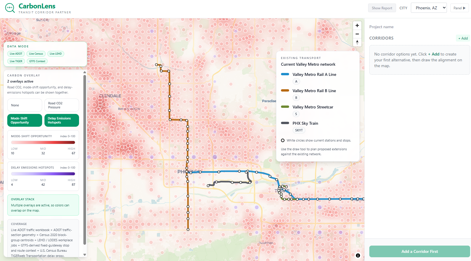
Workspace showing the existing Valley Metro network with Mode-Shift Opportunity and Delay Emissions Hotspots overlays from live public data.
-

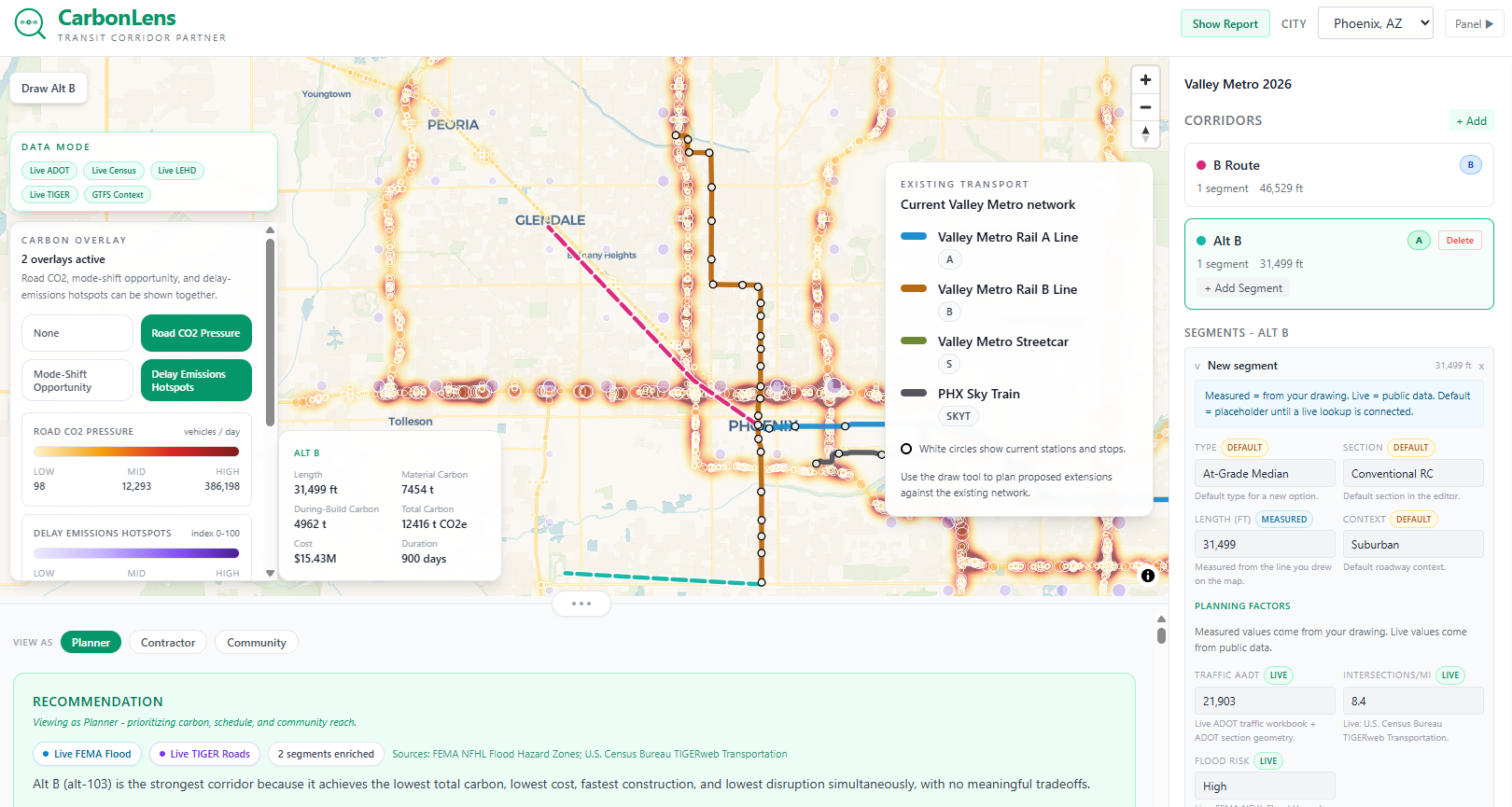
Two user-drawn corridor alternatives with live planning factors, Road CO2 Pressure overlay, and Planner-view recommendation .
-

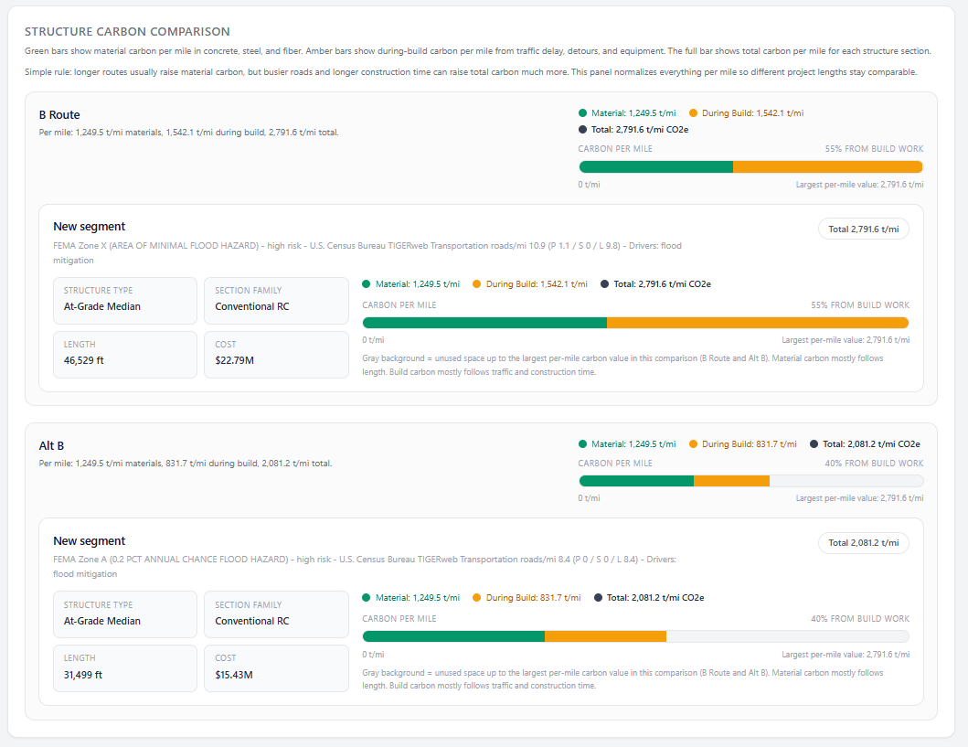
Structure Carbon Comparison showing per-mile material vs. during-build carbon breakdown for each corridor segment.
-
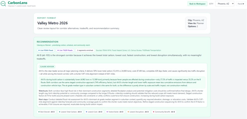
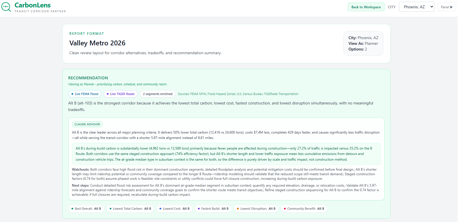
Report view with Claude AI advisor narrative - construction insight, flood risk watchouts, and actionable next steps for the planning team.
-
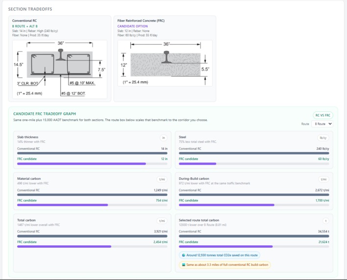
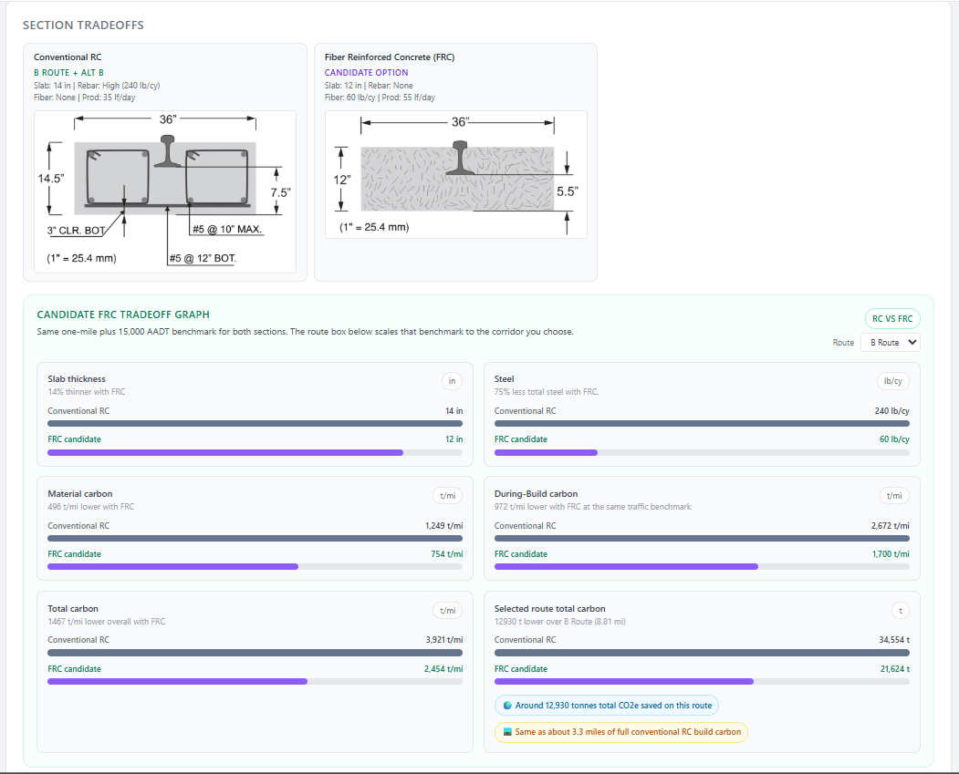
Section Tradeoffs panel comparing Conventional RC and FRC cross-sections with material carbon, during-build carbon, and total carbon saving.
Inspiration
Transit infrastructure decisions lock in carbon for 50+ years, yet early corridor planning still relies on spreadsheets and gut feel. We asked: what if planners could sketch three routes on a map and instantly see which one produces less carbon, costs less, builds faster, and serves more people by using real public data.
What it does
CarbonLens lets users draw rail corridor alternatives on a map and compare them across embodied carbon, construction-phase emissions, cost, duration, disruption, buildability, and community benefit. It pulls live data from 7 public APIs (ADOT traffic, Census population, LEHD jobs, FEMA flood zones, TIGERweb road network, Census zero-car households, and GTFS-derived transit context) to enrich each segment automatically. Three stakeholder views as Planner, Contractor, and Community reweight the same results so different audiences see what matters most to them.
How we built it
-Frontend: React 18 + Vite + Tailwind + MapLibre GL JS + Recharts. Backend: Netlify Functions (Node.js) with a deterministic analysis engine. Data: 7 live public APIs feed real traffic, population, jobs, flood, and road-network context into each corridor segment. AI layer: Claude API provides optional narrative explanations after the deterministic engine has already produced the numbers.
Challenges we ran into
-Getting the Vite production build to work required fixing a dynamic import pattern that broke the entry point tracing. Balancing engineering depth with judge-friendly simplicity. We wanted the real civil engineering to show without overwhelming the demo.
Accomplishments that we're proud of
-The app shows that FRC (fiber-reinforced concrete) saves carbon not just from thinner slabs, but also from shorter construction windows that reduce traffic-delay emissions. The hidden 84% of the real benefit. Every metric is deterministic and transparent. No black-box scoring. Three stakeholder lenses on the same data make the tool useful for planners, contractors, and community meetings alike.
What we learned
Real transportation climate impact starts at the community level, not the individual level. One corridor decision affects more carbon than thousands of individual choices combined. We also learned that live public data is surprisingly rich and accessible. ADOT, Census, FEMA, and TIGER data can power real planning tools today.
What's next for CarbonLens
-Expand city presets beyond Phoenix (Seattle and Portland geometry is already stubbed). Add operational-phase carbon (energy, ridership projections) for full lifecycle comparison. Connect to live GTFS feeds for real-time transit gap analysis. Partner with agencies for pilot use in actual corridor studies
Built With
- html
- javascript
- maplibre-gl-js
- netlify-(hosting-+-serverless-functions)
- react-18
- tailwind-css-3
- vite-5

Log in or sign up for Devpost to join the conversation.