-
-
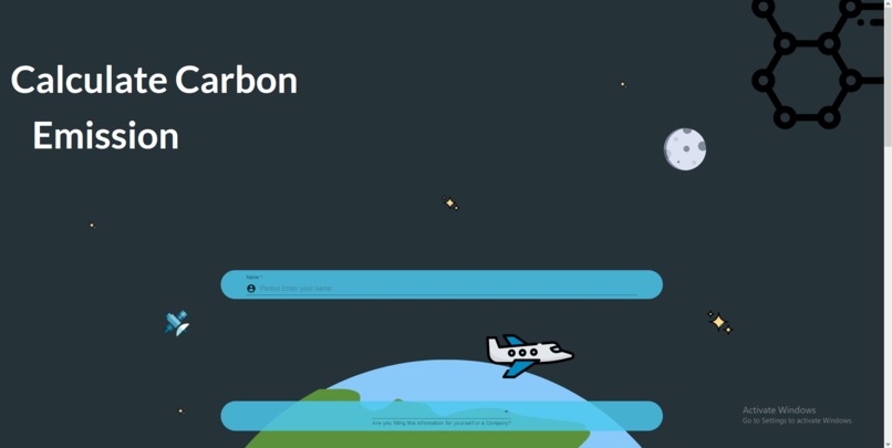
Landing page
-
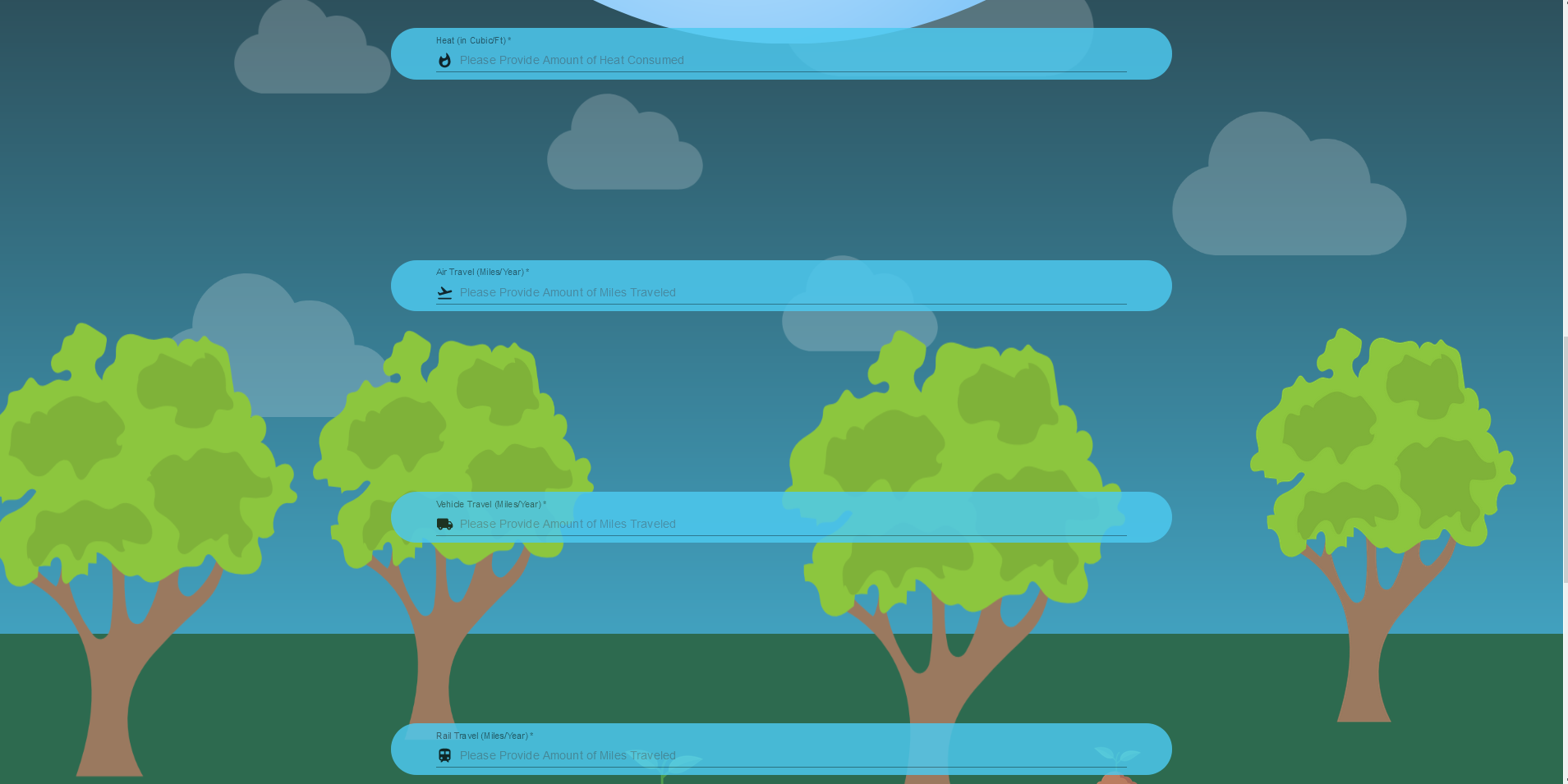
form 1 parralax
-
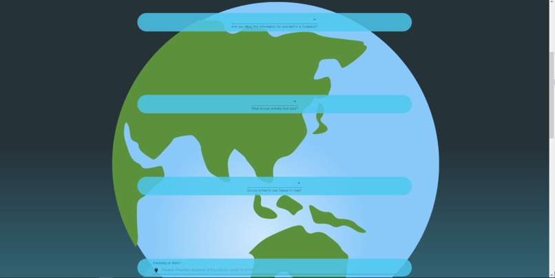
form 2 parralax
-

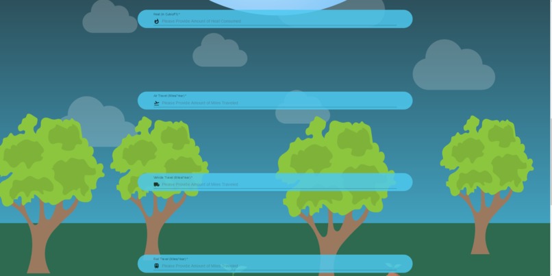
form 3 parralax
-

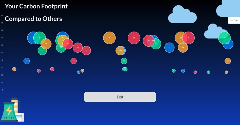
Custom bubble graph
-
Alternative custom bubble graph
-
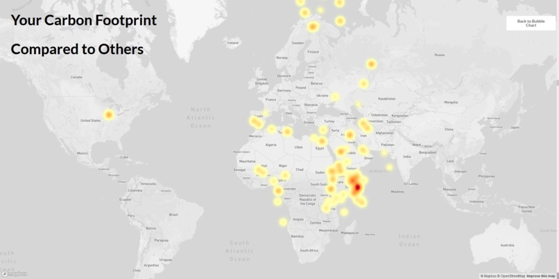
Heat map
-
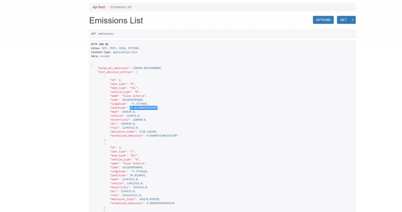
Django backend


Inspiration
We were inspired to help curtail global warming by visualizing carbon impact.
What it does
Our project calculates carbon emissions for residential or commercial entities, and uses data visualization heat maps and bubble graphs to show how your emissions compare to other people all over the world.
How we built it
We used Docker to make sure everyone on our team using cross platform OSs could contribute without dependency issues, and used a Python backend hooked up to a sqlite DB, and used a JS React based front end.
Challenges we ran into
As a team, we had a difficult time implementing a parallax scrolling landing page. A few of the team members were brand new to Docker and we had some issues getting up to speed. We also had some hard time generating the maps and getting the data onto the map, but we all learned quite a bit more about the tool.
Accomplishments that we're proud of
The front end looks incredible, and we are all very proud of it.
What we learned
We all had our specializations such as frontend, backend, and infrastructure. We all were able to flex our skills and be assets for our team, but we all got a chance to grow and try new technologies too; not to mention we all had lots of fun!
What's next for Carbon EmissionSquad
We are planning to add more data visualization, suggest users ways to reach carbon net zero, and write a web scraper to gather online data about companies. We hope to show users more about how their emissions compare not just to our website's visitors, but also corporations or countries.

Log in or sign up for Devpost to join the conversation.