
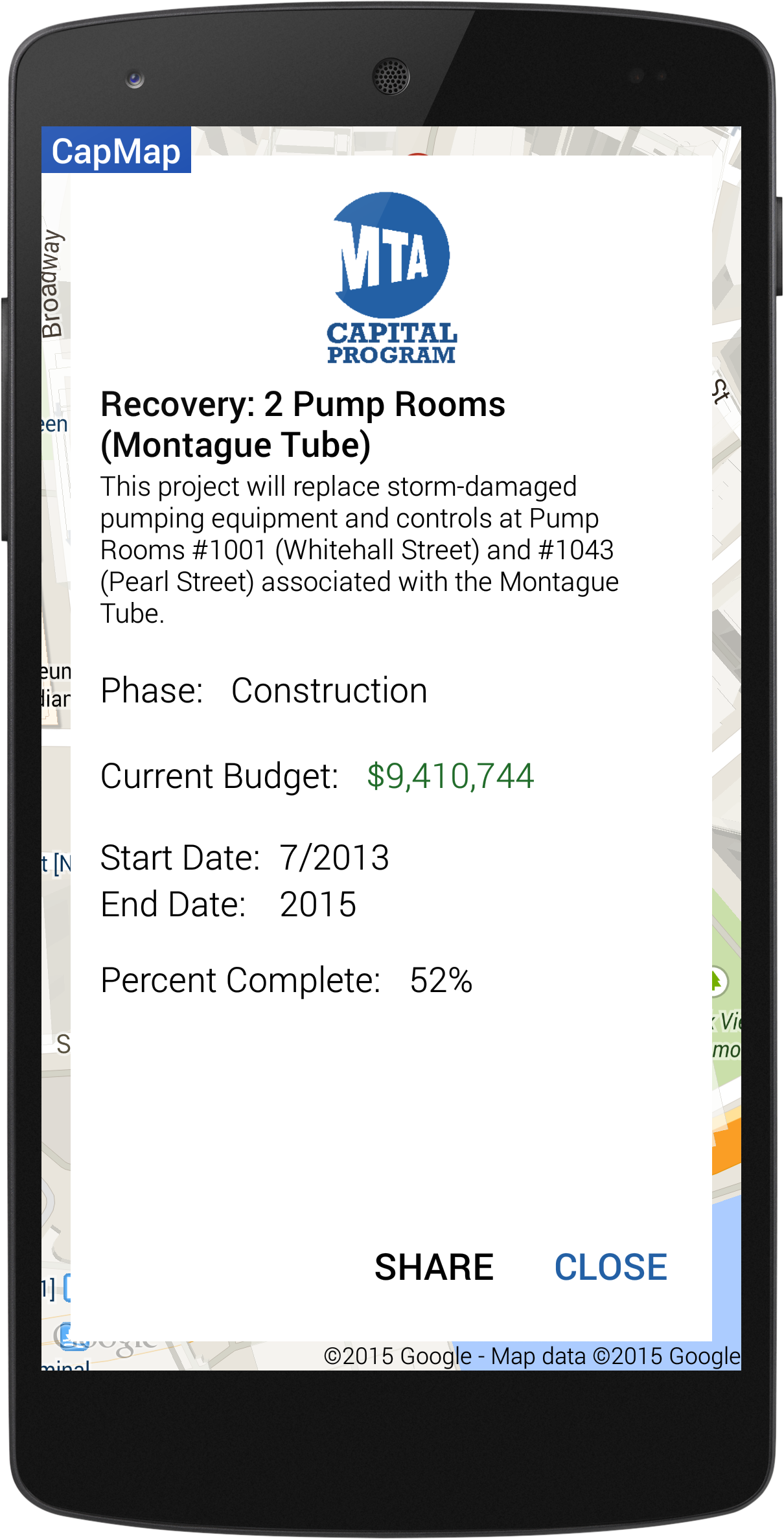

CapMap uses data provided by the Metropolitan Transportation Authority Capital Program and plots the data on a map.
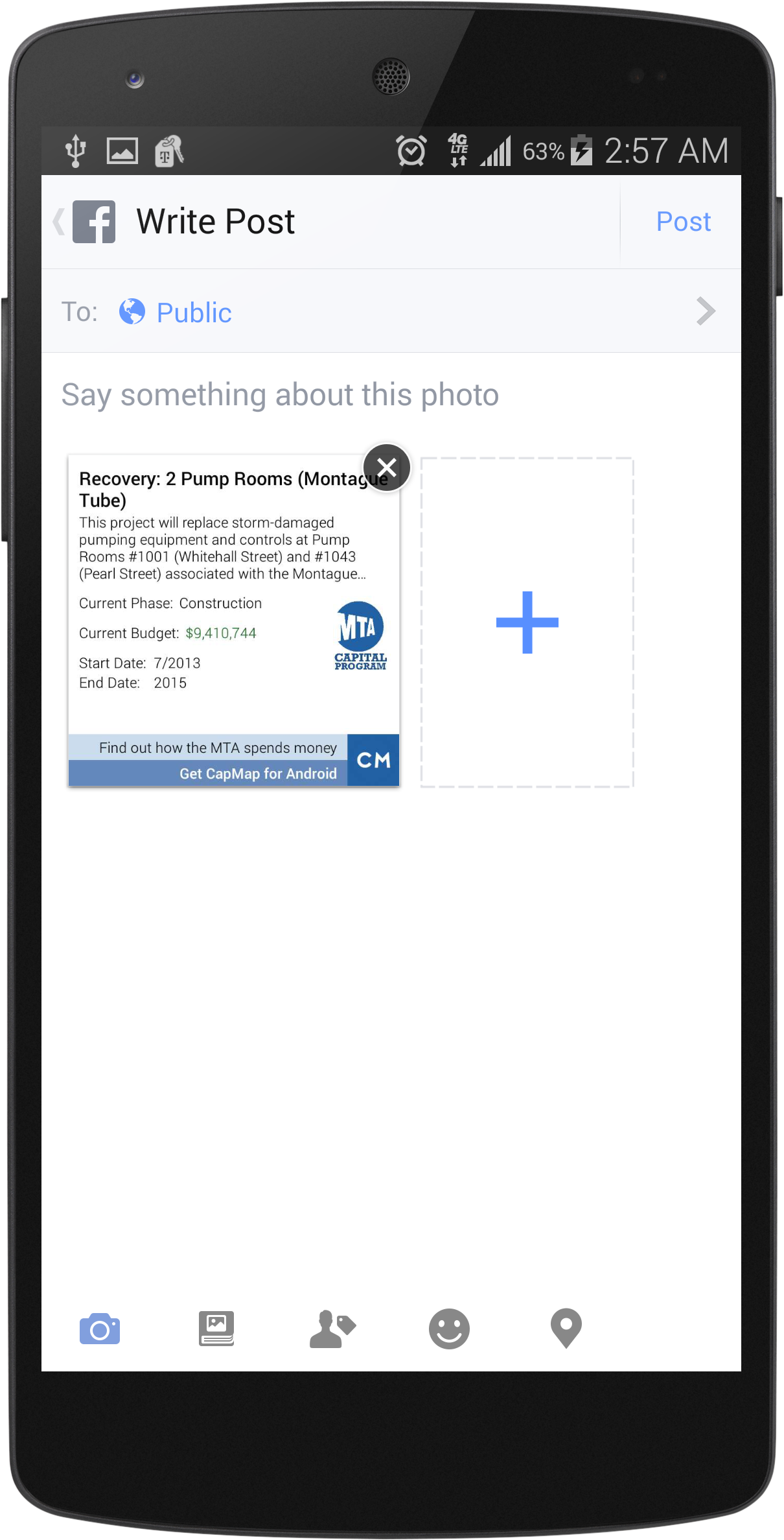
It groups projects together by neighborhood and proximity, so you can see the number of projects in that area. You can tap individual points to get more information about a project, including budget, detailed descriptions, and dates. You can also share interesting projects with others through social media and email.
With the new fare increase in March, and another one in 2017, I just wanted to know where my money was going. I always felt that the fare increases were pointless, since I never noticed any direct impacts to my commute. However, while using CapMap, I was able to find projects that have a huge effect on me! My target users are people like me, those who want to know if they are benefiting from the increases (and generally like being in the know).
I also decided to use the Capital Program data set because it was an untapped source. There are so many wayfinding apps from last year's App Quest, but not one application (that I could find) that focuses on the capital projects that impact the riders of New York City.... until now.
I'm very proud of the app's share feature, as well as it's ability to cluster many markers on a map. They are the features that help make the app what it is!
This was fun!
Built With
- android
- android-map-utils
- android-studio
- github
- google-maps
- mta-capital-program-dataset
- photoshop


Log in or sign up for Devpost to join the conversation.