-

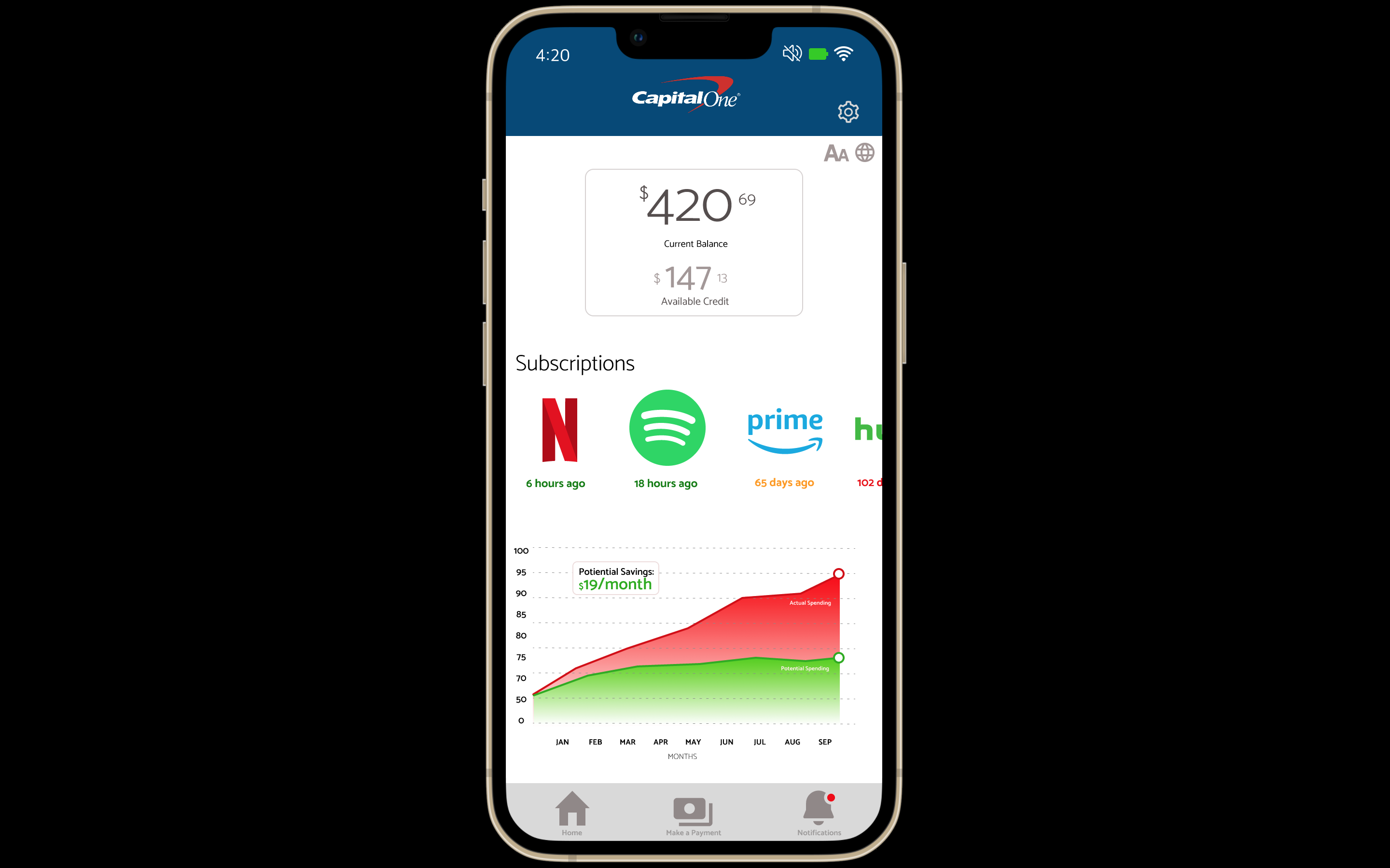
Home Page
-
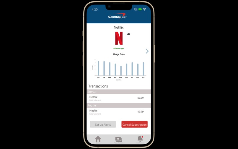
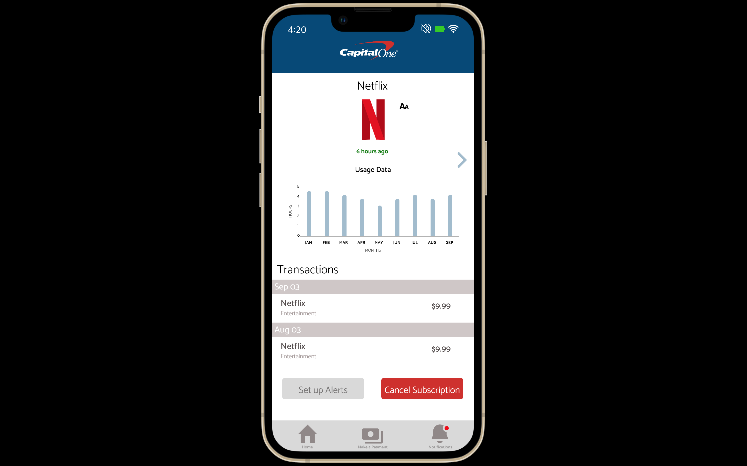
Netflix Data
-

Spotify Data
-

Audible Data
-

Amazon Data
-
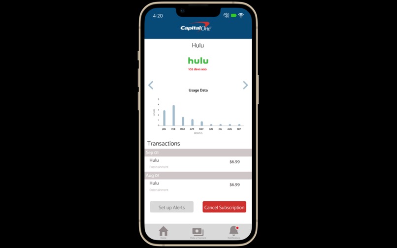
Hulu Data


Inspiration
We were inspired by the current UX/UI of Capital One's current app. We wanted to make something intuitive.
What it does
It gives users the ability to cancel unused subscriptions, in turn saving users hundreds of dollars in the long run.
How we built it
We used Figma, it was our first time using it so it was a learning curve for sure.
Challenges we ran into
We really didn't know what other features to add, so we decided to give users insight on their activity on these apps/subscriptions. That'll help them to make an informed decision.
Accomplishments that we're proud of
Learning Figma and creating an app from start to finish.
What we learned
It was pretty interesting figuring out what would be best for a user in using our app.
What's next for Capital One Subscription App
More features, more insight and a more detailed outlook on subscriptions.
Built With
- figma

Log in or sign up for Devpost to join the conversation.